

| » Forum Index » The Friday Challenge » Topic: Challenge 491: The tiled globe |
|
Posted on 12/02/14 4:10:33 PM |
|
bwild
* Posts: 12 Reply |
Re: Challenge 491: The tiled globe
WOW tough challenge but with a little bit of perseverance and time I came up with a way to keep the lines with the globe. 1st - I used computations to subtract the red from the green channel 2nd - Used level to increase the black lines 3rd- Used the clone tool to remove the top land mass 4th - selected the top 1/2 duplicated copied, flipped V & H 5th - copied the globe 6th new layer 7th paste 8th Opacity to 80% 9th top overlay image blend mode to multiply, need to use a lighter image.  |
Posted on 12/02/14 8:23:05 PM |
|
brewell
Pixel Pentagrammarian Posts: 752 Reply  |
Re: Challenge 491: The tiled globe
I just couldn't let this one go. In Camera Raw, I maximized the luminance for aqua and blue, then used the blue channel to burn shadows and dodge highlights.  _________________ I aim to give pause. |
Posted on 12/02/14 10:11:23 PM |
|
Deborah Morley
Makeover Magician Posts: 1319 Reply |
Re: Challenge 491: The tiled globe
Very tricky 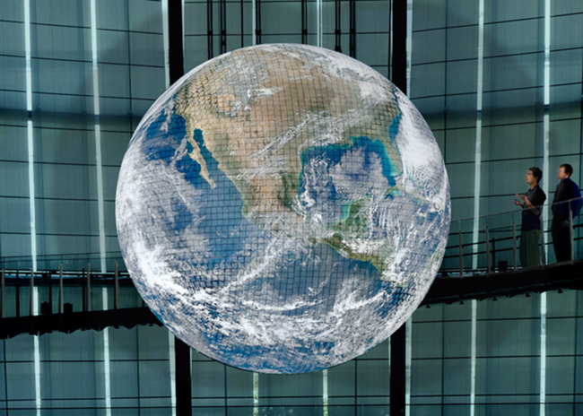 |
Posted on 13/02/14 10:58:04 AM |
|
Deborah Morley
Makeover Magician Posts: 1319 Reply |
Re: Challenge 491: The tiled globe
I copied the globe to a new layer, used Replace Colour which got rid of the majority of the 'blobs', set this to Multiply. Copy of the Earth beneath this layer and another copy of the Earth above set to Overlay @ 27% to lighten it up. The edges of the blobs were only just visible and with a busy Earth hopefully hidden. Tried Nicks technique which I thought worked really well. How would you have done this Steve? |
Posted on 13/02/14 4:40:45 PM |
|
josephine harvatt
Gag Gadgeteer Posts: 2603 Reply |
Re: Challenge 491: The tiled globe
Very impressed by everyone's technical expertise - I just use the "poke and hope" method _________________ I'm not really bad - I just draw that way |
Posted on 13/02/14 4:41:57 PM |
|
josephine harvatt
Gag Gadgeteer Posts: 2603 Reply |
Re: Challenge 491: The tiled globe
Never mind - really enjoying your banner this week _________________ I'm not really bad - I just draw that way |
Posted on 13/02/14 8:05:15 PM |
|
puffin31939
Montage Mariner Posts: 383 Reply |
Re: Challenge 491: The tiled globe
I had given up on this until I saw Gordon's and Nick's posts. Thanks, guys - you gave me some ideas to work with though I didn't follow either of them exactly. I have a feeling I should have left the two people out of the foreground - I'll find out tomorrow! 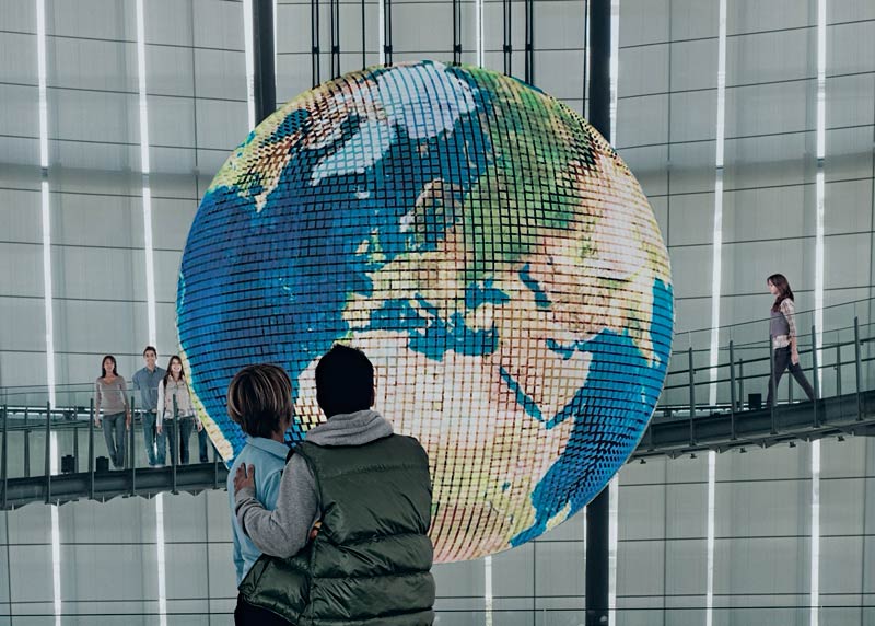
_________________ Man cannot change the direction of the wind but he can adjust the sails |
Posted on 13/02/14 8:15:05 PM |
|
Ben Mills
Luminous Luminary Posts: 570 Reply |
Re: Challenge 491: The tiled globe
Frightened by all the technical stuff - I just pinched a globe from another photo. 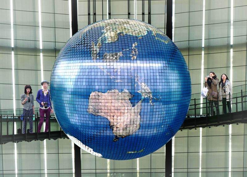 |
Posted on 13/02/14 10:06:41 PM |
|
marlcliff
Knight of Intrigue Posts: 171 Reply |
Re: Challenge 491: The tiled globe
the globe 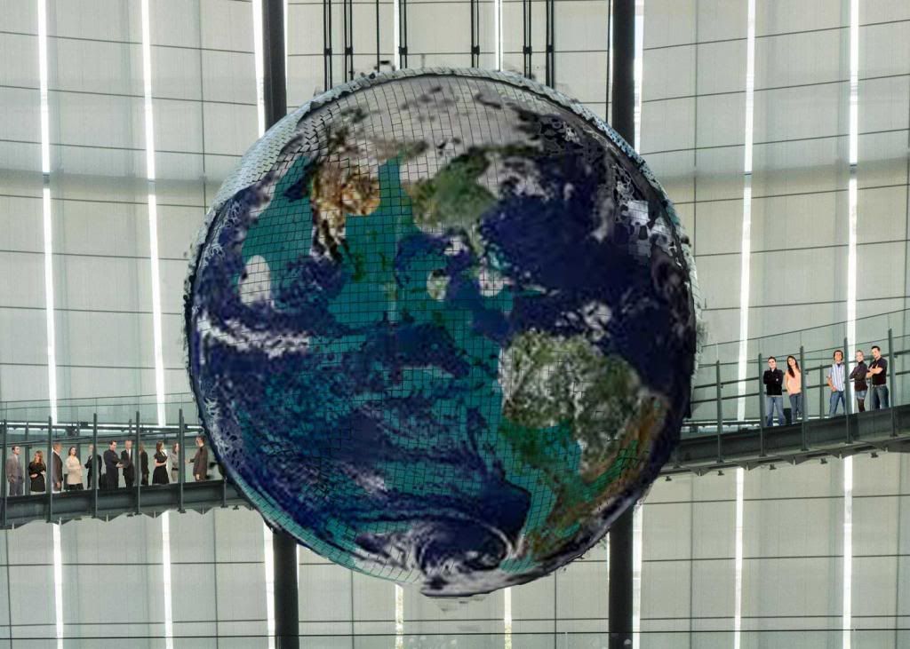 |
Posted on 14/02/14 04:47:15 AM |
|
Artwel
Satire Supremo Posts: 607 Reply |
Re: Challenge 491: The tiled globe
Slightly off brief.. http://vimeo.com/86673904 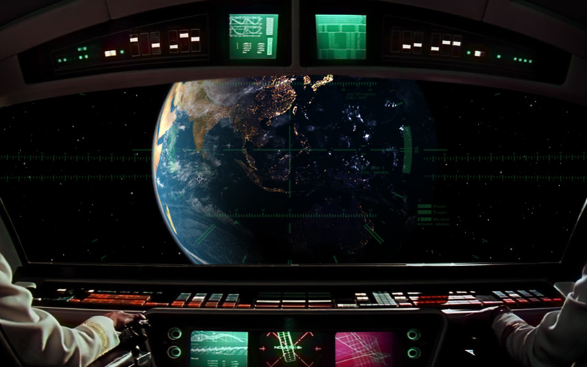 |
Posted on 14/02/14 07:59:15 AM |
|
joeysala
Perfect Palmist Posts: 604 Reply |
Re: Challenge 491: The tiled globe
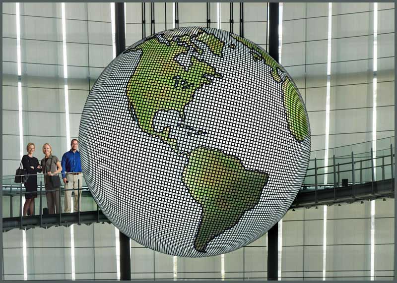 _________________ "Imagination, not invention, is the supreme master of art........" Joseph Conrad |
Posted on 14/02/14 08:58:32 AM |
|
Steve Caplin
Administrator Posts: 6982 Reply |
Re: Challenge 491: The tiled globe
This was a tricky Challenge, as those of you who attempted it found out. The hard part, of course, was lifting the grid from the initial shot of the planet - and I've a suggestion for how this can be done at the end of this write-up. First to attempt the impossible was Frank, who has either done a masterful job or cheated by finding another image of the same scene. I strongly suspect the latter, given the slight difference in viewing angle - in which case, it's hard to tell what you've added to this view. Either way, I like the silhouettes in the foreground. A very fine entry from GKB, who has replaced the earth's contents with great effectiveness. I like the idea of all the people on the walkway, but slanting them down like that isn't the way to put them on a slanting surface: it makes them look like cardboard cutouts. And are you sure about the shadow on the right of the globe? Given the large, you know, window right behind it? Very good work from Claudio_F, who has lifted the original tiles to great effect. An excellent job: no wonder those people are cheering. A good attempt from steve hill, who has replaced the globe with an entirely new one - but it's one that matches the spirit of the original very well. I like the way the girl's standing on the walkway: try adding a little tint to her lower half, below the glass, for extra realism. I enjoyed Nick Curtain's jokey entry - now that's how a globe should be displayed! A well lifted texture, and the people on the walkway are perfectly lit up. Very clever! A newly generated texture from Ant Snell, and it's one that matches the spirit of the original. I like the extras here: the space shuttle, as well as the telescope and the man - both artfully tucked behind the glass and railings of the walkway. Very nicely achieved. A great idea from brewell, using Mini-Me from the Austin Powers series - and there he is, dominating the world. Should he be even more rounded as he fades off around the sides? I like the poses of the people on the walkway - suitably horrified. A definite improvement in the second entry - it does seem to sparkle more. A tremendous montage from James, encompassing many of the world's leading brands in a striking political statement. I suspect, however, that you may have found this image ready-made. The most fun is in the animated version, which ingeniously spins the globe as the woman walks past it - while keeping the lighting in the same place. Good work! "I found this one really difficult", says Josephine Harvatt, with a globe in which the original contours have very nearly been removed. So to compensate, she inserted a could of rather muscular young men who, frankly, I don't recognise, although I do deplore their dress sense. Should I know who these men are? A well-rescued texture from Linda Eckert, with a good new globe view superimposed. I like the people on the walkway, but are they just a bit too big for the scene? I think that line at thigh height is a hand rail. A very dark entry from Garfield72 - well, that's one way to obscure the complex texture! I suppose the back lighting matches the fact that the window is behind it; but then the globe itself is made of screens. A gorgeous entry from tooquilos, with a planetarium view projected onto the screens behind. There's a tremendous sense of mystery and excitement here. Fabulous! But I thought you were travelling too much to take part? A novel approach from bwild, who has separated part of the texture and then duplicated and flipped it. And it very nearly works - but as ever, the joins give the game away. Thanks for sharing your approach: it's one that very nearly works. The astronaut and shuttle are good additions! An interesting view from Deborah Morley, with shadows of the globe thrown on the screens behind. Do you think it was spotlit? Surely, as it's made of tiny screens, it's lit from within - in which case there's nothing to cast a shadow. A very neatly replaced texture, though. A strong entry from puffin31939, who has rescued the original texture rather well. I like the people on the walkway - but when people are standing on a slope, they don't stand at an angle! Keep them upright! The couple in the foreground are a nice addition. An honest cheat from Ben Mills - and yes, the technical stuff was rather technical this week. That's a great globe you've found there. I like your people, even if they are so big they make the walkway sides a real health and safety hazard. A well-replaced globe from marlcliff, but watch those ragged edges: do you have anti-aliasing turned on? I know I've been complaining about people on the walkway being too big, but I think you've gone too far the other way! I like the way you've hidden them behind the vertical struts, though - very convincing. "Slightly off brief," says Artwel, with an image that includes nothing from the original Challenge... but what a beautiful image it is. And the animated version brings it to life in an intriguing and spectacular way. A terrific piece of work, with a fine soundtrack that really adds to the tension. Superb work. A good idea from joeysala: add a new grid, and use the Spherize filter to wrap it around the surface. The land masses work fairly well, although I'd have done without the outlines; but - take a look at a globe! You need to leave room for the North and South poles! ____________________ Many of you seem to have had difficulty lifting the grid off the background of the globe, and there are as many different ways of doing this as there are Photoshop users. The Channels approach is often a good one, but I find performing Calculations rarely gives me enough control over the result. Here's one possible method. I'm not saying it's the best, but it is perhaps the most straightforward. 1. Copy the globe to a new layer, and use Levels or Curves to brighten it up: 
2. Use the Replace Color dialog to select the blue. Drop the Saturation to zero, and increase the Lightness: 
3. Continue with Replace Color until almost all of the blue has disappeared (you can never get rid of all of it): 
4. Add a new globe, using the copied layer as a Clipping Mask; then duplicate the grid layer, move it to the top and set it to Multiply mode. The faint blue areas left in the previous stage disappear. But it's now looking a bit flat: 
5. Take a copy of the original globe, move it to the top and set it to Hard Light mode so we can see the original through it: 
6. Add a Layer Mask and paint out the entire layer, then use a soft brush to reveal it again in selected areas - just where the original was white - to create the highlights: 
Not a perfect solution, but it does more or less work; and the highlights make it seem that much more real. Oh, and for those of you wondering about the scale of people on the walkway, here's my son Joe looking at it. Note the position of the handrail:  |
Posted on 14/02/14 09:36:03 AM |
|
Nick Curtain
Model Master Posts: 1768 Reply |
Re: Challenge 491: The tiled globe
Thanks Steve I looked at images of the globe and noticed the glass was around head height, so I positioned the girls to fit the hand rail. Jo is clearly a tall lad. I enjoyed this one. Nick |
Posted on 14/02/14 10:38:38 AM |
|
josephine harvatt
Gag Gadgeteer Posts: 2603 Reply |
Re: Challenge 491: The tiled globe
Muscular young men? get yer glasses on Steve- the one in the background is a ladee ! 
Inspired by the current weather situation in blighty this was supposed to be a post diluvian global warming type situation hence the wet suits. Is "replace colour" tucked away in PS7 anywhere or should I have scaled the giddy heights of CS2 for this project? _________________ I'm not really bad - I just draw that way |
Posted on 14/02/14 10:49:09 AM |
|
Steve Caplin
Administrator Posts: 6982 Reply |
Re: Challenge 491: The tiled globe
Oops!
It's there in PS7, I think - look under Adjustments. |
Posted on 14/02/14 10:51:16 AM |
|
GKB
Magical Montagist Posts: 3956 Reply |
Re: Challenge 491: The tiled globe
Shadow? It was the middle of the night on that side of the planet!  
A tricky challenge. Well done to all who attempted it. _________________ It only seems impossible. |
Posted on 14/02/14 11:51:43 AM |
|
puffin31939
Montage Mariner Posts: 383 Reply |
Re: Challenge 491: The tiled globe
Thanks, Steve. I wouldn't have got anywhere with extracting the grid without the advice from Gordon and Nick which got me started. Glad the people in the foreground were OK - I wasn't sure about them. Quite pleased with myself now! _________________ Man cannot change the direction of the wind but he can adjust the sails |
Posted on 14/02/14 11:54:13 AM |
|
brewell
Pixel Pentagrammarian Posts: 752 Reply  |
Re: Challenge 491: The tiled globe
I had some extra time this week, and it was fun to be obsessed again. I tried something new every day. Good challenge. _________________ Is it necessary? Does it work? |
Posted on 14/02/14 12:02:05 PM |
|
Artwel
Satire Supremo Posts: 607 Reply |
Re: Challenge 491: The tiled globe
Thanks Steve. Well I did start off to the brief, but then I got side tracked..  |
Posted on 14/02/14 2:07:26 PM |
|
Claudio_F.
* Posts: 20 Reply |
Re: Challenge 491: The tiled globe
Tks Steve, I have done my best to try to stick to the premise doing all the effort to preserve the original texture and even the overall light... _________________ "I'm curious about everything, even things that don't interest me." -- Alex Trebek |
| page: 1 2 3 last |