
| » Forum Index » The Friday Challenge » Topic: Contest 175: Plastic horses |
|
Posted on 03/12/07 01:56:35 AM |
|
zapat
Audio Artist Posts: 44 Reply |
Re: Contest 175: Plastic horses
brilliant work mr. wayne and steve mac i think i need more practice to reach your level |
Posted on 03/12/07 8:29:09 PM |
|
Wayne
Printers Devil Posts: 312 Reply |
Re: Contest 175: Plastic horses
Steve, I hope you'll forgive the second entry, I just had to fix the strange growth on the horse's muzzle (a piece of bridle off another horse's head I used to add texture) I also took the opportunity to lose a bit more shine off the horse's rump and back legs. zapat, thank you. 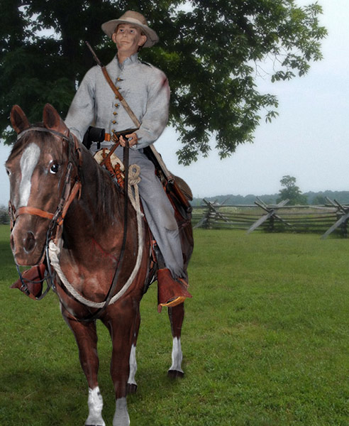 |
Posted on 03/12/07 10:18:10 PM |
|
james
Surreal Spoofer Posts: 1194 Reply |
Re: Contest 175: Plastic horses
[quoted] Wayne wrote: Steve, I hope you'll forgive the second entry, I just had to fix the strange growth on the horse's muzzle (a piece of bridle off another horse's head I used to add texture) I also took the opportunity to lose a bit more shine off the horse's rump and back legs. zapat, thank you. Wayne. Just how does one get rid of the gloss? I failed and used a different horse. Please |
Posted on 04/12/07 03:52:31 AM |
|
vibeke
Kreative Kiwi Posts: 2152 Reply |
Re: Contest 175: Plastic horses
I noticed, but then the forum is called "how to cheat in Photoshop", thought you did really well with your choice of horse. |
Posted on 04/12/07 07:59:02 AM |
|
Wayne
Printers Devil Posts: 312 Reply |
Re: Contest 175: Plastic horses
James/vibeke, to add texture to the plastic, I overlaid a selection from a real horses head, desaturated it and set the blend mode to hard light. Reduced the opacity and clipped it to the plastic horse layer. Problem was, I didn't notice the bit of bridle next to the mouth! (cant believe it now!) I just repeated this for other bits of the horse. I also used the burn tool set to highlights to tone down the shine on parts of the plastic horse. |
Posted on 04/12/07 4:22:09 PM |
|
Ben Mills
Luminous Luminary Posts: 570 Reply |
Re: Contest 175: Plastic horses
Hi Ho Dobbin Away 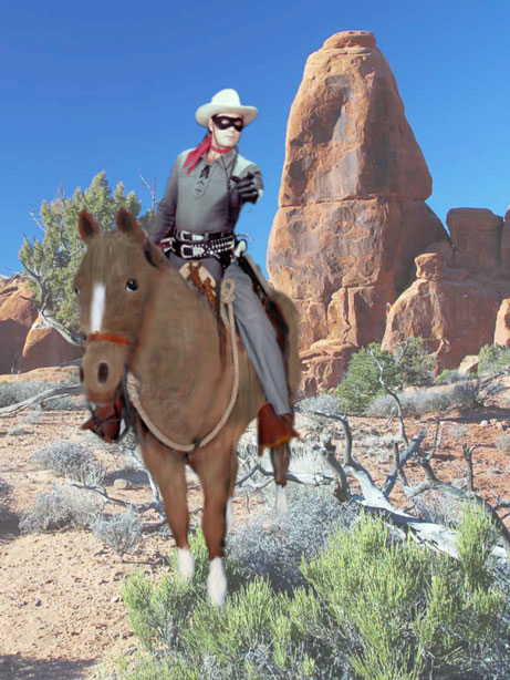 |
Posted on 04/12/07 8:40:08 PM |
|
Progenic
** Posts: 104 Reply |
Re: Contest 175: Plastic horses
for what its worth i tried hand painting the horse and overlaying real horse texture, then shaded and dodged in places and did all sorts of other stuff which ended in a bit of a mish mash really. Anyway here it is   |
Posted on 04/12/07 11:11:29 PM |
|
james
Surreal Spoofer Posts: 1194 Reply |
Re: Contest 175: Plastic horses
Thank you Vibeke and Wayne. I've had a dabble, not sure I'ts right. |
Posted on 05/12/07 9:15:08 PM |
|
Whaler
Visual Viking Posts: 330 Reply |
Re: Contest 175: Plastic horses
An old, faded, blurry, and yellowed picture is the only one I have of my long lost relative was out riding the ranges. 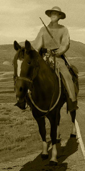 _________________ Only in my brightest moments I understand myself |
Posted on 06/12/07 05:48:51 AM |
|
vicho
Ingenious Inca Posts: 248 Reply  |
Re: Contest 175: Plastic horses
i didnt expect to end up with so many layers...!  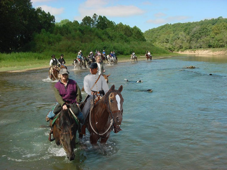 |
Posted on 06/12/07 12:00:36 PM |
|
katew
Virtual Virtuoso Posts: 676 Reply |
Re: Contest 175: Plastic horses
Riding through the desert on a horse with no name ... The rider is my husband (well, the head is, anyway). |
Posted on 06/12/07 12:03:26 PM |
|
katew
Virtual Virtuoso Posts: 676 Reply |
Re: Contest 175: Plastic horses
Sorry, posting on 3 hours sleep there. It wouldn't let me add a picture in the edit, so here it is ... 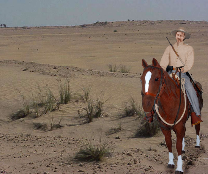 |
Posted on 06/12/07 11:53:41 PM |
|
jwhite
Collage Critter Posts: 274 Reply  |
Re: Contest 175: Plastic horses
Had a very difficult time trying to make the horse look real any pointers would be appreciated.  |
Posted on 07/12/07 08:56:39 AM |
|
Steve Caplin
Administrator Posts: 6842 Reply |
Re: Contest 175: Plastic horses
This turned out to be a tricky week - after all, bringing plastic to life is a far from easy task. But some entertaining and inspired work came of it. First to climb into the saddle was GKB, with a splendidly shaggy horse - looks like a cross with Highland cattle. Not sure about the furry ears, though! While changing the soldier's allegiances from confederate to unionist (if I've got that right) is an interesting idea, that shirt is now just too blue for comfort. As always, check you don't oversaturate when adding colour, as it tends to make the image look unreal. An excellent horse from gaoxiguo, with good shading on the head and great perspective on the path. Fantastic and subtle texture makes all the difference here. Good work! A glorious animation from james - not sure what the elephants are doing in the mid west, but there must be a reason for them. The eagle knocking the hat off is brilliant, and that charging elephant in the background moves most convincingly. I especially like the horse's slightly moving head. As always, James, I'm amazed at what you manage to do with GIF animation. My face seems to crop up here with alarming regularity - and there I am in vibeke's post, on a nicely textured horse and, somehow, wearing a lumberjack shirt. But at least I haven't dropped the iPhone! Great texture, a well matched shirt, and an idyllic pastoral setting. But did Robin Hood wear plaid? I bet zapat must have regretted this choice almost as soon as he started working on it - painting on all those Dalmation spots must have taken forever. But a great piece of work, and my face fits neatly into that slot. Very good use of perspective in the background, too - an excellent choice of setting. Well, I asked for texture... and xsi11598 has produced a cuddly critter that Disney would kill for. Some very fine wallpaper texture on George W's clothing, too, making it look like he's just stepped out of bed. Most entertaining! So Powerslave has come up with a neat solution to the shine problem: stick the horse in shadow. A great cheat - and I like the gloss on the ears. Still, I wouldn't argue with the Man with No Name, now would I. Looks like brewell's horseman is about to get pounced on - although that cat does look too docile to be an immediate threat. There's something odd about the ground: is that a stream? In which case, I think we should see some ripples or foam around the hooves. A rather attractive cornfield from dave.cox - but do watch that perspective! Our view of the horse is pretty much at the horse's eyeline, yet the background's horizon is much higher - even accounting for the fact that it's going up a hill. Very classy blending into the grass, though - that must have taken a while. A neat solution from Neil O - I like the way the hair has been drawn on the head, and the faint shadow on the wood. The horse itself needs some shading where it goes inside the stable, though. Looks like Mrs G popping up in mguyer's entry. But is her head really that small, Marty? Or have padded Sumo jackets made a comeback in Michigan? A great choice of background, though, and I like the overall painterly effect. It's me again... and an interesting dappled effect from CharlotteBabb, matching the sunlight in the rest of the forest. Again, there's the perspective issue - we really have to watch out for this one. There's a real Panto feel to tooquilos' entry, with a dastardly devil peeking out from behind the signpost. The real effort here, however, went into the horse: fantastic skin and mane, with a new head grafted on seamlessly. In fact, it's hard to tell how much of this is the original horse and how much a new one. Great blending into the grass, too! It seems Wayne's rider has suffered badly in the war, judging from the blood and bruises. But that's nothing to what the horse has gone through - he seems to have been spat on by a giant with a phlegm problem. Or is that just a lot of sweat? Great skin, and the new mane is excellent. And worthwhile improvements in the second entry too. A very tasty shadow for stefan's horse, and good new texture. Note how the horizon is dead on the horse's eyeline: great perspective matching! It seems Trev really had trouble with the horse texture - and yes, it is tricky. This is an ambitious piece, building a milk cart from scratch: the trick is to watch the perspective. Look at the middle bars on the windows, and you can see they're pointing slightly downhill. So we should be looking down at the milk churns as well, since they're on a similar level: which means the front row should be fully visible, the others more hidden behind. A valiant attempt! Beautiful work from Steve Mac: there's a quality of light here that's almost painterly in its approach. Great texture, a perfect shadow, and excellent new folds on the shirt - and the Clint Eastwood beard is a great addition. I think I'd have lost the front horse, though, as it just seems to detract from the scene. Otherwise, this is perfect. Excellent stuff! An excellent new body for the cowboy from Ben Mills, who fits just perfectly on there. And he also serves to detract from the horse itself, who appears to have been skinned alive. Tricky stuff indeed, this fur business! An almost surreal entry from Progenic, with a pair of horsemen who look just like Van Gogh. Indeed, there's a painterly feel to the whole image. My only problem here is with the shadows, which are too defined and from the wrong direction (the sun's right in front of us). Like the seagull, though. A cute faded photo effect from Whaler - although I'm not quite sure why the shirt has lost definition. But to complete the look, there should really be some folds and creases in that image - and perhaps a more torn border. A fantastic piece of work from vicho, who has montaged our horse in with another equine group - and it's a superb entry. The ripples around the legs, the distortion through the water, the twisting of the head to look at the rider next to him, the matching of the shading on the face - this is really classy stuff. you've set yourself a tricky task, and lived up to the challenge. Which means a well overdue title for you: I think, as you're from Peru, [i]Ingenious Inca[i] fits best. Excellent work! Good horse texture from katew, and the new head works well. But do watch the perspective, as I've said a lot this week! And with such a faded background, the horse is perhaps a little too saturated. Perhaps raising the saturation on the background would have helped here. And the final entry, appropriately, is from jwhite - and it was his image we used in the first place. You need to look more closely at your shadows, John - while that does more or less match the shape of the horse, it extends too far out the back - and appears to go over the horse itself, rather than being behind it. Thanks for providing the picture! |
Posted on 07/12/07 09:18:06 AM |
|
maiden
Golden Gif Gagster Posts: 471 Reply |
Re: Contest 175: Plastic horses
Sorry about the Challenge I had been working on the image (uncomplete) although too late for entry I was going to post to say I've not disappeared (again) and submit what I had done. However such is the way of things my FTP has decided not to work and tells me my password is invalid (which it isn't). Anyway once again sorry, I will try to post my efforts which limited me to not being able to complete it due to work and other factors. |
Posted on 07/12/07 09:42:09 AM |
|
GKB
Magical Montagist Posts: 3733 Reply |
Re: Contest 175: Plastic horses
Good morning Steve, Yes, you are spot on with the identification of the 'shaggy' source. I was going to replace the horse with a Highland Cow that I photographed a couple of years ago but, in the end I just decided to transpose the fur instead. I momentarily thought of using its horns but I thought that would be just toooooo silly. Point taken on the saturation - one of my many failings is to use too punchy a colour. Gordon |
Posted on 07/12/07 10:26:15 AM |
|
tooquilos
Wizard of Oz Posts: 2805 Reply |
Re: Contest 175: Plastic horses
Thank you so much Steve for your comments. I look forward to reading them each week.  |
Posted on 07/12/07 11:01:13 AM |
|
katew
Virtual Virtuoso Posts: 676 Reply |
Re: Contest 175: Plastic horses
Thank you Steve. |
Posted on 07/12/07 12:03:36 PM |
|
james
Surreal Spoofer Posts: 1194 Reply |
Re: Contest 175: Plastic horses
Thank you Steve. The background is the African Veld |
Posted on 07/12/07 12:33:35 PM |
|
vicho
Ingenious Inca Posts: 248 Reply |
Re: Contest 175: Plastic horses
hi Steve, thanks for the title! |
| page: 1 2 3 last |