| » Forum Index » The Friday Challenge » Topic: Challenge 696: Rebrand the SPD |
|
Posted on 15/03/18 4:56:41 PM |
|
Mariner
Renaissance Mariner Posts: 2817 Reply |
"We're on the Road to Nowhere"
|
Posted on 15/03/18 8:44:25 PM |
|
Deborah Morley
Makeover Magician Posts: 1319 Reply |
Re: Challenge 696: Rebrand the SPD
Lovely work Mariner. Another quick one from me, actually used one of my photos of the Berlin wall from when I visited there many years ago 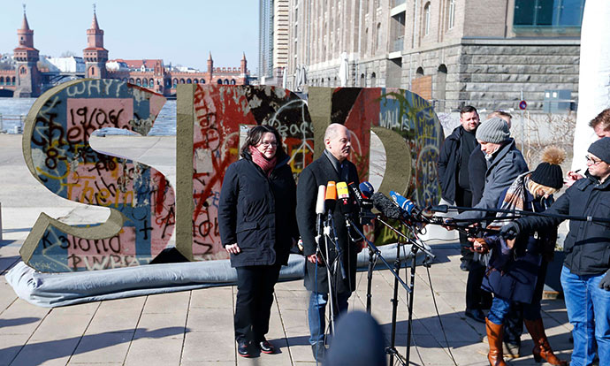 |
Posted on 16/03/18 06:09:25 AM |
|
Mariner
Renaissance Mariner Posts: 2817 Reply |
Re: Challenge 696: Rebrand the SPD
Thank you Deborah. The Berlin Wall, ah yes. I too visited it in the late 1970's and viewed it from one of those wooden platforms they built. A rather unsettling place. They told their people it was to stop a western invasion. |
Posted on 16/03/18 09:13:15 AM |
|
DavidMac
Director of Photoshop Posts: 4936 Reply  |
Re: Challenge 696: Rebrand the SPD
I saw this horrible wall many times over the years and crossed through it a couple of times when shooting for Granada TV's World in Action. I have black and white photos I took of it as a twenty year old in 1963 soon after it was buit. It was a crude breeze block structure topped with barbed wire. The taller concrete wall replaced this in later years. There was something about the gimcrack thrown together look of the early wall that made it all the more sinister and frightening. _________________ The subtlety and conviction of any Photoshop effect is invariably inversely proportional to the number of knobs on it ....... |
Posted on 16/03/18 09:18:55 AM |
|
Steve Caplin
Administrator Posts: 6835 Reply |
Re: Challenge 696: Rebrand the SPD
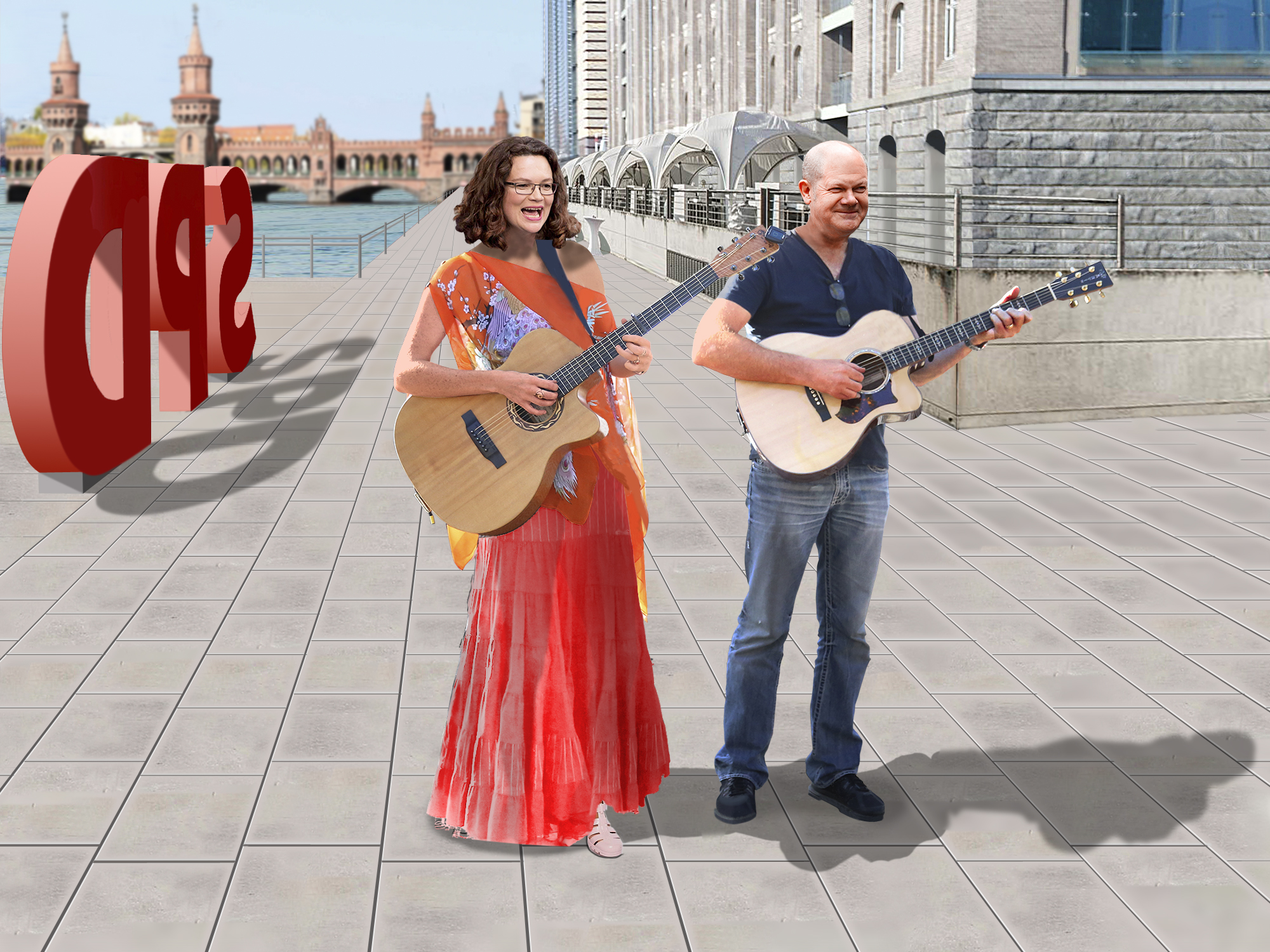
First to adjust the sign this week was Frank, with a fine array of seagulls making their deposits on the SPD sign. Very fine spattering, especially on the ground and that curious blanket thing; they seem to have missed the politicians altogether, though. A couple of HotChiPs branded entries from GKB, in both stone and steel. Nicely done - especially finding a view of the Oberbaumbrücke (thanks, Mariner) from the right angle to go in the background. That handsome chap in front of the microphones is wearing his hat at a rather jaunty angle, isn't he. And shouldn't the steel version perhaps reflect the scene? The rusty third entry is particularly appealing, I think. The animated version is nicely done, but wouldn't it make more sense in reverse? A clever move from Linda Eckert, moving the politicians and press in front of a similar piece of branding in Nice. I applaud the #I Love Nice sentiment, but that thing must be a bit of an eyesore on the sea front. A neat animation from lwc, with seagulls flying around (remarkably convincing) and a helicopter hovering overhead - which, I imagine, would rather disrupt the seagulls' flight. Maybe tone down the contrast on the helicopter a little, and remove that black outline? Animated textures in the second entry, as a series of cinematic wipes progress through the logo. Nicely done. Subtle work from DavidMac, who has done a fine job replacing that padded base with a hand truck - I especially like the shadow of the handle on the S. And the delivery man with his clipboard is a nice touch. Extremely well matched ground shadows! A shiny gold entry from tooquilos, shimmering in the sunlight - but, like Gordon's steel entry, shouldn't it reflect the scene in front of it? I like the way the letters float out of the container in the animatedversion, although I would strongly question the use of drop shadows over a three-dimensional background. Very neat unveiling, and the newspaper mockup is good - as is the revolving sign. Fun. Painstaking rebuilding from Mariner, who has moved the sign over to the side and rebuilt the bottom of the building. I like the addition of the wedges holding the S and D in place - very ingenious. And of course, the remodelled politicians look a lot more convincing than the originals. Has she had a perm? Deborah Morley's graffiti-strewn sign makes a rather powerful statement - and nicely done. I like the way you've remade the sides of the lettering in concrete. Perhaps a bit of paint or graffiti could splash round there. No entry from Jota120 this week, as we're instead treated to a curious explanation of how to boil nappies. And Michael Sinclair sends his apologies, but will not be able to enter for a while due to illness. We wish him well. |
Posted on 16/03/18 09:49:04 AM |
|
tooquilos
Wizard of Oz Posts: 2800 Reply |
Re: Challenge 696: Rebrand the SPD
Thank you Steve, I did struggle with this one on a few levels, not to mention agonising over those shadows. The question here though, with the reflections, is.. do political parties really reflect the people?? (Sorry, Jo,) Ill get me coat!!  _________________ Dorothy: "there's no place like home!" |
Posted on 16/03/18 10:05:25 AM |
|
GKB
Magical Montagist Posts: 3723 Reply |
Re: Challenge 696: Rebrand the SPD
Thanks Steve. I did it in reverse to start with but felt that it was more uplifting to do it from rust to polished steel. Michael, I hope that you get well soon; I feel the need for some more Napoleonic horsemen _________________ If at first you don't succeed then skydiving is not for you. |
Posted on 16/03/18 10:13:02 AM |
|
Mariner
Renaissance Mariner Posts: 2817 Reply |
Re: Challenge 696: Rebrand the SPD
Hope to see you back in gear next week Michael. |
Posted on 16/03/18 10:13:26 AM |
|
Mariner
Renaissance Mariner Posts: 2817 Reply |
Re: Challenge 696: Rebrand the SPD
Thanks Steve. |
Posted on 16/03/18 10:29:01 AM |
|
DavidMac
Director of Photoshop Posts: 4936 Reply |
Re: Challenge 696: Rebrand the SPD
Thank you Steve. It took me a while to into this one so I am delighted that you feel I pulled it off. Micheal please look after yourself. It's not the same without you. _________________ The subtlety and conviction of any Photoshop effect is invariably inversely proportional to the number of knobs on it ....... |
Posted on 20/03/18 3:51:10 PM |
|
Frank
Eager Beaver Posts: 1576 Reply |
Re: Challenge 696: Rebrand the SPD
Thanks Steve. Hope to see you back soon Michael. |
| page: 1 2 last |