
| » Forum Index » The Friday Challenge » Topic: Challenge 761: On Ilkley Moor |
|
Posted on 27/06/19 11:22:33 AM |
|
DavidMac
Director of Photoshop Posts: 4936 Reply  |
Re: Challenge 761: On Ilkley Moor
Oh wow! Now that is real attention to detail. A quick research shows that it does indeed. 
 _________________ The subtlety and conviction of any Photoshop effect is invariably inversely proportional to the number of knobs on it ....... |
Posted on 27/06/19 6:15:12 PM |
|
michael sinclair
Off-Topic Opportunist Posts: 1752 Reply |
Re: Challenge 761: On Ilkley Moor
I have updated and improved my entry, so I'm posting it here and deleting the original entry. 
|
Posted on 28/06/19 02:44:16 AM |
|
Mariner
Renaissance Mariner Posts: 2817 Reply |
Re: Challenge 761: On Ilkley Moor
 |
Posted on 28/06/19 08:32:12 AM |
|
Steve Caplin
Administrator Posts: 6835 Reply |
Re: Challenge 761: On Ilkley Moor
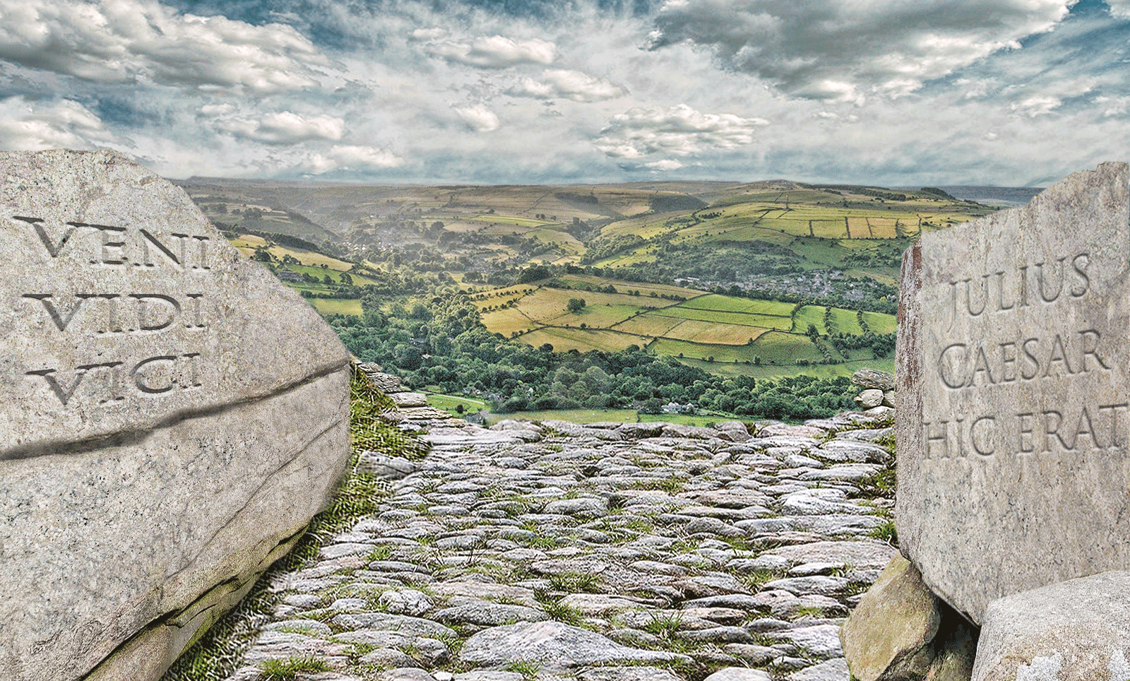
First to carve the rock this week was Ben Mills, with an appropriate World War 2 slogan. But being carved by a very 21st century man in a beanie and a hoodie? No wartime people from behind available? A fine composition from lwc, with an absolutely appropriate figure doing the carving. I think the lettering itself is perhaps a little small, though, given the size of his chisel - the third entry works perfectly for me. I enjoyed the second entry, playing with scale - but with the sun there, shouldnt what we see be much more in shadow? Very natural movement in the fourth entry; personally Id lose the plane, as its a distraction. I really like the toying with scale in the fifth entry - very subtly done, very effective. A male voice choir from DavidMac - all singing out of the clouds in ethereal fashion (and you can hear the song here). When you flip people horizontally, do remember to make sure the stripes on all their ties are sloping the same way. But thanks for the history! I enjoyed the Ilkley Moor alien in the second entry, but slightly confused by the floating policeman with his very strong ground shadow. Surely the shadow wouldnt be darker than the stone outside the light beam? Somewhat shaky carving from GKB, with an image depicting what appears to be a caveman showing surprising mastery of a Roman serif typeface. Id really add some perspective and a bit of curvature to that text, though. I like the bouncing dinosaur in the animated version - and intrigued by the cavemans telekinetic carving. Most entertaining. I think you need to check your history. A move to Egypt for tooquilos, with some neatly carved hieroglyphics. Still the leaden Yorkshire sky, though? A fun steampunk spaceship in the animated version, with a floating (and apparently also telekinetic) statue doing the carving before getting whisked away in a glass tube. Great reveal of the mummy chamber at the end! I like the handheld camera feel. A dancing monk from Josephine Harvatt, clearly pleased with his carving. And rightly so - some expert embossing there. Not sure about his footwear. Ghostly carving from Frank, with fine sprays of stone dust. The rocking motion of the hammer is good, but shouldnt the fist move with it? Im really enjoying your excursions into animation, Frank. Leaps and bounds. A slow tracking shot opens srawland's entry - I like the parallax effect, which works really well. Terrific stumbling reading in the second scene from your friend Tony - and good to hear DavidMac narrating the poem at the beginning. Really very moving. Good to see michael sinclair branching out from two frames into a big walking scene - although would it be better if the man simply walked pas the camera, rather than dissolving? I like the Julius Caesar hic erat. Benefits of a a classical education. What looks like a Roman soldier from Mariner, producing a very distinctive road sign carving. Nicely done; a couple of points, though. First, his feet seem to be at the wrong angle for the slope of the stone hes standing on. And that sans font is really much too modern: the reason serifs were invented was to prevent the stone splitting when long, wide strokes were carved. |
Posted on 28/06/19 09:44:57 AM |
|
Frank
Eager Beaver Posts: 1576 Reply |
Re: Challenge 761: On Ilkley Moor
Thanks Steve, I thought moving the hand and arm along was good but yes a snap of the fist as well would look good. Onwards and upwards that say. |
Posted on 28/06/19 10:04:43 AM |
|
Mariner
Renaissance Mariner Posts: 2817 Reply |
Re: Challenge 761: On Ilkley Moor
Thanks Steve. Yes he was once a Roman gladiator. Well spotted.
Yes. I tried bending them but that just made things worse.
I know that. I have a version here with serifs. I am sure you know how extraordinarily difficult it is to create sunken text. After hours of trial and error I got tired and took the easy way out. |
Posted on 28/06/19 10:29:39 AM |
|
DavidMac
Director of Photoshop Posts: 4936 Reply |
Re: Challenge 761: On Ilkley Moor
Now that's very observant. Never crossed my mind. But, by then, I was so disillusioned with my piece that I probably wouldn't have bothered with such a tiny detail even if I had spotted it.
Yes ...... well ...... now you point it out ..... it wouldn't. The Devil's always in the detail. Thanks Steve _________________ The subtlety and conviction of any Photoshop effect is invariably inversely proportional to the number of knobs on it ....... |
Posted on 28/06/19 10:47:25 AM |
|
Steve Caplin
Administrator Posts: 6835 Reply |
Re: Challenge 761: On Ilkley Moor
Easier just to flatten the stone!
What difficulty are you having here? Inner Bevel not doing it for you? |
Posted on 28/06/19 2:41:13 PM |
|
lwc
Hole in One Posts: 2630 Reply |
Re: Challenge 761: On Ilkley Moor
Thanks Steve, fooling with the scale was the most fun part for me. |
Posted on 28/06/19 3:35:03 PM |
|
srawland
Pixel Perfectionist Posts: 885 Reply |
Re: Challenge 761: On Ilkley Moor
Thank you, Steve. Tony actually read it straight. I had to do a lot of sound editing to make him sound as if he were having difficulty reading the carving. _________________ I'm still learning. |
Posted on 28/06/19 4:22:48 PM |
|
Mariner
Renaissance Mariner Posts: 2817 Reply |
Re: Challenge 761: On Ilkley Moor
Didn't think to flatten the stone. Brain dead. I tried the Inner Bevel thing, but it looked more like raised rather than chiselled script, so I tried doing it all by hand. With only limited success. |
Posted on 28/06/19 5:33:47 PM |
|
Steve Caplin
Administrator Posts: 6835 Reply |
Re: Challenge 761: On Ilkley Moor
Reverse the lighting direction! |
Posted on 28/06/19 11:14:07 PM |
|
Mariner
Renaissance Mariner Posts: 2817 Reply |
Re: Challenge 761: On Ilkley Moor
Ok, next time. I am not a big fan of Layer Effects. Sometimes they work brilliantly, but more often they need a lot of polishing. This week's text was all done by hand. |
| page: 1 2 3 last |
