
| » Forum Index » Image doctor » Topic: book cover |
|
Posted on 13/07/08 03:50:33 AM |
|
Luis
Six-String Synthesist Posts: 236 Reply  |
Re: book cover
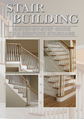
Hi Steve I Like what you have done on your book cover. Excellent work! I'm not sure the puzzle pieces will work. I hope you don't mind that If I try at creating the cover. You may or may not like it. Maybe it might give you some ideas. Luis  |
Posted on 13/07/08 07:18:18 AM |
|
Nick Curtain
Model Master Posts: 1800 Reply |
Re: book cover
I think you're right David, perhaps a moment of haste on my part. I like your version Luis, but believe Steve is on the right lines with his staggered pictures. Steve Correcting verticals - if you look at your background image, you will see that the age old problem created using wide angle lenses is there, i.e the doorframe and top post are leaning into the picture. Easily cured with Transform / perspective by pulling the top corner handles outwards. I think the background needs to be more apparent in order to show the stair sections and also the completed stairs. In the idea below I corrected the verticals, copied the layer to B&W and then added a solid fill white at about 80% opacity. You will see that I've lined up the handrail. Luis has blurred the background and could be onto something here, but would suggest perhaps slightly more subtle. Nick  |
Posted on 13/07/08 1:55:34 PM |
|
Steve Mac
Grunge Genie Posts: 539 Reply |
Re: book cover
Thanks Luis. I really like what you've done. How did dress up the edge on those black borders? Thanks Nick. I see what you mean about the verticals now. I like the idea of the connecting rails although I wouldn't want the reader to think that's what the rail will look like after reading the book. I do like the concept. Thank you for your time. |
Posted on 13/07/08 4:16:08 PM |
|
Luis
Six-String Synthesist Posts: 236 Reply  |
Re: book cover
Steve, Very easy. All I used was a Stroke and a Drop Shadow Layer Styles. For the Stroke, I set the size to 1. Luis |
Posted on 13/07/08 6:11:52 PM |
|
Steve Mac
Grunge Genie Posts: 539 Reply |
Re: book cover
Thank you Luis |
Posted on 22/08/08 5:48:30 PM |
|
chris berry
Overhead Overlord Posts: 724 Reply  |
Re: book cover
Hi Steve This is an alternative idea for a layout - not finished. That's your job! I've used a heavier type because stairs are bulky things - but a serif face to echo the artistry of the craftsmanship. Personally, I don't think you should play with the staircase imagery as the audience you're talking to will want to see it "in situ" - ie see it as it will appear in their house. This is an instruction guide, don't forget! Hope this helps. I also think Luis's is a neat solution. Chris  |
Posted on 22/08/08 11:48:28 PM |
|
Steve Mac
Grunge Genie Posts: 539 Reply |
Re: book cover
I like that Chris. I'm assuming that's a layer style for the text? |
Posted on 23/08/08 00:49:18 AM |
|
chris berry
Overhead Overlord Posts: 724 Reply  |
Re: book cover
Hi Steve Yes, it is a layer style on the type. I used bevel and emboss set to outer bevel smooth, with contour and satin. I knew what i wanted - just played about until i got it. Screen shot attached if you can make it out! Glad you like it - if you'd like any more help drop me a line. (the staircase looks fantastic, by the way, wish I had your skills in carpentry!)  |
Posted on 23/08/08 1:33:43 PM |
|
Steve Mac
Grunge Genie Posts: 539 Reply |
Re: book cover
Thanks Chris. I appreciate the help! |
Posted on 23/08/08 6:07:26 PM |
|
Steve Mac
Grunge Genie Posts: 539 Reply |
Re: book cover
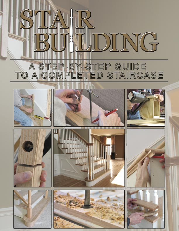
Okay, I screwed up the reply thing but this is what David wrote in a previous post. I don't think it needs to be so specific; unless that's all there is to stair-building, which I very much doubt (maybe I need this book?). Phrases that encompass the overall process would be better: From starting steps to polishing off: the essential guide to the perfect staircase. Or something. [/quoted] I thought about what David said about being specific which gave me another idea. I tried to show all different aspects of what the book covers with the finished product in the center. I sort of like this direction a little better. Any thoughts? Too busy perhaps? See post below. |
Posted on 23/08/08 6:11:55 PM |
|
Steve Mac
Grunge Genie Posts: 539 Reply |
Re: book cover
 |
Posted on 23/08/08 6:59:15 PM |
|
dave.cox
Marquee Master Posts: 518 Reply  |
Re: book cover
I like it! That really catches my attention, and interest. The grouping of photos is perfect to get readers to want more. 
|
Posted on 23/08/08 7:36:33 PM |
|
chris berry
Overhead Overlord Posts: 724 Reply  |
Re: book cover
Hi Steve I like the layout, but it might be a better idea to show the building of a stair case from start to finish in the smaller shots around the main finished shot? Also, and this is just personal, I don't like the newel post in the logo. As a punter, i feel like I'm having the staircase theme pushed in my face a bit - but that's only personal opinion. there's no right or wrong! It's a lot closer to looking like a hard-working book cover that will catch your publisher's eye. I like the way it's telling more of the story of how to build a staircase. Nice work. Chris |
Posted on 23/08/08 8:45:26 PM |
|
Steve Mac
Grunge Genie Posts: 539 Reply |
Re: book cover
Thanks Dave and Chris. It means a lot coming from you guys. Chris, I thought of doing the pictures in some kind of order but I like the randomness. I agree about the post. Here is a revision. I may change the color of the Title. Any suggestions for a color that may go well here. Thanks again guys!  |
Posted on 23/08/08 8:52:32 PM |
|
chris berry
Overhead Overlord Posts: 724 Reply  |
Re: book cover
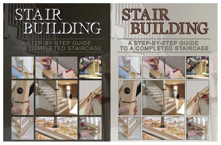
You're welcome. Lots of people have helped me on this forum and I'm more than happy if I can return the favour. The title is better, I think. Colourwise, I would still go with my suggestion - but then I'm biased! When I'm looking for a type style, I tend to let rip with fonts and layer styles and see what materialises. Also, go on something like amazon.co.uk and look at similar books eg DIY and see how they approach it. I do think you should stick with the solid outline around the letters, whatever else you do. Chris |
Posted on 23/08/08 11:49:02 PM |
|
Steve Mac
Grunge Genie Posts: 539 Reply |
Re: book cover
I'll repost using your layer style. We can see how it looks. Thanks Chris |
Posted on 24/08/08 02:57:27 AM |
|
Steve Mac
Grunge Genie Posts: 539 Reply |
Re: book cover
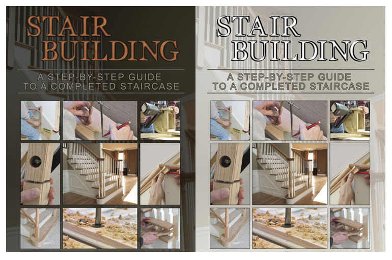
Chris,I couldn't quite get the style you have. I had to guess on the Satin settings. This will be the last few pics that I post. I've taken up too much server space as it is. If anyone has any suggestions or comments, please don't hesitate. Thank you everyone for your help! Steve mac  |
Posted on 24/08/08 02:57:55 AM |
|
Steve Mac
Grunge Genie Posts: 539 Reply |
Re: book cover
 |
Posted on 24/08/08 12:28:48 PM |
|
chris berry
Overhead Overlord Posts: 724 Reply  |
Re: book cover
Hi Steve Here are the settings for the stair build type (posted the wrong ones last time!) I prefer the cover with the lighter background - the dark one, I think, is too heavy and dominates the shots. Cheers Chris 
|
Posted on 24/08/08 10:12:44 PM |
|
dave.cox
Marquee Master Posts: 518 Reply  |
Re: book cover
Steve, I like the one where you first took out the post the best. It's sharp looking, and easy to read. The editions after, are a bit hard to read. I think I would keep the random order of the photos. You aren't trying to teach a concept at this point, but to catch a reader's eye. And it does that very well. I think that it is really looking great. Dave. |
| page: 1 2 3 4 last |