
| » Forum Index » Image doctor » Topic: Need serious help for school |
|
Posted on 18/10/08 05:19:57 AM |
|
Sallie
* Posts: 14 Reply |
Need serious help for school
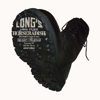
I am working on a project for school - an advertisement for Long's Horseradish sauce. The concept is that it has a lot of kick, thus the image of the combat boot, and I am attempting to make the label part of the sole of the boot, but not having much success at it. I started with trying to make the jar an actual part of the sole, but gave up n that and am now just trying to make the label part of the tread of the sole. Can anyone tell me the best way to make this happen? Image attached, which by the way I am shooting the boot again tomorrow because my initial photograph sucks. Also, I need to know how to adjust the label on the sole so that the perspective matches the bottom of the sole. Thank you in advance to anyone that can help! 
|
Posted on 18/10/08 08:07:35 AM |
|
Nick Curtain
Model Master Posts: 1800 Reply |
Re: Need serious help for school
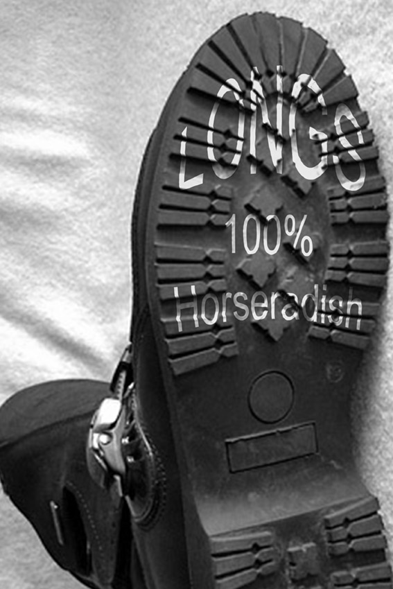
Hi Sallie I like the concept of your image and would suggest that the jar could serve as the leg in the boot - just a thought. I think the trick here is to make the logo appear as if it's moulded to the sole, so here's an idea you may wish to try. Make a duplicate of the boot image, so you have an exact replica, i.e. it must be the same size as the original. Make sure the image has fairly high contrast. You can achieve this with levels or curves. Apply enough Gaussian Blur to take the edge off the sharpness and the amount will depend on the size of your file. Save the file as a PSD, this is essential. Return to your original image and transform the text (CTRL-T) to fit the bottom of the boot. The Warp tool is great for this, if you have a later version of PS, otherwise you could try using the sheer filter. Once the text is in the correct position, duplicate it to a new layer, so it's safe if you want to go back an try again. Make sure the duplicated text layer is disabled. Select the text layer and go to Filter- Distort- Displace. Start with the Horixontal Scale and Vertical Scale set to 10 and select stretch to fit and repeat edge pixels. Click ok. PS will then ask you to choose a file for the displacement, so choose the PSD file you created earlier. The text should distort, but won't look good at this stage. Duplicate the boot layer, which is likely to be the background and move it to the top of the layer stack. This will hide your text, but dont worry. Double click on the layer thumbnail and the blend dialogue box will appear. You will see two sliders. Move the right hand white arrow on the upper slider to the left until the text starts to appear. Hold down ALT while on the arrow and this will allow you to split the arrow and move the left hand portion further to the left. Experiment until the text fades nicely into the sole of the boot. You can duplicate the boot layer, which will carry the 'Blend-if' settings and adjust the sliders, or change the opacity of the layer to make final adjustments. Here is the idea in practice. I did this quickly and you'll wish to spend more time transforming the text than I did, but I just wanted to show you the concept. I hope this helps. Nick  |
Posted on 18/10/08 1:58:03 PM |
|
GKB
Magical Montagist Posts: 4140 Reply |
Re: Need serious help for school
The displacement map solution is good. The only comment I might make is to make sure that the sole of the boot is not too dark so that you can see the texture of the sole well. Gordon _________________ Time flies like an arrow; fruit flies like a banana. |
Posted on 18/10/08 4:59:27 PM |
|
maiden
Golden Gif Gagster Posts: 471 Reply |
Re: Need serious help for school
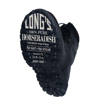
I think the problem with using a Displacement Map is that the text becomes unreadable, a better solution is to extrude the text to the same depth as the boot's tread then overlay it on the boot's sole. I've made an attempted using your image but obviously it's a bit low res but you get the idea.  |
Posted on 18/10/08 6:49:12 PM |
|
Sallie
* Posts: 14 Reply |
Re: Need serious help for school
You guys are all amazing! I can't thank you enough! SERIOUSLY! I wish I had found this site sooner! |
Posted on 18/10/08 6:50:40 PM |
|
Sallie
* Posts: 14 Reply |
Re: Need serious help for school
How did you do that one? That is exactly the look I am going for. Can you give me a rundown? Thanks! Sallie |
Posted on 18/10/08 7:13:35 PM |
|
maiden
Golden Gif Gagster Posts: 471 Reply |
Re: Need serious help for school
Well I had to seperate your text from the boot image but obviously you will have the text on a seperate layer, I presume. So with the Text Layer active Control/Cmd click on it's thumbnail icon in the Layer Palette to make a selection of the text. Create a new layer and fill with a color to match your text color. Drag this new layer below your text layer and Control/Cmd click the thumbnail again to make the selection then whilst pressing the Alt/Option key tap with the direction arrow keys in the direction you want to extrude (i.e. if you want to extrude in a right-down direction then press once on the right arrow key then once on the down arrow key and alternate) Once you have extruded to the depth you wanted then Control/Cmd D to deselect the selection. Grab the Burn Tool and set it to Shadows at 10% opacity and run it over the Extrude Layer until you get some good shading. Link the Text layer to the Extrude Layer and Free Transform to fit the perspective of the Boot's Sole. When it looks good see where the boot's tread is on the right side (as you look at it) comes to and using the Eraser Tool just erase back some of the extrude on the right side to make it look as if it's behind that layer of tread. I hope that makes sense to you. Good Luck and have fun. |
Posted on 18/10/08 7:30:13 PM |
|
Nick Curtain
Model Master Posts: 1800 Reply |
Re: Need serious help for school
That's a good solution Becky and great Sallie has a way forward. While you were posting the response I was working on a visual example to demonstrate the effect, so shame to waste it. When the rasterised text is on a blank layer and after the extrusion has been made, with the selection still active, create a new colourfill adjustment layer and clip it to the text and choose a colour. Then invert the selection CTRL-I and create another with a different colour, as per the Hello example. I have also added some texture. In the Hi example, I inverted the selection and clipped a new blank layer to the text and then picked a lovely green colour to add some 3D. The possibilities are endless. Hope this helps Sallie. Nick  |
Posted on 18/10/08 8:03:45 PM |
|
maiden
Golden Gif Gagster Posts: 471 Reply |
Re: Need serious help for school
Excellent example Nick, I really like the choice of colour to empathise the extrude. |
Posted on 18/10/08 8:15:20 PM |
|
Nick Curtain
Model Master Posts: 1800 Reply |
Re: Need serious help for school
Thanks Becky Sallie, the displacement map I suggested really comes into its own when folding text into cloth, so if ever you need to do this, then hopefully you have a starting point to refer to. I think Becky's suggestion is the right alternative for what you are looking to achieve. We're always here to help and between us should come up with ideas to consider. Nick |
Posted on 18/10/08 8:18:03 PM |
|
Sallie
* Posts: 14 Reply |
Re: Need serious help for school
Thank you sooo much! I will try this later tonight! |
Posted on 19/10/08 02:16:39 AM |
|
dave.cox
Marquee Master Posts: 518 Reply  |
Re: Need serious help for school
Hi All, Using the extrude to get a 3D effect on the letters is a good one. I was asked to do this for a project that I am currently working on. When using extrude though, don't forget that shadows and highlights can make a world of difference in looking flat or looking 3D. Take a look at these examples, and how much adding the shadowing adds to the effect. Dave.  |
Posted on 19/10/08 06:17:09 AM |
|
Nick Curtain
Model Master Posts: 1800 Reply |
Re: Need serious help for school
Totally agree Dave Nick |
Posted on 19/10/08 5:32:43 PM |
|
Sallie
* Posts: 14 Reply |
Re: Need serious help for school
I seem to be having a little trouble extruding the Long's label because it's not actually a text layer. They gave it to us in an .eps file. I would retype it, but I'm not sure I'll be able to match the name "Long's" at the top. Can you only use the extrude tool with actual text? Also, not understanding the first step where you say to "make a selection of the text". I don't see that option when I control-click. Trying alt-up/down only seems to create new layers when I use it if I have the layer selected and if I have an area selected it moves it up or down. And when I am creating new layers, they don't look like they are part of the original, even though I am moving only on time down and one time to the right. |
Posted on 19/10/08 6:04:30 PM |
|
Sallie
* Posts: 14 Reply |
Re: Need serious help for school
What do you mean by "create a new colourfill adjustment layer and clip it to the text and choose a colour". How do you do that exactly? I think this is where I am getting stuck, I think at least, but I haven't gotten through the extrusion yet either. Help! |
Posted on 19/10/08 9:12:23 PM |
|
maiden
Golden Gif Gagster Posts: 471 Reply |
Re: Need serious help for school
To make a selection of the text as long as it's on a transparent background simply press the Ctrl/Cmd button and at the same time with the mouse left-click on the Text Layer's Thumbnail in the Layer Palette this will make the selection. |
Posted on 19/10/08 9:36:49 PM |
|
Sallie
* Posts: 14 Reply |
Re: Need serious help for school
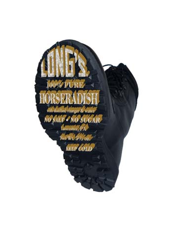
I think I've got the extrude part under control, but now I am struggling with getting the correct perspective. I can't see it to save my life! The final shot of the boot is attached with what I started for the perspective. I need to get that right before I can do the extrude on it I think. Can someone look at this and tell me what I am doing wrong on the perspective? Thanks!  |
Posted on 19/10/08 10:07:35 PM |
|
maiden
Golden Gif Gagster Posts: 471 Reply |
Re: Need serious help for school
The right edge of the boot (as you look at it) is closer to the viewer than the left edge so therefore the text needs to be slightly larger at the right edge. What I suggest is to make a selection of each row of text plus it's extrude and Ctrl/Cmd + Shift + J them to seperate layers and then individually Free Transform them to fit. Hope that makes sense. |
Posted on 20/10/08 02:35:11 AM |
|
Sallie
* Posts: 14 Reply |
Re: Need serious help for school
Yes, it does. I separated each line into different layers, added the extrude and then used Edit>Transform>Perspective to attempt to create the perspective by making the right side a tiny bit larger. Attached is the latest version. It still looks off to me, but much better. Can you tell me why it seems off? Do I have too much extrude? Thanks again for all your help!  |
Posted on 20/10/08 08:12:01 AM |
|
Nick Curtain
Model Master Posts: 1800 Reply |
Re: Need serious help for school
Hi Sallie A 'clipped layer will only affect the layer immediately below it. You can clip by holding ALT as you create a new layer or adjustment layer and then tick the 'use preveous layer as clipping mask'. If the layer is already in place, hover the cursor between the layers, hold down ALT and a symbol will appear. Just click and the upper layer will move to the right, i.e. become indented - see screenshot. Regarding Becky's point, it is far more accurate to move the text as one, because that will ensure that the perspective is correct for all elements. As suggested, use the Warp command under transform, if you have a later version of PS, or try free transform. For final adjustments try using Liquify with a large warp brush to nudge the text into position. I would also suggest that the extrude is a little too strong, particularly for the smaller text. Becky's example is about right, giving a believable perspective of 3D. I would also suggest that the extrude should be in a very dark grey and then use dodge and burn to match the highlights and lowlights on the sole. Nick |
| page: 1 2 last |