

| » Forum Index » Image doctor » Topic: book cover |
|
Posted on 09/07/08 03:08:54 AM |
|
Steve Mac
Grunge Genie Posts: 539 Reply |
book cover
I'm in the process of writing a book on stairbuilding. When it gets too late to write, I have been working on a concept for a cover. Here are a few ideas. If you have any suggestions or comments they would be greatly appreciated. I will not be offended by criticism. I will be trying to get the attention of a publisher so I want this the best it can be even if it means starting over! Thank you for your input in advance! Click on the picture to enlarge 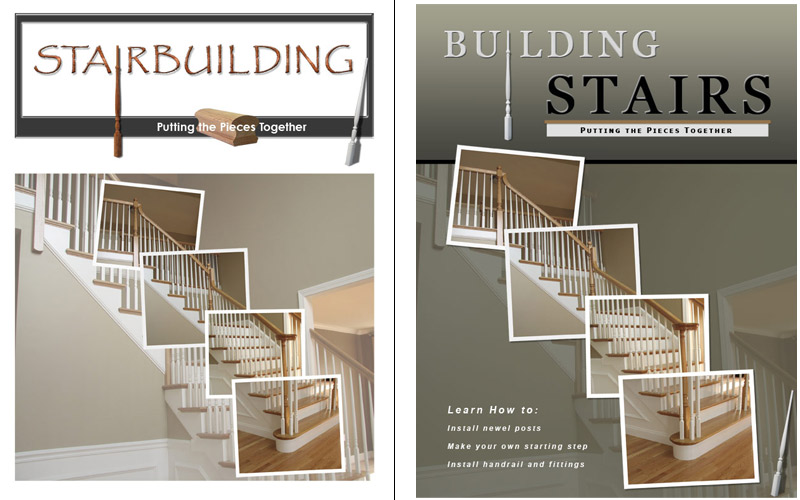
|
Posted on 09/07/08 11:45:16 AM |
|
Meltonian
Highlight Hermit Posts: 90 Reply |
Re: book cover
Hi Steve I think the second example is far superior and more professional looking. That's a book that means business! To my eye, though, the word 'stairs' would look better if it were shifted to the left so that it lined up under the 'L' rather than the 'D'. At the moment the baluster that forms the 'I' looks a little bit stranded. |
Posted on 09/07/08 1:12:46 PM |
|
vicho
Ingenious Inca Posts: 248 Reply  |
Re: book cover
hi Steve that`s a great idea..! i also like the second cover but why don`t you use the same picture of the stairs as the backgound too? i think i would look much as a whole ...what if you attached each frame to the one behind (using tapes or little nails for instance) so that it matches the idea of "putting the pieces togehter" just some thoughts 
|
Posted on 09/07/08 7:31:24 PM |
|
David Asch
Tech Support Posts: 1913 Reply |
Re: book cover
To add to the previous comments: I also much prefer the second image. I agree with Meltonian about the text needing to be tightened up; and perhaps making the two words equal in size - the black and white already gives enough separation. I would perhaps flip the baluster vertically; I know it would technically be upside down but as a design element it's like an arrow, which at present is guiding the eye up off the cover. I like the concept of the framed 'steps' but as Vicho says: use the same image. Maybe lose the baluster at the bottom, too, I don't think it's really necessary. _________________ It must be Thursday, I never could get the hang of Thursdays |
Posted on 10/07/08 07:30:22 AM |
|
Steve Caplin
Administrator Posts: 7152 Reply |
Re: book cover
I agree - second version is much better. The title could go a lot larger, though. And setting it in two colours splits the words into two sections, when they'd be better unified as one. Perhaps the baluster should form the i of Stairs instead? Do you have to have the divide between the title and the image? I think it would help to unify the cover without it, if the photo can be extended to go off the top left. And I also agree that the same photo, at the same size, should be used in the background as in the highlit squares. As it stands, it doesn't look as if the pieces fit together, which is a problem. Oh, and David's right - just the one baluster (although don't flip it!). Are you sure about the subtitle? I'm not sure it adds anything. Might want to think about rewording that. |
Posted on 10/07/08 11:15:05 AM |
|
Steve Mac
Grunge Genie Posts: 539 Reply |
Re: book cover
Thanks everybody. I get everything you said except for the background pic. The BG pic is the same stair as the four smaller ones. What should I do different? Thank you. I'll work on a revision. |
Posted on 10/07/08 11:56:41 AM |
|
Steve Mac
Grunge Genie Posts: 539 Reply |
Re: book cover
Here is a quick revision. I took the baluster out of the title. It didn't seem to be working. I like the full picture as the background but I have to stretch it to make it fit. Doesn't that change the quality of the image? Should the title be black instead or a certain color? 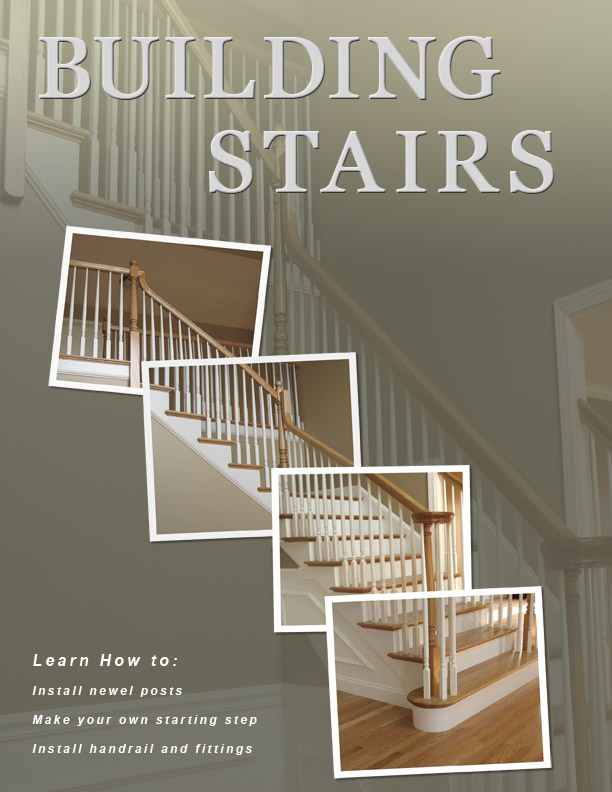 |
Posted on 10/07/08 5:28:40 PM |
|
Steve Caplin
Administrator Posts: 7152 Reply |
Re: book cover
Just a thought - wouldn't Stair Building be a better title? then you could have Stair a lot bigger, same width as Building, which could look good. You could also tighten up the letter spacing a lot on the title. I think the point about the background image was to make the highlit pics match up with their position on the toned-down background, so it's essentially the same image but you're focusing in on specific areas. Personally, I like the title in white with a bevel - looks like balusters, which works well. Maybe it would be an idea to post the original photo, so we could have a play around with it? Come to think of it, there's a Friday Challenge in here! |
Posted on 10/07/08 11:06:38 PM |
|
Steve Mac
Grunge Genie Posts: 539 Reply |
Re: book cover
Thanks Steve. I do like Stair Building better. I will post the BG pic if that is what you mean by original photo. Friday Challenge, sure. This has already been a challenge for me. It was almost embarrassing to post it, but it's better when you have help. I'm not that crazy about the subtitle either. Another idea I had was "from start to finish", or maybe nothing. |
Posted on 11/07/08 6:17:09 PM |
|
Babybiker
Shadow Spectaculator Posts: 151 Reply |
Re: book cover
Not sure if anyone else would agree with me, but I'm finding the stark white frames of the additional pictures too bright, compared to the Title of the book? At the moment my eyes are being drawn away from the text and onto the frames. Can the title be made any brighter without loosing the bevel effect, or alternatively, would colour matching the frames to the title work? Just a thought. BB |
Posted on 11/07/08 8:57:24 PM |
|
dave.cox
Marquee Master Posts: 518 Reply  |
Re: book cover
I kind of like the contrast of the frames. Is kind of gives it that concept to plan look. But I agree the text needs more contrast to keep it from fading into the background. |
Posted on 11/07/08 9:05:22 PM |
|
Steve Mac
Grunge Genie Posts: 539 Reply |
Re: book cover
Thanks guys. I meant to change the text back to white. I used the light grey to match the baluster I was using for the "I" in Building. I will post the BG pic late tonight. You should see it tomorrow. Thanks |
Posted on 12/07/08 02:29:12 AM |
|
Steve Mac
Grunge Genie Posts: 539 Reply |
Re: book cover
Here is the original background pic. If anyone want to play around with it, please do. 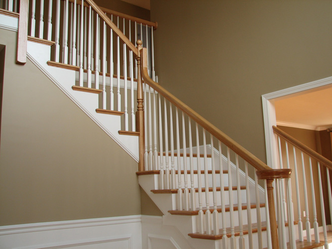 |
Posted on 12/07/08 02:32:59 AM |
|
Steve Mac
Grunge Genie Posts: 539 Reply |
Re: book cover
This is another concept I had "Putting the pieces together". I had this idea because I can't tell you how many times I have heard people say it's like putting a jigsaw puzzle together. There would be more stair pics on the pieces. This was only to get the idea across. Thank you everyone for your input so far. I really do appreciate it. |
Posted on 12/07/08 3:37:51 PM |
|
Steve Mac
Grunge Genie Posts: 539 Reply |
Re: book cover
here are the other pics I used 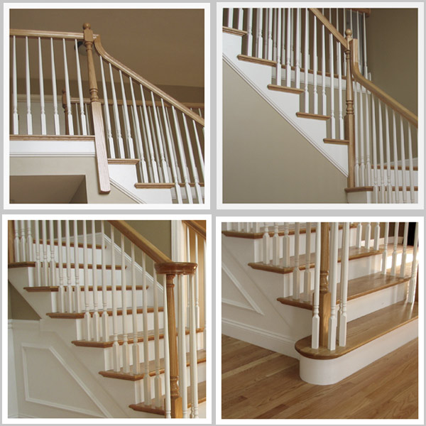 |
Posted on 12/07/08 3:38:33 PM |
|
Steve Mac
Grunge Genie Posts: 539 Reply |
Re: book cover
Here is another version 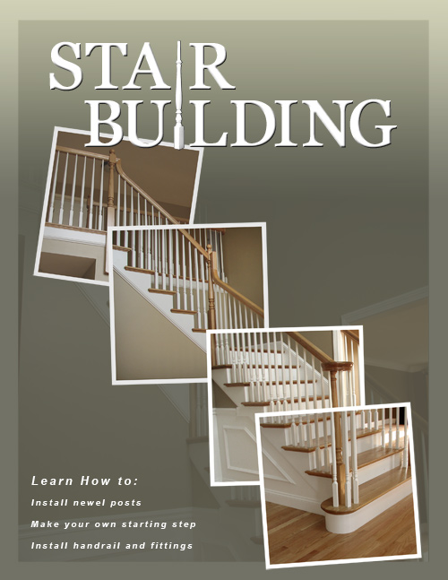 |
Posted on 12/07/08 8:42:43 PM |
|
Nick Curtain
Model Master Posts: 1800 Reply |
Re: book cover
Hi Steve I think your image looks really professional and I'm particularly taken with the spindle you have used so effectively. A couple of comments you may wish to consider: Not sure the lighter gradiant works at the top. Maybe a reflective version, i.e dark at top and bottom and lighter in the middle? Instead of 'learn how to, how about, 'I'll teach you to...' Perhaps more powerful? Consider correcting the verticals on the underlying image and reducing the opacity of the colour overlay by a touch. Nick |
Posted on 12/07/08 11:48:04 PM |
|
David Asch
Tech Support Posts: 1913 Reply |
Re: book cover
Sorry Nick, I disagree: 'I'll teach you' sounds too dominant and a little 'get rich quick-esque'. Learning is a shared process and should be described as such; the reader should feel like their questions are about to be answered within. I don't think it needs to be so specific; unless that's all there is to stair-building, which I very much doubt (maybe I need this book?). Phrases that encompass the overall process would be better: From starting steps to polishing off: the essential guide to the perfect staircase. Or something. _________________ Leap and the net will appear |
Posted on 13/07/08 02:08:08 AM |
|
Steve Mac
Grunge Genie Posts: 539 Reply |
Re: book cover
Thanks Nick. I will try the gradient pattern you suggested. Not sure what you mean by correcting the verticals. Thanks David. I agree with the description instead of the "how to". Is it me or does it look like the BG photo is completely lost behind the other photos? I may try a black BG as well. Thanks again! |
Posted on 13/07/08 02:10:58 AM |
|
Steve Mac
Grunge Genie Posts: 539 Reply |
Re: book cover
In reference to my post above the four stair photo I forgot to attach the photo.  |
| page: 1 2 3 4 last |