
| » Forum Index » Image doctor » Topic: Color profiles |
|
Posted on 24/07/12 07:47:08 AM |
|
Sjef
Flying Dutchman Posts: 571 Reply |
Color profiles
Hi Steve, I would like to know which color profile you used to work with. I suppose your Photoshop documents that goes to the press are in AdobeRGB, but your graphics on the How to... DVD's don't have the same profile. Most of your PSD-files on the DVD are in AdobeRGB, but a lot don't have a color profile, especially the ones with layers. This could be a little surprising when pasting one document into another (see the attachment). In this case pasting a AdobeRGB file into a file without any color profile, or Dot Gain 15%, some are Grayscale with AdobeRGB or huey D65 and so on. Most graphic viewers and the internet assume the sRGB color space, like Photoshop does by default when exporting to web-jpg. Wouldn't it be easier to have all the files in sRGB? Or is a stupid question? I take my photo's in sRGB, so I can be sure that everyone experience (about) the same colors one their monitors as I do. 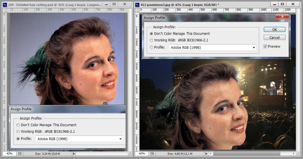 |
Posted on 24/07/12 08:47:38 AM |
|
Steve Caplin
Administrator Posts: 7157 Reply |
Re: Color profiles
You should always work in Adobe RGB, especially if you're working for print. The trouble with sRGB is that it's a colour space invented by a consortium including Microsoft and Hewlett Packard (and that should be enough to scare you off, frankly) that was designed to make business graphics look more consistent on Windows monitors. sRGB is a very limited colour space, and I wouldn't recommend it for any serious Photoshop work. If you were preparing an image to be seen only on a website, though, you could convert it to sRGB if you suspect the end viewers' PCs can't read embedded colour information in files. Important point: You should always convert an image to a different profile. You only assign an image to a profile if it already comprises colours using just that profile, and you want to tell another application (such as After Effects) to read that profile. |
Posted on 24/07/12 6:13:49 PM |
|
Sjef
Flying Dutchman Posts: 571 Reply |
Re: Color profiles
Thanks for your answer Steve. So I must reconsider my policy about sRGB. On my computer club though almost everyone view their pictures on a PC with Fast Stone Image Viewer, ACDSee, IrfanView or even Apple's QuickTime Pictureviewer. Those viewers shows pictures all together by default assuming them having the sRGB color profile. Some support AdobeRGB, which makes the loading much slower. Also most home printers are sRGB related by default. Having read your answer, I still don't understand why most of your own JPG-examples on the DVD have no color profile at all. We all use Photoshop don't we... So I wonder, WHICH color profile in Photoshop represents the true colors of the pictures WITHOUT a color profile on the DVD? In the attachment you see a DVD-picture, viewed by Photoshop with 2 different color profiles and by IrfanView. Untill now, Ken Rockwell (see http://www.kenrockwell.com/tech/adobe-rgb.htm) in his statement about sRGB VS Adobe RGB has earlier convinced me to use sRGB. Now I am in doubt... PS, I knew about the difference between convert and assign. 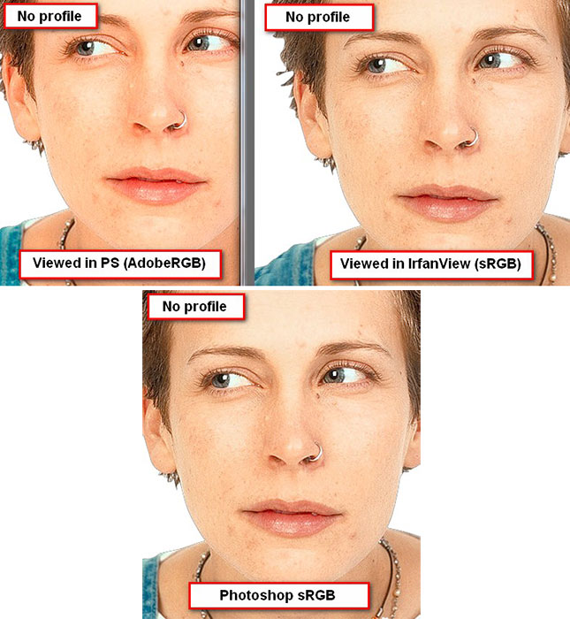 |
Posted on 25/07/12 07:28:01 AM |
|
Steve Caplin
Administrator Posts: 7157 Reply |
Re: Color profiles
I really don't know why the images on the DVD don't have a colour profile. They come from a wide variety of sources, and many of these didn't have profiles embedded when they came to me. I convert to Adobe RGB when anything I produce is going to be printed, to guarantee consistency with what I see on my monitor (or, at least, to move towards it). The images on the DVD are more likely to be in their raw state. When you're working on tutorial images, though, do you find the difference bothers you that much? |
Posted on 25/07/12 4:31:57 PM |
|
Sjef
Flying Dutchman Posts: 571 Reply |
Re: Color profiles
Hi Steve, it's clear to me now. If you're not bothered about any color profile, why should I. I was a little concerned you will judge for example the Friday Challenge on colors too, because all your Photohop files on DVD are AdobeRGB. So never mind, you informed me enough. Thanks a lot! |
Posted on 25/07/12 7:38:12 PM |
|
Nick Curtain
Model Master Posts: 1800 Reply |
Re: Color profiles
This is a very interesting debate on a particularly complex subject. I have read the pros and cons of using Adobe 1998, wider colour gamut and all that, but have stuck with the standard sRGB IEC61966-2.1 profile for the working space. My monitor is an NEC 20WGX2, which was always renown for colour accuracy on the standard sRGB setting. It sits in a dark corner of my dining room and, when I take a shot of the garden, the colour the monitor produces is what I see out of the window and I feel comfortable with this. My workflow is sRGB throughout from shooting, editing and viewing and I don't have to worry about people without colour management knowledge / photoshop seeing anything different. When I started with digital back in 2004, I nearly drove myself mad trying to get an accurate print and this is where I believe profiles really come into play. The same image printed on Ilford, Epsom, Kodak papers, will give you a completely different set of results using the same set of inks and it is for this reason that you should always have a profile created for each combination. In the end I gave up with inkjets and have gone to a lab, which produces prints with greater quality at reduced cost. A couple of years back I tried an experiment using 3 images, 2 colour and 1 mono brought into the same 12x8 inch file. I converted one to Adobe 1998, another to the printers profile for gloss paper and the other was left on the standard sRGB. The same process was also completed in the export function within Lightroom for comparison. One of the images contained a colour checker, shot under studio lights and then using the mid grey to provide the right balance. The files were sent to the lab and to be honest there was not a vast difference between the three, but the printer profile did seem to produce the most accurate results for skin tones and it's interesting the the Adobe image seemed to be rather desaturated in comparison. What was really interesting though was that the individual colours on the colour checker varied considerably. Where one profile was accurate on say a light blue another would be accurate on a yellow, or pink and on some colours they were all the same! I guess this could change completely if a different lab produced the images using different printers. So having done all this I'm still not absolutely clear on how it all works, but I have found a recipe that seems to work for me. I have seen images in magazines where the colour is way out and I don't believe the people I create images for have a critical eye to the extent where they could tell the marginal difference anyway, particularly if the prints are not side by side. I therefore work on the basis if the colour looks ok on my screen, which looks like real life and what I have printed looks like it does on the monitor, then I'm Merlin the happy pig. So to summarise I believe you should go with what looks right and if this takes a little experimentation, then so be it. |
Posted on 26/07/12 07:43:57 AM |
|
Sjef
Flying Dutchman Posts: 571 Reply |
Re: Color profiles
Quite right Nick. I did some experiments myself with color profiles on my Canon Photoprinter about two years ago. AdobeRGB, sRGB, CMYK. At some point I decided to make use of a lab for the few photos I want to print. The kind of photo paper is indeed very important. Nowadays my Photoprinter rests dried out on my attic and I only use a little black/white laserprinter, mostly used as a photocopier. In this digital age I have adapted myself and show my photos only on my screen. And via internet sending them to family and friends to their ipods and tablets (in sRGB). But it's another story when your files are to be pressed for publishing in books like How to cheat in Photoshop.  |
Posted on 26/07/12 08:17:22 AM |
|
Nick Curtain
Model Master Posts: 1800 Reply |
Re: Color profiles
The trouble with colour management is that there are so many steps in the the workflow process for something to go wrong. For example, when shooting outside, the colour temperature can move constantly. I know this is not the debate here, but the point is that laying the right foundations for the image is so critical. On many occasions I've edited an image and then looked at it afterwards and thought too blue and have had to revisit the RAW file. When I wrote the comment above, I had not read the article you attached by Ken. I was cooking outside and rushing to rescue the chicken! However, having digested this in detail, it would seem that what he says endorses what I discovered in my simple tests. To me, it makes sense to use the same profile throughout the entire workflow, in order to keep everything consistent and this is why sRGB was introduced. If this was not the case then cameras, monitors, scanners and printers etc would all be talking different numbers at each other and you'd be hard pressed to identify where the error / mismatch occurred, if there was one. The article confirms that sRGB is perfectly adequate as evidenced by the images he has produced, which are vibrant and colourful. The key step in the process for me is the conversion of numbers into printed format and the lab I use were adamant that I should use their profiles to ensure that the Fuji printers interpret the information correctly. Therefore my preference is to use sRGB in the workflow stage and then check with whoever is printing the material what they would like in terms of final file output. |
Posted on 26/07/12 10:35:20 AM |
|
Sjef
Flying Dutchman Posts: 571 Reply |
Re: Color profiles
I see you shoot your photos in RAW. Then you should read what Ken Rockwell has to say about that! (http://www.kenrockwell.com/tech/raw.htm) But there I partly disagree with Ken although he has his allowings at that point. Compare the same photo, taken with my 6 Megapixel Nikon D40, saved in camera to RAW and to JPG. Round the edges of the JPG there is seen (at 100%) a kind of softness as it was feathered within Photoshop. This may not to be seen after printing at a lab even at 12x18 inch (like Ken writes), but it does in most occacions on a big monitorscreen. But let's not forget about the AdobeRGB. I'll keep in mind what Steve wrote about it, so I'll not be surprized when colors are not what I expected or desired. 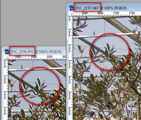 |
Posted on 26/07/12 11:37:33 AM |
|
Nick Curtain
Model Master Posts: 1800 Reply |
Re: Color profiles
Interesting, but doesn't he go on and on and on! The reason for the difference in the images above is because the camera has processed the RAW to produce the JPEG and in doing so has added sharpening. I use Canon and you can adjust how much is applied and I presume the same applies to other makes. I'm not in total agreement with his comments. Yes, JPEGs take up less space, but you do lose flexibility and of course a considerable amount of data is thrown away in the process. The eye is much smarter than the camera and with the best will in the world the camera cannot expose for two situations simultaneously. This can of course be achieved by making multiple exposures, but sometimes you don't have time to do that and there are situations where lugging a tripod around is not practical. There is also no guarantee the tripod will remain completely static between shots, but you could use align layers in PS I suppose. So the answer is to make a split RAW conversion. The shot attached is of Tornado at Nene Valley early one morning. The sun was behind the engine, so a horrible backlit scene for which no camera can compensate. The top is the original file and the bottom is the tweaked version. Had this been shot with Jpg, then none of the sky could have been retrieved, nor the detail in the shadow areas. What he also fails to mention is that with software such as Lightroom you can make a set of conversions and then apply those changes to all images instantaneously. Furthermore the algorithms in CS5 and Lightroom provide such excellent noise reduction and sharpening capabilities, it would take you far longer messing around with blur filters, which was the norm as recently as five years ago. He also talks about levels and curves being the great saviour. If ever you have photographed indoors and inadvertently left the camera on the tungsten setting when moving outside, I know which format I'd rather have to colour correct. If there is no neutral grey to work with, the old tools are very hit and miss.  |
Posted on 26/07/12 1:43:26 PM |
|
Sjef
Flying Dutchman Posts: 571 Reply |
Re: Color profiles
Steve gave us a nice 'Hot tip' on page 103 of his book How to cheat in Photoshop CS6: assign a shortcut to Shadows and highlights, which I did. I applied this feature -which is available from CS3- on your photograph. Not to criticise your photo, but to point out that everyone has a different opinion about when a photograph is perfect and/or has the proper color (profile).  |
Posted on 26/07/12 3:01:49 PM |
|
Nick Curtain
Model Master Posts: 1800 Reply |
Re: Color profiles
 |
Posted on 26/07/12 9:35:12 PM |
|
Jota120
Ingenious Inventor Posts: 2615 Reply |
Re: Color profiles
Interesting discussion, thanks for sharing. A couple of points, one to highlight, but maybe becomes a question too. 1) trying to get my printer to print my colour space(s) is a nightmare. Similar experience to Nick maybe. Its Epson 2400, great quality images, but in my work flow does not print what I want, especially when change from one machine to the next. Worse it loves eating ink$$$. I've used labs a bit and good results and save money!. Normally just share images now. After after Nick's comments, I think I'll try to find a consistent good quality Lab. Any suggestions Nick? Going back to Epson, the inks are pigment based, rather than dye. I must say very resilient when use them outdoors. Resist sun and rain. Its just colour management bane. 2) One thing I like about RAW is the higher dynamic range. Ideal if want to push an image. (I'm not talking HDR per-se). Each pixel channel of RGB has in my case 14 bits vs Jpeg only 8 bits. From a RAW image, PS will manipulate as 16bit in PS itself and Bridge. Compared with Jpeg just 8, so you can go much further with all adjustments in 16bit mode before get weird effects and colour anomalies. Yes we all have different ideas on images. Beyond camera, computer, VDU, web and printers, still have the eyeball and brain to try calibrating and infer how perceived  |
Posted on 27/07/12 07:52:57 AM |
|
Nick Curtain
Model Master Posts: 1800 Reply |
Re: Color profiles
Trevor, I use these: http://www.dscolourlabs.co.uk/ You will see that an 18x12 is £1.20 and the quality is excellent. They have profiles for gloss and lustre papers to download. As Steve says you must 'convert to profile' rather than assign, but the lab gives full instruction on the site. Nick |
Posted on 27/07/12 09:25:22 AM |
|
Jota120
Ingenious Inventor Posts: 2615 Reply |
Re: Color profiles
Nick, Many thanks for the recommendation and information how to use properly. I'll give them a try. They do seem good value. Trevor |