
| » Forum Index » Readers' gallery » Topic: Accrington Pals |
|
Posted on 26/09/13 9:39:01 PM |
|
chris berry
Overhead Overlord Posts: 724 Reply  |
Accrington Pals
Hi Folks An idea for a poster for our production of Accrington Pals next year - whatchyafink? Chris 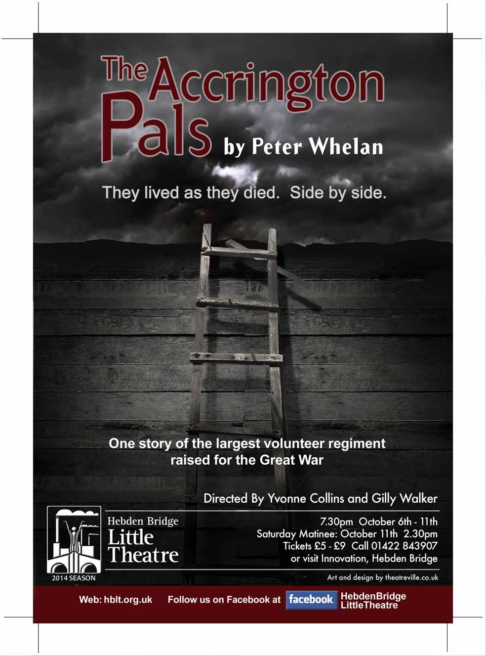 |
Posted on 27/09/13 07:11:40 AM |
|
Sjef
Flying Dutchman Posts: 571 Reply |
Re: Accrington Pals
Never heard of the Accrington Pals, but instantly thought about the first world war even before I read the last line about the Great War. Searching for the logo of Hebden Bridge Little Theatre I encountered this poster (with the unsuccessful attempted shadow). It's clear to me you found your inspiration there. I think your poster is more in balance. Great and sensitive image! 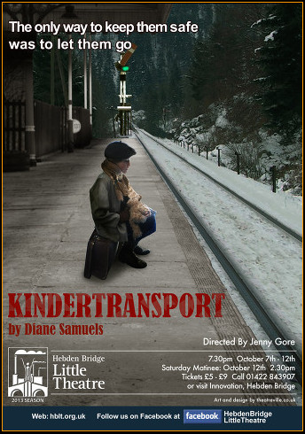
|
Posted on 27/09/13 07:51:01 AM |
|
Steve Caplin
Administrator Posts: 7135 Reply |
Re: Accrington Pals
Sjef, I think you'll find that was probably one of Chris's posters as well - I think he does all their posters, and that's certainly his style. Chris, I really like the starkness of your poster. But I'm going to challenge your typography again: wouldn't it be better to use a period-appropriate font, such as Clarendon or, if you want a sans, then Johnston Underground? Also, the Helvetica you've used for the two subheads clashes, to my eye, with the Futura used for the information further down the poster. |
Posted on 27/09/13 11:43:07 AM |
|
Sjef
Flying Dutchman Posts: 571 Reply |
Re: Accrington Pals
Thanks for the info Steve. Now I've yet even more appreciation for Chris' work! |
Posted on 27/09/13 12:31:40 PM |
|
chris berry
Overhead Overlord Posts: 724 Reply |
Re: Accrington Pals
Thanks Steve - will repost with Clarendon. I thought I had used something from the period. You live and you learn! The line at the bottom is coming out - would you use Futura for the "side by side" line to match the info type? |
Posted on 27/09/13 12:34:36 PM |
|
chris berry
Overhead Overlord Posts: 724 Reply |
Re: Accrington Pals
Yes that is my poster also! Can you tell me what's wrong with the shadow? The poster is already printed, but I would like to correct the shadow as a useful exercise. |
Posted on 27/09/13 1:12:51 PM |
|
Steve Caplin
Administrator Posts: 7135 Reply |
Re: Accrington Pals
Yes, I suppose I'd use Futura there as well - except that Futura is very much a post-war font, but maybe that's not so significant here. The shadow is a little too strong given the lack of direct sunlight. But I think the bigger issue here is that the platform is composed of warm brown tones, which contrast a little oddly with the very cold tones of the track and snow scene beyond. |
Posted on 27/09/13 1:14:56 PM |
|
chris berry
Overhead Overlord Posts: 724 Reply |
Re: Accrington Pals
Yes, I noticed the tones when I was looking at the poster on the theatre billboard last week. I need to pay closer attention to detail. I will experiment with the shadow for the practice value. Thanks Steve |
Posted on 27/09/13 1:20:17 PM |
|
ahmedalij
Atmosphysician Posts: 262 Reply |
Re: Accrington Pals
Great poster , I think adding some sort of ww1 military Gear beside the stair would intensify the feeling of ww1 trenches. |
Posted on 27/09/13 1:31:34 PM |
|
chris berry
Overhead Overlord Posts: 724 Reply |
Re: Accrington Pals
I had the same idea but was worried it would over-complicate it. I'll add some in and see what it looks like. Thanks for the suggestion admedall. |
Posted on 04/10/13 3:27:56 PM |
|
Sjef
Flying Dutchman Posts: 571 Reply |
Re: Accrington Pals
[/quoted] Yes that is my poster also! Can you tell me what's wrong with the shadow? The poster is already printed, but I would like to correct the shadow as a useful exercise. [/quoted] Well, it's always easy to have criticism about an image, produced in Photoshop. Your poster is all right of course and nobody in general will take notice of the shadow of the boy. It seems to me though the light source comes from 75 degrees (or about 'one o'clock), which maybe is to conclude from his scarf. So in my opinion the shadow of the boy has to look something like this. Of course it must be blurred and faded away, as descibed in Steve's How to book (edition 2004, Chapter Light and shade). Congratulate with such fine orders b.t.w. 
|
Posted on 06/10/13 04:12:10 AM |
|
Artwel
Satire Supremo Posts: 607 Reply |
Re: Accrington Pals
I think the image as you have it is perfect. You're right not to over complicate things. I think that picture says it all. But I think there is too much text on the page. The different fonts and different sizes doesn't quite feel balanced (not that 90% of people would worry about these things!  ) )
Steve how about some typography FC challenges? |
Posted on 06/10/13 10:43:33 AM |
|
Jota120
Ingenious Inventor Posts: 2615 Reply |
Re: Accrington Pals
Bit late with my comment as have been away... Looks good to me. Steve's suggestions fonts always helpful but I am no expert on such. I just have one/two thoughts you might consider. 1)Since those trenches so muddy could add some oozing muddy foot prints left after climbed over-the-top. 2) And maybe to add some depth add a/some small silhouette(s) as they cower and run into the distance, but not sure, clichéd, maybe the existing void is better and would probably make a mess of composition(?). |
Posted on 06/10/13 10:44:00 AM |
|
Jota120
Ingenious Inventor Posts: 2615 Reply |
Re: Accrington Pals
Duplicate. |
Posted on 06/10/13 5:53:03 PM |
|
Artwel
Satire Supremo Posts: 607 Reply |
Re: Accrington Pals
Jota I think the picture is best left subtle. It's like the calm before the storm, the last thing those soldiers would see is the ladder, knowing that almost certain death awaits them once they climb. Chilling stuff. |
Posted on 07/10/13 9:00:33 PM |
|
Jota120
Ingenious Inventor Posts: 2615 Reply |
Re: Accrington Pals
Well I can't disagree with that Artwel .... Chilling, I love climbing, but not for that.... My old granddad used to build the the wood aircraft that watched them and just repaired if(?) they got back (very good carpenter in the true accurate scenes)..... He was too old to go to war and they needed him at home more to fix and build the wooden aircraft. Horror on horror. Very quite man my grandad. |
Posted on 13/10/13 4:27:20 PM |
|
chris berry
Overhead Overlord Posts: 724 Reply |
Re: Accrington Pals
Thanks Jota for your feedback - it's all valuable. Artwel, you've caught the spirit of the poster spot on!!! That is the concept: the last thing they see is that ladder. Is you ever want to go into poster design, let me know LOL |