
| » Forum Index » Readers' gallery » Topic: Transition |
|
Posted on 18/03/07 10:39:58 PM |
|
Whaler
Visual Viking Posts: 330 Reply |
Transition
This backlit image enhances the background and lacks detail in the face. So I felt I had to do something about it. 
_________________ Only in my brightest moments I understand myself |
Posted on 18/03/07 10:42:11 PM |
|
Whaler
Visual Viking Posts: 330 Reply |
Re: Transition
And this is how it turned out. Any critisism is welcome! 
_________________ !!!!!!!!!!!!!!! |
Posted on 19/03/07 2:54:31 PM |
|
mguyer
Incisive Incisor Posts: 799 Reply |
Re: Transition
the woman tends to look artifical and cut so it's a neat effect but it depends on what you are after. Have you tried the shadwo/highlight filter? |
Posted on 19/03/07 4:23:58 PM |
|
Whaler
Visual Viking Posts: 330 Reply |
Re: Transition
Actually, my intention is to use this image for a birthday card. Do you think it would work for that purpose? _________________ !!!!!!!!!!!!!!! |
Posted on 19/03/07 8:22:04 PM |
|
mguyer
Incisive Incisor Posts: 799 Reply |
Re: Transition
good one for a birthday card |
Posted on 20/03/07 02:59:45 AM |
|
dave.cox
Marquee Master Posts: 518 Reply  |
Re: Transition
A little level adjustment can bring back much of the detail of the face. I only adjusted this one for the face, but by adjusting the face and the rest of the back ground seperatly, you can adjust each for the best total image. Not sure if the is what you want or not. 
|
Posted on 20/03/07 05:23:38 AM |
|
vibeke
Kreative Kiwi Posts: 2167 Reply |
Re: Transition
I don't she will be very happy with your very interesting rendation. No woman, wants to look older. Here is my version, achived with curves, shadows/highlights and hue. 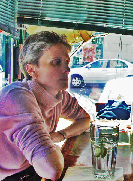 |
Posted on 20/03/07 2:49:08 PM |
|
Whaler
Visual Viking Posts: 330 Reply |
Re: Transition
Thanks, all, for your input! I have one question, though: What feature(s) are making the lady look old in the image Í have made? _________________ Only in my brightest moments I understand myself |
Posted on 20/03/07 6:34:13 PM |
|
Whaler
Visual Viking Posts: 330 Reply |
Re: Transition
Grey hair is what people in general associate with age, so I made some changes to the hair. Does this improve the picture and does this make the lady look younger? More input is welcome. 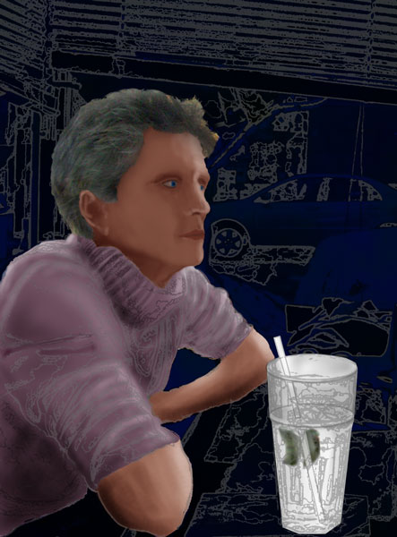
_________________ !!!!!!!!!!!!!!! |
Posted on 20/03/07 9:17:32 PM |
|
mguyer
Incisive Incisor Posts: 799 Reply |
Re: Transition
This is what I have come up with. If you like it I will tell you how...if you don't like please tell me. Marty  |
Posted on 20/03/07 10:52:28 PM |
|
Whaler
Visual Viking Posts: 330 Reply |
Re: Transition
Looks good, Marty! so please tell me! _________________ !!!!!!!!!!!!!!! |
Posted on 21/03/07 2:35:09 PM |
|
mguyer
Incisive Incisor Posts: 799 Reply |
Re: Transition
1. Duplicated the red channel (in this case the channel with the most contrast around the hair) and created a high contrast mask leaving your friend all black and everything else white. I use this method of selection when dealing with fine detail such as hair. 2. Went back to the picture and loaded the duplicate red channel as a selection. 3.Deleted the background 4. Created a new file and filled it with pink 5. Added another with darker pink above thie first pink layer 6. Added a layer mask to darker pink layer 7. Used circular gradient tool to paint with black to white from the center out to a corner of the mask to create lighter center 8. Dragged your lady friend onto new background 9. Fiddled and diddled a bit including burning in hair a bit to get rid of some of the gray. If she had been front or side lit I would have added a diffuse shadow behind her. Wish her a happy birthday from Marty |
Posted on 21/03/07 4:14:20 PM |
|
Wayne
Printers Devil Posts: 312 Reply |
Re: Transition
Wow! That is excellent, Marty! Definitely suitable for a birthday card. You've made it look sketched in soft pastels or something similar. Good job! |
Posted on 21/03/07 4:28:32 PM |
|
mguyer
Incisive Incisor Posts: 799 Reply |
Re: Transition
Thanks Wayne. It is amazing when you think about this forum allowing a group of people from UK USA Sweden and New Zealand to work on the same picture and compare their results back and forth. |
Posted on 21/03/07 8:06:02 PM |
|
Dek_101
Apocalyptic Artisan Posts: 175 Reply  |
Re: Transition
Here's my go ... I'm getting quite into the art history tool at the moment so I used that ... it takes a bit of trial and error to get a feel for how it works but is is great fun. 
I combined this with the smudge tool and some saturation adjustments. Hope you like the result.  |
Posted on 21/03/07 11:03:05 PM |
|
Whaler
Visual Viking Posts: 330 Reply |
Re: Transition
Wow! This is turning out to be a mini FC. I amazed how much effort you all put into my picture. And all with different and great results. Great work, Marty! And yes, I will send her your regards. Dek, it seems like I have to try the art history brush soon. The overall impression is excellent, but I particularly like the effect you achieved on the glass. I still have a couple of weeks to go before I need the birthday card but soon I'll be, or maybe already am, like the donkey between the haystacks, trying to decide which way to go _________________ !!!!!!!!!!!!!!! |
Posted on 22/03/07 09:30:36 AM |
|
Steve Caplin
Administrator Posts: 7101 Reply |
Re: Transition
Derrick, that's amazing - Edward Hopper couldn't have painted it better. What a fantastic result! |
Posted on 23/03/07 01:58:23 AM |
|
Dek_101
Apocalyptic Artisan Posts: 175 Reply |
Re: Transition
Geez!!! My head will never fit through the door 
Praise indeed ... and much appreciated ... thanks very much  |
Posted on 01/04/07 9:38:44 PM |
|
Whaler
Visual Viking Posts: 330 Reply |
Re: Transition
So I've come up with yet another version. Any input on this?  _________________ Only in my brightest moments I understand myself |
Posted on 02/04/07 8:35:40 PM |
|
Dek_101
Apocalyptic Artisan Posts: 175 Reply |
Re: Transition
I think the vectorised look works really well on the sweater and other elements but I think it might work better sticking to a single colour for the face? great pic though |
| page: 1 2 last |