
| » Forum Index » Readers' gallery » Topic: Let there be light: a comparison |
|
Posted on 27/06/07 2:56:44 PM |
|
michael sinclair
Off-Topic Opportunist Posts: 1871 Reply |
Let there be light: a comparison
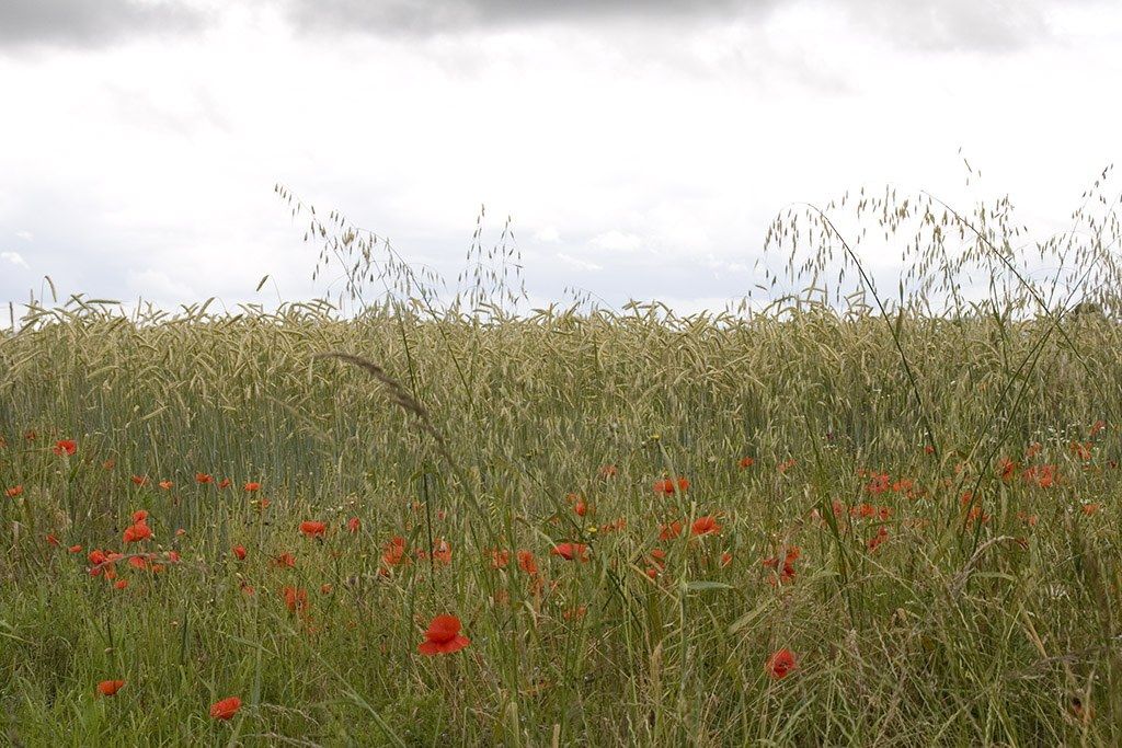
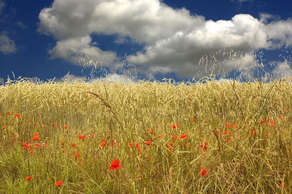
I was lucky enough to go for a trip in the countryside yesterday; however, it was cloudy for most of the time, but look what Photoshop can do: Click the pic for a bigger view. Before: 
After: 
|
Posted on 27/06/07 3:20:58 PM |
|
tank172
ThreeDee Thriller Posts: 692 Reply |
Re: Let there be light: a comparison
Very nice, michael. Making that selection must have been a bear! You may need to slightly bump up the contrast & darken the shadows on the wheat layer to match that of the clouds.. |
Posted on 27/06/07 3:37:58 PM |
|
Steve Caplin
Administrator Posts: 7145 Reply |
Re: Let there be light: a comparison
This gives the impression that we're standing near the top of a hill. Clouds get much smaller as they approach the horizon, as they're further away. Try shifting your cloud layer up a little and it may improve the realism! |
Posted on 27/06/07 6:58:43 PM |
|
michael sinclair
Off-Topic Opportunist Posts: 1871 Reply |
Re: Let there be light: a comparison
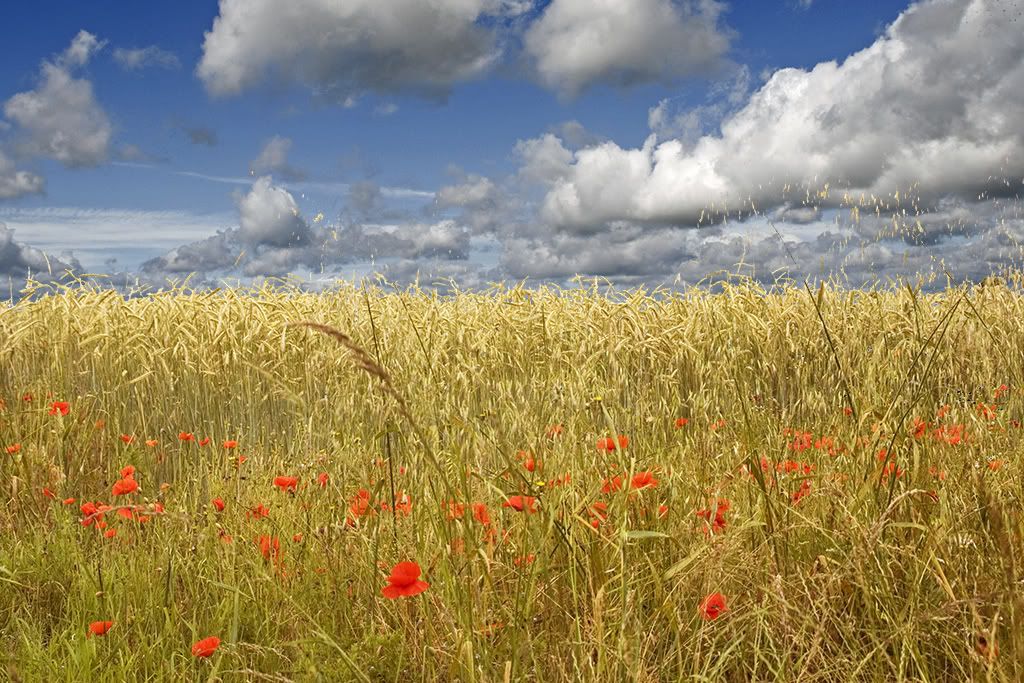
I wondered about that, so thanks for that valuable feedback. I didn't save as a PSD,  so here it is again with my "Brecon sky": so here it is again with my "Brecon sky":
Tank172 the sky is not so dark and saturated, so I think I've got away without darkening the wheat. 
|