
| » Forum Index » The Friday Challenge » Topic: Contest 163: Pub sign |
|
Posted on 09/09/07 7:43:36 PM |
|
Rocksham
* Posts: 11 Reply |
Re: Contest 163: Pub sign
 |
Posted on 09/09/07 9:17:43 PM |
|
Bob
Expert Expressionist Posts: 130 Reply |
Re: Contest 163: Pub sign
 |
Posted on 09/09/07 11:21:52 PM |
|
fitzpas
Guest Reply |
Re: Contest 163: Pub sign
I haven't visited for a while, here's my first entry since giving up my loyal Photoshop 6 and opting for a shiny, new CS3. 
|
Posted on 10/09/07 03:45:20 AM |
|
Abby-Helen Artfield
** Posts: 70 Reply |
Re: Contest 163: Pub sign
It's Sept. and I'm back in school - yes I am retired and now can do what I always wanted - to go back to university. I'm taking communications in graphic arts. I've been at Simon Fraser University for three years and love it. In this course we make use of Photoshop, Illustrator, and Indesign. It's highly challenging and very interesting. Oh, and I bought a Casio, my idea is to get the basics and then go for a DSLR. Right now I'm learning to change from analog photography to digital. Another beautiful day in paradise. Abby-Helen 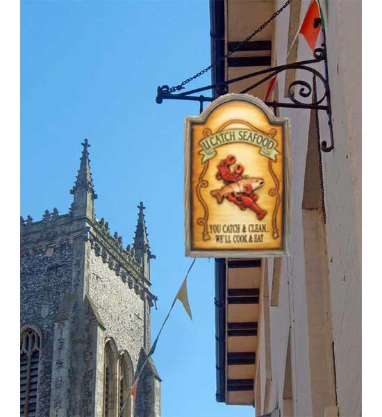 |
Posted on 10/09/07 12:52:55 PM |
|
tooquilos
Wizard of Oz Posts: 2957 Reply |
Re: Contest 163: Pub sign
Good on you Abby! Sounds like a great course. Enjoy it  |
Posted on 10/09/07 4:44:38 PM |
|
michael sinclair
Off-Topic Opportunist Posts: 1871 Reply |
Re: Contest 163: Pub sign
The Pig's Head! Did it move? 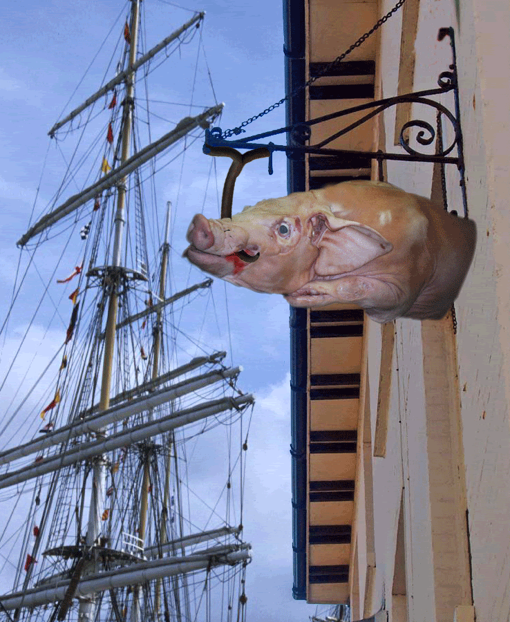 |
Posted on 10/09/07 4:55:58 PM |
|
Ben Mills
Luminous Luminary Posts: 570 Reply |
Re: Contest 163: Pub sign
 |
Posted on 10/09/07 9:30:18 PM |
|
Meltonian
Highlight Hermit Posts: 90 Reply |
Re: Contest 163: Pub sign
 |
Posted on 10/09/07 9:44:56 PM |
|
mguyer
Incisive Incisor Posts: 799 Reply |
Re: Contest 163: Pub sign
here is mine 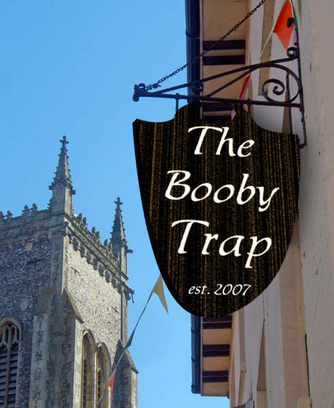 |
Posted on 11/09/07 09:30:27 AM |
|
michael sinclair
Off-Topic Opportunist Posts: 1871 Reply |
Re: Contest 163: Pub sign
Meltonian: absolutely superb!!!  |
Posted on 11/09/07 2:11:20 PM |
|
Meltonian
Highlight Hermit Posts: 90 Reply |
Re: Contest 163: Pub sign
Thank you Michael! |
Posted on 11/09/07 7:14:58 PM |
|
Deborah Morley
Makeover Magician Posts: 1319 Reply |
Re: Contest 163: Pub sign
Apologies |
Posted on 11/09/07 7:47:32 PM |
|
Deborah Morley
Makeover Magician Posts: 1319 Reply |
Re: Contest 163: Pub sign
Steve Mac really like your sign! Meltonian, I was going to do a night time scene until I saw yours - Excellent!  |
Posted on 11/09/07 8:00:11 PM |
|
steve hill
Brain Basher Posts: 228 Reply |
Re: Contest 163: Pub sign
heres mine  |
Posted on 13/09/07 00:09:33 AM |
|
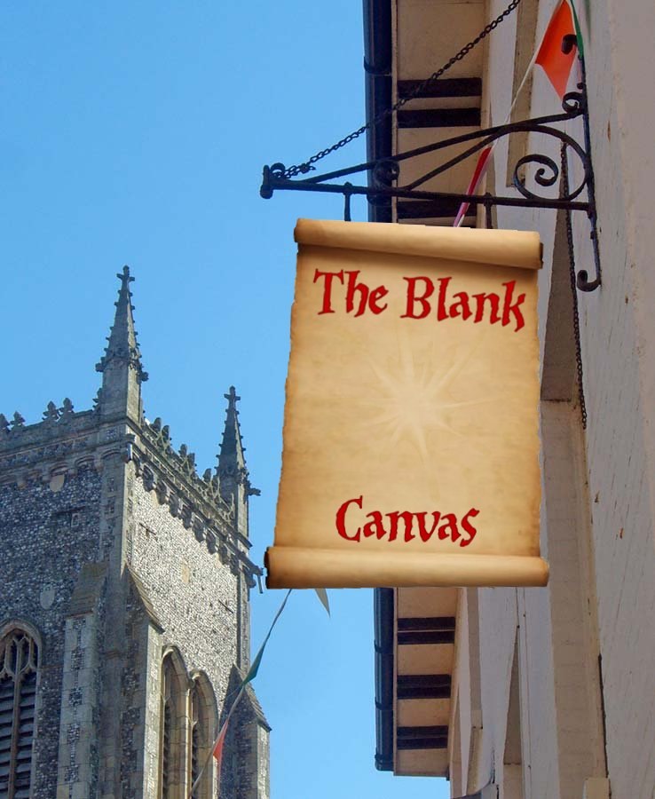
celosia
Wondrous Woolflower Posts: 58 Reply |
Re: Contest 163: Pub sign
 |
Posted on 13/09/07 10:13:27 AM |
|
Eggbox
Ovoid Opportunist Posts: 797 Reply |
Re: Contest 163: Pub sign
Have not been able to play this week because I'm recovering from a bout of double vision having been up in the Alps and contracting altitude sickness. Anyway, for your interest there is a pub in Croydon, south London, called 'The Nowhere in Particular'. A great answer to the question "So where are you off to now?" Ted |
Posted on 13/09/07 12:23:00 PM |
|
Whaler
Visual Viking Posts: 330 Reply |
Re: Contest 163: Pub sign
On a windy (gale force?) autumn day. The man in the picture is not historic since 1242, more like since 1984, but it's an appropriate use of his picture since his name is Björn. 
_________________ Only in my brightest moments I understand myself |
Posted on 14/09/07 08:49:49 AM |
|
Steve Caplin
Administrator Posts: 7135 Reply |
Re: Contest 163: Pub sign
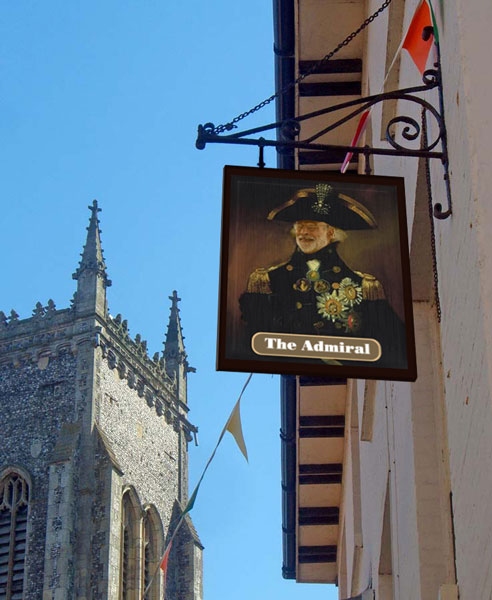
Our first entry this week was from a new member, spitzsticker - and a very accomplished piece of work it is. The imagery and typography are just right, and I like the way it's flapping backwards in the breeze. A subtle highlight, too, on the bottom rail of the frame, giving it a good sense of three-dimensionality. Good work, Roger - and welcome to the forum! A far more modern approach from Elliott, with funky handwriting-style lettering on an intriguingly rough wood background. I like the perspective on this one - but are you sure the frame should be the same texture as the wood? I'd have gone for something much smoother there. Welcome back, though - it's been over a year. A spectacular neon sign from 2bfree, using the cover of the book as a background. A great angle of view - that thick base on the sign really makes it appear as if we're looking up at it - and the timing on the neon is just right. Don't quite understand your optimization issue, though: you are using Save for Web, right? You should find the same set of controls there as you had in PS 6. A painterly approach from chris berry, with a great illustration of a pirate (complete with parrot, eye patch and claw) wielding a pint glass. Very nice starting point, but I think perhaps the texture is a little overwhelming, particularly in that green background. And watch the perspective on the sign: that bottom right corner needs to be raised up a way to be convincing. A very tasteful sign from fngirl that looks as if it's been drawn in chalk. And thanks for the history lesson! Great typography on the sign - that's a very appropriate font - but there's a slight perspective issue here. Again, raise the bottom right corner a little way to fix it. Excellent decrepitude from GKB, with a frame that's coming apart at the seams, and a sign peeling off its backing board. And - heavens - is that me? Must remember to order in a stock of wigs while I can still afford them. Still, free beer, it can't be all bad. Spectacular work from Neil O, with both crowns and text cunningly doubled - and yet the text is still legible, which must have taken some doing. A convincing perspective on the view, as well - but is it just a little exaggerated? Hare to tell, of course: the sign could be swinging towards us in the breeze. I was wondering if james would animate the sign to make it swing - but he's taken it several steps further, with both the sign and the bracket collapsing under the weight of the seagull. Very entertaining stuff! Interesting design - is it a real sign, or one you made up? A beautiful, rustic entry from vibeke: the vertical cracks, the faded painting, and the carved lettering all add greatly to the atmosphere of this one. The perspective, I'd say, is pretty close: it's a difficult one to judge, with no true horizontals in the image to use as reference! Another swinging entry, from tooquilos, showing the sign deteriorating over time with the worsening weather. A great day to night effect, and good breaking up on the sign: but given the strength of the wind, shouldn't those clouds be rolling by? Excellent rain! I didn't see Steve Mac's original post, but the version he's ended up with is quite spectacular: the rough wooden boards, the faded skull and crossbones painting, the carved lettering - all very convincing, and very appropriate to a seaside town. A great technique - and I especially like the double brackets at the top. Another new member this week: and powerslave has given us a Paul Hogan-inspired Australian pub. A very neat frame on this one, and the painting blends well with the wood texture: not sure about the glossy bevel, though. Is there a secret message in the animated version? Or just another internet porn link? Welcome to the forum! A great idea from katew, which puts me in mind of a pub I used to go to called the Three Kings. The trio portrayed on the sign outside were Henry VIII, Elvis Presley... and King Kong. I'm sure you'll agree, the three most famous kings of all. Kate's entry has a nicely tatty wooden border, and a good choice of lettering - Copperplate might have been designed especially for pub signs! A very Irish approach from Rocksham - which, of course, is a reversal of Shamrock, so there's obviously some deep significance here. The lettering works well, and the four leafed clover is well drawn: but I'm not sure about the texture in the background of the sign. Surely it hasn't been knitted? A very painterly approach from Bob, whose admiral certainly looks the part. The lettering on its brown slug, however, looks rather plain and artificial: you could do with adding some texture to it, so it looks as weathered as the sign. That admiral looks scarily like Marty Guyer, which is a little unnerving! A very funny entry from fitzpas - which will mean something to all those who have struggled with the Pen tool in the past. A very clear path, and the parchment looks good against that wood backing. Good to see you back - enjoyu CS3, there's some great stuff in there. A most intriguing sign from Abby-Helen Artfield. So let me get this right: the deal is I catch, gut and clean the seafood, take it to the pub and they cook it and eat it for me? Sounds like there's a catch there somewhere. Watch those perspectives, Abby-Helen! Glad to hear you've opted for a graphics course in retirement, it's a great way to go. But after three years, aren't you due to graduate? The sailing ship in michael sinclair's entry gives the setting a real flavour of the sea, and the rotting pig's head makes a truly disgusting pub sign. But - yes, it did move! That pig's still alive! A novel take on the tablet and mouse from Ben Mills - a good arrangement, Ben. When you're using the Background Eraser to remove the mouse from its original backing, though, it's always a good idea to place a new layer, filled with a dark colour, behind the one you're erasing. Otherwise, you tend to get all this half-erased background creeping in, which you don't notice until later. Topical work from Meltonian: here in the UK smoking has just been banned in pubs (and other public places), hence the sign - and the fumes rising from one of the unhappy band forced to stand outside to indulge their habit. A great night view, with excellent lighting - the reflection of the strip light in the sign is perfect. Great stuff, Graham. I'm intrigued by mguyer's entry: kept waiting for something to happen, then realized it wasn't an animation. What's the trap? Am I missing something obvious, Marty? Beautiful illustration work from Deborah Morley - I especially like the way the old Photoshop feather has been used as the quill, a very neat touch. A great, subtle gold effect on the lettering, too - and those metal brackets on the corners of the sign add a great sense of realism. A traditional approach from steve hill: but I'm not sure about that heavy overlaid texture, which looks rather as if the sign's been used as a bird perch for some years, if you get my drift. And it's traditional in 'head' signs to show the head going off the edge of the frame: this one looks like it's auditioning for a part in The Godfather! The horror of the blank page, eh? Celosia has come up trumps with a sign that says it all. An excellent scroll - did you draw it, or find it? - and perfect lettering make this a great entry. Good work, Helen. There's obviously a deep significance to Whaler's entry: who is Björn? Why is he a bear? And what does 1242 have to do with it? I think I'm missing something here! Still, the flying leaves are great, and the sign swings well in the wind (although it's perhaps a touch too long). All these pub signs are making me thirsty! |
Posted on 14/09/07 09:46:43 AM |
|
Deborah Morley
Makeover Magician Posts: 1319 Reply |
Re: Contest 163: Pub sign
Many thanks as ever Steve for taking the time to do this forum. Since buying your books I've learnt to do things in Photoshop that I would never have thought possible. |
Posted on 14/09/07 09:59:23 AM |
|
Whaler
Visual Viking Posts: 330 Reply |
Re: Contest 163: Pub sign
Thanks, Steve! To fully explain things: Björn is my son, born 1984, hence the reference to that year. The picture of him is a watercolour I made myself. The name Björn translates to Bear in English, that's why he is a bear. Finally, 1242 comes the original text I borrowed from the original sign you see here. BTW, Björn liked having his picture on a pub sign! 
_________________ !!!!!!!!!!!!!!! |
| page: 1 2 3 last |