
| » Forum Index » The Friday Challenge » Topic: Contest 164: Stairs and elevators |
|
Posted on 18/09/07 10:47:18 PM |
|
Pierre
Constructional Confabulator Posts: 637 Reply |
Re: Contest 164: Stairs and elevators
James! Your animation is great! (as always) 
Nice Reception at WIlkey International too!  _________________ |
Posted on 18/09/07 10:47:18 PM |
|
Pierre
Constructional Confabulator Posts: 637 Reply |
Re: Contest 164: Stairs and elevators
Woops... double post... Never hit the "Send" button twice... _________________ |
Posted on 18/09/07 11:57:30 PM |
|
fngirl
* Posts: 20 Reply |
Re: Contest 164: Stairs and elevators
A scene from one of my fav. movies! dreaming of being sat at my desk watching Harry Potter all day instead of working! Cool! 
|
Posted on 19/09/07 08:00:59 AM |
|
james
Surreal Spoofer Posts: 1194 Reply |
Re: Contest 164: Stairs and elevators
Thank you Pierre. There is such a lot of fine work here, so many differing ideas. The mind boggles. |
Posted on 19/09/07 08:44:13 AM |
|
katew
Virtual Virtuoso Posts: 681 Reply |
Re: Contest 164: Stairs and elevators
Thank you Pierre! |
Posted on 19/09/07 9:14:24 PM |
|
Deborah Morley
Makeover Magician Posts: 1319 Reply |
Re: Contest 164: Stairs and elevators
James a fantastic animation - how many layers was that? Totally befuddled on 2 point perspective and an open window but have run out of time  |
Posted on 20/09/07 08:12:34 AM |
|
james
Surreal Spoofer Posts: 1194 Reply |
Re: Contest 164: Stairs and elevators
Deborah, I'm pleased you like the animation. There are 33 layers (not counting those merged) Your visitors appear to have things in perspective. |
Posted on 20/09/07 09:44:27 AM |
|
char
Collage Conquistador Posts: 141 Reply  |
Re: Contest 164: Stairs and elevators
To get off on the wrong foot!!!  |
Posted on 20/09/07 09:45:43 AM |
|
char
Collage Conquistador Posts: 141 Reply |
Re: Contest 164: Stairs and elevators
To deceive the eye, the animation me I reserve it for when they throw the wall! .....  |
Posted on 20/09/07 12:36:13 PM |
|
james
Surreal Spoofer Posts: 1194 Reply |
Re: Contest 164: Stairs and elevators
|
Posted on 20/09/07 1:15:33 PM |
|
tooquilos
Wizard of Oz Posts: 2957 Reply |
Re: Contest 164: Stairs and elevators
Char, thats terrific!! I need to ask you, Ive been looking at the item stuck on the lift door...can you tell me what it is? Been looking at it for a long time and cant make it out 
Also, your animation link isnt working |
Posted on 21/09/07 08:05:20 AM |
|
vibeke
Kreative Kiwi Posts: 2167 Reply |
Re: Contest 164: Stairs and elevators
Ran out of time, and my PS is still crashing.  |
Posted on 21/09/07 08:52:29 AM |
|
Steve Caplin
Administrator Posts: 7135 Reply |
Re: Contest 164: Stairs and elevators
A lot of fun was had this week, but remember the title of the image for this Challenge: perspective.jpg. That was the key to making this one work - the doors on the right show the vanishing point, and so the horizon line, and was where a couple of you came unstuck. First in was Rocksham, with a well executed entry that has lots of good detail: the fitting of the sliding doors into the opening, the perfectly sealed stair entrance, and such touches as the light on the wall and the light coming in through the doorway. That's clearly an outside view of the doors, though, judging by the sunlight on them! And do watch your perspective: your horizon is too high for the room. Some extraordinary textures in stefan's entry, both on the walls and the floor. It's a powerful piece, full of menace and atmosphere - literally. The atmosphere's seeping under the door and floating about in clumps. Just a pity that the red-painted bottom half of the wall is at the wrong angle for the room: from where we're looking, it should be almost horizontal through the picture. A dramatic makeover from tooquilos, who's kept the original doors on the far left but otherwise remodelled the entire room. And it looks as if this has been built up, piece by piece, rather than the doors moved to a wholly new room. fabulous detail, and a great atmosphere to the new room. But watch those tricky perspectives: the picture frame on the right, and the right side of the coffee table. A fun animation from powerslave, who's clearly a Dr Who fan - or perhaps not, judging by the outcome. Shouldn't the Doc disappear for while in the final frame? Again, a bit of a perspective issue with the hallway, which definitely appears to be sloping uphill here. And that Tardis seems to have materialized half way through the wall: look how close it is at the base! Love the carpet, though, and the dalek works a treat. A rather fantastic plaque on the wall in 2bfree's entry: did you find this, or was it Lighting Effects? An interesting makeover, with Dubya entering Homeland Security in a rather nervous way (is that why he's red-faced?). The perspective on the end of the wall by the opening, and the new wall seen through it, are at odds with each other, though. The ceiling tiles show you the way to go here. Talking of which, the new ceiling through the opening does match the existing one rather well! A perfect entry from Meltonian, with a corridor whose perspective matches the ceiling and the rest of the room exactly right. Great shading on the corridor, too, and a seamless extension of the carpet. If I were running this office, though, I'd move that water cooler on health and safety grounds: anyone using it is bound to get bashed by people walking through the door. We'd expect a stairbuilder like Steve Mac to come up with interesting stairs, of course - but look how well these fit the scene. That'll keep the employees fit! And the two men in suits do add interest here. A tiny quibble over the perspective of the ceiling section under the RSJ, which seems too low compared to the door to the right of it - but generally this is a great entry, with the extensions well matched to the existing room. Many more staircases from G. E. Sutton - and you're right, we did place a Christmas tree in this hallway a while back. The M C Escher print on the wall gives a clue to the angles of the other stairs in this image: rather dodgy perspective on the one on the right, but the upside down stairs directly in front of us are a real treat, and achieved with great subtlety. Most entertaining! Great perspective from Neil O, with a well spotlit painting and a very neatly patched wall. The aquarium is magnificent, but I'm a little concerned about the diver we can just see on the right. From where we're looking, his body is in the room next door - so shouldn't there be water seeping under the door? With a big screen TV like mguyer's offering, going to the dentist could be less traumatic for me than it is. You're clearly having trouble with the text perspective, Marty, both on the screen and on the door: and while the second entry corrects it, it moves it too far the other way (although it works better on the door). Here's the key to this one: all the verticals in the room are truly vertical in the photograph, so the text should be straight up and sheared vertically, but not horizontally. Which works for Camille, but not Amiri, and certainly not Fox2News. I suspect this screen grab came from an angled view of the TV, which may be what's causing you the problem. I recognize those extras in Ben Mills'entry - good to see them put to use. With strong shadows like that on the wall, though, shouldn't they be casting some shadow on the ground as well? Since you've taken out both the stairs and the elevator, it's lucky they have some source of liquid out there while they're waiting to be rescued by helicopter. Stunning work from dave.cox, with a Burger King booth slotting neatly into that opening. It's an excellent fit - apart from the top of the left-hand inner wall, where we should see the underside of the supporting beam. Keeping that square of red carpet was a great idea - and it does partially cover that nasty stain. Has a football been removed from the corner, though? What is that bright patch? We never expect michael sinclair to stay on topic, and this week's no exception: rather than following instructions, he's moved the hall elements to another room entirely. But what a great fit they are: the lift, doorway and stairs all fitting well into the odd perspective of the new room. Lift seems a little high compared to the door, though - and where on earth is that staircase going? I can see daylight through the window above it! A nicely decorated vet's clinic from james - but you need shading to differentiate between the side and back of the green wall in the opening. (Oh, and check the spelling of Welfare.) The wall paintings are a great touch, and the cat in the foreground adds a good focus to the scene. It all takes second place, of course, to the magnificent animated entry: what a lot of work in here! And a very instructive lesson in how speed of movement can fool the eye: the opening of the shutter, the running men, all flash by before we have a chance to see if they're really moving. Fantastic stuff, James! Excellent remodelling from katew, with a fantasy office and Kate installed as Chief Executive (love the plaque on the door). So who's the receptionist? Not Celosia, by any chance?. Excellent matching of the curved reception desk with the tricky perspective of the room, and the view outside looks idyllic (if a little muddy underfoot). Intrigued about your husband's guide book: a search on Amazon.co.uk for books by Wilkey came up with A Checklist for African Snakes, Adventures in Early Aviation, How To Stop Smoking and The Wilkey Family Christmas Game. Any of these? An empty elevator shaft would make one hell of a chimney, as chris berry would have it. Excellent perspective matching on the new fireplace, and the wall behind is very neatly patched: but isn't the whole fireplace rather too big for the room? I couldn't imagine leaning against that mantlepiece and still being able to fit through the doorway. Great wall patching from fngirl - and that new skirting board fits the space perfectly. The light on the wall and floor is a very good touch. But - Harry Potter, the cartoon version? New one on me! I'd like to see a slight thickness to that frame, as well, on the near side. And from the point of view of aesthetics, the frame would look a lot more part of the room if the top lined up with the top of the doors. Deborah Morley says she's befuddled by perspective - but from where I'm looking, it appears to be pretty good.The board and new window fit perfectly into the scene: you've made it more complicated for yourself, of course, by opening the door and the window. Placing the old staircase behind the door is an excellent touch! The only small problem is with the open window: the bottom edge is sloping up too much. But the reflections in the window are perfect! Loads of detail from char: the half finished wall, the elevator panel leaning against the door (with a fantastic shadow), the pile of bricks... I especially like the polythene sheet over the door on the left. And the perspective on the ladder is excellent - a really tricky one to get right. I love the second entry, but there are some perspective issues here: we shouldn't be able to see the right hand wall, and the reflection of the curved brickwork curves the wrong way. A great hand painted ivy technique! Sorry to hear vibeke is having trouble with Photoshop crashing - but it's clearly been going for long enough to add an excellent fountain, and the water on the floor looks very good in there. The top edge of the fountain isn't quite in the right perspective - but a well patched wall, and the splash of water from the spout is perfect. Excellent work, everyone! |
Posted on 21/09/07 09:10:07 AM |
|
Deborah Morley
Makeover Magician Posts: 1319 Reply |
Re: Contest 164: Stairs and elevators
Thanks Steve, it was the open window I was having problems with. The only window that opened like that in my house I couldn't get back far enough to look at it properly! Must get a bigger house. |
Posted on 21/09/07 09:16:56 AM |
|
katew
Virtual Virtuoso Posts: 681 Reply |
Re: Contest 164: Stairs and elevators
Thanks Steve! No, the receptionist is not Helen - she came with the desk. Just to embarrass Helen completely, here she is: 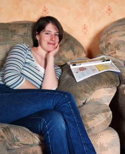
And here's David's book: http://www.waterfallsbreconbeacons.com/ It hasn't been picked up by Amazon yet, as he only registered it with the British Library etc a couple of weeks ago. |
Posted on 21/09/07 09:22:05 AM |
|
powerslave
Custom Cobber Posts: 136 Reply |
Re: Contest 164: Stairs and elevators
Thanks Steve, getting the correct or incorrect angle on the floor and roof was a bit of a lottery for me and the Tardis knocked the door out supposedly lol |
Posted on 21/09/07 09:25:24 AM |
|
stefan
Detail Demon Posts: 401 Reply |
Re: Contest 164: Stairs and elevators
Thanks Steve... I do seem to have a problem with perspective.  And just when I thought I got it right this time. And just when I thought I got it right this time.  |
Posted on 21/09/07 11:03:27 AM |
|
tooquilos
Wizard of Oz Posts: 2957 Reply |
Re: Contest 164: Stairs and elevators
Thank you Steve. |
Posted on 21/09/07 12:58:00 PM |
|
Neil O
Cartoon Contractor Posts: 389 Reply |
Re: Contest 164: Stairs and elevators
Thanks Steve, I just KNEW you would notice the diver and would say just that! I flipped the picture of the aquarium but it just didn't fit the scene as well. Thanks again
Neil _________________ "I haven't failed.... I've found 10,000 ways that don't work!" Thomas Edison |
Posted on 21/09/07 1:34:44 PM |
|
Rocksham
* Posts: 11 Reply |
Re: Contest 164: Stairs and elevators
Thanks for the comments Steve. |
| page: 1 2 3 last |