
| » Forum Index » The Friday Challenge » Topic: Contest 183: Drip, drip, drip |
|
Posted on 03/02/08 11:47:28 PM |
|
vibeke
Kreative Kiwi Posts: 2167 Reply |
Re: Contest 183: Drip, drip, drip
Too much Photoshop.  |
Posted on 04/02/08 5:55:58 PM |
|
Born2Run
Digital Dude Posts: 132 Reply |
Re: Contest 183: Drip, drip, drip
Steve knew it was a mistake visiting Darkplace Hospital!  _________________ We made a promise we swore we'd always remember, No retreat no surrender |
Posted on 05/02/08 7:15:17 PM |
|
katew
Virtual Virtuoso Posts: 681 Reply |
Re: Contest 183: Drip, drip, drip
How did THAT get in there??  |
Posted on 05/02/08 8:14:48 PM |
|
Elliott
Mirror Magician Posts: 91 Reply |
Re: Contest 183: Drip, drip, drip
Really struggled with this one....great work from everyone else though, you can tell who likes to have a drop!!  _________________ My fake plants died because I did not pretend to water them. |
Posted on 06/02/08 03:29:09 AM |
|
mguyer
Incisive Incisor Posts: 799 Reply |
Re: Contest 183: Drip, drip, drip
here is #2. Need to get rid of that big cap in view of the narrow bottle.  |
Posted on 06/02/08 11:56:33 AM |
|
katew
Virtual Virtuoso Posts: 681 Reply |
Re: Contest 183: Drip, drip, drip
Found a very small glitch on my first effort, so here's an updated version ... 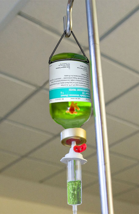 |
Posted on 08/02/08 07:35:57 AM |
|
tank172
ThreeDee Thriller Posts: 692 Reply |
Re: Contest 183: Drip, drip, drip
 |
Posted on 08/02/08 08:37:59 AM |
|
Steve Caplin
Administrator Posts: 7135 Reply |
Re: Contest 183: Drip, drip, drip
Some very fine entries indeed this week: it was a tricky Challenge, but as always this seems to have brought out the best in people. Some of you had difficulty with the angle of the bottle and label, but this is all set by the bottle cap: follow the shape of the top edge and you can't go far wrong. Fantastic work from james: the recolouring of the liquid, the design of the label, and especially the shine on the label giving it a real 3D quality are superb. Ingenious idea to flatten the bottle cap to match the perspective of the bottle, too. And while the still itself is remarkable, the animated version is a real bonus: turning that plastic clip into a butterfly is inspiring; flipping it back and forth to make the wings flap is a work of genius. James, you've really excelled here! Funny work from GKB, with a reference to the old Raquel Welch movie Fantastic Voyage - although, judging by her clothing, I'd say that still of Miss W is from One Million Years BC (which, so imdb tells me, was made in the same year and which may account for her costume confusion). A great idea, and interesting scaling with Raquel already part shrunk: I like the scan from last week that the doctor's holding. A great submarine in the bottle, and the reversed label is a neat touch (although we shouldn't be able to see it through the sub, of course). Most entertaining! And good fixing of the pole issue in the second entry. A first entry from gary j, who's taken the ingenious approach of lifting the toxic waste container from the book and distorting it into a funnel shape. It's a unique approach, with a well drawn clip; the bubbles in the liquid also add a sense of malice to the occasion. The added shading in the second entry focuses attention well too. There's a fuzziness to the edges of the red liquid, though, which makes the plastic container look too soft here: I'm not sure feathering the selection was the best choice here. And I like the atmospheric fog, but would have placed it right at the top of the stack: it seems to be behind the can, but in front of the bottle top. Moving the hook in the third entry is a neat idea. I like the added bottle opener, but lose the shadow - it's on the air. An excellent first entry - welcome to the forum! I suppose I should have expected something a little stronger than immunoglobulin... and tooquilos has given me a rather fruity liqueur, which - being 'hospital grade' - should certainly do the job. An extremely neat solution to the recoloured liquid: this version has strength without looking artificial. I think, though, that the colour shouldn't show up so strongly on the neck and lower tube: with much less liquid contained here, the result would be much paler. A nicely hallucinogenic entry from Born2Run, who returns to us after a year on the high seas. A neatly reshaped bottle to fit the perspective of the scene, and the haziness adds greatly to the dreamlike quality. Love the bear, of course, but if that's what Alaskan Amber does for you I think I'll steer clear of it. At least intravenously. Love the cartoon effect on the second entry - and what a great hand. Good to have you back, Chris. Sinister work from michael sinclair, with a gloved hand that hesitates (neatly twitching fingers, there) before ripping the life support away. The angle of the raised hand at the end is just right. A great plastic bag, and very nicely retouched background behind the removed drip container. I do hope I recovered from this one. A hand drawn bottle from Steve Mac, with great bubbles: this one's really made, of course, by the excellent distortion of the background, which adds tremendous authenticity. The angles of the liquid surface and the hanger ring are too shallow, though: look at the bottle cap, and match that. How did you find a picture of a doctor looking down, though? Must have taken ages! Looks like Whaler's blood transfusion should have been defrosted before the procedure started! With both snow at the top and icicles dropping from it, there's real cause for concern. A slightly fuzzier edge to the snow, particularly at the top, would help the realism - and don't forget to add a little Gaussian Noise and Gaussian Blur for texture. But especially, you need to distort the background seen through those icicles! Good to see brewell has been doing his research - there's nothing like referring to the real world for inspiration, and it's resulted in a convincing distortion through the glass. Is the glass itself photographed? It look really convincing - and the reflection of the chrome pole is especially good. Great bubbles, and the olives are a fantastic touch. But look at the contrast in the plastic section at the bottom: you need to boost the glass to match this for a totally convincing effect. Of all the doctors in the world, I had to end up with Dr Evil... Neal's ingenious entry has the old bloodsucker dipping into my... hang on, that's not blood... where on earth is that tube going???? Love the clamp - a brilliant solution to removing the tube support. The straw is, itself, a work of some genius: not just the top, where it pokes out of the cap, but right down through the container, disappearing behind the bubbles and refracting in the liquid. A distinctive malt from mguyer, with what appears to be one of those miniatures they give away on airlines. I like the recoloured liquid and the subtle drip, but the bottle itself needs more distortion to match the angle of the cap. I think the Shear filter could have helped a lot here - unless you have CS2 or 3, Marty, in which case Image Warp would do the trick. Losing the cap in the second entry helps - but not quite enough! I can almost feel the pixels flooding through my veins in vibeke's entry: great distortion on the boxes, and a very neat glass texture to the bottle. But you do need to distort the background, and the pole, seen through the glass for a more realistic effect. (Of course, the bottle should be behind the pole, but that's another issue.) Interesting texture on the drips! A great idea from katew, and the bubbles added to the recoloured liquid at the bottom give it a lot of sparkle. But you do need to watch the angle of the label: again, take your cue from the bottle top. And - tiny point - the fish's top fin is in front of the label, should be behind. Aha! you spotted it, and fixed it in the second entry! Whatever in that bottle certainly looks disgusting! So many bottles from Elliott - I think the one with the ship in is certainly my favourite. The angle is the tricky part here, certainly; and a bit of distortion on the top edge, to match the shape of the bottle top, would work wonders here. Easiest solution might be to separate the top edge into a new layer, distort it by itself, then mask out the rest of the bottle to fit. Intravenous viagra? Heavens! Can't the nurse see the wedding ring? A really funny entry from tank172. Seems almost petty of me to mention that the nurse's arm is a couple of sizes too small... Most entertaining work all round. And here, just for the sake of comparison, is the real thing: 
|
Posted on 08/02/08 09:08:31 AM |
|
vibeke
Kreative Kiwi Posts: 2167 Reply |
Re: Contest 183: Drip, drip, drip
Thanks Steve, Trust me to miss the obvious. Bottle behind pole. Good to have you back. Here is my original bottle.  |
Posted on 08/02/08 10:00:48 AM |
|
tooquilos
Wizard of Oz Posts: 2957 Reply |
Re: Contest 183: Drip, drip, drip
Thank you Steve. I think I spent too much time concentrating of the label. You are right though, the neck of the bottle should be lighter 
Hope you are feeling well |
Posted on 08/02/08 11:47:44 AM |
|
Steve Mac
Grunge Genie Posts: 539 Reply |
Re: Contest 183: Drip, drip, drip
Thanks Steve. I see what you mean about the bottle cap perspective. Now that I look at it, it looks really bad. The pic of the doctor came from a stock photo from an Advanced PS CD. |
Posted on 08/02/08 2:24:22 PM |
|
katew
Virtual Virtuoso Posts: 681 Reply |
Re: Contest 183: Drip, drip, drip
Thanks for the comments Steve. I found it really hard to get a suitable bottle and then put it in the right perspective! |
Posted on 08/02/08 6:43:10 PM |
|
GKB
Magical Montagist Posts: 4130 Reply |
Re: Contest 183: Drip, drip, drip
Thanks Steve, I was wondering if you would notice my deliberate mistake with the label showing through the sub(???!!!) I had actually posted another image with Miss Welch in another swim suit but I thought that it was just a bit tooooooo revealing for the forum so I quickly substituted this image instead. Hope you're feeling better. |
Posted on 08/02/08 6:53:29 PM |
|
tank172
ThreeDee Thriller Posts: 692 Reply |
Re: Contest 183: Drip, drip, drip
Thanks Steve, There was a joke on this forum some time ago about Paris Hilton, so I thought I'd try to bring it back to life. I can't seem to find that thread, though. I think it was from one of Vibeke's posts? I believe I remember a window and birthday cake in the montage...? |
Posted on 08/02/08 7:44:49 PM |
|
Elliott
Mirror Magician Posts: 91 Reply |
Re: Contest 183: Drip, drip, drip
Thanks Steve, really did struggle with this one. _________________ My fake plants died because I did not pretend to water them. |
Posted on 09/02/08 02:51:31 AM |
|
brewell
Pixel Pentagrammarian Posts: 752 Reply  |
Re: Contest 183: Drip, drip, drip
I started with the stretched glass of chapter nine and added the reflection from the collection tube, that really does have a stronger shine. It's all there in the tube if we can see it.  _________________ The journey of a thousand hours begins with a single layer |
Posted on 09/02/08 06:28:05 AM |
|
Whaler
Visual Viking Posts: 330 Reply |
Re: Contest 183: Drip, drip, drip
Thanks for the input, Steve. A reminder to always pay attention to detail. _________________ !!!!!!!!!!!!!!! |
| page: 1 2 last |