

| » Forum Index » The Friday Challenge » Topic: Contest 184: Pick a Democrat |
|
Posted on 10/02/08 07:45:51 AM |
|
Neal
Master Manipulator Posts: 322 Reply |
Re: Contest 184: Pick a Democrat
Watch out Republicans! The Democrats have a new candidate of the people, for the people, and made up of several people.  |
Posted on 10/02/08 09:24:50 AM |
|
vibeke
Kreative Kiwi Posts: 2167 Reply |
Re: Contest 184: Pick a Democrat
[quoted] Neal wrote: Watch out Republicans! The Democrats have a new candidate of the people, for the people, and made up of several people. That's even scarier than the real thing! |
Posted on 10/02/08 09:26:18 AM |
|
tooquilos
Wizard of Oz Posts: 2957 Reply |
Re: Contest 184: Pick a Democrat
Thank you Nick and Michael 
Was watching the news today and I saw the pair of them and all I could think of and see were the images that have been posted on this forum  |
Posted on 10/02/08 10:16:05 AM |
|
GKB
Magical Montagist Posts: 4130 Reply |
Re: Contest 184: Pick a Democrat
Neal, That's just magnificent! I love it. |
Posted on 10/02/08 1:33:00 PM |
|
josephine harvatt
Gag Gadgeteer Posts: 2605 Reply |
Re: Contest 184: Pick a Democrat
Is this a win-win situation ? 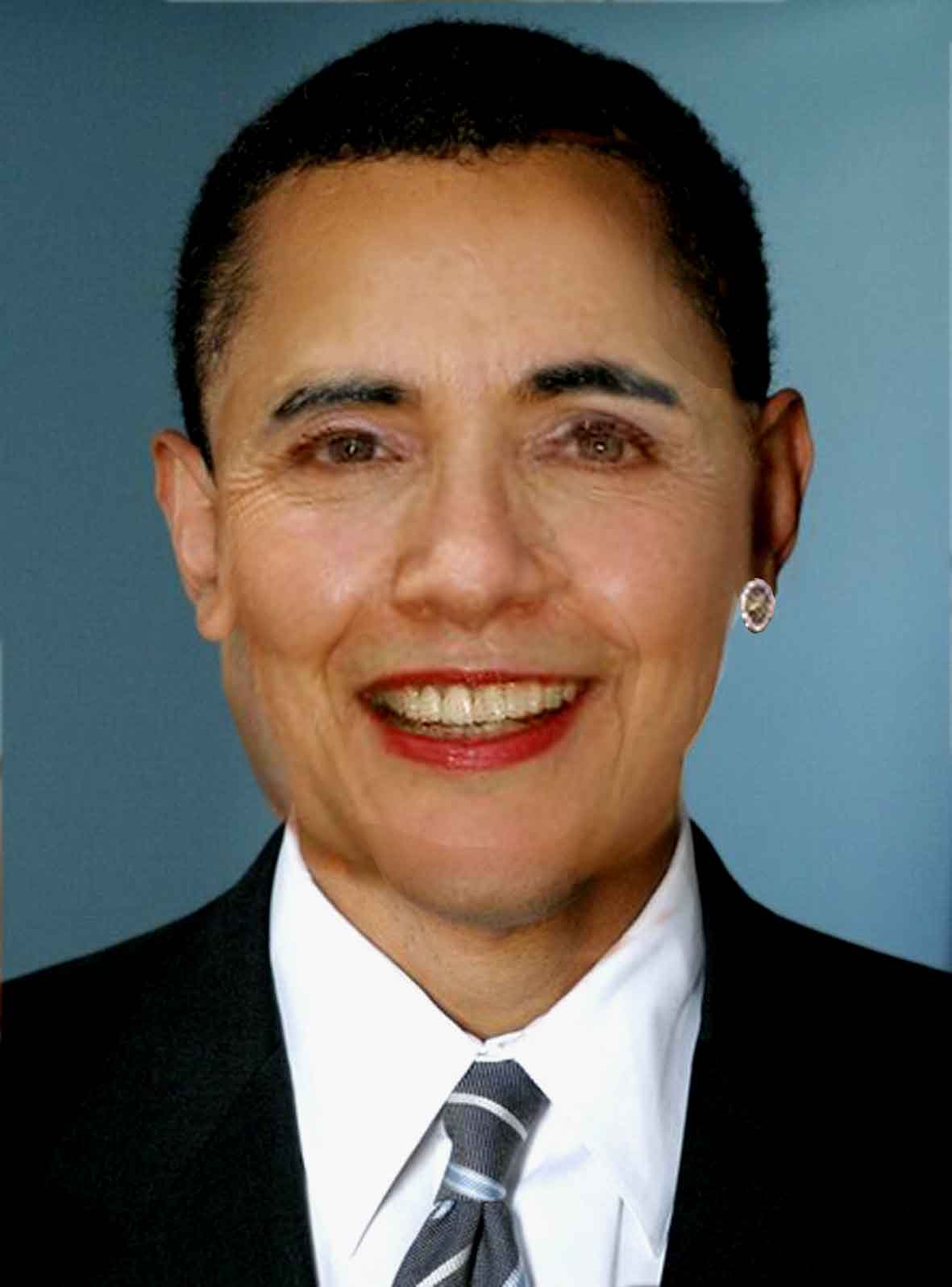 _________________ I'm not really bad - I just draw that way |
Posted on 10/02/08 3:36:52 PM |
|
Elliott
Mirror Magician Posts: 91 Reply |
Re: Contest 184: Pick a Democrat
_________________ My fake plants died because I did not pretend to water them. |
Posted on 10/02/08 5:31:07 PM |
|
Neal
Master Manipulator Posts: 322 Reply |
Re: Contest 184: Pick a Democrat
Thank you Vibeke, GKG, and Elliot for the kind words! I can't lampoon Bush forever, and this week's challenge got me thinking of new possible targets.  |
Posted on 10/02/08 9:09:33 PM |
|
james
Surreal Spoofer Posts: 1194 Reply |
Re: Contest 184: Pick a Democrat
http://i153.photobucket.com/albums/s211/fungismith/blank2.gif http://i153.photobucket.com/albums/s211/fungismith/ding_dong.gif |
Posted on 11/02/08 09:59:40 AM |
|
Nick Curtain
Model Master Posts: 1792 Reply |
Re: Contest 184: Pick a Democrat
Great work James, very creative and well executed. Nick |
Posted on 11/02/08 4:22:19 PM |
|
GKB
Magical Montagist Posts: 4130 Reply |
Re: Contest 184: Pick a Democrat
Sorry it's a rather pedestrian effort from me this week. Some more excellent work from everyone. 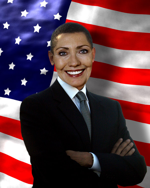 |
Posted on 11/02/08 7:22:03 PM |
|
Deborah Morley
Makeover Magician Posts: 1319 Reply |
Re: Contest 184: Pick a Democrat
Tricky but fun 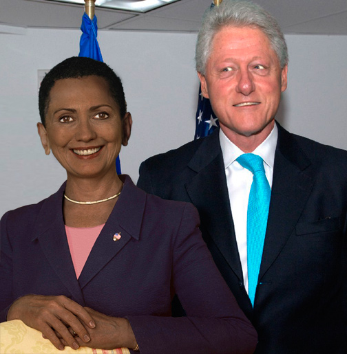 |
Posted on 11/02/08 9:07:18 PM |
|
james
Surreal Spoofer Posts: 1194 Reply |
Re: Contest 184: Pick a Democrat
Thank you Nick. |
Posted on 11/02/08 9:09:00 PM |
|
Ben Mills
Luminous Luminary Posts: 570 Reply |
Re: Contest 184: Pick a Democrat
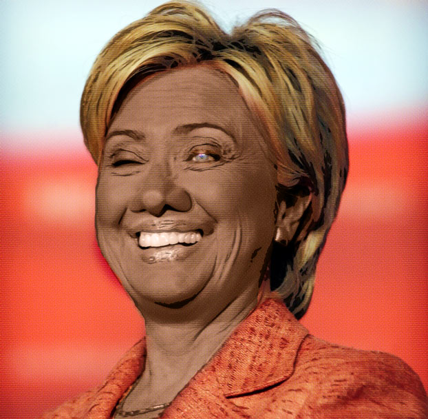 |
Posted on 13/02/08 9:02:29 PM |
|
Whaler
Visual Viking Posts: 330 Reply |
Re: Contest 184: Pick a Democrat
Away with Jefferson. The 2026 edition of the two dollar bill. Ten years after their glorious period in the White House as President and Vice President. 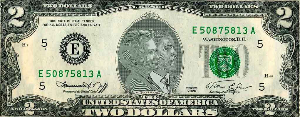 _________________ Only in my brightest moments I understand myself |
Posted on 14/02/08 06:21:58 AM |
|
billz
* Posts: 9 Reply |
Re: Contest 184: Pick a Democrat
... and the spouses  |
Posted on 14/02/08 11:25:42 AM |
|
Babybiker
Shadow Spectaculator Posts: 151 Reply |
Re: Contest 184: Pick a Democrat
Years ago I bought MorphStudio, but have never found a use for it till now! http://img337.imageshack.us/img337/6636/clintonani2gifmp2.gif |
Posted on 14/02/08 11:29:48 AM |
|
Babybiker
Shadow Spectaculator Posts: 151 Reply |
Re: Contest 184: Pick a Democrat
...And a non-animated composite using the same photos... 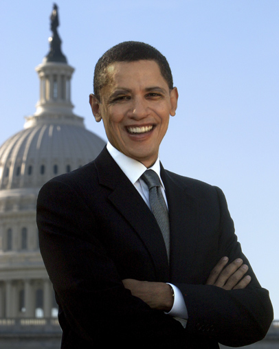 |
Posted on 15/02/08 02:31:03 AM |
|
dave.cox
Marquee Master Posts: 518 Reply  |
Re: Contest 184: Pick a Democrat
These are all such a hoot! I showed them to my wife and some co-workers. They gave everyone a good laugh. Good work to all. |
Posted on 15/02/08 09:22:18 AM |
|
Steve Caplin
Administrator Posts: 7135 Reply |
Re: Contest 184: Pick a Democrat
There were many ways to approach this week's Challenge, ranging from the straightforward swapping of heads to more complex solutions. All of you managed to match the skin tones well, which was the biggest hurdle to be overcome. One general point, though: when darkening the hands, you'll get a much more convincing African American appearance if you leave the fingernails in their original colour. First up was Born2Run, who's placed Barak's face onto Hillary's head and body. It's a good fit, although the hair looks a little more bouffant than we'd expect; but the setting on the White House lawn works well. I like the shadow, but would point out that on such an overcast day there wouldn't be one. Excellent choice of bodies in the second entry however: Obama's perfectly matches his grin. And as for ol' Bill as a parlourmaid - I might never get that image out of my head. At least, I assume he's a parlourmaid, and that isn't just a white stain on his little back dress. Bill's keeping a close hand on Obama in garyj's entry, and by the looks of it Barak isn't too happy about this - great twisting of his features, there. But it's unclear what Bill's got in mind, although I like the innovative treatment of the thought bubble. Why is Clinton's tie knot so fuzzy, though? Has some Photoshop work been done here? I suspect jwhite may not vote for either of these candidates... a perfect pose from Homer Simpson, which must have taken some time to track down. I like the idea of their jaws working like ventriloquists' dummies, but a little more time here would have made all the difference: those vertical black lines are only the beginning of the process, John. A very interesting mix from Steve Mac: this one's a subtle blend of the two faces. Strange how the head now appears rather too small for the body, though. A rather magnificent pair of custom created breasts, Steve - are these drawn from life? Do try to keep them symmetrical, though, if only from an aesthetic standpoint. Seamless blending from Neil O, with Barak's face neatly inserted into Hillary's head. Something about the jaw line doesn't quite work for me: it may be simply that we need a touch of extra shading in there. Highly political stuff from brewell: hard to comment on this one, really, except to point out that the original painting seems to owe more to Indiana Jones than the New Testament. These crazy Victorian artists... A detailed fact file from tooquilos, with a great description of the mixed-up candidate - and a scary photographic mix as well. The result is intriguing: I particularly like the way Hillary's hair has been styled into more of a male cut, and the glint on that earring is a great touch. Excellent stuff, Anna. The face beneath: a good cutaway from katew, with the thickness of the skin on the right really adding to the effect. The shadow's perhaps a little too strong, though: and the result would be much more convincing if the two eyes lined up, which is really the key to making this sort of image work. I love the fact that the hands are different colours - what a great detail! In his first entry, Nick Curtain didn't manage to track down high res pictures of Hillary or Obama - but that's been corrected in the second entry, which is a rather beautiful mix of the two faces. Rather than simply placing Barak's face in Hillary in its entirety, Nick has created a good blend between the two that really causes us to look twice. This is exactly the sort of image I was hoping for this week - very good work! It's not until you place two faces next to each other that you realize how different the spacing of the features can be. This is the problem faced by Steve Hill - and a lot of skill has cone into tweaking Hillary's eye, nose and especially lips to match Barak's. This hard split makes things harder for yourself, Steve, especially in such areas as the hair: Hillary's clearly should stick up much higher than Obama's close crop. A valiant attempt! Romantic stuff from vibeke, with a head swapping that works really well - and Hillary certainly looks scary with that haircut. I like the way the bodies stay in the same position throughout the transition, and the subtle recolouring of the hands works especially well. Judging from his comment, I'm not sure michael sinclair is very pleased with his results: but it's a good transformation, although the final frame doesn't seem to be completely there - we can still see a hint of Hillary's eyes behind Obama. The alignment of features works particularly well here, though, producing a convincing merge. Glorious work from Neal, who these days seems keener than ever on gore and gristle. It's a fantastically detailed piece of work, with beautifully drawn stitches and bandages: the neck and chest, which I suspect came from a horror movie still, is a fantastic touch. An ingenious idea, perfectly realized. Subtle work from Josephine Harvatt, with a composite image that is clearly a third person derived from both Clinton and Obama. A shame you started with such low res originals, though - although I appreciate the difficulty of finding suitable images from the same angle. The left side of the jaw seems to have some odd transparency in it! A very graphic image from Elliott - and the thing that intrigues me most is the way the fingers from Obama's side slide over into Hillary's. A great blurring technique between the heads, but I think it would have benefited from soft edges rather than hard ones. A comical blend from james, the neat animation leading to a composite that has a real Disney feel to it. The great textured background - is this a tattoo? - works well here. And I love the cartoon fight in the second entry: my only comment here is that in the final frame, they should perhaps be lying with the shadowed side of their faces towards the ground. Rather scary work from GKB: that's a real 'in your face' politician. I think the rather surreal quality here is caused by Hillary's features simply being too big for the head, dont you think? Very neat work from Deborah Morley: the apparent simplicity of the result gives little indication of the amount of work that must have gone into blending the features together here. But for me, this image is really made by the subtle cartoon distortion of Bill's face - wonderful. A hilarious (and not to say bizarre) entry from Ben Mills, who's distorted Hillary's face into an African American pastiche. The skin has taken on a peculiarly monochromatic appearance, though: surely her original teeth and lipstick would have added some colour to the mix? An interesting stab at an engraving effect from Whaler, which uses a fairly convincing technique - but the trouble is, it's too small. Better, surely, to have focussed on the portraits, rather than showing the whole banknote. What technique did you use? There used to be a good plug-in that created an engraving effect, but I haven't seen it for a while. A great idea, though! A new member's come to play this week: billz has taken a sideways approach, matching up Mrs Obama and Bil Clinton. It's a great idea, and a refreshingly different image. The problem is that Bill's face is just too small: enlarge it about 30 per cent, and you'll get a much better result. Welcome to the forum, Bill. An automated approach from Babybikerand the animation shows the transition working beautifully. The placement of anchor points takes ages with this sort of work, and the finished result must have taken a lot of cleaning up: the problem with all such automation is that it tends to produce very ragged edges. Great work all round this week - some really funny stuff here! |
Posted on 15/02/08 09:51:25 AM |
|
Deborah Morley
Makeover Magician Posts: 1319 Reply |
Re: Contest 184: Pick a Democrat
Many thanks Steve. It didn't take much distortion on Bill's face to make it like that! And I kept looking at the fingernails thinking they weren't right. |
| page: 1 2 3 last |