
| » Forum Index » The Friday Challenge » Topic: Contest 185: Bond's back |
|
Posted on 17/02/08 4:53:45 PM |
|
Ben Mills
Luminous Luminary Posts: 570 Reply |
Re: Contest 185: Bond's back
The secret formula is hidden in the barnet 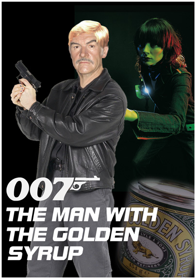 |
Posted on 17/02/08 5:33:42 PM |
|
katew
Virtual Virtuoso Posts: 681 Reply |
Re: Contest 185: Bond's back
Ben, that's brilliant! |
Posted on 18/02/08 00:07:01 AM |
|
zapat
Audio Artist Posts: 44 Reply |
Re: Contest 185: Bond's back
away for a long time, but never gone  _________________ "the closer you get to the meaning the sooner you'll know that you're dreaming" |
Posted on 18/02/08 04:21:04 AM |
|
vibeke
Kreative Kiwi Posts: 2167 Reply |
Re: Contest 185: Bond's back
I wasn't happy with my first attempt, JB still looked too dead. so here is an other attempt.  |
Posted on 18/02/08 1:59:37 PM |
|
michael sinclair
Off-Topic Opportunist Posts: 1871 Reply |
Re: Contest 185: Bond's back
Just a bag of wind... Click the pic for better quality: 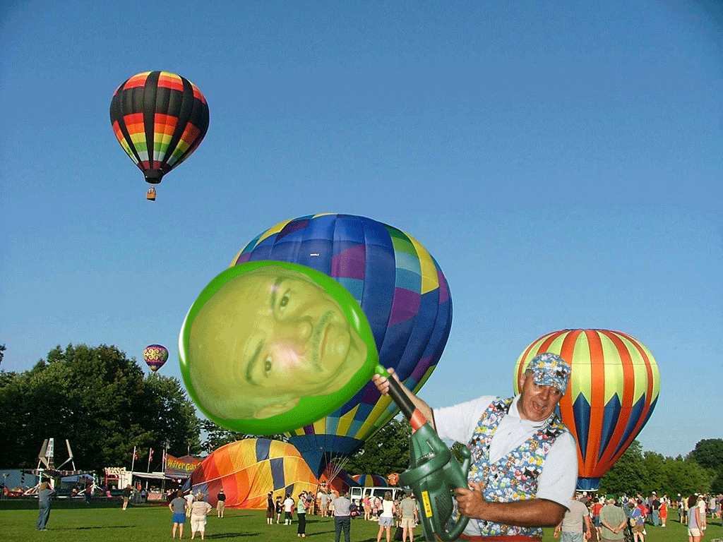
|
Posted on 18/02/08 3:31:01 PM |
|
michael sinclair
Off-Topic Opportunist Posts: 1871 Reply |
Re: Contest 185: Bond's back
The classical Sean Connery 
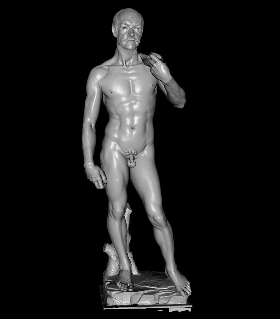 |
Posted on 18/02/08 3:35:52 PM |
|
josephine harvatt
Gag Gadgeteer Posts: 2605 Reply |
Re: Contest 185: Bond's back
The name's Bond, Brooke Bond. That will be two lumps please, shaken not stirred.... Michael! How wude !   _________________ I'm not really bad - I just draw that way |
Posted on 19/02/08 05:52:34 AM |
|
ziiwow
中国娃娃 Posts: 19 Reply |
Re: Contest 185: Bond's back
 |
Posted on 19/02/08 06:12:42 AM |
|
Neal
Master Manipulator Posts: 322 Reply |
Re: Contest 185: Bond's back
Sean's hands and martini's have something in common, there both shaken.  |
Posted on 19/02/08 6:36:45 PM |
|
chris berry
Overhead Overlord Posts: 724 Reply  |
Re: Contest 185: Bond's back
Aw, someone had to make him look a little bit cool!  |
Posted on 19/02/08 7:46:29 PM |
|
Deborah Morley
Makeover Magician Posts: 1319 Reply |
Re: Contest 185: Bond's back
Brilliant entries - as usual 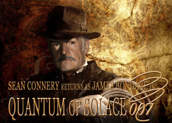 |
Posted on 21/02/08 06:03:14 AM |
|
Mick Malkemus
Meticulous Manipulator Posts: 91 Reply |
Contest 185: Bond's back
Hope this is the correct way to submit, sorry if I got it wrong... let me know.  |
Posted on 21/02/08 3:37:39 PM |
|
salfordnurse
Intensive Illustrator Posts: 207 Reply |
Re: Contest 185: Bond's back
Well it's been a over a year since my last post, In that time I qualified as a nurse and am now working on ICU. Well been out of the world of photoshop for a while, but just got the new book and thought why not have a go so here we are. Must say the quality of the work is amazing since I've been away 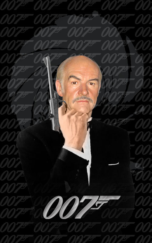 |
Posted on 21/02/08 9:13:52 PM |
|
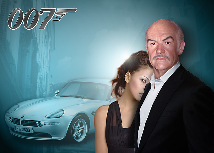
KristyLynn
* Posts: 3 Reply |
Re: Contest 185: Bond's back
okie dokie. i just got the book, it's actually the 4th edition annnnd i haven't read it yet. LOL. i can't wait. i've been taking it to class with me, praying not to be mugged, so i hold the title to my body. hahah.  the book is beautiful. the book is beautiful.  here is my.. thingy. i hope that it's not too inappropriate.. lol. well... it's not meant to be. at least. here is my.. thingy. i hope that it's not too inappropriate.. lol. well... it's not meant to be. at least.
whoa. how do you do this? hahahah. i'm only partially blond. 
|
Posted on 22/02/08 07:32:30 AM |
|
Atomicfog
Virtual Visualizer Posts: 238 Reply |
Re: Contest 185: Bond's back
The new bond movie you haven't heard about... 
And here is a sneak peak from the movie: 
|
Posted on 22/02/08 09:30:07 AM |
|
Steve Caplin
Administrator Posts: 7135 Reply |
Re: Contest 185: Bond's back
Several new members this week, clearly inspired by the Bond theme. We've seen some excellent posters from, well, some excellent posters. So here goes... First to don (or in this case strip off) the tuxedo was calou, with Sean's head neatly placed on Daniel Craig's body. Excellent matching of skin tones, and the size and blending work perfectly. But all that shine on Dan's shoulders does suggest there should be a similar shine on Sean's bare head: reverting to the original lighting in a patch here would probably have done the trick. A great first entry, though - welcome to the forum! An old Bond poster repurposed by Born2Run: Sean's head has been very neatly treated to make it match the tone, contrast and saturation of the original. And a good stab at the glowing text in the titles - a close match for the original. Although I'm not sure the font is a perfect approximation to Futura... a very cute second entry though, and the grafting of Sean's moustache, nose and eyes into Austin Powers' face is masterful. A great gag from gary j, playing on the Bond/bond name. Never have dentists' impressions looked so threatening! Best of all, of course, is the way Sean's mouth has been puckered into a gurning toothless pout. Excellent work, Gary, this is a really funny job. Another stab at the same Bond poster from Ocker, who's reset all the text. It's Gill Sans, which is a closer match for Futura! Again, excellent tonal matching in the head, and I particularly like the new hairpiece. That should keep him warm. A great first Challenge entry, Ocker. Floss 'em if you've got 'em, advises billz in his Dr... Quickly! poster, with a subtly decrepit Connery: he's certainly toothless here, and his eyebrow has lost its trademark quizzical lift. Great placement of the walking stick, and the desaturation on the face does seem to make it look more realistic. Good work. A real 1970s extravaganza from GKB with his Oldfinger. I love the ill-fitting wig! The text, though, looks yellow rather than gold: more deep tones needed here, and perhaps more of a 3D bevel would help too. I like the treatment of the jacket, changing it into a tuxedo - but surely Bond would wear a bow tie with that? An interesting melting problem in the second entry - the effect works especially well on the text. I don't know where tooquilos dredged up her elderly Bond girls, but there's something about that bikini and thong (and certainly that wet T shirt) that's really quite unnerving. Interesting to see the woman the bikini has grown an extra arm. The new eyes on Bond certainly help with the realism, and the gold walking stick and medic alert pendant are great touches. Does he still have the balls, indeed! And a great placement of the Martini glass! A much more realistic head from Elliott, although it's hard to tell exactly how this has been achieved. Partly the colouring, but there's more to it than this. I suspect a cuple of Hard Light layers may have played their part in the creation of this one. Very neat work, Elliott - a very coherent job altogether. A fine poster from Nick Curtain, with grumpy Victor Meldrew (star of the British TV sitcom One Foot in the Grave, for those who don't recognize him). An interesting solution to the realism problem: replace Sean's head with the real thing. Well, it works for me! A bit of karate action from vibeke, with a nicely enlivened head for Sean. I think, given the pose, that a little more expression is needed on the face: he looks somewhat detached from the action. Seems he can still pull the babes, though! Great skin tones, with added texture, a new moustache and new eyes in the second entry: but why does he look so surprised? A great set of gags from brewell - Thunder Bowl, indeed! Fantastic treatment of the expression, which makes Sean look neatly constipated. Most horrifying of all, however, is the vision of Angela Landsbury in a see through dress. It's going to take me weeks to shift that image from my subconscious. A modified Roger Moore poster from katew, achieved with great ingenuity: the wheelchairs replace the gadgets perfectly. I've no idea where you tracked down that tank track chair! Extra touches, such as the walking stick in the hand and the dentures in the glass really add fun here. Great work! An intriguing poster from james, with Sean showing off his Highland roots - and a rather cheeky grin. Turns out this is just the advertising poster for the animation, a glorious love story told entirely by facial expression. Share about the coy ending, but I guess there are limits to what even James can do with GIFs... Multi-layered gags from Ben Mills. First, you need to know that Golden Syrup is a kind of treacle/molasses made from sugar, commonly added to pancakes or, in Sean's case, porridge. Second, you need to know that in cockney rhyming slang, 'syrup' is short for 'syrup of figs' (a well known variety of laxative) which rhymes with 'wig'. So Bond's Golden Syrup isn't the sweetener, but the hairpiece - and there it is, shining away in all its golden glory. Wonderful. Extremely fine work from zapat, which really brings the waxwork to life. The eye wrinkles, the new beard, the new clothing, all add spice here; and there appears to be added texture in the skin, too. Add to this the 077 Years Old title, with the Swiss Army watch, and it all adds up to a great piece of work. Good to see you back here! A curious animation from michael sinclair, who as usual has wandered off on a tangent of his own devising. Still, you have to admire his second entry - a beautiful fitting of Sean's head onto David's body. Now if we can only get rid of some of that facial texture... Some rather subtle realism from Josephine Harvatt, as the man with the golden bus pass tackles two zimmer-frame-wielding babes. The new eyes are a good idea, but his seem to have black spots next to the irises - what's going on here? A classic Bond poster from ziiwow, with Bond's face subtly toned to match the blue cast of the background. the sharper eyes do help with the realism here - but, next to that girl in black, he does look very old... A rather beautifully bloated Bond from Neal - I especially like the unshaven look, and the perfectly matched lighting on the head. But shouldn't his face be a little more chubby with a gut like that? Looks like Sean's been letting himself go here. Great lighting, a great body and a very coherent poster from Chris Berry. What works best here is the subtle altering of Bond's expression: the blank look of the original has been turned into a wry smirk with terrific subtlety. Very neat. Bond meets Indiana in Deborah Morley's entertaining mixup: I like the unshaven, Harrison Ford look. Intrigued by the lighting, though: what's that light spot on his eye? Maybe I need to check out the Indiana Jones poster again for clarification. Good restrained colours on this one! Another new member this week: Mick Malkemus has given us new eyes for Connery, with added sparkle. He's also added a touch of eyeliner, and a touch of darkening in the moustache and, I believe, the hair. That out of focus gun makes his appearance more menacing, as well. I'd have softened the edges of his hair a little, though, and perhaps tweaked out one or two strands to make it look less cut out. Good work, Mick - welcome to the forum! Good to see salford nurse back again after a long absence. Subtly altered colouring makes this head look much more real - but is it perhaps a touch small for the body? I like the background texture, although I'm not sure I'd have brought it in front of the body like that. Good to see you back! Yet another new member - and KristyLynn has brought us a nicely desaturated Sean with one of his favourite cars. Talk about product placement! One thing here, about the composition: because his eyes are so far below the horizon set by the background image, it looks rather as if Sean's either very short, or is kneeling down. Even in cases like this, where its clearly supposed to be a montage and not a realistic scene, the horizon placement can make a big difference to our perception of relative heights and sizes. Welcome to the forum, KristyLynn! A bit of a Carry On feel to this week's poster from atomicfog - but no, I think that really was the poster for the original film. Extraordinary! You couldn't imagine them getting away with that now. A funny second entry, too - but I think a touch more bending on those legs would have added greatly to the sense of someone falling down stairs. Fantastic work this week! |
Posted on 22/02/08 10:07:55 AM |
|
katew
Virtual Virtuoso Posts: 681 Reply |
Re: Contest 185: Bond's back
Thanks Steve! I've had the wheelchair pictures for some time - I can't remember where I found them. As I use a wheelchair myself for days out, I'm just deciding whether to get the tank track one, the turbo one or both!! |
Posted on 22/02/08 10:46:14 AM |
|
tooquilos
Wizard of Oz Posts: 2957 Reply |
Re: Contest 185: Bond's back
Thank you Steve
Dragged them out of cryogenic suspension The one with the wet tshirt is still thawing out. I thought I was going to get away with the extra hand LOL..no such luck |
Posted on 22/02/08 10:55:52 AM |
|
Nick Curtain
Model Master Posts: 1792 Reply |
Re: Contest 185: Bond's back
Thanks Steve I found Seans face in what must be a fairly recent image. The head angle was virtually the same, so I merely borrowed the main features, including some forehead to make the transition from waxwork to real thing. The original photo was colour corrected, rather than the other way round, as the original seemed slightly on the yellow side to me. The background was my own image taken at the Studios in Disneyland Paris a couple of years ago and I just added the car. I'm looking forward to approaching the restaurant with glee, not!! Nick |
Posted on 22/02/08 8:45:18 PM |
|
brewell
Pixel Pentagrammarian Posts: 752 Reply  |
Re: Contest 185: Bond's back
I tried to add a couple of different explosions, but the project was rapidly descending into bad taste. I guess you could say I was blocked. _________________ |
| page: 1 2 3 last |