
| » Forum Index » The Friday Challenge » Topic: Contest 202: Fly the flag |
|
Posted on 17/06/08 8:46:47 PM |
|
mguyer
Incisive Incisor Posts: 799 Reply |
Re: Contest 202: Fly the flag
this seems weak compared to some of the entries this week  |
Posted on 17/06/08 9:14:02 PM |
|
mguyer
Incisive Incisor Posts: 799 Reply |
Re: Contest 202: Fly the flag
sorry for #2...had to bend the rope  |
Posted on 18/06/08 02:18:37 AM |
|
Ellen
Fire Queen Posts: 102 Reply |
Re: Contest 202: Fly the flag
It's not cheating but more of a challenge mash-up from an PS Elements challenge. http://www.elementsvillage.com/forums/showthread.php?t=38082 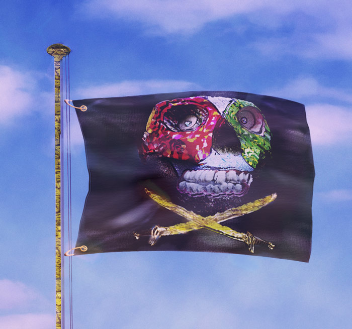 |
Posted on 18/06/08 03:43:23 AM |
|
DanLundberg
Darkroom Diva Posts: 16 Reply |
Re: Contest 202: Fly the flag
I chose to express my solidarity with Gryffindor at Hogwarts where Harry Potter is the best-known student. The flag folds are based on Vincent de Groot's flag pic at http://commons.wikimedia.org/wiki/Image:Gouden_kruisdragers_vierdaagse_vlag.jpg The owl is from a public-domain pic on Wikimedia Commons. The sky is the local weather at mid-day today. 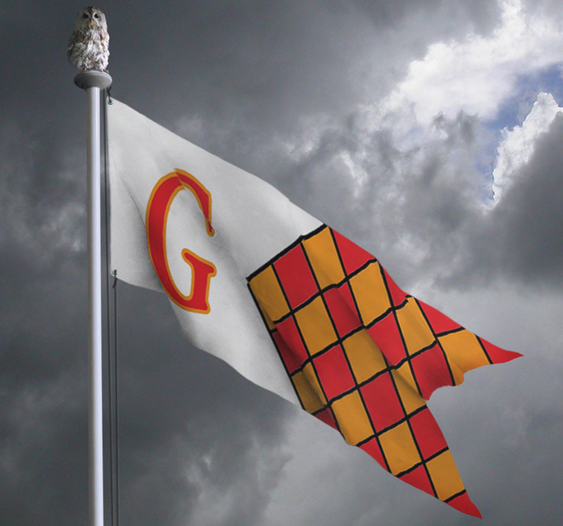 |
Posted on 18/06/08 04:31:16 AM |
|
DanLundberg
Darkroom Diva Posts: 16 Reply |
Come on November!
I'm a big fan of the topical! Nice play on Talluhah Bankhead's (I believe) comment, "If you don't have anything nice to say -- sit by me." |
Posted on 18/06/08 09:14:54 AM |
|
Jeppe Junior
* Posts: 6 Reply |
Re: Contest 202: Fly the flag
"Welcome to the forum Jeppe Junior; nice idea well done!" Thanks! |
Posted on 18/06/08 12:33:04 PM |
|
Maja
Dewey Decimator Posts: 66 Reply |
Paint with light
Someone described Photoshopping as "paint with light". How poetic. It makes a good motto too!  |
Posted on 18/06/08 12:35:12 PM |
|
Maja
Dewey Decimator Posts: 66 Reply |
Re: Contest 202: Fly the flag
This is how it originally looked like  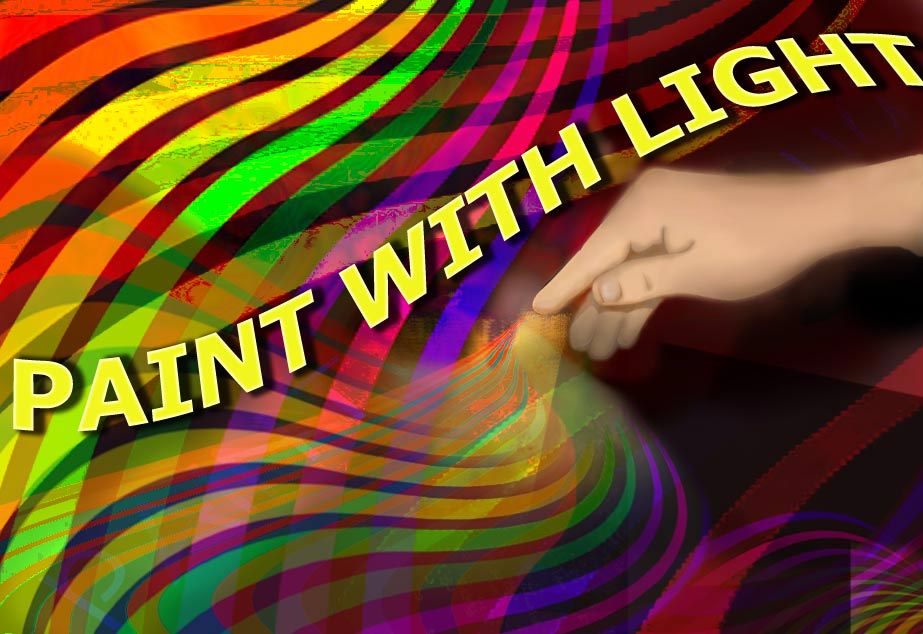 |
Posted on 18/06/08 3:32:50 PM |
|
Deborah Morley
Makeover Magician Posts: 1319 Reply |
Re: Contest 202: Fly the flag
James, that is very funny. After last weeks Challenge I just had to do something silly! 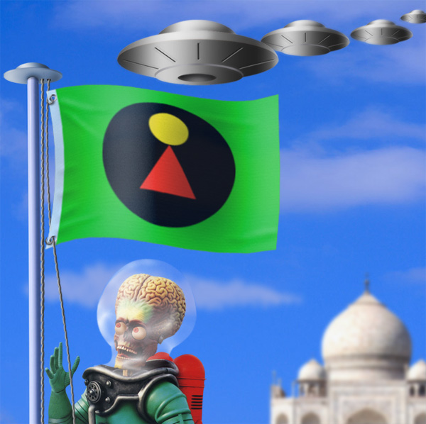 |
Posted on 18/06/08 7:54:39 PM |
|
Mick Malkemus
Meticulous Manipulator Posts: 91 Reply |
Jasper Johns revisited
I think I finally understand what Jasper Johns was trying to say with this encaustic flag. The rope was left straight on purpose, to reflect the artwork. 
|
Posted on 18/06/08 8:37:50 PM |
|
james
Surreal Spoofer Posts: 1194 Reply |
Re: Contest 202: Fly the flag
Thank you Vern, your comments are welcome. (Not sure what goes on up top) Beborah, I do enjoy a little silliness. |
Posted on 19/06/08 03:35:07 AM |
|
mariong
Bayern Brushsmith Posts: 36 Reply |
Re: Contest 202: Fly the flag
Not much time this week, but had to try out displacement mapping for the first time. Great ideas and flags this week!  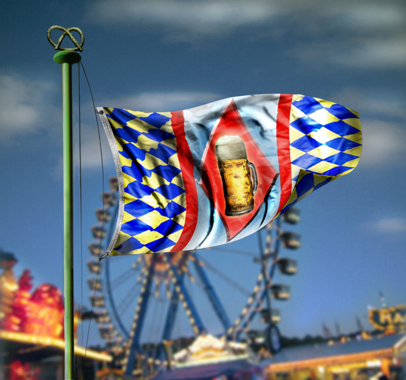 |
Posted on 19/06/08 04:36:13 AM |
|
dave.cox
Marquee Master Posts: 518 Reply  |
Re: Contest 202: Fly the flag
 |
Posted on 19/06/08 08:16:51 AM |
|
Maja
Dewey Decimator Posts: 66 Reply |
Re: Contest 202: Fly the flag
Made some minor changes. 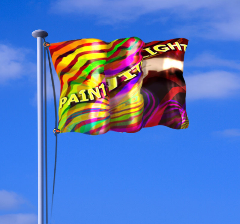 |
Posted on 19/06/08 8:14:55 PM |
|
jwhite
Collage Critter Posts: 274 Reply  |
Re: Contest 202: Fly the flag
Certified, pre-owned, vehicle.  |
Posted on 20/06/08 07:38:11 AM |
|
Steve Caplin
Administrator Posts: 7135 Reply |
Re: Contest 202: Fly the flag
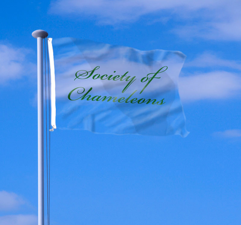
Plenty of excuses for creative outpourings in this week's Challenge - and good to see so many entertaining flags. In general, the field was divided into those of you who recognised that the cable would distort to hold the flag, and those who didn't; however, there was a fair amount of variation in your perception of the way the cable bends. First to hoist the flag was, unusually, David Asch. His reference to 'cheating' comes from the fact that this flag is a sheet he photographed for a tutorial on displacement maps in our book How to Cheat in Photoshop Elements - always good to get another plug in there, eh, David? A different sort of plug from Charlotte Babb, with the cover of the book neatly rippling. A rather bizarre leopardskin flagpole - and why not. I like the fact that the cables are distorted, but there are a couple of issues: first, only the one that's attached to the flag itself should be distorted; and second, it should surely be in a straight line to the top and bottom of the flag, rather than a curve? A Greek flag from Elliott, with some great ripples on the material. But those ripples don't translate onto the flag design: a case here for displacement maps, surely? And can flags really ripple in that way? The flag of the state of Maine from Luis, with multiple ripples and a design that maps well onto the surface. I like the shading, particularly, although I'm nor sure about the well-defined border. I thought we might get some nationalism this week... is that the New Zealand crest on vibeke's flag? If so, what's with the ladder and the cannonballs? And I daren't even ask what the device right at the bottom of the shield is... It seems Nick Curtain is still smarting from last week's Challenge - I'll have to send you one of these glasses, Nick, so you can see they really are that thick. Some good rippling here, but I'm not sure about the curve on the bottom of the cable - straight, I'd have thought. Some serious movement from tooquilos, whose flag is rippling beautifully in the animated wind. It also seems to be jumping around on its fixings in a rather alarming way - I'd be worried, given the extremely high typhoon it finds itself in. I really like the bird in Steve Mac's entry, although the flag itself looks rather more like plywood than fabric. Maybe it's an offcut from one of his staircases? With the top so much longer than the bottom, surely the bottom needs to undulate to take up the slack? Good animated distortion from michael sinclair, with the design wrapping convincingly over the flag texture. A little too much distortion at the fixing end, though: remember, you can use mid tones on displacement maps to prevent any displacement taking place. It seems brewell is rather obsessed with these tetrahedrons, having spent the last week painstakingly cutting them up and rearranging them. A good sense of wind here, but the strong diagonals in the design are rather too straight for comfort: I'd like to see these rolling over the surface more. A nicely tattered flag from Andy L, with a convincing cable. That's exactly what I'd have done: keep the cable straight, and bend the flag edge. Perhaps a few individual strands of cotton flying out, just to accentuate the tearing effect. A touch of politics from Mick Malkemus - and I won't rgue with that. I think damaging the Stars and Stripes may be the US equivalent of High Treason, though. Are those icicles dripping from Bush? And those are huge water droplets! I really like the second entry - but, in fairness to Jasper Johns, you really should have rippled the flag! There seems to be no end to james' patience and determination: I lost count of how many layers were involved in getting that monkey to climb the flagpole, leap from the top and grab the banana. Amazing! A first entry this week from Jeppe Junior, who's begun by turning the idea on its head with a flag so weighty it bends the pole. Not only is the pole beautifully bent, the problem of the cable has been neatly solved by wrapping it around the pole. The only different I'd lke to see is the top cable, which should be hanging down under the weight - but this is a fantastic entry, and much valued. Welcome to the forum, Jeppe! A wonderful pair of bloomers from katew, and it's the transparency (and of course the detail of the red bow) that really makes this image work so well. Great stuff, Kate - very tickled. I like the way the lettering slides off in mguyer's entry, although the flag itself could do with stronger shading to accentuate the rippling fabric. And do they really make flags out of burlap? Choose your textures with care! The bent rope in the second entry does make sense, but of course only the strand holding the flag should be pulled - and it does need to be fixed to the flag in some way! A most entertaining skull and crossbones from Ellen - now there's a modern take on an old design. The distortion is good, the fixings are neatly done (although I'm not sure how those strings are holding the flag to the cables). But what's the texture on the flagpole? Some kind of stone? A very accomplished effort from DanLundberg, who has chopped up the design on the flag to hide those portions that are under protruding ripples. And it's a very effective solution, resulting in greater realism. The shading on the owl and flagpole also match the lighting in the sky and on the flag itself, and the cable does look well and truly fixed onto the flag. All in all, a well thought-out and well executed piece, showing great attention to detail for a thoroughly convincing result. And well deserving of an early title for you, too. Without knowing anything about you (you need more in your profile!) I think Wizard Waver suits this week's entry. Good work, Dan. Some very interesting distortion from Maja, on a very tasty flag design. I really like the way the design rolls over the flag, but you do have to watch over-stretched distortions: the half-hidden letter W, for instance, is rather too wide here. I like the second entry, too - but why does the cable fade off at the bottom? I wonder if Deborah Morley's Mars Attacks entry was sparked off by noticing a similarity between the flagpole cap and the shape of the flying saucer? It's a really entertaining piece of work - I especially like details such as the rope texture. But the scale issue with the flying saucers bothers me: either they're behind the flagpole, in which case they're too big to sit on it, or they're in front, in which case the largest one ought to be on the right so they get smaller as they approach it. And where's the design on that flag from? I'm sure I recognize it... Splendid work from mariong, with a Bavarian flag modified to include a glass of Bavarian beer (and, of course, a Bavarian pretzel on the pole). The distortion and shading are both excellent: I particularly like the way in which the bottom right corner curls back on itself, which adds a tremendous sense of three-dimensionality to the piece. Excellent! A subtle chameleon flag from dave.cox - a neat idea, having a flag that blends into its background. But you really need to distort that text to match the flag, Dave: it's just too straight and regular. An old-fashioned flag from jwhite, matching the wrecked truck to which it's attached. I like the way it's fixed on, and the slight translucency is appealing. But shouldn't the flag be tattered, to match the truck? And you need to watch the amount of distortion: while rippling can make elements appear narrower than they really are, it can never make them wider - and the bottom left star is way too big compared to the others. Image Warp is a great tool, but you have to move more anchor points! |
Posted on 20/06/08 08:13:26 AM |
|
Nick Curtain
Model Master Posts: 1792 Reply |
Re: Contest 202: Fly the flag
Smarting Mr C, never! I was really stuck for a theme and wanted to steer away from the traditional, so a previous challenge seemed to fit the bill. Knowing that companies have their own flags, I decided to use the glass as the subject. You're absolutely right about the rope and I saw my error as soon as Andy had posted his entry. Please send the glass by very secure delivery. I don't want it to come to any harm, as there's a serious viewing session in store for it on arrival. As always, thanks for the comments. Nick |
Posted on 20/06/08 10:11:31 AM |
|
vibeke
Kreative Kiwi Posts: 2167 Reply |
Re: Contest 202: Fly the flag
Not the New Zealand Crest, but the Friis Family's. |
Posted on 20/06/08 10:58:32 AM |
|
katew
Virtual Virtuoso Posts: 681 Reply |
Re: Contest 202: Fly the flag
Thanks Steve! |
Posted on 20/06/08 11:07:14 AM |
|
Steve Mac
Grunge Genie Posts: 539 Reply |
Re: Contest 202: Fly the flag
Thanks Steve. Not my favorite entry either. |
| page: 1 2 3 last |
