
| » Forum Index » The Friday Challenge » Topic: Contest 206: The Wright Stuff |
|
Posted on 13/07/08 3:56:30 PM |
|
Andy L
Exquisite Executioner Posts: 30 Reply |
Re: Contest 206: The Wright Stuff
It looked to me as though he was very interested in something. Well this woman would interest me!! 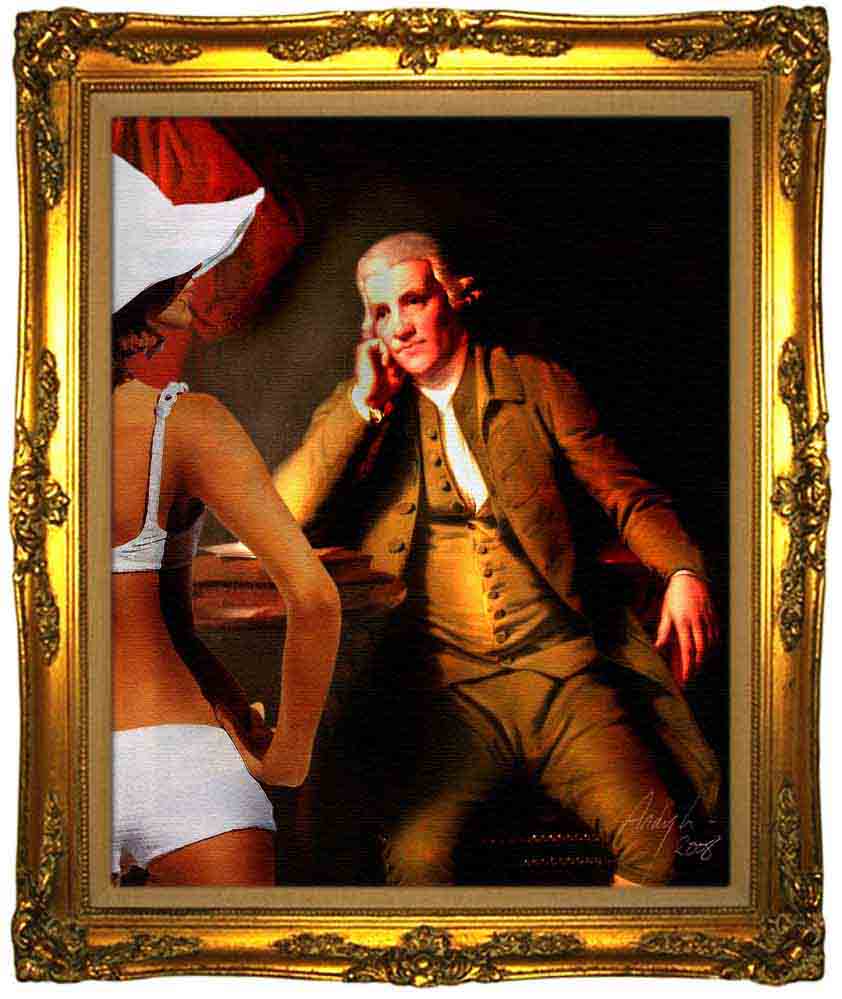 |
Posted on 14/07/08 12:09:46 PM |
|
vibeke
Kreative Kiwi Posts: 2167 Reply |
Re: Contest 206: The Wright Stuff
Greetings from sunny Antibes, but I did find a few spare moments.. 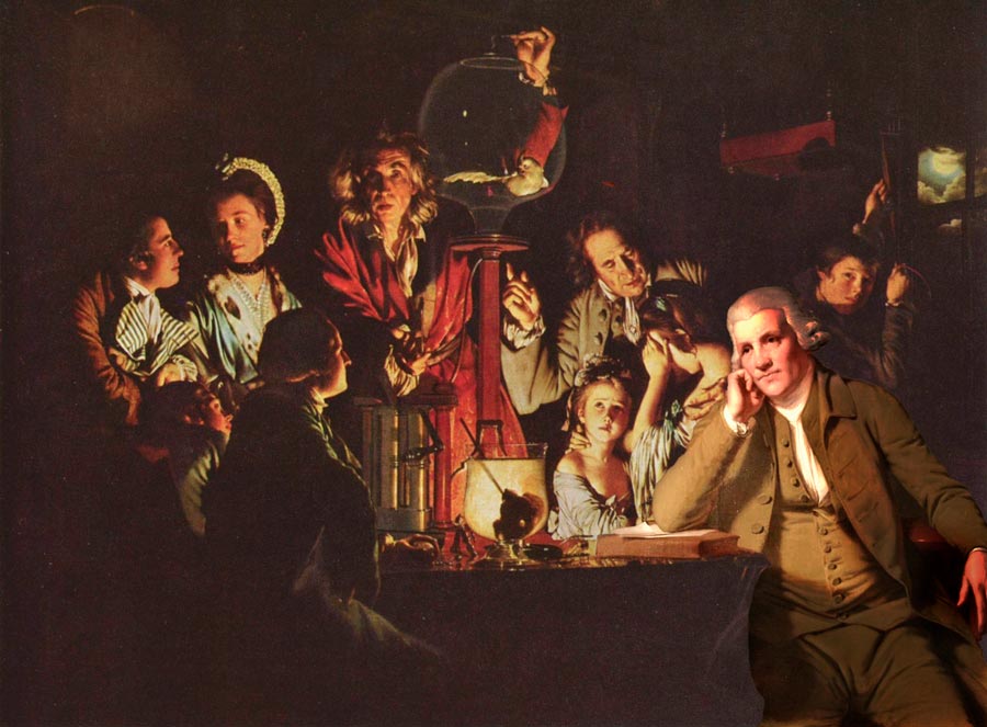 |
Posted on 14/07/08 12:59:23 PM |
|
tooquilos
Wizard of Oz Posts: 2957 Reply |
Re: Contest 206: The Wright Stuff
Thank you Michael  Cute gerbil Cute gerbil 
|
Posted on 14/07/08 4:00:14 PM |
|
michael sinclair
Off-Topic Opportunist Posts: 1871 Reply |
Re: Contest 206: The Wright Stuff
It's ferret Anna
Vibeke that is astonishingly faultless: a wonderful piece of work  |
Posted on 14/07/08 4:00:14 PM |
|
michael sinclair
Off-Topic Opportunist Posts: 1871 Reply |
Re: Contest 206: The Wright Stuff
double post |
Posted on 14/07/08 5:17:11 PM |
|
vibeke
Kreative Kiwi Posts: 2167 Reply |
Re: Contest 206: The Wright Stuff
Thank you Michael, love your naughty ferret. |
Posted on 14/07/08 7:48:14 PM |
|
james
Surreal Spoofer Posts: 1194 Reply |
Re: Contest 206: The Wright Stuff
http://i153.photobucket.com/albums/s211/fungismith/josephwright.gif 
|
Posted on 15/07/08 10:27:00 PM |
|
gaoxiguo
赤土陶 器战士 Posts: 114 Reply |
Re: Contest 206: The Wright Stuff
Vibeke 处理的影调和场面及烘托的气氛非常好,如果将左臂再加深会更好得融入背景,非常棒! |
Posted on 15/07/08 11:23:42 PM |
|
char
Collage Conquistador Posts: 141 Reply  |
Re: Contest 206: The Wright Stuff
A brilliant composition Vibeke!!!!!  |
Posted on 16/07/08 01:54:18 AM |
|
Ellen
Fire Queen Posts: 102 Reply |
Re: Contest 206: The Wright Stuff
I agree - Vibeke, it looks seamless! The ferret is great fun too- I got distracted looking at orreries. 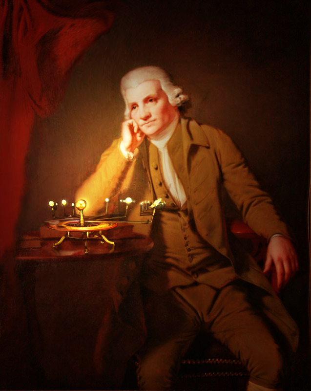 |
Posted on 16/07/08 6:27:15 PM |
|
katew
Virtual Virtuoso Posts: 681 Reply |
Re: Contest 206: The Wright Stuff
Let's see how he likes being in an air pump!
 |
Posted on 16/07/08 7:06:48 PM |
|
Patrick33
* Posts: 8 Reply |
Re: Contest 206: The Wright Stuff
 |
Posted on 16/07/08 7:43:57 PM |
|
Deborah Morley
Makeover Magician Posts: 1319 Reply |
Re: Contest 206: The Wright Stuff
Run out of time as ever  |
Posted on 17/07/08 7:03:18 PM |
|
jwhite
Collage Critter Posts: 274 Reply  |
Re: Contest 206: The Wright Stuff
Of course today, Wright would of subsidized his mediocre art work with product placements.  |
Posted on 18/07/08 06:14:58 AM |
|
Tom
Texture Technologist Posts: 405 Reply |
Re: Contest 206: The Wright Stuff
 |
Posted on 18/07/08 08:48:16 AM |
|
Mick Malkemus
Meticulous Manipulator Posts: 91 Reply |
Re: Contest 206: The Wright Stuff
James, James, you are just too funny! |
Posted on 18/07/08 08:57:59 AM |
|
Steve Caplin
Administrator Posts: 7135 Reply |
Re: Contest 206: The Wright Stuff
Some ingenious approaches to the portrait problem this week. One curious omission: many of you have placed lamps or candles on the table in front of the subject, without adding a shadow on the wall behind him. This, I'd have thought, would be a vital part of the change: that huge expanse of wall is crying out for a man-shaped shadow. First to squeeze the oils was Trev, with a beautifully created oil lamp. There's a warmth to the scene now, and the overall shading works well - but no shadow behind him (see above). Also, the lamp seems to have a curious translucent quality. This works well on the lantern, but why can we see the book through the brass base? Strong rays of light from Maja, with beautiful colouring: shady blue away from the light, warm yellow in its beam. The individual rays are perhaps a little too well defined, though; but I like the flare on his arm and face. Again, he should cast a shadow on the wall behind him. A strong sense of light and shade from Ben Mills, with a warmth that's bordering on jaundice. No visible light source, though: we could do with a hint of where the illumination is coming from. A bright, sunny scene from Mick Malkemus, who's almost backlit his subject with a dazzlingly bright background. Again: with the strong shadows on the figure, shouldn't he be casting a shadow on the wall? A nice idea from Eliott: a window casting its shape on the scene. The trouble is, if you take this approach you need to make sure the window light wraps around the three-dimensional nature of the scene. So it should bend around the man and the curtain in order to make them look solid; at present, it's as if the window light is acting upon a painting. Which, in a sense, it is. A touch of real genius from Eva Roth, who has taken elements from the Air Pump painting and added them to the scene. Not only are the air pump and the surrounding equipment perfectly blended in, there's one of the original spectators providing a foreground element, too. Best of all, of course, is the way the bird has escaped its prison, sprouted a new wing and taken flight. A fantastic idea, beautifully realized - and well deserving of a title for you, Eva. Hmm... no details in your profile... so on the basis of this image, I think it has to be Luminous Liberator. Great idea, great execution. I enjoyed Josephine Harvatt's entry: somehow, the subject's forlorn expression makes perfect sense in the light of his hand-written electricity bill. The candle is a neat touch, although the glow around it should be more orange (the colour of the flame) than white. The position - behind the book - is appropriate for the existing shadow on the figure, though. I make a guest appearance in gaoxiguo's entry - complete with How to Cheat in Photoshop lettered along the side of the book. This must be an early edition! The text in his post reads: "Steve Caplin Is the great artist, I want with the picture on master setoff, ha-ha, to borrow the new head picture not to be able sufficiently to be angry". Thanks, Babelfish. The added frame works well, and I like the reflections of the viewing figures. Good work! A remarkably similar facial montage from Nick Curtain, whose source of illumination is a monitor with the portrait open in Photoshop. It's well placed for the lighting in the scene, but perhaps we need a little extra shadow on the top of the head, where the screen light wouldn't reach it? Some fantastic disco lighting from tooquilos, with an animated background and a new table leg that looks like it's been taken from Steve Mac's book cover. Best of all is the dripping wine bottle, which has been perfectly achieved! And I love the white suit: although perhaps the shadows should be a little deeper? A novel approach from Tony A1, whose source of illumination is a charmingly old fashioned (but perhaps not quite 18th century) television set. Can't make out what he's watching, but the remote in his hand is a nice touch - and it fits there perfectly. A beautiful candlelit scene from brewell, with a skull that matches the scene immaculately. Great new lighting, with strong extra touches such as the shadow to the side of the subject's nose, and the hot spots on the leg and arms. The shading around the edge works well, but - again - a candle in this position really needs a shadow of the man on the wall behind him! A new member this week: and dikidee has produced a strong, moody scene with dramatic lighting and deep blue shadows. It's very close to the style of the Air Pump painting, and is a very evocative piece of work. Welcome to the forum! Some charmingly anachronistic animation from michael sinclair, whose figure is chatting on the phone (great, subtle lip movement here) while removing a ferret from his trousers - complete with neatly distorted fabric. (At least, I assume it's a ferret: it could be a gerbil, which would make this a whole different story altogether.) That couch seems rather too small for him, though, wouldn't you say? The new watch is a good detail! Dramatic new lighting from Andy L - and, at last, the poor fellow has something to spend eternity gazing at. It's a great composition, which adds a lot of life to the scene: and this woman's certainly enough to intrigue an 18th century gentleman! I love the way vibeke has worked the subject into the Air Pump painting - he's a perfect fit there. But you do need to watch the relative tones of the two images: the darkest shadows in the background are far brighter than the shadows in the added figure. All that's needed here is for the low-contrast original to be strengthened somewhat. Amazed you're finding time to do this while you're touring the world! A classic candle from james, served up as an entree to the real entertainment: the animated entry. And it's a James classic, bristling with intrigue: what's he going to do with the knife? What is the significance of the cat? Astonishing movement, as always: the way the figure's clothes have been altered to enable him to stand is amazing. Look at the rebuilt coat, the adjusted legs, the swinging arms: a colossal amount of work has gone into this. James, this is wonderful! And there's even a shadow on the wall behind him! The orrery in Ellen's painting is the perfect accompaniment - especially since Joseph Wright had a bit of a thing about orreries. There's a new warmth here, too, and the object explains his wistful gaze. It's certainly done the job of making the portrait more interesting! Clever stuff from katew: that's one way to integrate the two pictures! Good to see the vacuum is having no ill effects on him, though. Patrick33 has given the subject what looks like a brain in a jar to contemplate: it's one of the scientific experiments in the Air Pump painting. It fits well in here, providing a focus of attention: he really is looking right at it. And good to see an early edition of the book in there, too! I can't worked out if Deborah Morley has tweaked the subject's smile, or if it's just my imagination: but he looks far happier nestling in a warm bosom than he did merely resting on his hand. A charming idea, and one that has been perfectly brought to life: beautiful! Funny stuff from jwhite, whose idea of product placement is an excellent one. The Coke sign fits well into the background, perfectly lit (although I'd have moved it so the bottom is just covered by his shoulder, to integrate it more). The Oreo box is rather bright and brash - but I like the way the hand has been turned to hold it in place. A cute book title, too. And, er.... what's with the head? If you can't bring the light to the man, then bring the man to the light. This is Tom's approach, and it's one that clearly works: he looks perfectly at home in ancient Rome, with adjusted lighting to match the scene. He still looks just as miserable, though. Just to explain what I mean about the shadow: here's a quick image with the shadow added on the wall behind him. I think it helps the illumination to work:  |
Posted on 18/07/08 09:07:09 AM |
|
Mick Malkemus
Meticulous Manipulator Posts: 91 Reply |
Vibeke Critique
Vibeke, like everyone, I am really impressed with this work. I wanted to play devil's advocate just a little, because my eye doesn't see perfection, but you are very close to it. (I assume forensic photographers are examining this for a court case, to see if it is a real photo of a painting or not.) If we darken the levels, we see that the value of the inserted man is a bit too bright compared to the surrounding area. This tends to make him the focal point, at least when I look at it. The other thing is the reflection of the book. It isn't there. I vote yours at the best entry this week. Great job.  |
Posted on 18/07/08 09:17:38 AM |
|
Deborah Morley
Makeover Magician Posts: 1319 Reply |
Re: Contest 206: The Wright Stuff
Many thanks Steve. I agree he does look happier, but I didn't do it! |
Posted on 18/07/08 09:48:02 AM |
|
Maja
Dewey Decimator Posts: 66 Reply |
Re: Contest 206: The Wright Stuff
Thanks Steve! Of cooooooourse..... the shadow on the wall!!! Why have I not thought of that? Congratulations Eva, it is such a beautiful image. |
| page: 1 2 3 last |