| » Forum Index » The Friday Challenge » Topic: Challenge 340: Name that train |
|
Posted on 01/03/11 10:03:40 AM |
|
Sophie
Political Parodist Posts: 595 Reply |
Re: Challenge 340: Name that train
Fantastic Michael! I'm blown away by this week's display of talent.  |
Posted on 01/03/11 10:43:50 AM |
|
GKB
Magical Montagist Posts: 4131 Reply |
Re: Challenge 340: Name that train
Very clever Ted. A jolly good wheeze, in fact.
_________________ If at first you don't succeed, destroy all evidence that you ever tried. |
Posted on 01/03/11 6:35:16 PM |
|
Eggbox
Ovoid Opportunist Posts: 797 Reply |
Re: Challenge 340: Name that train
Thank you Gordon. It was like a deep intake of Ozone when I posted. Ted |
Posted on 01/03/11 7:12:34 PM |
|
Sophie
Political Parodist Posts: 595 Reply |
Re: Challenge 340: Name that train
Heavy breathing Ted? Do elucidate so I can understand the subtleties of your clever entry. 
|
Posted on 01/03/11 8:18:51 PM |
|
GKB
Magical Montagist Posts: 4131 Reply |
Re: Challenge 340: Name that train
Sophie perhaps the following site might help? http://www.makingthemodernworld.org.uk/icons_of_invention/technology/1750-1820/IC.006/ _________________ The early bird might get the worm, but the second mouse gets the cheese. |
Posted on 01/03/11 8:59:43 PM |
|
vibeke
Kreative Kiwi Posts: 2167 Reply |
Re: Challenge 340: Name that train
found a little time to play.  _________________ Perfect confidence is granted to the less talented as a consolation prize. |
Posted on 01/03/11 9:11:28 PM |
|
josephine harvatt
Gag Gadgeteer Posts: 2605 Reply |
Re: Challenge 340: Name that train
I love the Vincent Van Goch train Lunah - and Michael, what can I say but "Hoots mon!"  _________________ I'm not really bad - I just draw that way |
Posted on 01/03/11 11:11:47 PM |
|
Sophie
Political Parodist Posts: 595 Reply |
Re: Challenge 340: Name that train
Thanks Gordon. |
Posted on 01/03/11 11:15:57 PM |
|
Sophie
Political Parodist Posts: 595 Reply |
Re: Challenge 340: Name that train
No political bias here, just a challenge opportunity.  |
Posted on 02/03/11 09:04:06 AM |
|
josephine harvatt
Gag Gadgeteer Posts: 2605 Reply |
Re: Challenge 340: Name that train
_________________ I'm not really bad - I just draw that way |
Posted on 02/03/11 09:08:23 AM |
|
Eggbox
Ovoid Opportunist Posts: 797 Reply |
Re: Challenge 340: Name that train
Sorry about that! Ted  |
Posted on 02/03/11 1:02:07 PM |
|
puffin31939
Montage Mariner Posts: 383 Reply |
Re: Challenge 340: Name that train
I hope I have made a better job of the people sizes - I drew in a horizon for the man. I fought for ages to get the sun emblem looking right and didn't! I have left it in hoping someone will tell me where I have gone wrong Angela  _________________ Man cannot change the direction of the wind but he can adjust the sails |
Posted on 02/03/11 4:28:53 PM |
|
james
Surreal Spoofer Posts: 1194 Reply |
Re: Challenge 340: Name that train
http://i153.photobucket.com/albums/s211/fungismith/olympus_2.gif |
Posted on 02/03/11 9:05:35 PM |
|
Dooley
** Posts: 76 Reply |
Re: Challenge 340: Name that train
When he pulled up that Reno hill He whistled for the crossing with an awful shrill The switchman knew by the engine's moan That the man at the throttle was Casey Jones 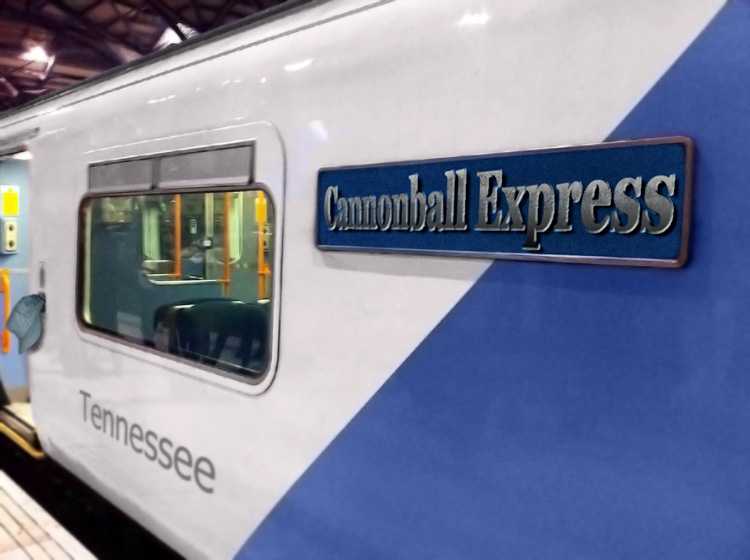 _________________ I've fallen and I can't get up. |
Posted on 02/03/11 9:49:14 PM |
|
brewell
Pixel Pentagrammarian Posts: 752 Reply  |
Re: Challenge 340: Name that train
_________________ Is it necessary? Does it work? |
Posted on 03/03/11 05:16:26 AM |
|
Marty
* Posts: 39 Reply |
Re: Challenge 340: Name that train
 |
Posted on 03/03/11 8:40:28 PM |
|
Emil
KAFKAsFRIEND Posts: 413 Reply |
Re: Challenge 340: Name that train
 _________________ For me the creative process is more one of discovery than creation. - James Lee Burke |
Posted on 04/03/11 09:13:43 AM |
|
Steve Caplin
Administrator Posts: 7138 Reply |
Re: Challenge 340: Name that train
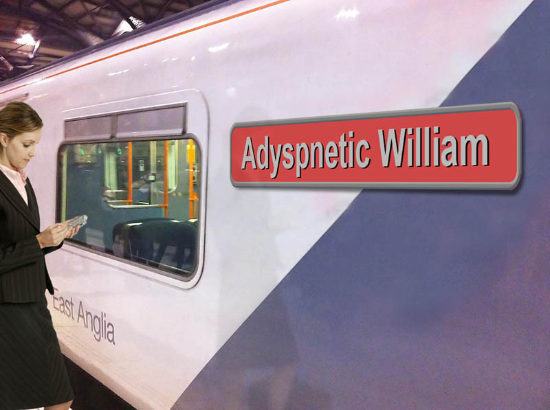
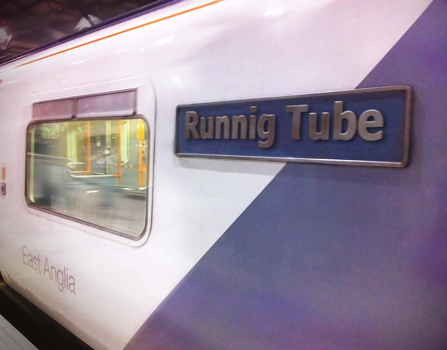
First to leave the station this week was bjansen, with a rebranded Hogwarts train, complete with Harry Potter sitting inside. I like the new colours, and the fact that you've taken the train outdoors (good track). Since it's now going at speed, perhaps the door should be closed? And maybe a touch of shine on that lettering? GKB makes a guest appearance in his own train this week, with a rather magnificent crest - is that real, or did you devise it yourself? I'd tone down the colour a little, as that bright yellow looks rather more like plastic than gold or brass. And I'd be the last to accuse you of being big-headed, Gordon, but dont you think you're just a touch oversized for the carriage? A great early Royal Wedding scene from Josephine Harvatt, with Our Future King and his Bride To Be (like the flowers, a nice touch). Good graffiti, too - a very convincing spray paint effect, with the variation in spray strength. The lettering has a good old, dull shine, but is it leaning backwards slightly? A magnificently flooded scene from tooquilos, with great underwater distortion and miscellaneous flora. I love the diver being chased off by the swordfish in the animated version - and that red stain at the end... A truly convincing sign from Nick Curtain. I don't know whether to congratulate you on finding an existing sign from just he right angle, or be overawed by your skill if you've constructed it from scratch... I suspect the former, but do let us know! A very jolly train from gaoxiguo, with fine chrome lettering. I like the party scene inside - that does look like a good train to be on! I suspect there are hidden meanings in Ben Mills's entry. Valentines Park is a park in Ilford, presumably near the depot, and Satin Algae (surely it should be Saint Algae?) is an anagram of East Anglia... is that you inside, Ben? Have you grown a beard? A touch of a perspective problem on the lettering: it's much smaller on the left than on the right (too much for the angle of the sign, that is). I like LonnieK's Train Without An Interesting Name - perhaps that should have been preceded by the Mississippi Area Railway Kitchen? When you're applying a bevel and emboss to perspective text, though, you can't apply it and then distort the text: the bevel then doesn't shrink in perspective. The only way is to apply it to the text straight, then turn the text into a Smart Object, then distort the Smart Object. Good to see a couple of characters from thefullmontage have got together! Beautiful styling from Garfield72, with a rather good handwritten font and that nice old Photoshop feather at the top. Good shine here, François - but are you sure that apostrophe should be there? I really liked brewell's train with the rain on the inside - very nicely achieved, especially how the people are integrated into the interior. The lettering seems a little distorted on the left, and leaning over slightly; and is Mumbai in the right perspective? Some rather fine shining from Deborah Morley, with great highlights - but shouldn't we be able to see a little of the edge of the letters from this angle? I like the expectant look on the girl in the carriage, and she does look well placed behind that glass. I like the idea of PDelavigne's Cheat Express, especially the man reading the book inside the carriage. He needs a bit of reflection on top of him so he looks like he's behind glass. And is the perspective on the lettering just too strong for the sign? A magnificent Van Gogh train from lunah, with his signature as the name, a painting beautifully spread across the whole of the exterior, and the window recoloured to match. Is it just a coincidence that the interior colour scheme is also orange and blue? Very effective! That's one very mean panda from tomiloi - is he from the Kung Fu movie? I like the shine on the lettering, but the perspective distortion doesn't match the sign: the letters get too small too quickly. A great idea from emanuelefrau, who has turned the train into an aquarium. A very neat sign, and the fish work well within that space. Bur, er, shouldn't you have closed the door before filling the train with water? Terrific games console lettering from 2tonezack, with a great shine on it and very good perspective distortion. I like the way the PacMan figure has been placed neatly behind the glass - although the hat now looks somewhat transparent. Is that East Pacland lettering right? More perspective distortion, maybe? A slew of entries from michael sinclair, starting with a clever wordplay on 'depot' - and yes, there's Gaddafi, as imperious as ever. A bit of trouble with perspective on both sets of lettering, though - the effect is just too strong. A great Flying Scotsman in the second entry - I assume you didn't take that photo yourself... and you've done a meticulous job cutting out all those people for the third entry - but that shadow makes the edge look rather fuzzy. And it should be smaller at the back than at the front! It took me a moment to translate Eggbox's Adyspnetic William into Puffing Billy - and I still haven't looked up Adyspnetic to see what it really means. Nice idea! And a very neatly adjusted sign in the second entry - that's one way to deal with a typing error! You get points deducted for not flipping the woman's reflection horizontally, though... A couple of weeks late for Valentine's day, but vibeke's loved-up entry is altogether rather splendid. The kissing couple clearly couldn't wait until they got seated, and that pot of roses is a very nice touch. Fantastic lettering from Sophie - the shine on there is exactly right, and looks entirely convincing. A good choice of font, too. I like Nick Clegg in the seat, nicely coloured to match the tones of the interior: but why is West Minster two words? And is the perspective right on that lettering? A very accomplished train from puffin31939, with a very train-like background on the sign, and terrific lettering. The people inside the carriage have been nicely placed behind the glass, too. As for that sun logo... well, the only real problem is that we're looking at it from slightly above, which means we should be able to see something of the edge. The shadow indicates that it's not flat on the train surface, so the thickness of the material needs to be seen - easy enough to achieve just by placing a copy behind it, and filling that copy with an appropriate dark grey. I always have to watch james's animations at least a dozen times to be sure of seeing everything... and there's a whole love story being unfolded for us here. I had to open the GIF in Photoshop before I was sure of the 2012 Olympiad logo on the back of the boy's sweater! And congratulations on being the only person this week to actually close the door. A great Casey Jones reference from Dooley, with an appropriately-named train and location - and that cap hanging on the handle is perfect. Too much perspective on the lettering though - but you aren't the only one! Nicely chiselled lettering from Marty, with a very well accomplished angle of view. I'm a little confused by Phil, though: is he a karaoke performer or a station announcer? Hang on - that's not Phil Collins, is it? Have I missed an obvious Genesis reference? A great sense of movement from Emil, with a neatly closed door and a very good speed effect. But, er... Runnig? Are you sure? __________________________ Several of you seemed to have trouble with the perspective on the lettering in this Challenge. So here's a quick guide to the easy way to get it right. This is the problem you faced: the lettering needs to be inset from the edges of the sign, so how can we see where to position the corners? Here's what you might get: 
The simple solution is to make a larger selection around the lettering before you distort it. This selection matches the size of the sign around the text: 
Now, when you use Free Transform to distort it, all you have to do is to drag the corners to match the corners of the sign: 
If you want to adjust it - let's say we think the left edge is too tight - all we have to do is drag the handle on the middle of that side, and it will move in perspective: 
Simple! |
Posted on 04/03/11 09:24:57 AM |
|
josephine harvatt
Gag Gadgeteer Posts: 2605 Reply |
Re: Challenge 340: Name that train
Thanks for that Steve - you were right, it is leaning back slightly now I review it _________________ I'm not really bad - I just draw that way |
Posted on 04/03/11 09:33:44 AM |
|
Nick Curtain
Model Master Posts: 1792 Reply |
Re: Challenge 340: Name that train
Thanks Steve Yes, it's a real Googled engine nameplate, but not taken from the right angle. It took a bit of skew and distortion to make it fit. I added noise to a new grey layer and increased the size to help the nameplate blend and match the noise in the original image. Others may be interested that you can open a JPEG in Camera Raw and apply the noise reduction, which is excellent in CS5. I didn't do that with this image though. Nick |
| page: 1 2 3 last |