
| » Forum Index » The Friday Challenge » Topic: Challenge 1076: Opening the pavilion |
|
Posted on 20/10/25 3:16:09 PM |
|
lwc
Hole in One Posts: 3467 Reply |
Re: Challenge 1076: Opening the pavilion
She was so small that I didn't expect anyone to see her... hope your eyesight continues to improve. |
Posted on 20/10/25 3:18:31 PM |
|
lwc
Hole in One Posts: 3467 Reply |
Re: Challenge 1076: Opening the pavilion
IR Pavilion 
|
Posted on 20/10/25 3:55:33 PM |
|
GKB
Magical Montagist Posts: 4130 Reply |
Re: Challenge 1076: Opening the pavilion
Very nice Loyd. Hooray for IR _________________ Why is it that all the contestants in the Miss Universe contest are all from Earth? |
Posted on 20/10/25 8:37:01 PM |
|
lwc
Hole in One Posts: 3467 Reply |
Re: Challenge 1076: Opening the pavilion
Thanks Gordon, although I make thousands of color photos a year, IR remains my favorite medium.  |
Posted on 21/10/25 09:34:56 AM |
|
Mariner
Renaissance Mariner Posts: 3255 Reply |
Re: Challenge 1076: Opening the pavilion
 |
Posted on 22/10/25 12:23:40 PM |
|
lwc
Hole in One Posts: 3467 Reply |
Re: Challenge 1076: Opening the pavilion
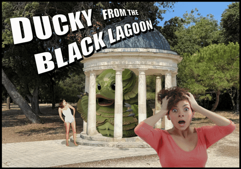
Sorry about the blatant theft of your rubber duck concept Gordon the  made me do it. made me do it. |
Posted on 22/10/25 1:59:38 PM |
|
GKB
Magical Montagist Posts: 4130 Reply |
Re: Challenge 1076: Opening the pavilion
I was playing around with this panoramic shot of Rhossili Bay, near Swansea, that I shot a few weeks ago and discovered that a pavillon had been erected in honour of HTCIP on this beautiful site. The panoramic image covers some 150 degrees. 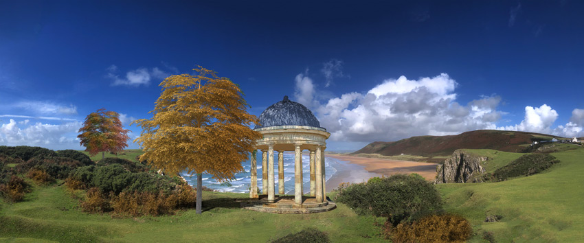 _________________ Have you ever noticed that all the instruments designed to detect intelligent life are pointing away from the Earth? |
Posted on 22/10/25 2:01:09 PM |
|
GKB
Magical Montagist Posts: 4130 Reply |
Re: Challenge 1076: Opening the pavilion
Loyd - you are forgiven; don't let it keep you up at night 
_________________ Whatever you do in life do it with the enthusiasm of a 4-year old in a Batman suit. |
Posted on 23/10/25 09:38:27 AM |
|
DavidMac
Director of Photoshop Posts: 6037 Reply  |
Re: Challenge 1076: Opening the pavilion
Well this is an unusual approach Micheal. You seem to have transported Steve's pavilion to where it already is ............
But nicely done. _________________ The subtlety and conviction of any Photoshop effect is invariably inversely proportional to the number of knobs on it ....... |
Posted on 23/10/25 1:24:24 PM |
|
Mariner
Renaissance Mariner Posts: 3255 Reply |
Re: Challenge 1076: Opening the pavilion
Thanks David. What I did was to swing the viewpoint around to take in the sea, which makes the picture more interesting. I hope. Observe the interplay between the four characters, which, I must admit, is more luck than good management. |
Posted on 23/10/25 4:40:58 PM |
|
DavidMac
Director of Photoshop Posts: 6037 Reply |
Re: Challenge 1076: Opening the pavilion
Open to various interpretations. Seems to be more a picture of self absorption and lack of interplay. But maybe that's exactly what you mean ................ _________________ The subtlety and conviction of any Photoshop effect is invariably inversely proportional to the number of knobs on it ....... |
Posted on 24/10/25 06:13:51 AM |
|
Mariner
Renaissance Mariner Posts: 3255 Reply |
Re: Challenge 1076: Opening the pavilion
In my iimagination the two couples know each other well. Jim and Marie fall out and Jim goes and sits on the bench, sulking. Marie sits with Blondie and Wayne. Blondie takes photographs of Jim sulking, makes a comment and laughs. Wayne laughts with her. Marie scowls and wishes she were somewhere else. (to be cont'd?) |
Posted on 24/10/25 08:57:58 AM |
|
Steve Caplin
Administrator Posts: 7135 Reply |
Re: Challenge 1076: Opening the pavilion
It didnt occur to me when posting this Challenge that the hardest part would be those square capitals on the columns added to the back. It would have been so much easier if they were round! First to visit the pavilion this week was lwc, moving it to a new location (attractive park, by the way) and with added symmetry. The square capitals are a real problem, arent they. But I the darkening of the columns works well. I like the distance view, but couldnt spot the third person until you pointed her out. The distance certainly helps obscure those square capitals! Splendid trees in the infrared version, which is bound to appeal to GKB. Youd think the couple would find somewhere more private for their shenanigans. Is that one of Gordons rubber ducks gone bad? Its a really scary monster! But it does seem to be well caged by those columns. A perfectly realised background infill from GKB, with suitably shaded columns. Those square capitals! I like the statue, although he seems rather odd being placed flat on the ground without a plinth. Ive noticed that you something of an obsession with rubber ducks. Well, they are very cute as is the candy-stripe carousel. Ah that Magic Roundabout theme tune will be going round my head for the rest of the day! Absolutely charming. I really enjoyed this one. I like the Rhossili Bay, with its added attraction. Purists might wonder whats casting those shadows on the roof of the pavilion. Brilliant work from Ant Snell, who has managed to give the impression the roof is being suspended even though it hasnt moved from its original position. Theres so much great detail here: the way the ropes wrap around the roof, the man holding the column, and especially the plan diagram of the pavilion did you draw that from scratch? Outstanding, Ant. All it needs is some kind of fixing where the ropes meet the underside of the roof, and perhaps a couple of shadows of the rope. I see the square capital issue has plagued even Mariner, although it is barely noticeable in the shadows. A well-judged background, and the courting couple make a good focus. Tremendous opening-out of the scene in the wider entry, restoring the view over the sea (although the Ile de Ré would be surprised to find it had grown mountains). Beautifully done, with the benches neatly framing the scene. As always, Im impressed by your workmanship: especially removing the shadows from the columns and roof of the pavilion. Expertly done. Baguettes, stripy tee shirts and berets from DavidMac, a sure sign were in France. I love the Escher-like treatment of the pavilion, an innovative idea that works really well. A couple of issues: the trunk of the tree to the left of the original pavilion seems to have a kink in it. But more importantly, having the sign square on to the camera not only makes it look artificial, it also has the effect of breaking the image up so it looks like three different shots, rather than a coherent whole. It only takes a simple perspective distortion to fix the problem: 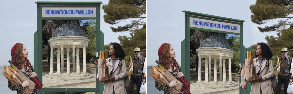
The Las Vegas version is very fine, the pavilion slotting in there perfectly. I like the idea of having one at each end of the pool, but making the far one so much larger does rather break the illusion it looks as if youve got the perspective all wrong, although I know you consider it to be just a larger version of the pavilion. I enjoyed Ben Boardmans dancing nymphs, who certainly bring life to the scene. But I have to ask: why are those on the right so much higher than those on the left? I like the strings of lights, the night feel, and the fire in the middle (but watch your perspective on that). Oh, and the variation in arms of the girl nearest the pavilion does work remarkably well. A somewhat ghostly carousel from tooquilos, looking rather forlorn without anything riders. Very disturbing music in the animated version, entirely appropriate to the spooky goings-on! I really like the treatment here. |
Posted on 24/10/25 09:19:24 AM |
|
Ben Boardman
Printing Pro Posts: 734 Reply |
Re: Challenge 1076: Opening the pavilion
But I have to ask: why are those on the right so much higher than those on the left? Oops - operator error. Thanks Steve, enjoyed that one. |
Posted on 24/10/25 09:41:56 AM |
|
Mariner
Renaissance Mariner Posts: 3255 Reply |
Re: Challenge 1076: Opening the pavilion
Thanks Steve, I just loved this one. I learned a new word "capital". I learned about a new island, the Ile de Ré. The benches are "from scratch" and need some polish, but I was not confident enough to start polishing. Bring on the next! |
Posted on 24/10/25 10:53:32 AM |
|
DavidMac
Director of Photoshop Posts: 6037 Reply |
Re: Challenge 1076: Opening the pavilion
That works!! _________________ The subtlety and conviction of any Photoshop effect is invariably inversely proportional to the number of knobs on it ....... |
Posted on 24/10/25 11:14:44 AM |
|
DavidMac
Director of Photoshop Posts: 6037 Reply |
Re: Challenge 1076: Opening the pavilion
Very odd. It looks bifurcated. Its an odd effect of light and shade in the original photo. I haven't touched it!
I started angled. It was the obvious thing to do. Then I got concerned that it looked as if the left hand girl wouldn't be able to see it and that it diminished the perspective games in the pavilion poster itself. Coming back fresh to your adaptation it would seem that both doubts were unfounded. It does look far better.
The one at the far end is not me. It's the original Caesar's palace. It's quite untouched. It was that that gave me the idea of adding ours. I did think about making Fleuriau taller to match but it seemed to counter the idea of it having come from somewhere else. Thanks Steve. It was fun to do. _________________ The subtlety and conviction of any Photoshop effect is invariably inversely proportional to the number of knobs on it ....... |
Posted on 24/10/25 5:13:00 PM |
|
lwc
Hole in One Posts: 3467 Reply |
Re: Challenge 1076: Opening the pavilion
Ha, they were dancing... I placed them in an ambiguous position partially behind the column. Thanks Steve! |
Posted on 26/10/25 01:26:12 AM |
|
tooquilos
Wizard of Oz Posts: 2957 Reply |
Re: Challenge 1076: Opening the pavilion
Thank you, Steve. _________________ Wicked Witch of the West:I'll get you, my pretty! And your little dog, too! |
Posted on 26/10/25 01:26:13 AM |
|
tooquilos
Wizard of Oz Posts: 2957 Reply |
Re: Challenge 1076: Opening the pavilion
Thank you, Steve. _________________ Dorothy: "there's no place like home!" |
| page: 1 2 last |
