
| » Forum Index » The Friday Challenge » Topic: Contest 71: Bling bling |
|
Posted on 17/11/05 7:34:14 PM |
|
Paul McFadden
Dream Decryptor Posts: 138 Reply  |
Re: Contest 71: Bling bling
Huh ? !!! _________________ |
Posted on 17/11/05 10:21:13 PM |
|
tabitha 1
Guest Reply |
Re: Contest 71: Bling bling
Sorry to go off thread here... The story is that many moons ago David introduced me to a certain US based chopping (photoshop) site and one of the members made a HUGE chop of all the site 'jurors' (of which David was one) and it contained them all as Pimps and Hoes. Seeing your source pic rekindled the memory in my poor frazzled pregnant mind (and believe me that takes some doing at the mo!). There... not very exciting and I'm sorry to bring it up, I'm just going to lurk back into the shadows now and see if I can load up my copy of photoshop for the first time in months  _________________ "She had lost the art of conversation but not, unfortunately, the power of speech." George Bernard Shaw. |
Posted on 18/11/05 10:36:57 AM |
|
Steve Caplin
Administrator Posts: 7161 Reply |
Re: Contest 71: Bling bling
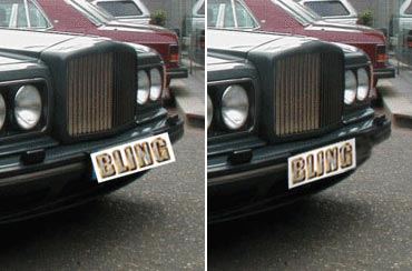
It's always tricky when the first post in a Challenge does the job to perfection - makes it rather hard to follow. And that's certainly the case with maiden's opening salvo - a pair of beautifully blinged objects. The original Bing Bling was a great gag, but the real Challenge entry is a beautiful piece of work - sparkly, tactile, very appealing altogether. Lovely job! Glen took the piece a stage further - and although we can barely see the Bling piece, it's probably just as well, given his taste in couture. i mean - there's glitz and there's glitz, but to turn a much-loved entertainer into a fashion disaster is perhaps going a bit far! The horrible thing is, I have a sneaking feeling thats not just Photoshop, and perhaps those clothes actually exist! More sartorial references in the second entry, with a pair of solidly realistic Oz shoes. Best thing here is the way both words match the perspectives of the shoes to perfection. Can't imagine what that poor girl is doing underneath a tablecloth, though. A fantastically detailed piece of work from John, with a piece of Bling text that's not only expertly made of mother-of-pearl, but has been painstakingly slotted in behind the frets and strings of the guitar. It's hard to imagine the amount of effort this must have taken, but it's a perfect job. Only one thing, John - you need to watch those Magic Wand cutouts. There's a tendency to lose highlights - such as the missing bits of the machine heads - while forgetting to remove other areas, like the wall between the left of the guitar and the strap. nothing really replaces a pen path! A great idea from steve hill, placing the words as a number plate on a Bentley. (Nerdy aside: the only difference between a Rolls Royce and a Bentley is the radiator.) Instead of just rotating it, though, you really needed to shear this one: the two short sides of the sign should be parallel to those vertical lines in the radiator grill: 
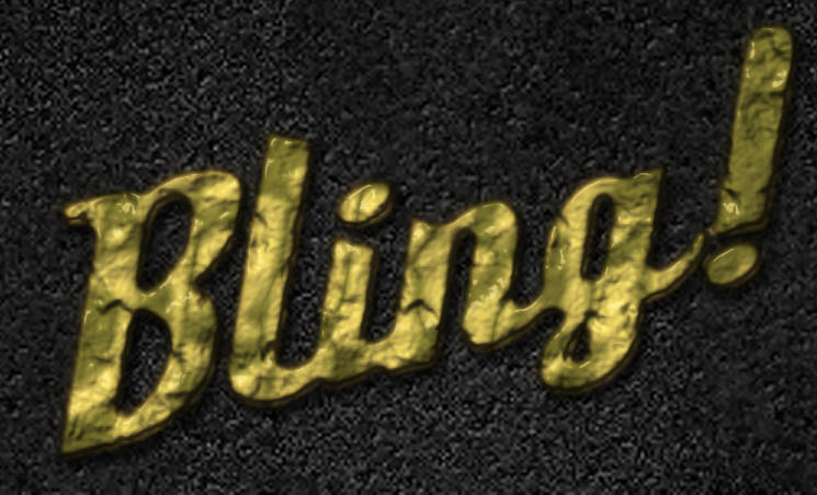
A really strong, graphic interpretation from Lexus, with a good comic book feel to it. At least, I'm assuming this was intentional - otherwise, you need to tone down those bright yellows. Seems to be a bit of disparity, though, between the hard shading of the gold outer, and the rather soft texture inside the letters. Either sharpen one, or soften the other! But the shine really helps in the second entry. We do like silver, MJ, but it's difficult to achieve. And, to be honest, I'm not sure this treatment really works for me. I think part of the problem may be the overall softness of the bevel: I'd really like to see some hard edges in there, which would provide more scope for refraction and reflected elements. And - soften those shadows! An intriguing entry from Atomicfog, with his usual dark, moody scene setting. I like the overall feel, but there are a couple of problems: the head-on view of the Bling object seems a little artificial against the perspective of the candles - I'd like to have seen a bit more of an angle on that. But the main issue is, surely, the lighting: the object has been lit from the extreme left, when we can see three visible light sources directly above. Rotate that lighting direction in Layer Effects! There's a great, shiny, bleached-out feel to kenny's entry that gives us a good sense of glare. The manual placing of the jewels really pays off, and the bevel gives them a good setting. My only slight problem is with the fragile nature of those joins between letters: my approach would have been to add an outer bevel of a sufficient thickness to tie all the characters together. A really consistent montage, though. Ah, silver again I think mguyer's having the same difficulty. The only way to do real silver is to show something reflected in it: there's no way this can be done with shading alone. And, again, you really needed an outer rather than an inner bevel to make this one work! Those letter joins now look much to spindly to support their own weight! Some rather dodgy face matching in your second entry this week - and who are those people? Can't recognise either of them. I don't think either one is supposed to be me. You need to go easy on the old Nitrous Oxide, Martin! Cracking good work from jwhite this week (sorry, I'm starting to talk like Wallace and Gromit) with a beautifully worked Bling thing, and a convincing chain tying it round the frog's neck. My only problem here is with the shadow: a couple of issues, really. First, the shadow beneath the object needs to bend around the frog's body. Image Warp would do this, if you have CS2; otherwise, a selection with the shadow in the top left corner, followed by a bit of Spherize, would do the job. Secondly, we'd get a much better sense of the thing hanging from the frog's neck if the shadow of the chain touched the chain at the neck, and then moved away from it as it bent around the body. Oh, and finally, I'd love to see a drop of dew hanging from it I laughed out loud at Paul2005's entry - the scan of Victoria Beckham. What a hoot! A fantastic idea, and a great image. The only (really tiny) change I would have made would be to turn off anti-aliasing for the name and hospital text, to match the existing text on the page. It's a small change, but it would make all the difference - at least to Photoshop detail obsessives like me, that is. Always good to see an animation here, and Paul McFadden's bling thing is a great GIF. The decision to rotate the sparkles between flashes really gives this one a convincing feel - good call, there. That's the way to do silver! And as for the second entry - I'm off to my tailor first thing in the morning to order up a silver suit! A great montage, very well achieved. Just the one thing: the underside of the hat is quite bright, but you've added a very strong shadow to the face. Perhaps this could do with lightening slightly? If it was anyone other then Neal then I'd guess he used SuperBladePro for his piece of art - but, knowing his distaste for contemporary software, that's probably too racy for him. In which case, we have to assume that all that marble and diamante was done by hand. Fantastic! Particularly the way so many of the diamonds have disappeared in some of the letters. Great sparkles, with a magnificent sense of restraint. I particularly liek the scratchiness inside the exclamation mark where all the diamonds have fallen off. But if it was me, I might have strengthened that gold bevel a touch, just to make the lettering a little more distinct. Self-made textures are always a real bonus here, and Stefan has clearly mastered the art. That knotty wood reminds me of an example maiden posted a year or so ago - and I really like that flaking, peeling wallpaper, looks fantastic. I wonder, though, if the Bling object is just a little too acid a yellow to be truly convincing: very tempted to add some red, and take out a lot of blue in that, to warm it up somewhat. And maybe it should be a little distressed, to match the rest of the scene? Whoa, Lexus! Remember the two-entry limit! Still, hard to get cross when the Christmas theme is so well developed. I like the way the Bling sits on the roof, but I'm not sure how it's supposed to be lit, or indeed what it's made of. A good take on the problem, but it needs more clarity! Beautiful work from BobbyJo - I especially love those fingernails and toenails, and the tiny sparkle in the squirrel's mouth. He's holding that Bling in a convincing way - but, again, the shadow needs to curve around his body. When it's placed on flat, it makes the whole image look artificial. A great treatment of the object, though! Move over, EyeCandy - Vigar has given us some great hand-drawn flames. I'd suggest, though, toying with the Dodge tool, set to highlights: a great way to add both colour and shading to your flames without having to paint them on by hand. It's really easy to do, and produces spectacular results: 
Dek_101 has turned the word into a great belt buckle, flipping the conventional approach to place the studded background outside the object. Good shading and sizing, but there's something that makes this not quite fit; perhaps it's the perspective? A stronger angle would seat this on the front of the jeans better, I feel. but a refreshingly different approach! You spoil that baby, John-BoB. And surely the item carries the warning "not suitable for children under 36 months due to small parts"? But a neat piece of work, good and sparkly. Again, though, I'd have thickened up that bevel to position it outside, rather than inside the text. not sure about the vertical line in the chain - I know, these things are a pain to draw, but they are worth the effort! Some great work this week. Sorry if I seem to have been too harsh in my criticisms: but it just seems to me that where there's room for improvement, my job is to point it out. I really welcome all your entries, so please don't be put off! |
Posted on 18/11/05 6:30:12 PM |
|
Lexus
Persistent Pixellator Posts: 623 Reply  |
Re: Contest 71: Bling bling
Ooopps!! Sorry forgot about the 2 Picture Limit! Im Sorry! _________________ Quote From Family Guy: Oh I Would Like Some Cake, Oh I Would Like Some Cake, Oh I Would Like Some Cake, Oh I Would Like Some Cake. |
Posted on 02/12/05 12:00:20 PM |
|
Samantha
* Posts: 9 Reply  |
Bling bling
This is my first ever posting, I know this 'Bling Bling' challenge is a bit out of date, however it was something I could do quite quickly whilst on my tea break!  |
| page: 1 2 3 last |