
| » Forum Index » The Friday Challenge » Topic: Contest 127: Happy New Year! |
|
Posted on 02/01/07 2:20:08 PM |
|
josephine harvatt
Gag Gadgeteer Posts: 101 Reply |
Re: Contest 127: Happy New Year!
Maybe Stonehenge should be spelling it out in ogham! _________________ I'm not really bad - I just draw that way |
Posted on 02/01/07 2:55:20 PM |
|
Pierre
Constructional Confabulator Posts: 637 Reply |
Re: Contest 127: Happy New Year!
Vern, I saw the same thing first and then realized that the four left most buildings are creating 2 "M" with the top of them falling down! So these 2 long legged "M" with 2 small legs in the middle of them... Err... is that clear enough??  _________________ |
Posted on 03/01/07 02:24:42 AM |
|
mguyer
Incisive Incisor Posts: 799 Reply |
Re: Contest 127: Happy New Year!
here is my #2  |
Posted on 03/01/07 11:08:50 AM |
|
Dave Rune
* Posts: 2 Reply  |
Re: Contest 127: Happy New Year!
Ahh thankyou for the response. If you can see it is actually MMVII The two sets of falling buildings form the two M's then the outward leaning ones form the V and finally the doubled building forms the two I's You got it Pierre! |
Posted on 03/01/07 7:36:22 PM |
|
BobbyJo
Image Imaginator Posts: 250 Reply  |
Re: Contest 127: Happy New Year!
Hi gang, I'm back. Happy new year to you all.  _________________ BJ - Image Imaginator  |
Posted on 03/01/07 8:02:27 PM |
|
Pierre
Constructional Confabulator Posts: 637 Reply |
Re: Contest 127: Happy New Year!
Good to see you back BobbyJo! Happy 250th posting!!  _________________ |
Posted on 03/01/07 8:27:45 PM |
|
Wayne
Printers Devil Posts: 312 Reply |
Re: Contest 127: Happy New Year!
Fantastic work everybody! David, very clever. All the best for the New Year to Steve and all on the forum.  |
Posted on 04/01/07 00:17:18 AM |
|
2bfree
Twilight Trickster Posts: 81 Reply |
Re: Contest 127: Happy New Year!
I hope you all have a very fine year!! May every day be filled with success in all your endeavors. 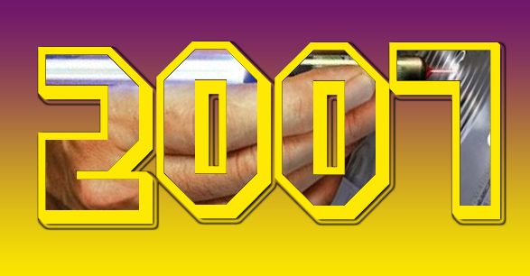 |
Posted on 04/01/07 12:40:58 PM |
|
BigVern
Q Quipper Posts: 674 Reply |
Re: Contest 127: Happy New Year!
David and Pierre, Thanks for the explanation. I can now see two smaller M's rather than one large M. Funny how your brain makes you see one thing and then you cannot see an alternative. Pierre, Your mini in the snow is a treat, by the way! BigVern |
Posted on 04/01/07 3:26:12 PM |
|
char
Collage Conquistador Posts: 141 Reply  |
Re: Contest 127: Happy New Year!
Happy New Year!! to everyone in the forum!!. Everyone is doing wonderful work!. This forum as a great place to have fun, while learning and growing!.THis is not helped a little by Steve's insightful and thorough comments,which give us inspiration and which encourage us keep doing the challenges,and keep us coming back for more!  |
Posted on 05/01/07 01:00:44 AM |
|
BigVern
Q Quipper Posts: 674 Reply |
Re: Contest 127: Happy New Year!
I hope everyone has a happy and prosperous 2007! BigVern 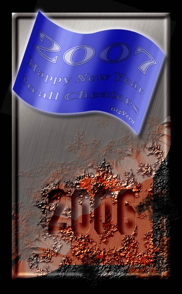 |
Posted on 05/01/07 01:48:14 AM |
|
Shadow
* Posts: 2 Reply |
Re: Contest 127: Happy New Year!
Happy New Year  |
Posted on 05/01/07 05:27:39 AM |
|
eyal fitoussi
Ace Animator Posts: 45 Reply |
Re: Contest 127: Happy New Year!
happy new year everybody. i was so busy with school and work for the last few months that i did't have time to post anything. damn, i missed the forum...
 |
Posted on 05/01/07 09:51:02 AM |
|
Steve Caplin
Administrator Posts: 7094 Reply |
Re: Contest 127: Happy New Year!
Good to see so much Photoshop activity going on over the holidays - I hope you took at least one day off! Bob got in first, with a tranquil and evocative scene. I'm not quite sure why, but for me it's the ripple that really makes this one work. Perhaps it's because it adds a sense of action to an otherwise static view? Thoroughly clever work from Eggbox - a really good idea, impeccably executed. Is this a montage, though, or did you just turn the time to seven minutes past eight? A great idea in the second entry, but the pool balls look rather flat to me. More shading required! And the perspective on the numbers could be greatly enhanced by selecting the pool ball shape and adding a bit of the Sphereize filter to them. A fantastic landscape from tank172, complete with blighted trees, a caveman and even a pterodactyl. I particularly like the way the ground texture curves up at the base of the lettering, most interesting. OK, so it's not all Photoshop, but I admire the ability to draw in elements from other applications. I really can't believe you don't have a title yet, Chris - so please accept ThreeDee Thriller. Long overdue! A simple idea, but well realized, from Paul 2006: great typography! The Bond silhouette fits really neatly into those flames. Should we look at updating your screen name, though, Paul? 2006 is, like, so last year... Some splendid fireworks from Dirtdoctor23, clearly created from scratch. I'd have added a touch of glow to the lettering, though, just to make it fit in better with the scene. But I greatly enjoyed the second entry - the sharp horizon angle adds a lot of dynamism to the scene. Some beautiful lettering from Dek_101, with well judged touches of sparkle here and there, and a subtle reflection. There's slightly too hard an edge on the underside of the horizontal bar on the 7, but otherwise this is an intriguing technique. A really entertaining bit of skidding from Pierre: those tracks have been expertly created and really give the impression of skid marks in the snow. The banks of thrown snow on the outside edges of the curves are a master stroke, and the clear patch revealing the car park is a fantastic touch. Wonderful! A very fine piece of neon bling from Babybiker - most entertaining! I'd have been tempted to leave a hint of the neon tubes visible when they're switched off, particularly where the red neon goes in front of the lettering on the zeroes - but all in all it's a great animation. Beautiful lettering, and a tranquil scene, from mguyer.. Surprised you haven't placed yourself in the montage this time, Marty - or are you hidden in the lake somewhere? I like the idea in the second entry but would have added a little ripple and shading to the banner. A truly magnificent feline animation from Raffy, with an excellent soundtrack that really brings the whole thing to life. This is the kind of work that makes me want to learn Flash! Just wondering why the lettering is so ragged, though. Love the snowflakes! A fine animation from James, with 2006 turning into 2007 around the London Eye. I like the way the lights appear on the pods! Now if only we can get the thing to turn... a pretty second entry, although that blue is a little too unreal for my liking. And is that shark a metaphor? Good to see the old Displacement Map trick turning up in Ben Mills' entry. I think I'd have added a few drips to the lettering before applying the map to it, though, to give the sense of it having been painted on the wall in a hurry. And perhaps a little hand smudging where the words roll over the cement? Cool reflections from Chris, with a bejewelled 2007. You've tweaked the base of the reflection to follow the perspective line well, but I'd have shaved a little off the very bottom (top, looking at it upside down) to accentuate that perspective. And perhaps a touch more contrast on the gold to really make it sing out? A beautiful montage from j.harvatt - a kind of artist's scrapbook. The calligraphic text is gorgeous! When using a font for handwriting, though, I find it greatly helps the realism to place it at a slight angle - and this certainly goes for the PostIt note, too. The compass is a good addition, but shouldn't it have a pencil in there? Love the second entry! Very fine neon from dave.cox, with a great glow, good choice of typeface, and some neatly drawn wiring behind. The only (tiny) criticism is that the ends of each neon tube are cut off in rather a straight line: rounding them off with the eraser would have been well worth the effort. Whaler's solution is certainly a big new year launch! Not sure the font and colour of the lettering are strictly in keeping with NASA's corporate guidelines, though. I do like the dynamic action in the second entry: that 2007 is really bursting through! Great textures from Deborah Morley, with beautiful flames that neatly obscure the tops of the 2006 lettering - and I like the way the glow begins at the base of the letters. Very tasty work, with a tactile 2007 to cap the whole thing off. Nice stuff! Michael Sinclair's take on global warming gives us 2006 collapsing into the ocean, while 2007 is revealed behind it. Good lettering, particularly the melting 2006; not sure that's an appropriate choice of clothing for arctic exploration, though. An interesting sense of balance in the second entry - good holes in the zeroes! I'd be worried about standing too close to the 7, though. A fabulous, texture-rich entry from Tom, with an ultra-modern 2007 escaping through the retro 2006 doorway. Beautifully balanced, a great job! Prize for the most subtle entry of the week has to go to David Asch. Took me a while to spot this one! Sure, it's a Goodyear tyre, which would be enough in itself - but the faint 2007 at the top really makes it. Great typography! A first post from Dave Rune, with 2007 spelled out in Roman numerals using some of the world's tallest buildings. I take the readers' comments about the MM looking rather like a single M - but the buildings have been well broken off, and the fireworks are a neat touch. Good work, Dave - and welcome to the forum! Good to see BobbyJo back, with a tasty piece of graffiti that works well on the wall. Again, I'd love to have seen some drips in the paintwork! An exuberant starburst from Wayne - an intriguing lighting effect! I'd have been tempted to add more of a bright spot right in the middle, as a source for all that ray action. Ah, I recognize that picture inside 2bfree's post! I feel I know that one like the back of my hand (ha ha). Truly fabulous rust and decay from BigVern: there's an organic quality here that must have been hard to achieve. The faint bevel on the inside of the 2006 gives it a real sense of having been punched out of the metal. Gorgeous. Another new member this week - and a fantastic first entry from Shadow. The subtle 2007 has been beautifully formed from leaves and branches in this restrained and subtle piece. Great work, Shadow - and welcome to the forum. A great animation from Eyal Fitoussi, with a good sense of timing: great to see the cover of the second edition showing up there. Couple of queries: why has the poster been chopped off at the edge? And, er, shouldn't the neon have a reflection? Happy New Year, everyone! |
Posted on 05/01/07 10:22:04 AM |
|
Eggbox
Ovoid Opportunist Posts: 797 Reply |
Re: Contest 127: Happy New Year!
In the best possible tradition of this forum, I cheated. I had the idea at about 20:01. Rushed around to be ready and waited for the real time to happen and posted ASAP. I understand what you mean about the pool balls but couldn't work out how to achieve the effect. Ted |
Posted on 05/01/07 11:02:04 AM |
|
Babybiker
Shadow Spectaculator Posts: 151 Reply |
Re: Contest 127: Happy New Year!
Thanks for the comments Steve BB |
Posted on 05/01/07 12:56:48 PM |
|
Steve Caplin
Administrator Posts: 7094 Reply |
Re: Contest 127: Happy New Year!
Drawing the ball itself is just a matter of adding deeper shading to it. Don't hold back here! 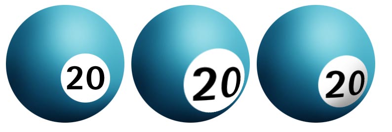
For the numbers, begin by making your number in the circle and position it where you want it (left). Then load up the pixels on the ball layer to make a selection area, and apply the Sphereize filter (middle). This may make the number too big, so just reduce it and add shading (right). Simple! |
Posted on 05/01/07 1:50:23 PM |
|
paul_2006
Guest Reply |
Re: Contest 127: Happy New Year!
I'd like to make it clear that the main image was not my work (I wish it was). As I said in my original post it was "quick and dirty". All I did was think of putting a figure 2 in front of the existing 007 while trying to match font style. As for my screen name I already updated from Paul 2005 a few weeks back when I lost my pasword |
Posted on 05/01/07 2:09:29 PM |
|
raffy
Guest Reply |
Re: Contest 127: Happy New Year!
Thanks,Steve!The font came that way-it's supposed to be letters covered with streamers and confetti.I got it from dafont.com.Here's the link if anyone's interested: http://www.dafont.com/party-by-tom.font All the best in '07! _________________ Dogs have masters;Cats have staff. |
Posted on 05/01/07 2:23:53 PM |
|
dave.cox
Marquee Master Posts: 518 Reply  |
Re: Contest 127: Happy New Year!
Thanks for the feed back Steve. Good idea, hadn't thought of that, but rounding the ends would help the look.  |
| page: 1 2 3 4 last |