
| » Forum Index » The Friday Challenge » Topic: Contest 166: Hogg wash |
|
Posted on 04/10/07 3:35:04 PM |
|
jwhite
Collage Critter Posts: 274 Reply  |
Re: Contest 166: Hogg wash
I get this error message when trying to post my rendition 
Gee, thanks a lot Ted.  |
Posted on 04/10/07 7:46:39 PM |
|
vibeke
Kreative Kiwi Posts: 2167 Reply |
Re: Contest 166: Hogg wash
I have been trying not to comment on our newest member's entry. Paul Farr, but I feel I have to say it. The subject of the entry makes me feel uncomfortable.  |
Posted on 04/10/07 8:15:07 PM |
|
Elliott
Mirror Magician Posts: 91 Reply |
Re: Contest 166: Hogg wash
I wasn't going to say anything, but I have to agree with you Vibeke. |
Posted on 04/10/07 8:23:40 PM |
|
chris berry
Overhead Overlord Posts: 724 Reply  |
Re: Contest 166: Hogg wash
Not wanting to sound "me too", but me too. |
Posted on 04/10/07 10:09:36 PM |
|
Whaler
Visual Viking Posts: 330 Reply |
Re: Contest 166: Hogg wash
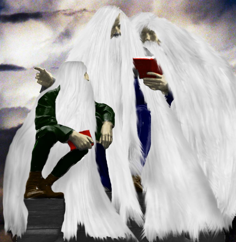
These people have obviously been sitting there for a very long time. [Edit] This image has bee replaced by the one below _________________ !!!!!!!!!!!!!!! |
Posted on 04/10/07 10:10:53 PM |
|
Meltonian
Highlight Hermit Posts: 90 Reply |
Re: Contest 166: Hogg wash
Phew! It's not called the Friday Challenge for nothing, is it?  |
Posted on 04/10/07 10:15:23 PM |
|
Whaler
Visual Viking Posts: 330 Reply |
Re: Contest 166: Hogg wash
It's been said before, the devil is in the details!  _________________ Only in my brightest moments I understand myself |
Posted on 04/10/07 11:00:54 PM |
|
celosia
Wondrous Woolflower Posts: 58 Reply |
Re: Contest 166: Hogg wash
Hmmm, not great, I thought new computer with new operating system, twice as much memory and an uncluttered hard drive was supposed to make it go faster?! I think I need a memory upgrade... Should have started on it earlier. Plus I didn't manage to come up with any good ideas this week... Ah well.  |
Posted on 05/10/07 02:49:32 AM |
|
Dek_101
Apocalyptic Artisan Posts: 175 Reply  |
Contest 166: Hogg wash
 |
Posted on 05/10/07 08:09:41 AM |
|
char
Collage Conquistador Posts: 141 Reply  |
Re: Contest 166: Hogg wash
 |
Posted on 05/10/07 09:30:09 AM |
|
Steve Caplin
Administrator Posts: 7135 Reply |
Re: Contest 166: Hogg wash
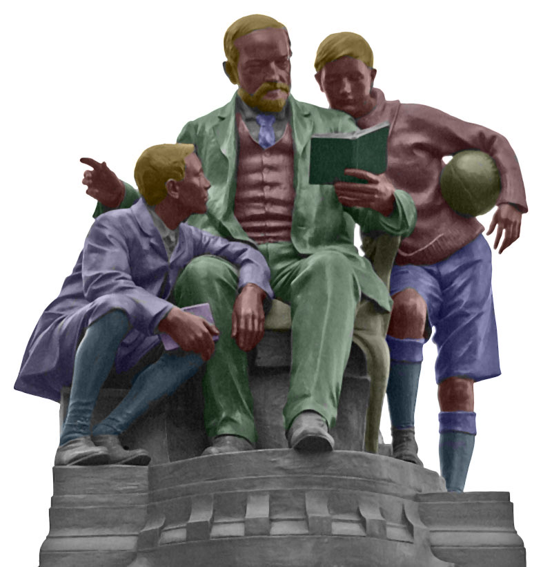
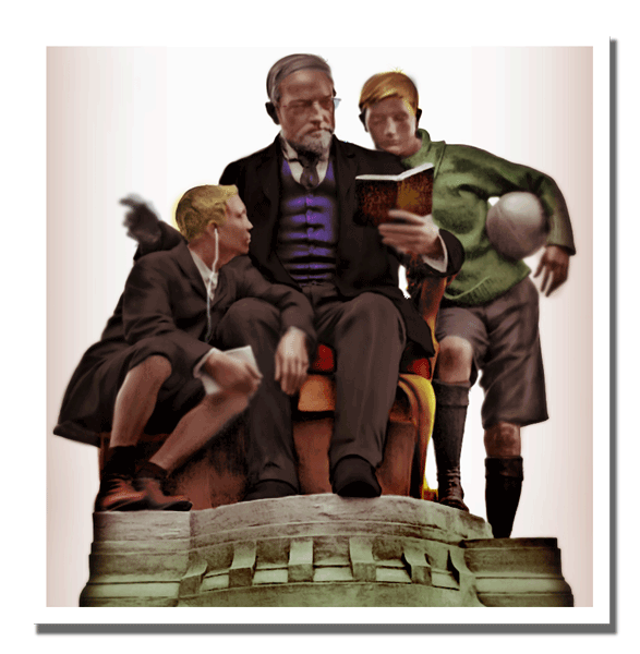
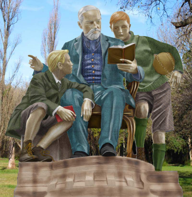
A difficult Challenge this week, not helped by the odd angle of view. We're looking up at the statue, as can be seen from the curve of the plinth: this stumped a lot of you who tried to fit the group within a room setting. First up was Rocksham, with a good selection of colours and well brightened skin. I think these characters could have done with eyes, though, to liven things up a little. An ingenious solution from new member Brian Ruddock: great illumination from a suitable illuminating source! The traditional second entry shows some subtle colouring, with added texture in the folds of the clothes. The lighting makes a big difference, too, adding life to the flat original. Great stuff - and welcome to the forum, Brian. A partial entry from Chris Berry - but better than not entering at all. Good skin color, and there's a tactile quality to the book that works really well. The waistcoat needs some attention in the shadows, though, particularly where it tucks into the jacket. Cool spotted tie, though. A beautifully rendered book from vibeke, whose scene has some nice extra detail - the copy of Stuff the Turkey in the boy's hand, the rugby ball tucked under the arm. The perspective of the room works fine at the top, but runs into problems at the bottom: we're looking down at the room here, but up at the statue. Stretching the whole room down would have solved this. A good choice of colours from 2bfree - I especially like the red of the chair seat, and the book fits really well into that hand. When colouring images like this, it's important to ensure that neighbouring areas don't have the same fill: the man's trousers are the same colour as the plinth, which rather gives the game away. There's a wintry quality to Elliott's entry: perhaps boosting the skin tones to a warmer hue would bring these people back to life? The outdoor setting works well, though, and the choice of tones is consistent with this view. A touch of brilliance from tooquilos - if you can't colour faces, then cheat! It's a great selection of heads, and the expressions really add tremendous interest to this scene. An interesting decision to remove the plinth: what on earth is that boy on the left sitting on now??? A very sepia quality to Abby-Helen Artfield's entry, which has the look of a faded photograph to it. Excellent detailing in the features, which brings in a lot of shading that wasn't present in the original. The bright blue shorts seem to scream a little, compared with the rest of the scene: this is one of those things that can happen far too easily when colouring images. Always tone down the colours! The extra facial detail in the second entry is a huge improvement! A bit of wit from michael sinclair - the extra and moved hands making a far more suggestive scene. The neatest touch is the removal of the ball, giving the boy a rather camp pose. Shame you didn't have time to finish this one, Michael. An excellent choice of colours for the clothing in dave.cox's entry - very subtle, and very clothes-like. You do need to watch a couple of things: the base of the plinth is so strong that it overpowers the scene, and the man's features - and especially the standing boy's - really need strengthening up. The basketball's a nice touch, though, and the added texture on the chair seat is a great idea. A first entry here from Paul_Farr - and it's a brilliant reconstruction of the scene. For those who don't recognize him, that's 70s glam rocker Gary Glitter, recently imprisoned for dirty doings on far-flung shores. The pose of the kneeling girl is a fantastic match for the original - but why the distorted head? An inspired entry, Paul - but be aware that sensitive issues won't always meet with approval from all the members. Welcome to the forum! It seems mguyer wasn't alone in finding this a tricky challenge. There are some great results in here - the brown suit, the waistcoat, the boy's jacket. But there's a lack of definition in the faces - and do watch out for over-bright elements, such as the red tie and blue shirt. Old Quintin Hogg does look uncannily like you in this shot, Marty! A superb wood effect from GKB - that grain works amazingly well on this statue. And, of course, the pigeon adds that vital element of humour. Excellent, Gordon! A very subtle range of shades from Deborah Morley - and the added texture in the book and the waistcoat really help this one. There's a great consistency of tone here, and although the eyes are perhaps a touch zombie-like it's refreshing to see them included. Very neat work. Plenty of added texture in stefan's entry, which gives life the clothing and the skin: the extra detail in the faces is also very welcome, adding much needed definition. But- a pink football? Hogg would turn in his grave! Some real genius from Eggbox - not just an excellent idea, but beautifully executed. And of course, the second entry refines the image - but really, the error you pointed out isn't noticeable! Still a great piece of work! A poster entry from Neil O, with some intelligent colouring: Hogg seems very at home in those clothes. When using a strong bevel effect on text, though, a serif font tends to get lost in all the shine and shadow: best to use sans serif here, it will hold the effect much better. A magnificent setting from srowden, with a coloured statue that matches the opulence of its surroundings. Great choice of colours for the boy holding the football, and the man's clothes are strong and appropriate; but the faces appear washed out and lacking definition here. And, of course, there's the perspective issue: we're looking down on the room, but up at the statue. Although this seems like an impossible problem, its easily solved: move the statue much higher up the room, and crop the bottom off. Ah - it's that room again! Katew has used the ingenious technique of cropping off the bottom of the statue to confuse the perspective problem, and it works well. The figures are a good scale for the room, although the skin tones are perhaps a little anaemic! A dazzling animation from james, with a squirrel playing havoc with the scene. I like the check waistcoat - that must have taken some time - and the fact that this statue's the most ethnically diverse so far. Great work, James! Fantastic work from Meltonian - look at the quality of Hogg's face, and the general rosiness and warmth of the scene. This has a real Norman Rockwell feel to it - fantastic work, Graham! It's so good I'm not even going to mention the perspective thing. Oh, hell, it just slipped out. Very funny work from Whaler - what a great way to save yourself extra work! Top marks for cheating, but - you're cheating! The beginnings of an entry from Celosia. But what a strange choice of skin colour! Very detailed work from Dek_101: not just fantastic texture and skin, but all the added elements - the glasses on Hogg, the boy's iPod, the wagging finger - really add to the realism here. With such a strong image, a realistic background would have added greatly to the overall effect. Some beautiful added textures from Char: the waistcoat and tie, the boy's shorts, even the stitching on the football - plus the shoelaces, the gold buttons, the fantastic new beard, the detailed book with its bookmark ribbon... so much extra work, and to such great effect! Fantastic, Char! |
Posted on 05/10/07 09:42:55 AM |
|
stefan
Detail Demon Posts: 401 Reply |
Re: Contest 166: Hogg wash
Thanks Steve.......Oh dear, a pink football...Sorry mr. Hogg...I must have kind of overlooked that one...I was in a bit of a hurry, which is of course not an excuse  |
Posted on 05/10/07 09:47:23 AM |
|
katew
Virtual Virtuoso Posts: 681 Reply |
Re: Contest 166: Hogg wash
Thanks Steve! I found the skin tones really hard, I must admit. What you don't know is that it's your skin .... I sampled it off that picture where we had to age you (the before one)! |
Posted on 05/10/07 09:59:57 AM |
|
vibeke
Kreative Kiwi Posts: 2167 Reply |
Re: Contest 166: Hogg wash
Thanks Steve, I did stretch the room a little, but not enough. good to know I was on the right track. |
Posted on 05/10/07 10:16:04 AM |
|
Meltonian
Highlight Hermit Posts: 90 Reply |
Re: Contest 166: Hogg wash
The chair is an early reclining model, and the boy on the right is resting on a monopod. Obviously! |
Posted on 05/10/07 10:49:06 AM |
|
Whaler
Visual Viking Posts: 330 Reply |
Re: Contest 166: Hogg wash
I go along with that!
Thanks, Steve! I know I'm cheating, but cheating can be a time saver occasionally! _________________ !!!!!!!!!!!!!!! |
Posted on 05/10/07 11:53:33 AM |
|
tooquilos
Wizard of Oz Posts: 2957 Reply |
Re: Contest 166: Hogg wash
Thank you Steve. I left part of the plinth there but it sort of blends in with the path..but it is there though  |
Posted on 05/10/07 1:05:35 PM |
|
Neil O
Cartoon Contractor Posts: 389 Reply |
Re: Contest 166: Hogg wash
Thanks Steve. I'm not real familiar with fonts so thanks for the suggestion. Is there somewhere I can research what fonts to use where, or is it just something one picks up with experience (or from suggestions of others?  ) )
Neil _________________ "I haven't failed.... I've found 10,000 ways that don't work!" Thomas Edison |
Posted on 05/10/07 1:18:04 PM |
|
Elliott
Mirror Magician Posts: 91 Reply |
Re: Contest 166: Hogg wash
Thank you Steve. |
Posted on 05/10/07 4:54:18 PM |
|
dave.cox
Marquee Master Posts: 518 Reply  |
Re: Contest 166: Hogg wash
Thanks Steve. I tried to do something with the facial features, but couldn't seem to come up with something that looked right. I ended up dumping what I had, and going back to just the color, as I was running out of time to work on this. |
| page: 1 2 3 4 last |