
| » Forum Index » The Friday Challenge » Topic: Contest 186: Closing time |
|
Posted on 27/02/08 11:00:23 PM |
|
Mick Malkemus
Meticulous Manipulator Posts: 91 Reply |
PLEASE go home...
I've tried to pay special attention to lighting here. I overdid it on the burning and dodging, but plan to improve. I used only images from the DVD provided with the book, and plan to do so whenever possible in order to learn to adhere to specifications delineated by clients (in other words, images that I probably would never use in my own work). |
Posted on 28/02/08 04:54:09 AM |
|
billz
* Posts: 9 Reply |
Re: Contest 186: Closing time
There are really some terrific entries this week! Here's my try. 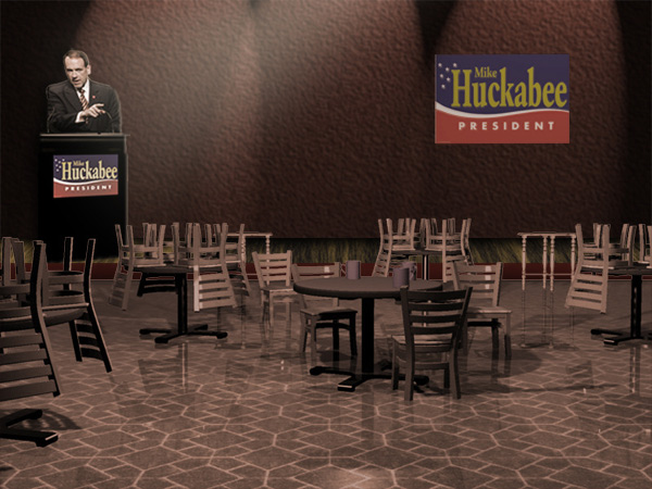 |
Posted on 28/02/08 11:36:52 AM |
|
james
Surreal Spoofer Posts: 1194 Reply |
Re: Contest 186: Closing time
Thank you Michael, I'm wondering where you find your wonderful images, surely not Google. |
Posted on 28/02/08 12:01:42 PM |
|
Gavin
* Posts: 15 Reply |
Re: Contest 186: Closing time
Hi Claire, Really like your Closing time scene, a very nice composition. same here as a first timer, it was a challenge for me trying to get things in perspective. Gavin |
Posted on 28/02/08 12:20:47 PM |
|
josephine harvatt
Gag Gadgeteer Posts: 2605 Reply |
Re: Contest 186: Closing time
A little homage to Douglas Adams from me.... Nowhere near as photorealistic as I would wish - my attempt at a neon sign is risible I know but dig that crazy wallpaper Hey ho! 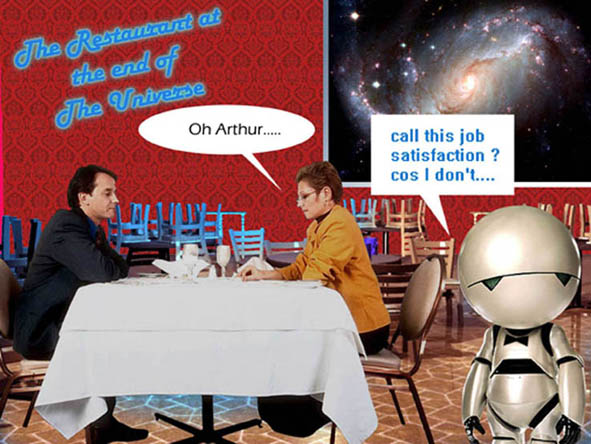 _________________ I'm not really bad - I just draw that way |
Posted on 28/02/08 12:58:30 PM |
|
Deborah Morley
Makeover Magician Posts: 1319 Reply |
Re: Contest 186: Closing time
James, that is an excellent animation Gordon, love the way the earth is at the centre of the galaxy or is it a nebulae?  |
Posted on 28/02/08 5:53:13 PM |
|
GKB
Magical Montagist Posts: 4130 Reply |
Re: Contest 186: Closing time
Thanks Deborah, It's a Hubble telescope image of the Crab Nebula which is the remnants of a star that exploded quite a few thousand years ago. The main astronomical image is the Horsehead Nebula which is a cloud of dust that is so thick it obscures the starlight behind it. The stars that you can see are actually in the foreground. |
Posted on 28/02/08 6:14:29 PM |
|
vibeke
Kreative Kiwi Posts: 2167 Reply |
Contest 186: Closing time
Love the Kiwiguana, but I think I will give Kiwifruit a miss this morning.  |
Posted on 29/02/08 03:01:07 AM |
|
KristyLynn
* Posts: 3 Reply |
Re: Contest 186: Closing time
thanks for the input on last week!  and thank you for the welcome and thank you for the welcome   |
Posted on 29/02/08 07:46:41 AM |
|
Eva Roth
Luminous Liberator Posts: 269 Reply |
Contest 186: Closing time
Thank you, Trev!!! The picture sort of created itself, I had a vast selection of nice rubbish pictures to work with. Eva |
Posted on 29/02/08 09:27:17 AM |
|
Steve Caplin
Administrator Posts: 7135 Reply |
Re: Contest 186: Closing time
This week's Challenge has obviously inspired a lot of people - including a record number of new members. So thanks, Dave, for coming up with the idea! First up was Meltonian, with a beautiful retro room: the man sitting at that table perfectly matches the overall feel of the scene. I like the way he has a reflection drawn in that perfectly matches the reflection of the table support next to him - and, of course, the reflections from the lamps adds greatly. A really consistent, solid image. A hark back to the Hitchhikers' Guide from GKB, with a cast taken from the original TV show (but isn't the Vogon from the film?). Great reflections, again, and the white mice are a nice addition. Placing Marvin in the front helps conceal the fact that all the characters are way too big for the tables and chairs! I like the sign, too, but I think the under side of the rear portion needs a little more shading. The scifi theme continues with gary j's Star Trek entry - with a dozy Ferengi as the last customer. The recolouring of the floor and furniture fits well with the new room backdrop, but I'm a little puzzled as to why the dalek is quite so small: its perspective now doesn't match that of the room. But the slotting of a metallic broom into its sucker arm is brilliant. And I do like the wheel tracks! I seem to recognize the lone coffe drinker in zapat's entry from an Edward Hopper painting (although she should really have a shadow). The picture is really made, of course, by the stunning aquatic backdrop, and the subtle shading of the room to match it. Very nice work. Our first new member of the week is hdaoyuan, with a very Chinese scene. The figure on the table nestles well with the three mugs, and the backdrop's perspective matches the feel of the room perfectly. A very pleasing scene. Welcome to the forum, 胡道远! An exotic tropical scene from vibeke, with a couple of waiters who are so cheerful they don't seem to care that their customers won't leave (or even that they have no reflections, and so are probably undead). Top marks for sticking the horizon bang on their eyeline! And the "lovely ladies" in the second entry look well settled into that sand. Great horizon/eyeline placement, again - see, it really does work. I took my 13 year old son to see the Rocky Horror Show recently, and I'd forgotten just how raunchy it is... tooquilos has captured the mood of the piece with the entire cast (more or less) stepping to the right... and to the left... Very good to place Janet and Brad up front, although I'd like to have seen Brad's head look both ways. A splendid Egyptian scene from Nick Curtain, with a host of camels taking over an outdoor pizza restaurant. Great perspective, beautifully painted in sand, and a magnificent array of beasts. A few rather interesting shadows there form the tables and chairs on the left, but I won't quibble. Excellent placement of the truck in the background: we can see just enough of the sign to make out all the wording, but it's fully integrated into the scene. I love the close-up camel in the foreground - but shouldn't that piece of pizza be more in its mouth? A wealth of love scenes from brewell: are the heads of these two girls just full of romance? A very interesting placement of the clock, which turns what would have been a flat wall into an interestingly angled one. They could all do with some reflections, though! A very moody, evocative sunset from vicho, who's recoloured the restaurant scene to match the colours in the sunset. Is it just coincidence that there's a reflection on the floor that exactly matches the position of the sun behind? Ben Mills' morning after image is a great idea - and that scene is the perfect setting for such a grand restaurant. But where on earth did the owners find two giantesses to do their cleaning work? Those women are huge! Look at the size of the chairs next to them! More cleaners, this time from Trev. A good choice of background, but the perspective doesn't quite match the room: the chairs in the distance look twice as big as those nearest to us, relative to the slope of the ceiling. Sorry to hear you've been unwell - hope all is on the mend now. Fantastic body animation from james, particuarly in the woman cleaning the table in the distance - thoroughly realistic arm movements, made so much more convincing by bending at the elbow. But watch those relative heights: the woman in the foreground should be on the same eyeline as the woman at the back. What are they all so cheerful about in the final frame? A double act this week from two new members. Claire4132 has turned in a beautiful black and white scene with a cast of intriguing characters. Great reflections on all of them: I particularly like the positioning of the man at the table, who's been very neatly slotted into that chair. The decrepit background adds greatly to the debauched sense of mystery - very entertaining stuff. Claire has asked to be judged against her boyfriend, gobblejuke - but how can we possibly compare such different pieces? This one's a fantastic space scene, with all the restaurant elements disassembled and sent floating about in zero gravity. I like the way the astronaut's legs have been foreshortened, which makes him look much more like he's floating, and the way the liquid is evaporating out of the bottle. I'd have changed the angle on one of the tables, though - it just draws attention to the fact that they're all the same one. Welcome to the forum, both of you! Our fourth new member is Gavin, who's created a rather beautiful urban restaurant scene. Excellent reflections from all the added characters, and it's especially gratifying to see the reflection on top of the table as well. My only problem here is with the sofas in the background, which point to a horizon that's at odds with the rest of the room. And has Daniel Craig given up on Bondage for a career as a waiter? Greatly enjoyed the kiwiguana by the way - but this belongs in the Reader's Gallery section. Welcome to the forum, Gavin. Another new member, Eva Roth, with a dazzlingly good piece of work. Look at the wealth of detail in here: the cobbled, rubbish strewn ground, painstakingly blended in around all the table and chair legs; the perfectly run down background; the heaps of empty boxes and vegetables in the foreground; and the pair of characters from Ratatouille giving meaning to the whole scene. Eva, this is really fantastic, flawless work. Welcome to the forum! A touch of Van Gogh from katew - and why not, indeed. He does fit rather well at that table, and I see he's even brought his own chair. The recoloured furniture perfectly matches the chair in his bedroom - a neat touch, there. I do think that he'd have painted the carpet in perspective, though... A moody, evocative room from salfordnurse - there's a real story behind this scene. As you say, not entirely sure about the guy in the window; but rather than remove him, I'd have moved him over to the side, so he isn't directly behind the main character. And you need to move that table in front of the door - no wonder the place is empty! No-one can get in! Our sixth new member is Ellen, with a reworking of one of those paintings full of dogs. I've never really admired the genre, but I do like your take on this: the tables and chairs have been treated to match the painterly style of the original really well. The dogs in the background are, of course, rather too large for the tables they're behind, but that foreground one sits perfectly in the scene. Welcome to the forum, Ellen. An excellent choice of characters from Mick Malkemus - the waiter and the husband are exactly right here. The top of the woman's a little over saturated, though: too much Dodging here? She needs toning down a little. Good reflections of the feet, especially in the table - but the man's shoe needs to shear up at the back so he doesn't look like he's standing on tiptoe. Soften the edges of the light beam, too. I know this sounds like a lot of criticism, but it's really a great entry - just needs a couple of tweaks to make it perfect. A bit of a typhoon from michael sinclair: I do like the way the lower legs of the chairs and tables have been subtle blended beneath the water surface. This must have taken a lot of work! Rather too many different eyelines here, though, which makes the horizon difficult to gauge (especially since the perspective of the tables and chairs points to a different horizon altogether). A great political scene from billz - poor old Mike Huckabee talking to an empty room. But he does seem rather large, compared with the size of the chairs! I know it's always tempting to place your main character as large as possible, but in this case I think the scene would have benefited from having him a lot smaller and more insignificant within the room. The Hitchhikers' Guide returns with an entry from Josephine Harvatt, in which Marvin's got a job as a waiter - love the bow tie! I'm sure I recognize that couple from an earlier Friday Challenge, though. Is Marvin really that small? Deborah Morley has transported the tables and chairs to a cloister in what looks like Rome: a great waiter, and the men in the foreground add a good sense of depth. Some rather curious perspective going on on the right, though - one of the tables appears to be levitating. Maybe this one should have been removed altogether? A very emotive scene from KristyLynn: that single light really focuses the viewer's attention on the solitary table, and the broom adds to the feel of closing time very neatly. I like the extra lights, and the lack of focus does help the sense of perspective. The only thing I'm not sure about is those large flower portraits: they seem to me to be rather intrusive, drawing attention away from the table. Perhaps if they were coloured more to match the background they'd stand out less? Some truly exceptional work this week. And a big thanks, once again, to Dave Cox for coming up with the starting image. |
Posted on 29/02/08 09:43:46 AM |
|
vibeke
Kreative Kiwi Posts: 2167 Reply |
Re: Contest 186: Closing time
Thanks Steve "Great horizon/eyeline placement, again - see, it really does work. " 2 years in the forum, and I finally got the horizon righ, and yes it does work. I did try to get the waiters to look less happy, you should have seen them before I 'changed' their expressions.  |
Posted on 29/02/08 09:44:05 AM |
|
vibeke
Kreative Kiwi Posts: 2167 Reply |
Re: Contest 186: Closing time
Thanks Steve "Great horizon/eyeline placement, again - see, it really does work. " 2 years in the forum, and I finally got the horizon right, and yes it does work. I did try to get the waiters to look less happy, you should have seen them before I 'changed' their expressions. |
Posted on 29/02/08 10:03:15 AM |
|
Nick Curtain
Model Master Posts: 1792 Reply |
Re: Contest 186: Closing time
Cheers Steve I noticed the shadows re the left hand table after I posted the entry and also the fact that I'd missed the leg shadow on the middle Camel. The pizza in the camels mouth was a challenge and on reflection I would have had this appearing from the side to give the impression of chewing. Thanks for your kind comments. Nick |
Posted on 29/02/08 10:11:56 AM |
|
josephine harvatt
Gag Gadgeteer Posts: 2605 Reply |
Re: Contest 186: Closing time
Marvin may not be that small but he was very low res .... and yes that couple still haven't sorted things out. _________________ I'm not really bad - I just draw that way |
Posted on 29/02/08 11:18:57 AM |
|
tooquilos
Wizard of Oz Posts: 2957 Reply |
Re: Contest 186: Closing time
Thank you Steve. RHPS opened here just last week also. |
Posted on 29/02/08 11:19:25 AM |
|
katew
Virtual Virtuoso Posts: 681 Reply |
Re: Contest 186: Closing time
Thanks Steve. Yes, thinking about it, I should have done the floor on a separate layer and then free transformed it - I actually recoloured the floor and then used the swirly thing in the liquefy filter. But hey, this is Van Gogh - you want perspective as well??  |
Posted on 29/02/08 11:43:14 AM |
|
Gavin
* Posts: 15 Reply |
Contest 186: Closing time
Hello Steve, Hope you are keeping well. Really glad I bought your book, everything is laid out perfectly and so easy to follow, although my girlfriend now thinks photoshop is replacing her I have been on there so much. :0) I have got so much to learn but am looking forward to the challenges each week. I tried to line the perspective up with the bottom of the sofas, will definitely have to work on my perspective learning. Thanks again Steve. |
Posted on 29/02/08 1:50:44 PM |
|
Steve Caplin
Administrator Posts: 7135 Reply |
Contest 186: Closing time
If you look at the top edge of the sofas, they're still rising - you can see that the far arm rest is higher than the near one. But this is on a line with Daniel Craig's eyes, and as he's the dominant element in the scene, this is what sets the horizon line for us. Tricky stuff, perspective! Thanks for the kind words, also. Hope you get a lot out of both the book and the forum. Steve |
Posted on 29/02/08 6:02:46 PM |
|
Ellen
Fire Queen Posts: 102 Reply |
Re: Contest 186: Closing time
Thank you for the nice welcome Steve. It seems above and beyond to make such insightful comments on everyone's entries. Thanks again, Ellen |
| page: 1 2 3 4 last |
