
| » Forum Index » The Friday Challenge » Topic: Contest 187: Rebranding |
|
Posted on 05/03/08 05:05:44 AM |
|
Mick Malkemus
Meticulous Manipulator Posts: 91 Reply |
Re: Contest 187: Rebranding
I like this idea a lot. |
Posted on 05/03/08 09:07:17 AM |
|
chris berry
Overhead Overlord Posts: 724 Reply  |
Another Water Attempt...
Great branding spoof - eau de toilet is the best joke yet. |
Posted on 05/03/08 09:11:44 AM |
|
chris berry
Overhead Overlord Posts: 724 Reply  |
Re: Contest 187: Rebranding
The line makes sense of the image - it looks more like a magazine article. Nice idea too! |
Posted on 05/03/08 11:40:34 AM |
|
Mick Malkemus
Meticulous Manipulator Posts: 91 Reply |
Another Water Attempt...
Thanks Chris, I'm not even sure where that idea came from... probably a synergy of seeing all the other water bottle posts. |
Posted on 05/03/08 11:41:08 AM |
|
tooquilos
Wizard of Oz Posts: 2957 Reply |
Re: Contest 187: Rebranding
Eva, that bottle is brilliant!  |
Posted on 05/03/08 1:29:43 PM |
|
Babybiker
Shadow Spectaculator Posts: 151 Reply |
Re: Contest 187: Rebranding
Taking Chris' advice (love the Theatre Posters btw, and you are only down the road - I must try and see a play!), and realising what the brief is now...  |
Posted on 05/03/08 7:42:15 PM |
|
salfordnurse
Intensive Illustrator Posts: 207 Reply |
Re: Contest 187: Rebranding
Well I've had to rush this weeks entry, wasn't actually going to enter I was supposed to be taking my friend to Paris for her birthday, but a family crisis ment we couldn't go, So I've been trying to get our money back (some hope) Plus I'm on 14 hour shifts on ICU untill sunday. So any way heres my atempt at re-BRANDING (sorry!!!)   |
Posted on 05/03/08 10:20:04 PM |
|
Eva Roth
Luminous Liberator Posts: 269 Reply |
Re: Contest 187: Rebranding
josephine harvatt "I very much like the "cubist bottle" - a stunning image in its own right and one which I will probably steal at future date" tooquilos "Eva, that bottle is brilliant!" Hi josephine and tooquilos, glad you like the bottle, this one was seriuous cheating, doesn't even pretend to look like a photo... |
Posted on 06/03/08 8:11:50 PM |
|
michael sinclair
Off-Topic Opportunist Posts: 1871 Reply |
Re: Contest 187: Rebranding

 |
Posted on 06/03/08 9:37:13 PM |
|
vibeke
Kreative Kiwi Posts: 2167 Reply |
Re: Contest 187: Rebranding

[/quoted] Now there's an idea that could bring out the worst in most of us. |
Posted on 07/03/08 08:30:11 AM |
|
Steve Caplin
Administrator Posts: 7135 Reply |
Re: Contest 187: Rebranding
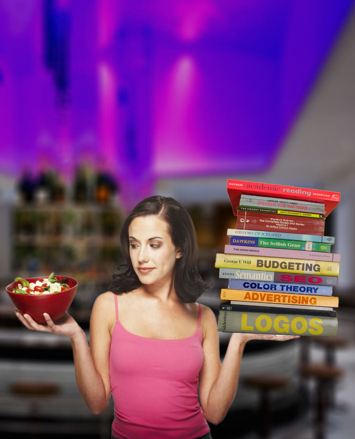
An interesting challenge this week, with a great variety of entries. As James pointed out: "Where the hell do I start?" Exactly what I thought when I got the commission. First on the drawing board was billz, with his invention of 'lacerz' - that's laces, to you and me. A rather glorious text effect here brings texture and interest to the wording, but shouldn't we see a shot of the product as well? Turning Smarties into Dummies is the approach taken by tooquilos, with a lovingly hand drawn box (I like the combination of 'now with nuts' and 'may contain nuts'). Great lettering, and a neat reflection of the cutaway choc. Bound to be a winner! I was very intrigued by Nick Curtain's entry, mainly because he took the same approach as I did - and he even used one of the same stock images (the man up the ladder). The welding of the new neon sign has been beautifully done - I particularly like the smoke and the white hot tip. Not sure Health and Safety would approve of the man having his hand vapourized, though. One thing about the man up the ladder: he confused me at first, because he looks as if he's putting the sign up, rather than taking it down. It's all a question of the direction he's looking in, which shows his intention. A couple of extremely well chosen images from Ben Mills illustrate his take on the dangers of progress. Certainly, the antiseptic, mass-produced top version doesn't compare at all well with the traditional fish and chips below. But I'm not sure those typefaces go together all that well, but in terms of font and treatment. Never shy of taking on the big boys, vibeke has turned her sights on McDonald's - a frightening task, indeed. The new green approach is amply demonstrated through a healthy eating program of asparagus and salad in this excellent montage. But as a McDonald's spokesperson said last year: "Our customers told us they wanted salad. They lied." A designer's scribble pad from Josephine Harvatt, trying to bring an old restaurant up to speed - which is a shame, because the original restaurant looks excellent. I like the shades of Sweeney Todd - and the two swatches of Soylent Green are a master stroke. Tap water seems to be a big issue this week, and Eva Roth's beautifully drawn bottle does highlight the issue. For those who don't know, 'robinet' is the French for 'tap' - a rather subtle touch there. The reflection of the downmarket sauce and cruet basket is a cure addition! And I really liked the pulled-apart cubist version, which is a thing of beauty. A hotel makeover from brewell, with a rather cool distortion of the view as seen through the curtain (but do curtains actually do that. do you think?). I'm not sure the strengthened contrast in the second entry is necessarily an improvement: it rather diminishes the sense of seeing the view through a transparent object. Simplicity, but watery inspiration from Elliott: reversing the letters makes a bold, powerful statement. What a great idea! Chris Berry's pub rebranding shows an example of what's happening all too often to our traditional venues - and a great shame it is, too. What, no more chicken in a basket? And a fantastic expression in the second entry - very neat work indeed! A splendid new market logo from james - for those in far-flung countries, Billingsgate is Britain's main fish market. It's a cunning construction make of swordfish, and the leaping dolphin is a great touch. The second entry brings a sailing shp and another dolphin -and a rather curious band of cloud at the bottom of the sea... I was rather horrified by Babybiker's rebranding of some classic albums: those from the Doors and ZZ Top are ingenious, and I like the subtlety of the Dark Side of the Moon. But The Who setting out in a Tesco livery is just to much to bear! I greatly enjoyed the second entry - Jo Brand and Russell Brand, what a great idea! A good idea from zapat - selling his town in the Philippines through imagery within the lettering. But you need to pay closer attention to the placement of the images themselves: one of the creatures in the O is cut off through the head, and it's rather awkward when some images leak over from one letter onto another, such as on the right side of the H and the left of the L. Looks like a great place to visit, though. Looks like Steve Mac's been getting some grief from his phone provider! Still, better to get it all out in a Photoshop document than to go round to their head office with a chainsaw. Some great ideas in here, Steve! Glad to see you managed to get back on line for long enough to post this. I don't know when Mick Malkemus's hotel on the moon is going to be built, but put me down for a room. The hotel itself is neatly slotted into the lunar landscape - except, perhaps, for the tower on the left, which I think should be leaning over rather more (if it was truly vertical, the line of the tower should point to the centre of the moon). A rather over-enthusiastic glow on the lettering, perhaps - particularly when the lettering gets very small. A very nice idea, neatly achieved, in the second entry - but a dodgy cutout on the toilet itself. Use that pen tool! A great joke, though. Taking the Ritz downmarket has been katew's task, and the subtle changing of the name is perfectly complemented by the low rent inset images. The plastic wood panelling on the interior shot is ghastly! The England flag hanging from the balcony is a very nice touch. A thoughtful approach to the water issue from GKB, with a very good stab at cascading sparkling water (tricky stuff, indeed). The placement of the Badoit label onto the barrel has been expertly achieved, and the tap is at a perfect angle (although the shadow makes it look a little like it's floating above the lid). A wonderful image from Deborah Morley, with a rebranded Starbucks: perfect matching of the lettering, both above the shop and on the roundel logo: I really like the way the two posters are torn in different ways, and the broken glass in front of the window poster. Top marks, too, for taking the newspaper out of the reflection of the man's hand! Classy work. Three different brandings ideas from Gavin, and they're all well thought-out, convincing logos. You should work in advertising! All these people seem rather too distinctive for the scene, though; what's needed is some blander shots of people walking by, surely. But you can keep the cowboy firing out of the Western style restaurant! Great to see that salfordnurse has managed to take enough time off from saving lives to enter this week. 14 hours shifts? Sounds ghastly! Apart from being a good branding joke, this is a nicely achieved entry - and, certainly, 100% natural beef does sound a lot better than 100% meat! A little curvature on the lettering would help it to look as if it's wrapping around the animal, though: a slight application of the Spherize filter would do this well. Looks like michael sinclair is no fan of Bill Gates this week. Trouble with your PC, Michael? Some excellent solutions to what, at first, looked like a rather impenetrable problem. Here's my version: as you can see, it's similar to Nick Curtain's entry in approach. The tricky part here was making the Joe's Cafe sign still legible while being clearly discarded. The purpose of the man in the foreground is to draw the reader''s attention up to the lettering.  |
Posted on 07/03/08 08:32:20 AM |
|
tank172
ThreeDee Thriller Posts: 692 Reply |
Re: Contest 187: Rebranding
Sorry my entry was a bit late. Fantastic job, Steve!   |
Posted on 07/03/08 08:39:31 AM |
|
GKB
Magical Montagist Posts: 4130 Reply |
Re: Contest 187: Rebranding
Thanks Steve, That was one where I had to think about it for a while before inspiration came. Like the Brasserie. Gordon |
Posted on 07/03/08 09:16:34 AM |
|
Nick Curtain
Model Master Posts: 1792 Reply |
Re: Contest 187: Rebranding
Thanks for you comments Steve. I approached this challenge having read the brief numerous times going home on the train and decided that a picture without words should tell the story. The article itself should do that. I then studied examples of your own work within the 2nd edition and tried to imaging how you would approach the task I'm glad to see I was on the right lines. We didn't phone eachother did we? I accept what you say about the man on the ladder and nearly altered the angle of his head. In the end I decided to show the old sign coming down by removing the letters, replacing the wood and darkening where they would have been, as if natural bleaching has occued on the surrounding wood over the years. I did draw holes where the letter pins would have supported the brass, but this has been lost in the resolution The welder has not been altered in any way, other than cloing out detail on his hat and adding the word 'rebranders' Nick |
Posted on 07/03/08 09:26:17 AM |
|
Deborah Morley
Makeover Magician Posts: 1319 Reply |
Re: Contest 187: Rebranding
Thank you Steve. I actually went and took a picture of an empty shop, then realised I couldn't put the posters etc in "between" the reflection and the depth of the shop, so had to start over! That will teach me to take a photo with a very detailed reflection! |
Posted on 07/03/08 09:55:23 AM |
|
brewell
Pixel Pentagrammarian Posts: 752 Reply  |
Re: Contest 187: Rebranding
This was a classic case of being fascinated with the effect and losing sight of the intent. The curtain should look more like an atmospheric distortion. _________________ |
Posted on 07/03/08 10:03:34 AM |
|
tooquilos
Wizard of Oz Posts: 2957 Reply |
Re: Contest 187: Rebranding
Thank you Steve for you comments. Warning - may contain nuts...was actually on a packet of scorched peanuts I bought  |
Posted on 07/03/08 11:29:11 AM |
|
katew
Virtual Virtuoso Posts: 681 Reply |
Re: Contest 187: Rebranding
Thanks Steve. That bedroom is truly ghastly, isn't it?  |
Posted on 07/03/08 12:20:45 PM |
|
Steve Mac
Grunge Genie Posts: 539 Reply |
Re: Contest 187: Rebranding
Thanks Steve. I'd love to post every week but thanks to Mr Bush Ive been trying to find work. When the housing market suffers, so does the stair business. We shall see. Love your montage! |
Posted on 07/03/08 4:06:15 PM |
|
Babybiker
Shadow Spectaculator Posts: 151 Reply |
Re: Contest 187: Rebranding
Thanks as always for the comments Steve. The idea for redesigning the albums was my Dad's, a couple of days before you posted the challenge! Sometimes HTCIP is the only thing that keeps me sane! BB |
| page: 1 2 3 4 last |