
| » Forum Index » The Friday Challenge » Topic: Contest 217: A new business |
|
Posted on 01/10/08 4:28:54 PM |
|
josephine harvatt
Gag Gadgeteer Posts: 2603 Reply |
Re: Contest 217: A new business
Some very clever entries I particularly like the more downbeat versions by McGuyer and Vibeke and hats off (congratulations) to Gerard and his lateral thinking. I had real problems finding an interior so had to cobble one together - as you can see in terms of the brief it is a terrible fudge !  _________________ I'm not really bad - I just draw that way |
Posted on 01/10/08 5:08:51 PM |
|
katew
Virtual Virtuoso Posts: 681 Reply |
Re: Contest 217: A new business
Vibeke - that's great! I wouldn't like to hang around there too long! |
Posted on 01/10/08 6:59:15 PM |
|
vibeke
Kreative Kiwi Posts: 2166 Reply |
Re: Contest 217: A new business
Thanks, have to admit my first thought had been a cheerful flower shop, like you lovely colourful entry, but I ended up going in the opposite direction. The image developed on it's own, once I had got the interior in place, didn't start out to make it an night pic. |
Posted on 01/10/08 9:26:00 PM |
|
Ben Mills
Luminous Luminary Posts: 570 Reply |
Re: Contest 217: A new business
May I submit a second entry?  |
Posted on 02/10/08 08:49:03 AM |
|
Gerard
Digital Dutchman Posts: 145 Reply |
Re: Contest 217: A new business
[quoted] josephine harvatt wrote: hats off (congratulations) to Gerard and his lateral thinking. Thanks Josephine for your kind comments, Photoshop, a blessing for my friday's! |
Posted on 02/10/08 08:55:34 AM |
|
Gerard
Digital Dutchman Posts: 145 Reply |
Re: Contest 217: A new business
Ben, love the glass, great work! Gerard |
Posted on 02/10/08 10:25:09 AM |
|
Eva Roth
Luminous Liberator Posts: 269 Reply |
Re: Contest 217: A new business
Lots of inspiration for shops here in Sicily, but too many other things to do, so apologies - grand opening of fruit and veg shop is some way off... 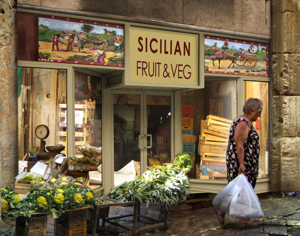 |
Posted on 02/10/08 2:50:55 PM |
|
Gerard
Digital Dutchman Posts: 145 Reply |
Re: Contest 217: A new business
Tutti Bella!! Beautiful piece of work! Well done Eva Gerard |
Posted on 02/10/08 3:27:22 PM |
|
Whaler
Visual Viking Posts: 330 Reply |
Re: Contest 217: A new business
Looks like a shot in the dark. Some might say it's party time! 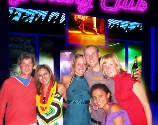 _________________ Only in my brightest moments I understand myself |
Posted on 02/10/08 4:52:23 PM |
|
Philbo
* Posts: 12 Reply |
Re: Contest 217: A new business
A very quick attempt from me, being sneaky at work so forgive the lack of detail! |
Posted on 02/10/08 4:56:44 PM |
|
Philbo
* Posts: 12 Reply |
Re: Contest 217: A new business
Whoops, would help if i attached it... 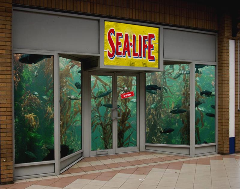 |
Posted on 02/10/08 5:41:51 PM |
|
katew
Virtual Virtuoso Posts: 681 Reply |
Re: Contest 217: A new business
Great idea, Philbo, and welcome to the forum! |
Posted on 03/10/08 08:06:26 AM |
|
Steve Caplin
Administrator Posts: 7068 Reply |
Re: Contest 217: A new business
This week has seen some of the most accomplished, inventive work we've witnessed here on the forum. I've been quite harsh in my comments this week - not because I'm in a bad mood, but because good work deserves extra critical attention. Hope you don't think I'm just nitpicking. First to open up shop was srowden, with a rather impressive furniture outlet. It's a good glass effect, and a brave stab at opening the doors- although there is something a little odd about the two angles here, especially at the tops of the doors. A bit more distortion needed on the interior, Scott: those verticals inside should be at the same angle as the verticals outside. I like the typography of the sign, though. Painless dentistry offered by mguyer: a good selection of dental images, and I especially like the name on the doors. Not sure that covering all the windows is especially welcoming, though - especially with the shot of the boy having his head twisted off. I like the second entry, with its night view - but it doesn't look that enticing! Wonderful animal action from james, with superb realism in the movements of the cat and the pigeon. Couple of issues with the shop, though: firstly, those people are clearly far too big to fit through the door. And secondly - while adding a reflection to the glass is a great idea, you must remember to remove it over the open door! A fantastic 'charlatan' setup from tooquilos, with a store front filled with the arcana of the fortune teller's profession. Some great gags here - I particularly like the astral travel with frequent flyer points - and some cool neon lighting. Dodgy angle on the pentangle on the floor outside: this would have been a case for Vanishing Point. An intriguing empty store from gaoxiguo, with a lot of space that could be filled with computers. The angle of view is difficult: we're looking straight at the interior, but looking at an angle at the front. Good lettering and reflections - and this is a lot tidier than my real office. I love The Mad Lep's idea of a place where Barbie shops for children - and that doll walking out is perfectly scaled and integrated into the scene. Great pink decoration, but the children all seem rather large for the shop - especially those on the left. And what's going on with the ceiling in the left window??? A splendid view of Ben Mills' family butcher - and I'm glad to see you've resisted the temptation to butcher a family for this one. It's a good angle but there's a problem around the right hand window: the counter seems to sink into the floor as it approaches the front. A little rebuilding would have helped here - and perhaps a different floor, as this one draws attention to the mismatched perspective with the tiles outside. An amazingly good second entry though- there's real life in the bursting glass, and great action from the bull. Good work! A most interesting poker club from Charlotte Babb - although you think they'd want some curtains for privacy. I especially like the light glow around the sign, and on the floor outside. But what's casting the shadow of that neon? Great perspective from brewell (except perhaps on the bottom shelves, which seem to be tilting downwards). I love the idea of this one: all those boneless chickens slumped around the place. I think what's needed here is the human element, though: a shopper examining the goods would have given a great boost to the effect. An amazingly good video store from Nick Curtain, that's about as perfect a job as we could hope for. The angles, the reflections and the shopper fit immaculately into the original frontage. My only comment would be to ask for an apostrophe in "Nick's" - but that's hardly a Photoshop comment! Funny work from Meltonian, with an ingenious solution. All that empty space though, does draw attention to the floorboards, which don't quite follow the angle set by the tiles outside. Damn this perspective! A great idea from maiden, with Adobe gearing up for yet another software upgrade. Do you think it takes them long to come up with the name each time? I like the transparency of the lettering, and the poses and expressions of the people in the scene. Looks like they've cleaned out the shop, though - has he nothing left to sell? Again: if you're using a strongly patterned floor, make sure it lines up with the tiles immediately outside the door. I'm trying to read the message in dave.cox's entry. We have a largely empty (but huge) store, a church dance hall apparently, and a grand piano floating on a piece of wooden floor in one of the windows. I'm sure there's some ingenious pun work here, but I can't quite see it! From a technical standpoint, the piano seems a little small. But all the signage works well, and I like the perspective of the interior (although you should take another look at the tiles immediately outside the door). A splendid new setting from michael sinclair, who has transported the shop to a magnificent Italian setting. It's a slightly curious fit: the doors have ended up absolutely huge, and the angle of view of the interior is rather at odds with the space outside. And if you have to use a view with a reflective floor - make sure you reflect your new scene! A great tattiness in Neal's closed-down bank, with a fine selection of window signs - I especially like the boards covering the far left window. A great banner, too, and the hint of a three dimensional sign above works perfectly. Best of all, of course, is the appearance of the Three Stooges - lovingly hand tinted, perhaps? A fantastic scene from katew, with a beautifully contrived flower shop that's full of interest. The addition of all the elements outside makes all the difference here. A great sign, too, with a cunning adaptation of the original logo. Really good work, Kate - you should be very pleased with this one. A touch of true ingenuity from Gerard, who's turned the whole view around with great panache. The exterior has been made into an interior beautifully, with great detail such as the light on the view outside penetrating onto the floor within. My only issue here is with the woman on the bench: her feet are clearly sticking into the shop, and that's because she's too big for the scene - if she stood up, she'd never get through the door. It's always a problem when adding background scenes that have been photographed close up. What's needed is a section of a more distance image, without the distortion of the close-up elements. A cosy bar from vibeke, but the warmth inside is set off by the graffiti outside. I like the way the interior fits, and those curtains are the perfect way to hide the join around the floor. they should perhaps be a little higher, and the sign a little larger. It's a great treatment, though, and a very consistent scene. A beautiful shop front from Josephine Harvatt, which she describes as "a terrible fudge" - not at all! The interior is perfectly consistent, and would have been even better if we could see through the doors as well. It's the colouring and lettering that make this work so well - although I'd like to see a person in there somewhere. We know now of Eva Roth's passion for Sicily, and it's well reflected in the way the shop front has been integrated into the new scene. The interior seems rather bright, perhaps, especially on the left: darkening it would have made it look more like it was inside the shop. And what's the Italian for "fruit & veg"? Well, that's one way to get round the perspective issue: Whaler's hidden the shop behind a group of partygoers. Looks like a fun place to spend an evening, even if the guests do spend their time outside mugging at the camera. I like the small amount of neon here. Good to see Philbo back after a long absence - with an ingenious aquarium scene. It's a great idea, and the fish look good in there: but you need to add a floor, to match the height of the one outside. And the door says "open", but what would happen if you opened it? Excellent work from everyone. A real treat. |
Posted on 03/10/08 08:42:34 AM |
|
Nick Curtain
Model Master Posts: 1768 Reply |
Re: Contest 217: A new business
Thanks Steve I pondered over this one for a while before doing anything, because I saw the biggest challenge being to make the glass look like glass. Looking closely at local shops revealed to me that you probably see more of what is reflected from the outside, than what is actually inside the shop. I considered it would have been very difficult to achieve this from scratch and make it look convincing. Fortunately the video shop came to my rescue, but it did not fit exactly, even when photographed from exactly the same angle, so there was an element of transforming to do. I added the people interest by snapping a shot of my daughter in the garden holding a DVD case. Nick |
Posted on 03/10/08 09:28:48 AM |
|
The Mad Lep
Four-Leafed Fantasist Posts: 323 Reply  |
Re: Contest 217: A new business
Thanks Steve! Youre dead right and I have no excuse for the children. I knew they were too big, but I'd spent so long on the rest of the image's colouring at that point that it was just pure complacency. Good lesson for me in this; take more breaks. I tend to sit down and try to do it all in one go, which is a lethally stupid idea. I forget that a fresh look at things a few hours later can be very beneficial. I think what I did with the left ceiling was a mistake too; theres two separate images made for each window, because the ceiling I used didnt have enough space to stretch across both. Im hoping that new feature of the transform aspect in CS4 will help with things like that. I also think I need to do more tutorials on perspective, its not something I enjoy working with and so I spend little time on it .. point taken. Many thanks  |
Posted on 03/10/08 10:26:32 AM |
|
josephine harvatt
Gag Gadgeteer Posts: 2603 Reply |
Re: Contest 217: A new business
Thanks Steve - take my word for it that if you had been able to see through the doors it wouldn't have been "perfectly consistent" - or even vaguely consistent  _________________ I'm not really bad - I just draw that way |
Posted on 03/10/08 10:59:21 AM |
|
katew
Virtual Virtuoso Posts: 681 Reply |
Re: Contest 217: A new business
Thanks Steve. I enjoyed doing this one. Re-writing the Austin Powers logo took some time, but it was good fun! |
Posted on 03/10/08 12:21:59 PM |
|
tooquilos
Wizard of Oz Posts: 2918 Reply |
Re: Contest 217: A new business
Thank you Steve  I need to polish up my vanishing point skills. I need to polish up my vanishing point skills.  |
Posted on 03/10/08 1:16:59 PM |
|
Gerard
Digital Dutchman Posts: 145 Reply |
Re: Contest 217: A new business
Hi Steve, thanks for the comments,  you are absolutely right!! you are absolutely right!!
The woman in the picture aswell as the bench where to close to the window. I just focussed on the inside -outside idea but practise makes perfect!! |
Posted on 03/10/08 1:36:51 PM |
|
maiden
Golden Gif Gagster Posts: 471 Reply |
Re: Contest 217: A new business
From what I could see Steve is that the tiles just before the doors didn't match the perpective of the room itself the reason for this is that those tiles go up in an incline which you can seen by the bottom edges of the windowframes each side of the doors, so to match the perspective of those tiles would have made the interior floor look as if it was rising. I made several perspective lines using those tiles but they never worked to match the perspective lines of the rest of the image. 
|
| page: 1 2 3 4 last |