
| » Forum Index » The Friday Challenge » Topic: Contest 148: Clowning around |
|
Posted on 29/05/07 4:43:06 PM |
|
GKB
Magical Montagist Posts: 4057 Reply |
Re: Contest 148: Clowning around
Thanks Neal and Katew, I really couldn't decide which version was better. The version using the white layer seemed to give a 'thicker greasepaint' look at the expense of some texture but the curves version seemed to give a 'thin coating of greasepaint' look but with better texture. I have posted a URL below for a larger image to compare with my first posting. The question is ............ What does Steve think? And, by the way, I hope all our US chums had a great Memorial Day. I used to get over to Northern Ca for a good few years for the Memorial Day Weekend and have very fond memories. http://i150.photobucket.com/albums/s93/GKBphoto/DubyaClowncurves.jpg |
Posted on 29/05/07 5:43:52 PM |
|
Whaler
Visual Viking Posts: 330 Reply |
Re: Contest 148: Clowning around
[quoted] GKB, I agree with Neal and Katew, the second version is better since detail and texture comes through in a better manner. _________________ !!!!!!!!!!!!!!! |
Posted on 29/05/07 7:11:51 PM |
|
Deborah Morley
Makeover Magician Posts: 1319 Reply |
Re: Contest 148: Clowning around
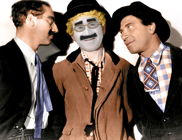
With many thanks to Vibeke for a great tutorial We may have been mad, but who does this clown think he is!  |
Posted on 29/05/07 7:14:49 PM |
|
michael sinclair
Off-Topic Opportunist Posts: 1871 Reply |
Re: Contest 148: Clowning around
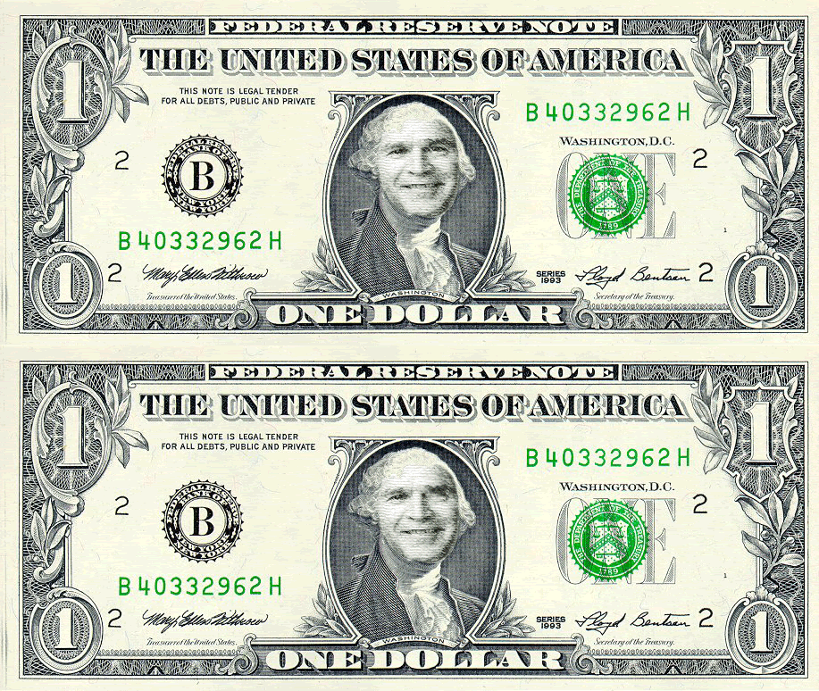
I wish to thank everybody for both this week and last week's compliments; unfortunately, I have not been able to respond as quickly as I liked, as my Mother has been ill (bit better now), and my own heart problem has not helped. Michael 
Click the pic for more detail 
|
Posted on 29/05/07 7:35:56 PM |
|
vibeke
Kreative Kiwi Posts: 2166 Reply |
Re: Contest 148: Clowning around
Lovely work Deborah, didn't know I was such a good teacher, and best wishes for your's and your mother's health, Michael. |
Posted on 30/05/07 2:53:06 PM |
|
josephine harvatt
Gag Gadgeteer Posts: 101 Reply |
Re: Contest 148: Clowning around
Good thoughts to both you and your mother Michael _________________ I'm not really bad - I just draw that way |
Posted on 30/05/07 3:55:04 PM |
|
GKB
Magical Montagist Posts: 4057 Reply |
Re: Contest 148: Clowning around
That goes from me too Michael. |
Posted on 30/05/07 7:10:49 PM |
|
Eggbox
Ovoid Opportunist Posts: 797 Reply |
Re: Contest 148: Clowning around
I feel for you both Michael. My thoughts and best wishes are with you. Ted |
Posted on 31/05/07 00:22:46 AM |
|
james
Surreal Spoofer Posts: 1194 Reply |
Re: Contest 148: Clowning around
http://i153.photobucket.com/albums/s211/fungismith/Bush_2.gif 
|
Posted on 31/05/07 07:12:52 AM |
|
Tom
Texture Technologist Posts: 403 Reply |
Re: Contest 148: Clowning around
This challenge is not for the clourophobic. 

|
Posted on 31/05/07 7:32:44 PM |
|
michael sinclair
Off-Topic Opportunist Posts: 1871 Reply |
Re: Contest 148: Clowning around
Thank you all for your concern 
I've squeezed in a litle bit of time to make the "Yankee Dollar" more realistic: Please Note: it appears that by clicking on the image for a larger pic will remove the differential shading caused by who knows what! 
|
Posted on 31/05/07 9:08:50 PM |
|
celosia
Wondrous Woolflower Posts: 58 Reply |
Re: Contest 148: Clowning around
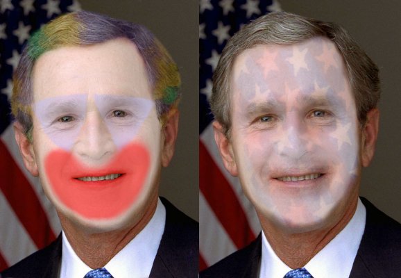
Couple of choices for Bush from me... I started off thinking I'd do something along the lines of what ben did with a Krusty-style face, but when I actually sat down to work on it (an hour or so ago!  ) I ended up doing a fairly traditional face. Then I thought he might want something patriotic, hence the second face. I can't decide which I prefer so submitted them both... ) I ended up doing a fairly traditional face. Then I thought he might want something patriotic, hence the second face. I can't decide which I prefer so submitted them both... |
Posted on 31/05/07 11:45:30 PM |
|
jwhite
Collage Critter Posts: 274 Reply  |
Re: Contest 148: Clowning around
A young Mr. Bush proves that one doesn't need make-up to be a clown.  |
Posted on 01/06/07 08:48:10 AM |
|
Steve Caplin
Administrator Posts: 7068 Reply |
Re: Contest 148: Clowning around
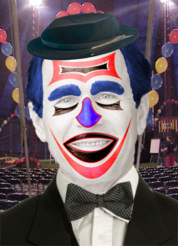
You know, until hi-liter pointed it out, it honestly hadn't occurred to me that turning George W into a clown might be politically sensitive. Would we have done this with a Muslim cleric? No, almost certainly not. One of the great benefits of living in a democracy is that lampooning our leaders is not only tolerated, it's expected. And compared to most of the acerbic treatments to which politicians are regularly subjected, adding a clown's face is tame indeed. But enough of politics... First to pick up the make-up box was stefan, with a new version of Grant Wood's American Gothic. A web search will turn up dozens of variations on this iconic image, but Stefan's is notable for the seamless blending of the new head into the old one - and, of course, the subtlety of the clown's makeup. Very good! Very patriotic hair from Whaler - and eye styling that's more reminiscent of glam rock than the big top. Great skin texture showing through here: the painted eyebrows are especially convincing. And the second entry is truly extraordinary - but he doesn't look that happy about it... Some fantastic shine on the make-up in Dejá_vu's entry - and the dictionary's been pressed into service here as well. Very convincing make-up, and a great design - that stylized moustache neatly forms the outline of the cheeks. And a truly splendid second entry! We have a new member this week - ziiwow has weighed in with a fantastic piece of work. There's so much detail in here: the wrinkling of the leg of the shorts above the knee; the sagging of the dropped trousers; the neat curve on the photo of Bin Laden; the undone shoelace; and, of course, the whole image set on an aircraft carrier. Just one observation: the shadow on the globe is a little at odds with the one on the ground. Tricky to get this business right - but if you think of them as being one single shadow, that should help to make the joins work. Intrigued by the added drain in the second entry - subtle stuff, indeed. Great work - welcome to the forum! Pauline's entry reminds me of the sort of painting that used to be on sale in Woolworths in the 1970s! But it's a really well accomplished piece, with Bush's likeness definitely beaming out of there. When you say you used pastels and chalk, do you real the real stuff? With no multiple undo? Now there's dedication! A fabulous fright wig and a funky background from vicho: and the new mouth certainly adds some character here. But the pure white of the face needs a little decoration, surely? Glad to see that hi-liter felt moved to explore the subject, even if the theme strayed a little. It's certainly a strong piece of work: and that's a fabulous glow! The way I see it: if you've been motivated to create a piece of artwork, then it's all for the good. A really striking entry from tooquilos - the glam rock Bush is really made by the skilfully opened mouth, and the seamless tongue. And an excellent second entry - what a great poster! And what a horrifying movie that would be! These are two really good entries, Anna, and are certainly enough to earn you a forum title. Of, course, there's only one contender: the Wizard of Oz. A bit of a monkey face from josephine harvatt: no political comment intended, I'm sure. I'd recommend changing the layer mode to, say, Hard Light or even Multiply, though, to make the skin texture show through here. A very cartoony approach from 2bfree, with a liquified Bush (now there's an idea) who's looking more like his dad than ever. The colours of the lips and suit are a little too strong to be entirely convincing: bright colours are certainly appealing, but in a photographic context they do stand out rather too much. Dollars in the eyes from dave.cox: they make rather good eyebrows, too. Once again, though, the red make-up seems superimposed on the image, rather than part of it; it's all a question of layer modes. Try cycling through them until you find one that does the job! A great circus scene from vibeke, with a selection of bodies and bro and dad getting in on the act too. Are they going to perform the legendary Counting Chads trick? And thanks for posting the second entry so we can see the make-up in full! An excellent book cover from Dirtdoctor23, with a fantastic flag make-up - complete with Texas over the eye. Love the reflection, too! My only criticism here is that we can see the top of the book from too high an angle. I'd try losing the top altogether, and slanting the side down from the top right corner: this would bring us closer to the cover, as if we were on the same eyeline as Bush. Astounding work from Neal this week: there's a level of realism here that's truly extraordinary. And the added details - the hat, the bow tie - really make this one sing. Wonderful! Freedom of expression, eh? So which came first from michael sinclair - the idea or the title? Clearly been having fun with the Liquify filter! And the wink in the second entry is a really good touch. To echo other members, my best wishes for yourself and your mother, Michael. A funny spinning bow tie from BigVern - and Bush rendered onto a hand-drawn egg, from the look of it. Just a couple of observations: first, eggs tend to be, you know, egg shaped; and secondly, are you sure the canvas texture is the right choice? A minimal approach from steve hill: the white works well on the right, but on the left it seems to flatten out the face rather too much, wouldn't you say? The new hair colour works well, though. There's a real charm to Pierre's entry: I've certainly never seen Dubya looking so damn cute - and thanks for showing us the unmade-up inset for comparison. He could really do with a professional to help with his make-up, though. A great car and body from GKB, and the makeup and wig fit well into the scene. The background design suggests a big top without actually showing one, which is effective; I would like to have seen some ground and shadows there, though, to tie the scene together. And interesting to see the two different approaches to whitening the face. I'm leaning towards the Curves version, although the make-up looks flat in this one - why can't we see the skin texture through it? Really, though, I think a combination of the two would produce best results. Extremely well achieved work from Ben Mills this week, with a Bush who's not only bald, he's acquired a presidential seal. The fitting of the seal to the head is really neatly achieved: this is a very tricky perspective to get right, and it's been done perfectly. Spherize? Or Warp? A White House location from katew, and a well planned knife-throwing act. There's a consistency of tone and colour here that ties the scene together well - very well achieved. The only problem here is one of the horizon line: our view of the room shows our eyeline to be on a level with the middle of the top window sash, but we're looking down on Bush too much. It's hard to get this one right, and although not everyone would spot that it's a horizon issue, there is something uncomfortable about the scene. Check out the perspective chapter again! Beautiful work from Wayne, that's both funny and sad. The wig fits perfectly, with fantastic shading: the monochrome approach to the skin adds a gravity that works really well. You're lucky there wasn't more of the suit visible, though: I've drawn a full striped suit before and it isn't easy! A very funny entry from ben, turning George into Sideshow Bob from the Simpsons. It's been achieved with great skill: the distorted mouth to make the smile, the enlarged irises, the bald head all combine to make this one work. And I love the trademark Simpsons overbite! Great stuff, Ben. I really enjoyed james' animation, particularly the way the shadow moves with the figure: and the changing hand positions add a lot of life here. I loved the second entry, too - but surely the make-up shouldn't have spread to cover the teeth and eyes?Now, if only animated GIFs supported a music track... Wonderful work from Deborah Morley - Bush slots so neatly into Harpo's body that he might have been built for it. Looks like you've coloured an original black and white photo there, too - good skin tones! And I think adding a Groucho moustache is a neat touch. Honk honk! A couple of variations from celosia, with different approaches. I like the style of the makeup in the first, especially the subtle tinting in the hair; but it's the second version that really tickled me, with the sense of Bush fading into the flag behind him. An interesting take on the subject! Well, if you can't beat them - hang up side down from the ceiling, that's what I always say. And jwhite has slotted Bush onto this Spiderman body perfectly: a touch of grey in the hair would have helped to complete this scene. By the amount of wrinkles and the visible watch, I'm guessing this isn't a still from the movie? |
Posted on 01/06/07 08:57:23 AM |
|
Whaler
Visual Viking Posts: 330 Reply |
Re: Contest 148: Clowning around
Thanks, Steve. In the second entry GWB doesn't look happy. That's because I made him look more sinister. A more positive thinking person might say he looks more determined. _________________ Only in my brightest moments I understand myself |
Posted on 01/06/07 09:26:06 AM |
|
katew
Virtual Virtuoso Posts: 681 Reply |
Re: Contest 148: Clowning around
Thanks Steve. Yes, the perspective was difficult. I found this quite a difficult challenge altogether, but I had fun trying! _________________ Wrinkled was not one of the things I wanted to be when I grew up ... |
Posted on 01/06/07 09:31:34 AM |
|
GKB
Magical Montagist Posts: 4057 Reply |
Re: Contest 148: Clowning around
Thanks Steve. An interesting technical problem this week. |
Posted on 01/06/07 10:08:00 AM |
|
stefan
Detail Demon Posts: 401 Reply |
Re: Contest 148: Clowning around
thanks Steve. |
Posted on 01/06/07 11:13:54 AM |
|
Ben Mills
Luminous Luminary Posts: 570 Reply |
Re: Contest 148: Clowning around
Thanks Steve. I used spherize plus 3D transform to fit the seal |
Posted on 01/06/07 11:54:37 AM |
|
Whaler
Visual Viking Posts: 330 Reply |
Re: Contest 148: Clowning around
Oops! Double post. Should've been edit. See post above _________________ Only in my brightest moments I understand myself |
| page: 1 2 3 4 5 last |