

| » Forum Index » The Friday Challenge » Topic: Contest 153: Brown study |
|
Posted on 05/07/07 10:10:23 PM |
|
michael sinclair
Off-Topic Opportunist Posts: 1871 Reply |
Re: Contest 153: Brown study
Thanks Stefan, and Deborah! Immortality for Gordon: 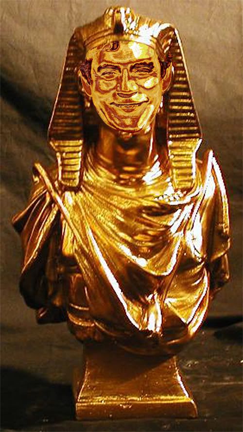
|
Posted on 05/07/07 10:38:38 PM |
|
BigVern
Q Quipper Posts: 674 Reply |
Re: Contest 153: Brown study
That's better ... 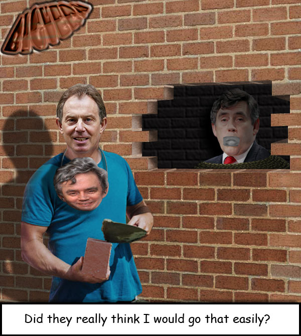 |
Posted on 05/07/07 10:40:26 PM |
|
BigVern
Q Quipper Posts: 674 Reply |
Re: Contest 153: Brown study
Tut Tut Michael ... geddit? 
|
Posted on 06/07/07 00:35:57 AM |
|
Neal
Master Manipulator Posts: 322 Reply |
Re: Contest 153: Brown study
BigVern, That's fantastic! It's very funny. |
Posted on 06/07/07 00:38:24 AM |
|
stefan
Detail Demon Posts: 401 Reply |
Re: Contest 153: Brown study
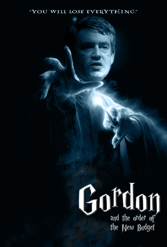 |
Posted on 06/07/07 02:16:43 AM |
|
celosia
Wondrous Woolflower Posts: 58 Reply |
Re: Contest 153: Brown study
Love it, Stefan! Here's mine... well, diamonds *are* a girl's best friend! 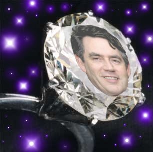 |
Posted on 06/07/07 05:17:21 AM |
|
tooquilos
Wizard of Oz Posts: 2957 Reply |
Re: Contest 153: Brown study
Having just recently seen The Fanstastic 4..I felt compelled and inspired to create our own Fantastic 4  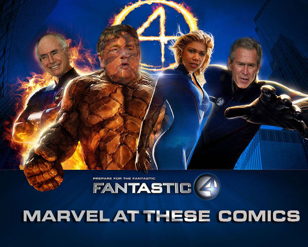 |
Posted on 06/07/07 08:04:24 AM |
|
stefan
Detail Demon Posts: 401 Reply |
Re: Contest 153: Brown study
Thanks Celosia  |
Posted on 06/07/07 08:38:13 AM |
|
Steve Caplin
Administrator Posts: 7135 Reply |
Re: Contest 153: Brown study
I do hope Gordon Brown is a secret visitor to this site. I think we may have found a few ways to get him re-elected. Stefan set the tone with a startlingly good new body for the new Prime Minister: the colour matching with the head is spot on, and the shading on the head is a good attempt to match that of the body. Beware the random shadows and highlights, though: the shadows on the forehead and cheek make him look bruised rather than bronzed. But what a great body! And the second entry borders on genius. Fantastic stuff. Good to see mguyer back in action, giving us a rather sinister Brown who looks like an enforcer for his local rabbi. Mind you, I suppose a man with a beard would find a man with a beard voter-friendly... jwhite was the first this week to surround Brown with pouting bimbos, and there he is in full Hefner attire. Great colour matching - although he does seem more interested by the table decorations than by his companions. A bit of eye contact needed? A splendid magic poster from Ben Mills, with deputy PM Harriet Harman perched on his lap. Perfect matching and blending on both heads makes this a treat - but I would question your choice of typography. That font, best known as Machine, is most suited to football shirts. Something more 1900s needed here! A very moody study from Tabitha: the head fits well on that body, and the shading matches that of the body. From this angle, though, I don't think we'd see the hard line beneath his jaw, between his chin and his ear: seems to me the neck would join pretty much straight in to the back of the jaw. A good mix of cartoon styles from steve hill: always good to see Homer and Bender making a guest appearance. A great body for Gordon, certainly, and a fair stab at cartoonifying his head. But I reckon it wouldn't have been hard to draw his features in afterwards, matching the style of the other figures. Hmm... maybe there's a Friday Challenge in that... Beautiful work from vibeke: the choice of body for Gordon is perfect, the hand giving him a perfect smirk - and great colour matching on the head. But shouldn't Paris' photo on the curtain be in perspective with the rest of the scene? A great mythological second entry - neatly rebuilt wings, there - and a cool animated version. A cool morph from tooquilos, with Gordon turning into Lurch from the Addams Family. One tip here: when doing these transformations, it really helps if you give both starting and finishing images the same clothes and background. The less we see changing, the more convincing it is. I love the second entry - but couldn't his legs bend as he leaps? The third entry is a terrifying view of world leadership. Comics, indeed! Bit of an allegory from james, with Gordon as St George, with the flag of St Andrew on his spear, impaling John Bull while some celtic patriarch looks on. Complex work, particularly impressive that you managed to find a reclining image of John Bull! A really great animation in the second entry - scary stuff, indeed! An altogether more patriotic approach from Steve Mac, with Brown as jester waving the flag. Good colouring on the clothes, and a neatly rippled flag. The shadow behind him places him closer to the wall than the position of his feet would suggest, though: hard to get this one right, isn't it. Bit of an Escher approach from Babybiker. I do find this technique impressive, although I wonder if the shading on the inside of the head is just a little to dark. Is he just unravelling? A funny mock Soviet poster from josephine harvatt, with neatly flipped Rs and a lower case b adding typographic authenticity (although this 1970s font is perhaps too rounded). The dot screen on Brown's face is a really neat touch, and adds a lot to the texture of the poster. Excellent! A new member this week: and ArchAngel has decided to take the years of Mr B. A very convincing remodelling of the chin and general slimming down - and those bags and wrinkles have been very neatly removed. Strange to think, though, that in his younger days Our Leader had shoulder length hair. Welcome to the forum, ArchAngel. A cool Bond poster from Dirtdoctor23: a dynamic pose, and good line of sight in the eyes. I'd be interested to know how many images went into this one - what did you start off with? A great choice of theme in the second entry as well - and it really comes to fruition in the third entry. There's something very odd about Whaler's entry. We now have eye contact, some laughter lines, and a toothy grin: but there's something about Gordon that makes him look like he's had major facial surgery. Could have cleaned his teeth, Hans-Erik! A similar approach taken by dave.cox, so it's interesting to compare this with Whaler's entry. The eye contact is particularly good here, but the mouth seems to be at a different angle to the rest of the face. Tricky stuff, matching these features. A good choice of background from katew - but what's most impressive here is how much more rugged Gordon seems in this photo. Bit of a neck join issue, though! Darken the original, it's the only way. Very neat work from Wayne, merging Gordon's features into Churchill's head and body. Matching the grain of the original works particularly well - good attention to detail, there. I'd have left Gordon's hair in, though, to help with recognition. Old rockers never die, they just charge outrageous amounts for tickets... and 2bfree's entry puts Gordon on stage with the Rolling Stones. A perfect fit, and a surprisingly appropriate expression: tucking him behind the guitar head really places him firmly in the scene. A great magazine cover from Meltonian, with great cover lines and a neat logo. Plenty of good gags in here - and what a good job for Sven. Perhaps he'd bring some much-needed glamour to the cabinet? Good work, Graham. Sheer genius from Deborah Morley: a great solution, beautifully executed. Excellent shading through the eye holes! I take it michael sinclair isn't going to vote for Gordon next time around. A well fitting uniform, and the monocle is a great touch: but watch its shadow! On the face only, please! A splendid second entry though. One tip: add the Curves effect as an Adjustment Layer, and you can blur the layer beneath at the same time to prevent the fine raggedness in the detail. Otherwise, this is perfect. Another startling entry from Neal: the poses, the expressions, and the blending are all just right. The only thing I'd take slight issue with is the colour of Bush's face - a little too red for his arm, and for the scene? Otherwise spot on! Glen has recycled last week's entry to place Gordon into the scene - now compete with flooding and a V-sign from a silhouetted Postman Pat. Classic - and classy - work! A touch of surrealism from Tom: a great wood effect, which looks like it's been hand rendered; great texture on the painting behind, and thoroughly beautiful smoke. But what's it telling us? I didn't see Tabitha's first entries, as she deleted them - but judging from the final image, I don't really see how it could be improved upon. A great gag, a perfectly recreated Dummies cover, and Brown's head fits neatly into that collar. Excellent work, Tabs! A very funny gag from BigVern, with good perspective on the inner brickwork and great bodies for both. The rope coils work really well, as does the tape over Gordon's mouth. It's always tricky making a face look like a mask, though; I find it helps to show a bit of an edge to it, giving the impression of slight thickness. But what a great idea! A good idea from celosia - a girl's best friend, indeed. But doesn't Gordon's face rather lower the value of the gem? You know, I'd really have tried the Facet filter on Gordon's face, to see if it helped to make him part of the diamond... Excellent work, everyone: some really great ideas this week. |
Posted on 06/07/07 09:11:42 AM |
|
Deborah Morley
Makeover Magician Posts: 1319 Reply |
Re: Contest 153: Brown study
Many thanks Steve, I tried the eye shading about 8 times so am glad I eventually got it right! |
Posted on 06/07/07 09:40:25 AM |
|
stefan
Detail Demon Posts: 401 Reply |
Re: Contest 153: Brown study
Thanks Steve. |
Posted on 06/07/07 09:44:11 AM |
|
BigVern
Q Quipper Posts: 674 Reply |
Re: Contest 153: Brown study
Thanks Steve. I spent quite some time creating the perspective on the brickwork. I will try thickening edges if I create a mask in future. |
Posted on 06/07/07 10:35:23 AM |
|
vibeke
Kreative Kiwi Posts: 2167 Reply |
Re: Contest 153: Brown study
Thanks Steve, and you are right about the poster, I knew there was something not quite right. |
Posted on 06/07/07 11:37:26 AM |
|
katew
Virtual Virtuoso Posts: 681 Reply |
Re: Contest 153: Brown study
Thanks Steve! _________________ Wrinkled was not one of the things I wanted to be when I grew up ... |
Posted on 06/07/07 12:54:09 PM |
|
Steve Mac
Grunge Genie Posts: 539 Reply |
Re: Contest 153: Brown study
Thanks Steve. The shadow thing bugged me too. Perhaps if I lowered the shadow of the hat might have helped. _________________ Steve Mac |
Posted on 06/07/07 1:22:42 PM |
|
steve hill
Brain Basher Posts: 228 Reply |
Re: Contest 153: Brown study
thanks steve will give it a go next time |
Posted on 06/07/07 1:44:51 PM |
|
michael sinclair
Off-Topic Opportunist Posts: 1871 Reply |
Re: Contest 153: Brown study
Tips much appreciated. No, I think Gordon Brown is OK; it's that wimp on the other side who is too obsequious.  |
Posted on 06/07/07 3:00:04 PM |
|
tooquilos
Wizard of Oz Posts: 2957 Reply |
Re: Contest 153: Brown study
Thank you Steve. I wasnt entirely happy with Gorch animation and now I can see where I went wrong.  |
Posted on 06/07/07 3:58:25 PM |
|
Wayne
Printers Devil Posts: 312 Reply |
Re: Contest 153: Brown study
Thanks Steve. You're right, he would've been more recognisable with his own hair! |
Posted on 07/07/07 00:03:21 AM |
|
dave.cox
Marquee Master Posts: 518 Reply  |
Re: Contest 153: Brown study
Thanks Steve. I see what you mean about the crooked smile. I wondered if anyone would notice that it came from Bush. 
Oooh, Tooquilos I just saw your fantastic four. Cooool!  |
| page: 1 2 3 4 5 last |