
| » Forum Index » The Friday Challenge » Topic: Contest 235: Museum lighting |
|
Posted on 11/02/09 11:28:20 AM |
|
Swade
* Posts: 19 Reply |
Re: Contest 235: Museum lighting
Hi everyone, here is my first attempt at the friday challenge. As i compare it to the other's pictures here is what i found difficult/had problem with. i used the method "paste into" for the sky of course... but... my ceiling is not very well defined. I used the select color range method for the sky... and even if i tried to refine the edges i still have that somewhat fuzzy ceiling... I then simply changed the hue/saturation of the museum, and added some shadow at the ramp. Cheers F./ 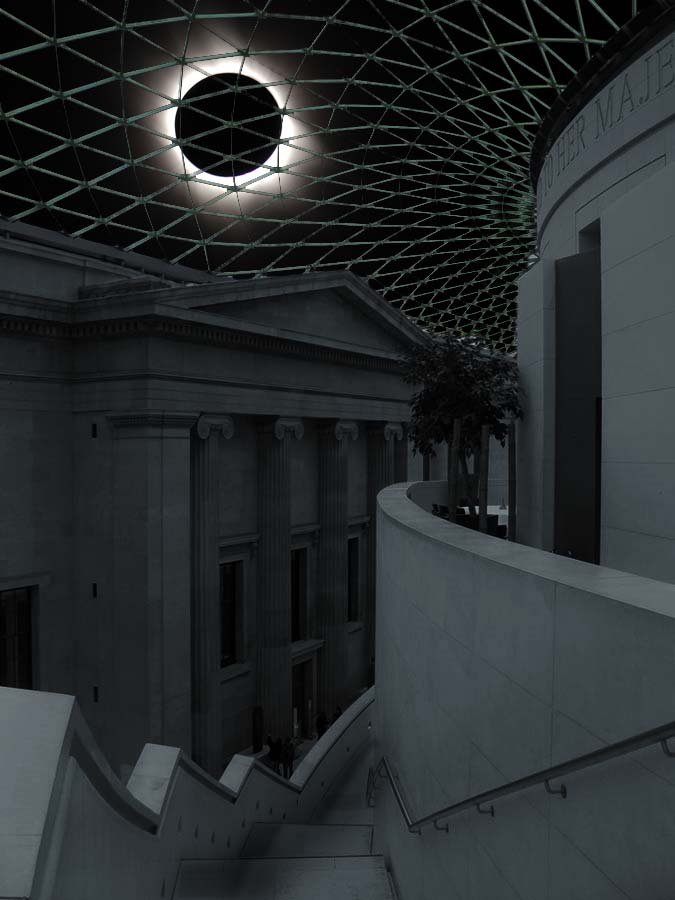 |
Posted on 11/02/09 12:01:40 PM |
|
josephine harvatt
Gag Gadgeteer Posts: 2605 Reply |
Re: Contest 235: Museum lighting
Very spooky Swade _________________ I'm not really bad - I just draw that way |
Posted on 11/02/09 2:02:21 PM |
|
The Mad Lep
Four-Leafed Fantasist Posts: 323 Reply  |
Re: Contest 235: Museum lighting
Oooh I like that Swade! Very creepy effect. Welcome to the forum. 
Jeepy that's a great entry, what a clever idea. I love those taps!! 
Thanks for the comments Anna and Jo!  |
Posted on 11/02/09 4:11:05 PM |
|
Jota120
Ingenious Inventor Posts: 2615 Reply |
Re: Contest 235: Museum lighting
Great all and new guys. You've done great work. Not sure mine is appropriate again .... 
Excuse ... really short of time this week and was/am thinking of Oz and others. So just this one, bit rushed again. ....also my flight to London is not until end of month, so I'd have missed deadline
Subject: artist from London (was still work in progress). Theme Take the aritist from without and put them within   |
Posted on 11/02/09 6:59:07 PM |
|
Jota120
Ingenious Inventor Posts: 2615 Reply |
Re: Contest 235: Museum lighting
Kate, Nick, Stephan and others, If you want? How come you avoided the pixelation of the roof which I tried to subdue? (Some others had the same problem!) Cheers, Trevor |
Posted on 11/02/09 7:25:11 PM |
|
katew
Virtual Virtuoso Posts: 681 Reply |
Re: Contest 235: Museum lighting
I didn't do anything special with it, but I copied it to a new layer by selecting all the sky and inverting the selection. |
Posted on 11/02/09 11:55:49 PM |
|
Jota120
Ingenious Inventor Posts: 2615 Reply |
Re: Contest 235: Museum lighting
Thanks Kate. .... lazy I used blending option (seems not sophosticated proramme behind it ????.... ) |
Posted on 12/02/09 00:03:55 AM |
|
Jota120
Ingenious Inventor Posts: 2615 Reply |
Re: Contest 235: Museum lighting
Oh! there was alot of quick pen work too. We must get Jospehine into pen work Its your/our best friend
|
Posted on 12/02/09 05:57:40 AM |
|
Nick Curtain
Model Master Posts: 1792 Reply |
Re: Contest 235: Museum lighting
Nothing special Trevor. Given the numerous panes to be selected, I started with the Wand set to a low tolerance and then normal (32), but no automatic selection is going to give to an accurate result. The issue is that the roof is some distance from the camera and therefore the join between the frame and pane can become muddled, unless the image is very his res and taken with a very expensive camera. Therefore there was no substitute for manual selection and on this occasion I used the Poly Lasso tool and feathered the selection by 1 pixel. I usually create a new file 12X8 in @ 300 ppi and drag in the challenge image. Convert to Smart Object and scale in Free Transform to fit the new canvas. I find this this gives me a bigger and higher quality image on which to make selections. Nick |
Posted on 12/02/09 08:46:02 AM |
|
Jota120
Ingenious Inventor Posts: 2615 Reply |
Re: Contest 235: Museum lighting
Thanks very much also Nick. Makes a lot of sense. (There was no easy option). Thanks also for the second hint. This could have saved me problems, frustration in the past. Sometimes I do something similar with other sources. ..... the files get a bit large though I do not think I can try again for this week. .....
.... appologies to all for a bit too much noise from me .. Trevor |
Posted on 12/02/09 12:30:58 PM |
|
Dek_101
Apocalyptic Artisan Posts: 175 Reply  |
Re: Contest 235: Museum lighting
Hmmmm? .... I must have been REAAAAALLY lazy because I made my own sky layer with the clouds filter ... placed that over the whole picture ... switched layer mode to multiply ... then used a layer mask to get rid of the bits I didn't want ... there was no intricate selection or cutting out. Other methods may give you better results? ... But I was pleased with mine for the amount of time I spent on it and I think I avoided pixelation. Using this method only took about 2 mins to do the sky/roof. |
Posted on 12/02/09 1:00:14 PM |
|
maiden
Golden Gif Gagster Posts: 471 Reply |
Re: Contest 235: Museum lighting
That's was more of less what I did as in the original photo the sky is pretty much whited out it made sense to simply overlay the sky on the masked area of the skylight using Blending Modes. |
Posted on 12/02/09 5:33:39 PM |
|
josephine harvatt
Gag Gadgeteer Posts: 2605 Reply |
Re: Contest 235: Museum lighting
I have actually got the hang of the pen now (sort of  ) it's masks I have difficulty with - I keep forgetting how they work and have to go back to the book ) it's masks I have difficulty with - I keep forgetting how they work and have to go back to the book  _________________ I'm not really bad - I just draw that way |
Posted on 12/02/09 5:36:44 PM |
|
josephine harvatt
Gag Gadgeteer Posts: 2605 Reply |
Re: Contest 235: Museum lighting
There are so many ways of achieving the same result that I find that I tend to stick to "the devil I know" even if another way of doing it would be more appropriate or effective. More practice needed ! _________________ I'm not really bad - I just draw that way |
Posted on 12/02/09 7:42:48 PM |
|
Jota120
Ingenious Inventor Posts: 2615 Reply |
Re: Contest 235: Museum lighting
Dek and Maiden, That's exactly what I did. Very quick(ish) (blend and mask) solution. B4 I should have gone for Nick's 300+ resolution to get rid of the pixels. Josephine your always great, from my unqualified position of comment .... I can give you some ignorant hints on paths -> to selections to -> masks if you want ??? I don't know. As you say lets just do what we know We can help each other(s) though. I always like to learn and practice ..... that's the Photoshop ...
|
Posted on 12/02/09 8:59:31 PM |
|
Dek_101
Apocalyptic Artisan Posts: 175 Reply |
Re: Contest 235: Museum lighting
I think, for me, part of Photoshop's appeal is that there are so many different ways to achieve the same or similar results. When it comes to 'right' or 'wrong' way of doing things my opinion is that if your method works for you and you are pleased with the end results .... then that is most definitely the RIGHT way! |
Posted on 13/02/09 02:12:05 AM |
|
Jota120
Ingenious Inventor Posts: 2615 Reply |
Re: Contest 235: Museum lighting
So much for nothing ... got rid of the pixels (and still Blended )
To be honest I probably preferred the first version(????). Not really I had to try this ....... the theme is the same just got distacting on the roof? Thanks for your help guys.  |
Posted on 13/02/09 02:24:24 AM |
|
Jota120
Ingenious Inventor Posts: 2615 Reply |
Re: Contest 235: Museum lighting
Guilty also not very good placement for her. I can do the hair and shadows to get the placement. (I was pushed for time). The message was important? |
Posted on 13/02/09 05:33:18 AM |
|
Jota120
Ingenious Inventor Posts: 2615 Reply |
Re: Contest 235: Museum lighting
Might as well get the last word in
Its Taschen!!! |
Posted on 13/02/09 08:33:01 AM |
|
Steve Caplin
Administrator Posts: 7135 Reply |
Re: Contest 235: Museum lighting
Many excellent entries this week. The field was divided between those who added the lattice shadows - which is what actually happens when the sun shines - and those who didn't. Which is not to say they've got it wrong: the sun might just be in a different location... First up was maiden, with a rather fine hand drawn sky (love the fluffy cloud) and some good distorted lattice. I like the warmed tones here, which give a much sunnier aspect to the image; but the best touch of all is the shadow of the low wall down the middle of the steps, which really suggests strong sunlight. The difference in brightness between the left wall, in the shade, and the right one, in the sun, is impressive. A good rendering of Stefan's technique in the second entry - good to see his instructions being followed. A great sky, and good overall brightening, from mguyer. Apart from the obvious mistake - neither you nor Sheila seem to be visible this week, Marty - this is convincing. But why am I left feeling there's no glass in that roof? Aha! There you are, in the second entry! Great lettering, but you shouldn't let it go to your head. Dazzling work from stefan, with an entry that's full of mystery and atmosphere. The light beams, the softening effect, and the dazzle of the sun are superb: the sun's reflecion on the wall beneath it is an inspired addition, and the subtle lattice on the steps and left wall make good sense. Beautiful work, Stefan - you're clearly back on form. A new sky from gaoxiguo - but the evening tones do not match the colour of the stone. With a dark sky like this, we need dark colours inside as well. A personal touch from The Mad Lep, with added handprints (thoughtfully, on a removable plaque). Again, though, such a blue sky would surely produce a warmer interior. I do like the Sistine Chapel effect in the second entry - now there's a good idea for a roof! An extraordinary second entry with a menacing seagull - and a truly startling final frame. Now whatever made you think of doing this? A new member this week: Daniel H has added a strong sense of light and shade, with deep shadows on the walls facing us, balancing the bright sunlight on the other side. A very powerful, effective technique - I particularly like the deep blue of the right hand wall, which gives a very graphic effect. Bienvenue chez notre forum, Daniel! Very subtle work from Josephine Harvatt, with the sun low in the sky so that only the top of the building is directly illuminated. The lattice work and the shading on the wall are great pointers. I would have lost the feathering on the wall shadow, though - it contradicts the crisp shadow of the lattice. Love the second entry - so that's what the mummies get up to at night! For the sake of the composition, though, I wouldn't have placed all three with their heads in a straight line like that. Come to think of it, is three necessarily more scary than one? A night shot from steve hill, which allows us to see the evening sky perfectly. A little too perfectly, perhaps? I'd have lit up those inset bulbs down the side of the stairs, to counterpoint the stars and add visual interest further down the page. A bright second entry though - but we need some shadows! A great approach from Dek_101, adding the lattice shadows to the subtle play between light and shade. I like the lens flare effect, which gives it a more photographic quality: but is it perhaps a mistake to show the sun itself? From that position, it couldn't cast that shadow on the left wall. A fantastic transition from sun to shade in tooquilos' post, accompanied by ingenious clouding over of the sky. It's certainly a speedy transition you've got there. Why are the plane's wheels down, though, if it's taking off? A great brightening of the roof metalwork in this one. Excellent shading from zapat, with a slight lattice shadow and well realised contour shading on the building. I like the lens flare effect here, too, and the added shadow of the tree on the top of the wall - a nice touch. All kinds of health and safety regulations being broken in vibeke's entry - not least by the giant on the stairs. Take a look at the wall beside him: that should be well above waist height! But great shadows, good lattice work, and a very sunny overall feel to the room. So Andy L has managed to oust the kids from the PC for long enough to get into Photoshop - and it's a great result, with a hazy warmth that really suggests afternoon sun. Excellent shadows, with a softness that adds greatly to the scene. A really appealing image, Andy. You should barge your way onto the PC more often! Very fine work from Ben Mills, who's really thought about the position of the sun and the angle of the shadows. Look at the difference between the lattice shadow on the far wall, and the one bending around the near wall: there's a real sense of distance caused by the softening here. But I would like to see a shadow thrown by the low wall onto the stairs. An interesting sun position from Nick Curtain, whose location of it directly above must have caused all kinds of problems. I think the effect on the left stair wall is probably largely accurate, except that it does need to bend over those surfaces - there needs to be a different between the shape on the top of the wall, and on the side. But would we really see the lattice shadow on the stair wall, and not on the building to its left? Plenty of lattice shadow from Hope Leslie Laust - and I like the way it has been painstakingly distorted around the columns, and around the shape of the walls. Great fitting, but is there perhaps just too much of it? I'm trying to imagine if the sun could be in such a position as to cast shadows on both sides. An interesting conundrum, certainly. 'A bright wintry day' runs brewell's caption - and there's certainly a strong suggestion of watery winter sunlight in this image. Good distortion of the shadows around the curved wall, and the floor of the stairs looks perfect. I particularly like the special attention paid to the shadow on the handrail - now that's attention to detail. A very dramatic scene from katew, with the contrast between high sun and deep shadow. But shouldn't some of that sunlight be shining on the upper surfaces of the stair wall, on both sides? Is the contrast just too much? I like the lit-up bulbs in the stair lights - a nice touch. Overall, a very enjoyable image. A load of action from james - that girl running along the high wall is excellent, if somewhat scary. An ingenious approach to the helicopter blades, and excellent moving shadows cast on the side walls. It always amazes me how we're so easily fooled by motion: it's as if we really want to be taken in. Still, I suppose that's how cinema works. A fantastic entry from Jeepy, turning the stairs into a water slide: the position of all the children is perfect. I love those taps pouring water through the window spaces! A very funny, clever solution. One small thing: the lettering needs to be curved to match the shape of the wall. I knew Steve Mac wouldn't be able to resist if there was a staircase involved... the lattice shadow is beautifully curved over all the walls here. Note particularly the angle between the right hand curved stair wall and the shadow on the top of that wall: this is the best version yet of this technique, and it's an issue that many of you have had difficulty with. A very well achieved result. Our second new member this week is Swade, with an ingenious solution to the sun/shadow problem: make it a solar eclipse. Now that's what I call cheating! Very well achieved, good recolouring, and the soft shadow on the steps works particularly well. I think the only way to select that roof accurately might be a lot of hand adjustment! Welcome to the forum, Swade. Interesting work from Jota_120, with the Primavera again - this time distorted as a banner. Is it fading away in the top right corner, though? Or has it just come adrift? I like the new sky, and the yellow glazing - a definite improvement. The figure in the foreground adds a good human element to the image, too, although I do feel her hair could do with a little softening. An interesting approach in the second entry: I like the haze around the sun on this one. A lot of good collaboration and discussion this week. It's good to see the Friday Challenge generating debate, especially when it shows us the many different ways of approaching a problem: I think we've all learned a few new techniques along the way. |
| page: 1 2 3 4 5 last |