
| » Forum Index » The Friday Challenge » Topic: Challenge 322: Sign of the times |
|
Posted on 21/10/10 10:21:51 AM |
|
josephine harvatt
Gag Gadgeteer Posts: 2605 Reply |
Re: Challenge 322: Sign of the times
Sorry Deja - my fault entirely for not explaining an obscure reference _________________ I'm not really bad - I just draw that way |
Posted on 21/10/10 1:34:19 PM |
|
dejá_vu
Guest Reply |
Re: Challenge 322: Sign of the times
Trevor, thanks a lot for your reference. Despite my "ears" are not trained to such a british accent I've understood almost all the dialog and, of course, I've laughed out loud when he stands up and says: " my coat..." very funny!! _________________ There are men who fight one day, and are good men. There are men who fight a year, and they are better. There are men who fight many years, and they are very good. But there are men who fight all over their lifes. Those are the indispensable. Bertold Brecht |
Posted on 21/10/10 1:36:45 PM |
|
dejá_vu
Guest Reply |
Re: Challenge 322: Sign of the times
No problem Josephine  Trevor has explained me the inner meaning of the phrase and made a quite funny reference to Youtube. Now I know a little more and have won a laughing time also. Fantastic! Trevor has explained me the inner meaning of the phrase and made a quite funny reference to Youtube. Now I know a little more and have won a laughing time also. Fantastic!

_________________ There are men who fight one day, and are good men. There are men who fight a year, and they are better. There are men who fight many years, and they are very good. But there are men who fight all over their lifes. Those are the indispensable. Bertold Brecht |
Posted on 21/10/10 1:41:00 PM |
|
Zuney
* Posts: 3 Reply |
Re: Challenge 322: Sign of the times
 |
Posted on 21/10/10 3:49:30 PM |
|
Deborah Morley
Makeover Magician Posts: 1319 Reply |
Re: Challenge 322: Sign of the times
 |
Posted on 21/10/10 5:44:24 PM |
|
josephine harvatt
Gag Gadgeteer Posts: 2605 Reply |
Re: Challenge 322: Sign of the times
Excellent! 
And thank you Trevor for the link _________________ I'm not really bad - I just draw that way |
Posted on 21/10/10 8:37:44 PM |
|
BigVern
Q Quipper Posts: 674 Reply |
Challenge 322: Sign of the times
The CSR was announced by the Government yesterday. What everybody doesn't realise is that CSR does not stand for Comprehensive Spending Review; it actually stands for Comprehensive Signage Review. Follow this link "http://i143.photobucket.com/albums/r160/BigVernphoto/CSR.jpg" to see what happened to Sammy the sign when the CSR hit home ... 
|
Posted on 21/10/10 9:12:52 PM |
|
Emil
KAFKAsFRIEND Posts: 413 Reply |
Re: Challenge 322: Sign of the times
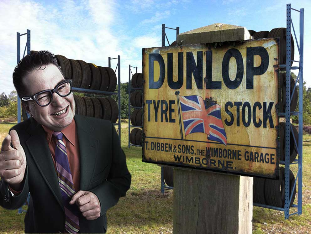
I was looking for some texture for that challenge and I found this web: http://www.grungetextures.com/. There are free images so I hope it will be maybe helpful for you all. 
_________________ The most beatiful thing we can experience is mysterious. It is the source of all true art and sience. - Albert Einstein |
Posted on 21/10/10 11:16:56 PM |
|
gaoxiguo
赤土陶 器战士 Posts: 114 Reply |
Re: Challenge 322: Sign of the times
   |
Posted on 22/10/10 08:08:14 AM |
|
Steve Caplin
Administrator Posts: 7138 Reply |
Re: Challenge 322: Sign of the times
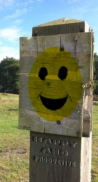
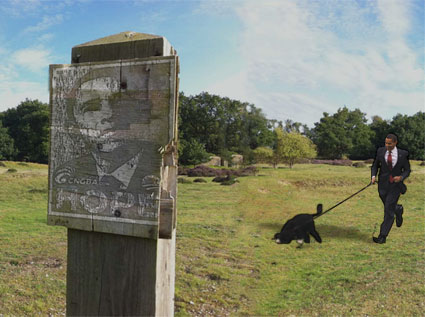
A lot of clever entries this week - seems this one really inspired many of you. First up was GKB, with a No Swimming sign - most amusing, given the background. I like the faded paper feel to this one, but would take issue with the typography: you can't condense Helvetica like that! A very pristine sign in the second entry - but watch the obvious repetition when you extend a background! And a really nice idea in the third entry: I really like the way the lettering is still immaculately painted, as if the artist didn't realise he was sinking. Couple of fixings needed on the sign, perhaps. A new background, and a stark Area 51 sign from Stefano Giacomuzzi, with a very strong tone to it. I particularly like the red posts. When distorting the sign contents in perspective, though, it's better to make the whole sign and then distort it all together, rather than doing so in pieces: it's too easy for the perspective to go wrong that way. I like the second entry, with the fence in front. A very nicely made paper sign from Eggbox, with a beautifully curled corner and very neat tearing. And I do like the grave in the background. Makes all the heather look like piles of earth as well. A very funny second entry - and a nicely made sign, too. A card sign from maiden - I recognise those wrinkles! I like the adaptation of the logo, and the stark photo treatment. But wouldn't the text be rather more faded than that? Or would that be cheating? A rather beautifully weathered sign from Nick Curtain - is this all your own creation, or did you take it from elsewhere? Great typography, I like the hand lettered look. Excellent work from aschiewe, with a first Friday Challenge entry - a really funny piece of work, with ET's finger scratching the lettering and a neatly crashed spaceship in the background. Perhaps a little too neatly crashed: could the edges of that hole do with softening up a little? I like the new sky, it adds a lot of atmosphere. I wonder if it was the mounds of heather in the background that inspired Ben Mills to think of moles? A good sign - except shouldn't the lettering be raised, rather than recessed? Powerful moles, that can eat through metal: although I do feel we ought to be able to see daylight through some of them. An entertaining second entry - although if that's your vision of a loose woman, Ben, I think you need to get out more. A very nicely drawn sign from Carlo Alessandro Della Valle, with a rather tasteful tree placed behind it. An interesting idea to raise the contrast on the image to match the tree. Perhaps we need a few white stains on the sign itself? Text in English, Hebrew and Arabic from micky47: I really couldn't imagine living somewhere where these signs exist. Perhaps we could do with a hole in the background where one of the mines has gone off? Immaculate rebuilding of the post by Trevor, but it does leave me thinking: if the lettering is still on the sign, what was written on the notice the magpie has flown off with? A great pose for the bird, very nice composition altogether. I like Vibeke's shortsighted man, struggling with the faded sign - and that's certainly a mighty bull. But the ground it's standing on seems very much higher than the ground the man must be on: and, given his size, the sign post itself is enormous! Do we have a slight scale issue here? Ingenious work from brewell, with a radiation warning frazzling off the noticeboard. Best of all, of course, is the running figure, his skeleton showing through like an x-ray. Poser, I assume: don't forget that these characters also come with shoes! I'm always amazed that tooquilos should find such appropriate soundtracks to her animations - where on earth did you dig up that one? I really like the part where Stonehenge topples over like dominoes - very nicely achieved, a clever piece of work. And is that an authentic Stonehenge sign you started with? It does look like it... A ghostly image from Daniel, with skeletons attacking a mini - there's a whole story being told here, from the fallen-off Apache Lake sign (good bloody handprint) to the very distorted figure on the ground. Is this Poser? Good modelling! A very enigmatic sign from Sophie, all the more so because there's no apparent risk in sight. Intriguing! A hand drawn screw head, too? A very good idea from tomiloi, with a picnic area infested with lions. The clip frame seems like a slightly odd choice for the new sign surround - and do watch your perspective! Distort the whole sign in one, rather than each element separately, and you won't have these diminishing lettering problems. A striking and entertaining image from Deja_vu, with a host of signs that fulfil their own prophecy: clearly, reading these signs really is a danger! I like the subtlety of the small danger signs beneath the targets, and the assortment of dead bodies. Good work. The global recession has clearly hit LonnieK's region as well, with a grand building now not to be built. Great tearing and curling, but I'm most taken with the way the background has been thrown out of focus. It really brings our attention right into the sign, and gives a great depth of field (ha ha) effect. Very attractive. More politics from Josephine Harvatt, with Britain being sold off by our entertaining new government. The faded Union Jack is a subtle and tasteful addition - nice work! A fine couple of animated bulls from james, one of them tossing a skull at the sign (and when it falls we can see the rest of the skeleton behind). But look at the subtlety of the animation: not only does the bull bend its head down, it also bends the legs to accommodate the movement. Brilliant. Helen S is our newest member, with a beautifully scary Halloween entry: a nicely composed graveyard scene, full of atmosphere and mystery. A couple of points about the lighting, though: the moon is at the back, but the shadow of the ghoul comes from the front - and the ghoul himself is lit from the right. But these are really minor points - it's a great composition, and I love the extra touches like the scratches on the board. Welcome to the forum, Helen! And that's the first Avatar avatar we've seen. I had to use TinEye to figure out exactly what we're looking at in Jota120's entry - wasn't sure if it was a rocket or a missile. Turns out it's carrying cosmonauts to the International Space Station - so a kind of shuttle, with a Russian accent. A good lighting match on the sign! A nicely distressed sign from Zuney, with good faded lettering. But would the lettering really take up such a small area of the sign? Wouldn't the signwriter have tried to make its message stronger? And, er, wouldn't have put another 's' in 'trespassing'? A bit of a lilt on Deborah Morley's sign, with perfect perspective on the design (although the word Danger could have been rather larger). I like the lone arm in the distance, with earth flying out and up from the hole: very nicely achieved! Dissolve brush and Motion Blur? We haven't seen Big Vern here for a while - good to see you back. I like the distortion on the sign, and the rather jolly rendering of the standard smiley face. Shouldn't the lettering be embossed, rather than raised, though? Your method would involve the signwriter hacking away the entire surface just to leave those letters standing! But I do applaud the sentiment. A beautifully constructed image from Emil, with stacks of tyres running off in the same perspective as the sign and a fantastic salesman - his lighting even matches that on the signpost. And a great source of textures, Emil - thanks for sharing it with us! Obama out jogging with the dog in gaoxiguo's entry - and a much-faded promotional poster from the presidential campaign. I like the way the sign has been moved to the other side, a very interesting method - but do make sure your perspectives don't clash! Very entertaining work this week. Most enjoyable. |
Posted on 22/10/10 09:31:00 AM |
|
josephine harvatt
Gag Gadgeteer Posts: 2605 Reply |
Re: Challenge 322: Sign of the times
Thank you Steve - I loved Big Verns entry btw _________________ I'm not really bad - I just draw that way |
Posted on 22/10/10 09:42:23 AM |
|
BigVern
Q Quipper Posts: 674 Reply |
Re: Challenge 322: Sign of the times
Thanks for the wise words Steve. I decided to raise the letters so I could show them affecting the REDUNDANT sticker in the larger image. You are right though in practice this would create a lot of work for a carver. Thanks for the kind words Josephine. I was unsure whether to post the whole image directly on the forum or only a part of it and decided in the end to post a small bit and the whole image on photobucket as I could make it bigger. I have been away for a long time due to work demands but hope now to be back in the forum more now as things have settled down a bit. |
Posted on 22/10/10 10:58:03 AM |
|
tooquilos
Wizard of Oz Posts: 2958 Reply |
Re: Challenge 322: Sign of the times
Thank you Steve! The sign was a borrowed sign from Google. 
_________________ Dorothy: "there's no place like home!" |
Posted on 22/10/10 3:02:20 PM |
|
gaoxiguo
赤土陶 器战士 Posts: 114 Reply |
Re: Challenge 322: Sign of the times
 谢谢 坎普林! 谢谢 坎普林!
我先在GOOLGE上搜到了奥巴马先生的海报,贴到了标牌上,感觉画面有些空就又搜关于奥巴马的全身的运动图片,结果就搜到了遛狗的这张。将标牌一道左边主要是试一下CS5的识别填充功能。图片只是有趣而已。 |
Posted on 22/10/10 4:54:56 PM |
|
dejá_vu
Guest Reply |
Re: Challenge 322: Sign of the times
来自西班牙的问候,gaoxiguo。感谢谷歌翻译,因为我能理解你。否则,我会丧失。我喜欢说中文,但是我恐怕,首先我必须学习汉字成千上万,真正让我害怕:ð 尼斯条目。井目的。很高兴认识你。希望看到你的下一个挑战。 :) _________________ There are men who fight one day, and are good men. There are men who fight a year, and they are better. There are men who fight many years, and they are very good. But there are men who fight all over their lifes. Those are the indispensable. Bertold Brecht |
Posted on 22/10/10 4:57:43 PM |
|
dejá_vu
Guest Reply |
Re: Challenge 322: Sign of the times
 . I'm glad you liked it. I missed this challenges for a long time but now I've come back and hope to spend a lot of good moments and fun with you all. . I'm glad you liked it. I missed this challenges for a long time but now I've come back and hope to spend a lot of good moments and fun with you all.
Thanks for your words. _________________ There are men who fight one day, and are good men. There are men who fight a year, and they are better. There are men who fight many years, and they are very good. But there are men who fight all over their lifes. Those are the indispensable. Bertold Brecht |
Posted on 23/10/10 3:55:55 PM |
|
brewell
Pixel Pentagrammarian Posts: 752 Reply  |
Re: Challenge 322: Sign of the times
I knew I was going to get called out on the shoe issue. This was only supposed to be a test shot to see if it could be done. By the time I sliced and shifted and warped and liquified, I got involved in lighting and glowing effects and forgot I was working with a prototype. But the good news is I can take a picture of shoes and add it in. Photoshop is so good, I only have to get close with a photo.  _________________ I aim to give pause. |
Posted on 25/10/10 1:53:55 PM |
|
Stefano Giacomuzzi
Modernist Maestro Posts: 146 Reply |
Re: Challenge 322: Sign of the times
Thank you Steve, in fact in the second entry I corrected the perspective. _________________ Stefano |
Posted on 25/10/10 5:43:50 PM |
|
Jota120
Ingenious Inventor Posts: 2615 Reply |
Re: Challenge 322: Sign of the times
Its a bit difficult to get away from you Steve. Great comments to all. Honest I'm not sure how you do it, in the phase please keep doing it. Mine was a Soyuz rocket. Gist they just use a train to get it to launch-site. This is the most reliable rocket and according to my understanding the last machine that can service ISS. I worked with Russians, engineers brilliant, and ok, more ... their ART fantastic as well Last comment, That is great Emil |
Posted on 25/10/10 6:50:37 PM |
|
aschiewe
* Posts: 39 Reply |
Re: Challenge 322: Sign of the times
Hi Steve, i did not realise you commented on our stuff as well..this is great ..Looking forward to the next challenges..you are right my UFO crash is too clean and edges need softening. cheers, Andrew |
| page: 1 2 3 4 5 last |