

| » Forum Index » The Friday Challenge » Topic: Contest 189: A better use of space |
|
Posted on 14/03/08 10:24:24 AM |
|
Steve Caplin
Administrator Posts: 7135 Reply |
Contest 189: A better use of space
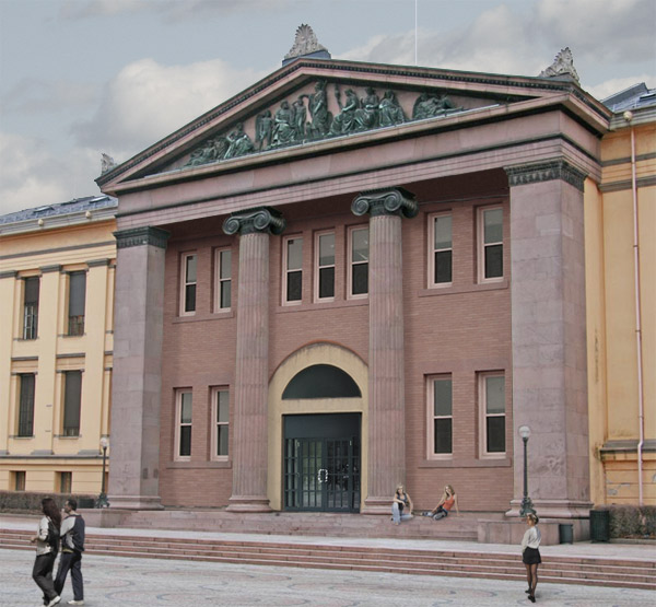
Another photograph from my Oslo trip. This is the main entrance to the university, built - as you can see - in the Classical Overbearing style. There's an awful lot of enclosed space behind those massive columns, housing just a grand staircase. Which may have been fine in those days, but I'm sure the university is now running short of space, along with every other seat of learning in the world. So can we collectively come up with a better use for that void? It's a tricky angle, looking up at it from below; but some kind of architect's rendering of how the finished building might look would be good. High res is here.  |
Posted on 15/03/08 11:44:41 AM |
|
Mick Malkemus
Meticulous Manipulator Posts: 91 Reply |
Future Oslo University Upgrade
Glass is always a nice addition, and an academic sculpture wouldn't hurt either. 

|
Posted on 15/03/08 12:06:39 PM |
|
tooquilos
Wizard of Oz Posts: 2957 Reply |
Re: Contest 189: A better use of space
Solo Apartments in Oslo?  |
Posted on 15/03/08 12:34:31 PM |
|
michael sinclair
Off-Topic Opportunist Posts: 1871 Reply |
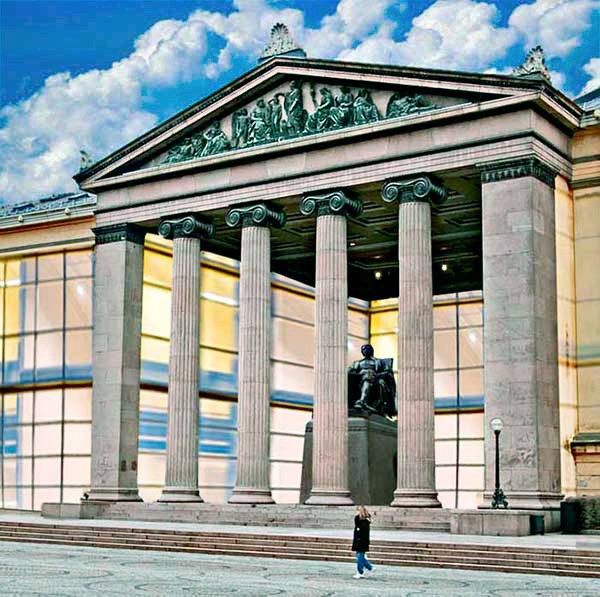
Future Oslo University Upgrade
Hi Mick, you have to be careful when you put an intense green-blue sky against a magenta-red building: the tonality of each element is in conflict. In the second example I have brought both elements to a more compatible tonality. 
 |
Posted on 15/03/08 2:52:06 PM |
|
Steve Mac
Grunge Genie Posts: 539 Reply |
Re: Contest 189: A better use of space
 |
Posted on 15/03/08 4:16:06 PM |
|
Nick Curtain
Model Master Posts: 1792 Reply |
Re: Contest 189: A better use of space
 |
Posted on 15/03/08 5:03:53 PM |
|
james
Surreal Spoofer Posts: 1194 Reply |
Re: Contest 189: A better use of space
Oop's |
Posted on 15/03/08 5:04:01 PM |
|
james
Surreal Spoofer Posts: 1194 Reply |
Re: Contest 189: A better use of space
http://i153.photobucket.com/albums/s211/fungismith/Oslouni.gif 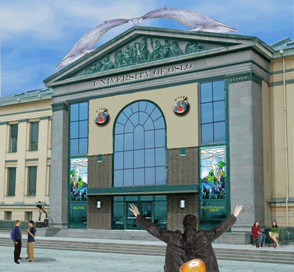
|
Posted on 15/03/08 10:07:48 PM |
|
Mick Malkemus
Meticulous Manipulator Posts: 91 Reply |
Re: Contest 189: A better use of space
Thanks Michael, I like your tonal adjustments better than mine. I look in the book to find out how to do this. |
Posted on 16/03/08 01:38:32 AM |
|
dave.cox
Marquee Master Posts: 518 Reply  |
Re: Contest 189: A better use of space
It's not pretty, but it is more office space.  |
Posted on 16/03/08 03:56:11 AM |
|
Neil O
Cartoon Contractor Posts: 389 Reply |
Re: Contest 189: A better use of space
New use for an existing building? 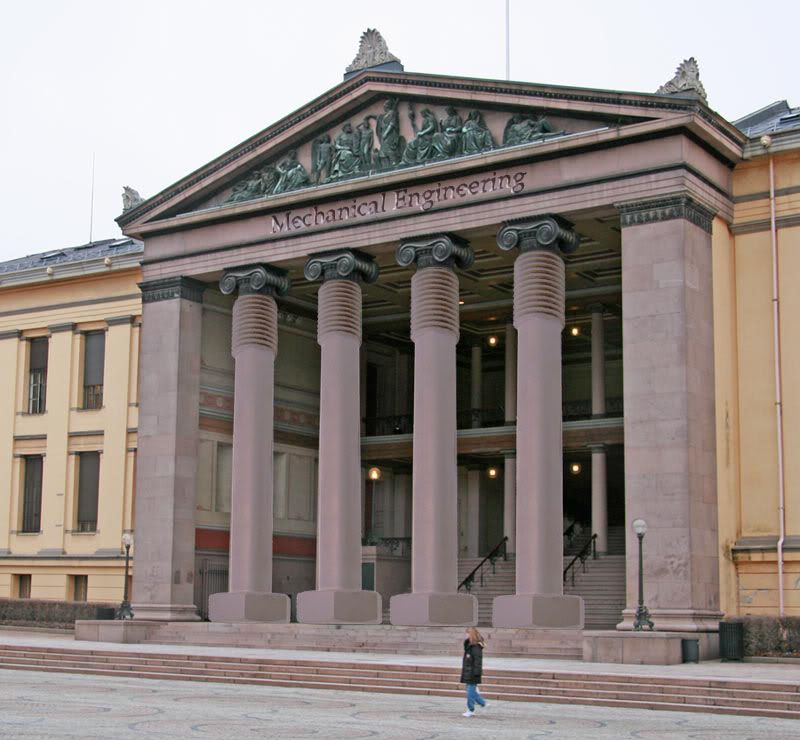
_________________ "If I find 10,000 ways something won't work, I haven't failed. I am not discouraged, because every wrong attempt discarded is often a step forward".... Thomas Edison |
Posted on 16/03/08 6:39:46 PM |
|
michael sinclair
Off-Topic Opportunist Posts: 1871 Reply |
Re: Contest 189: A better use of space
Click the pic for bigger: Cropped for keystoning too 
|
Posted on 16/03/08 7:34:13 PM |
|
Nick Curtain
Model Master Posts: 1792 Reply |
Re: Contest 189: A better use of space
This made me chuckle Michael, well conceived. Nick |
Posted on 16/03/08 7:54:55 PM |
|
Eva Roth
Luminous Liberator Posts: 269 Reply |
Contest 189: A better use of space
A recent survey at Oslo University suggested that most would appreciate more 'recreational' or 'green' space. This artist's impression was put together by a class of first year art students. 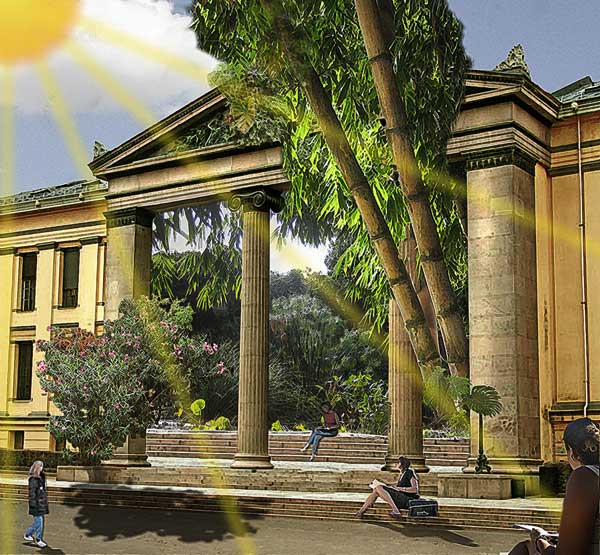
|
Posted on 16/03/08 8:00:47 PM |
|
TaTa_MoStWaNteD
* Posts: 3 Reply |
Re: Contest 189: A better use of space
First ,I wanna say hello for all,Because I am new Here..am beginner at photoshop ,I started to learn it 6 months ago..and am hoping to become like u,, Good luck 4 all I see that all peoples here r Great "seems professional" ,u Really do magics on the pics... Thnx Mr.steve for this site and those contests Here is mine "funny /ugly one  " ,It's for my favorite singer " Amr Diab" ,I made it quickly ,I didn't finish it ,but I won't add sth on it.,but Next contests after the college years/after learn more tutorials,U will see good designer isa. " ,It's for my favorite singer " Amr Diab" ,I made it quickly ,I didn't finish it ,but I won't add sth on it.,but Next contests after the college years/after learn more tutorials,U will see good designer isa.

http://img155.imageshack.us/img155/7783/tatamostwantedpx8.jpg |
Posted on 16/03/08 8:06:48 PM |
|
TaTa_MoStWaNteD
* Posts: 3 Reply |
Re: Contest 189: A better use of space
If u can edit my previous post plz and add this attachment instead of that link  |
Posted on 16/03/08 10:31:41 PM |
|
BigVern
Q Quipper Posts: 674 Reply |
Contest 189: A better use of space
Apparently T5 wasn't quite big enough so extra terminal space was needed and is opening soon.  (in Dolby Digital Surround Sound as well) (in Dolby Digital Surround Sound as well)

|
Posted on 16/03/08 11:21:45 PM |
|
vibeke
Kreative Kiwi Posts: 2167 Reply |
Re: Contest 189: A better use of space
I thought this was "child's play"  |
Posted on 16/03/08 11:48:30 PM |
|
Mick Malkemus
Meticulous Manipulator Posts: 91 Reply |
Modern School of Fashion
 |
Posted on 17/03/08 00:59:20 AM |
|
Ellen
Fire Queen Posts: 102 Reply |
Re: Contest 189: A better use of space
I have a long way to go- these are great! Hope the on-line translater was right  |
| page: 1 2 3 4 last |