

| » Forum Index » 100% Photoshop » Topic: Chapter 4: The Desk Drawer |
|
Posted on 17/04/10 3:53:04 PM |
|
Emil
KAFKAsFRIEND Posts: 413 Reply |
Chapter 4: The Desk Drawer
Steve I am struggling with the Coin. My question are: 1. I have problem to recognize text font because I do not know nothing about fonts. Only there are Sans Serif or Serif etc. Is there some way how to find out what kind of fonts you used in your book? I choose a font for the coin but it was not correct. 2. Is the bumpy texture which I have on my coin correct or I did something wrong. The bumpy texture appeared after Lighting Effect and was stronger when I used curve for metal turning. 3. I am not satisfied with the result of the coin. Some comments on that work will be appreciated. Thank you. Emil 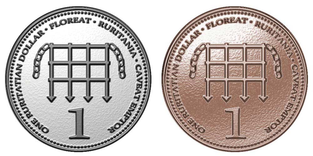
_________________ The most beatiful thing we can experience is mysterious. It is the source of all true art and sience. - Albert Einstein |
Posted on 17/04/10 5:03:30 PM |
|
Luis
Six-String Synthesist Posts: 236 Reply  |
Re: Chapter 4: The Desk Drawer
Hi Emil, For the Lighting Effects Filter settings, try setting the Height between 5 - 10. If you slide the slider towards Mountainous, you get bumy texture. Move the slider towards the Flat side. Just experiment with the Lighting Effects and the Curves. I hope this helps. Luis |
Posted on 17/04/10 7:00:51 PM |
|
Luis
Six-String Synthesist Posts: 236 Reply  |
Re: Chapter 4: The Desk Drawer
Emil, Try this. I notice something when I re-did the coin. When you start creating your coin (steps 1-3), start with a white circle and use a black color for the stroke & dots. When I applied the Lighting effects, I did not get the bumpy texture on the coin when I set the setting to Mountainous. I did notice a bumpy texture when I used a pale gray color for the coin and a dark gray color for the stroke & dots. Luis |
Posted on 17/04/10 7:27:57 PM |
|
Emil
KAFKAsFRIEND Posts: 413 Reply |
Re: Chapter 4: The Desk Drawer
Hi Luis, many thanks for your advice. I tried it. I dragged the slider to 20. The result you can see on picture. Still there is some bumpy. I made it smaller and it looks fine now. I could not make the lighting effects exactly according with Steve's instruction in step 12. The grid and text is black colored and when I used the lighting there was not any effect. Black color was black? So I changed the color to gray and after it works. Did I here something wrong. I do not like the result of the metal looks. I was playing with the curve "hours" and could reach effects like in step 13. The coin is my nightmare  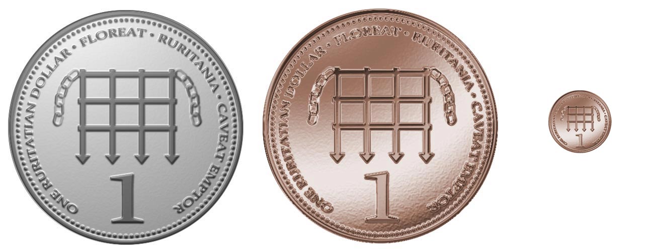 _________________ There are most happy who have no story to tell. - Anthony Trollope. |
Posted on 17/04/10 7:43:44 PM |
|
Emil
KAFKAsFRIEND Posts: 413 Reply |
Re: Chapter 4: The Desk Drawer
Luis, I made all black excepting the chains. The result after lighting effects is here. Emil 
_________________ For me the creative process is more one of discovery than creation. - James Lee Burke |
Posted on 17/04/10 7:47:02 PM |
|
Luis
Six-String Synthesist Posts: 236 Reply  |
Re: Chapter 4: The Desk Drawer
Emil, I started out with a 600 x 600 document Steps 1-3: The colors should be White- (coin-step 1) and Black-(Stroke & dots- Step 2-3). Do not use any gray colors. Steps 4-9: Text and grid in black color What I did next is merged all layers into one layer. Do step 11. Now apply the Lighting Effects filter using the settings as shown in the book. When you applied the filter, you should not get a bumpy texture on the coin. Continue with steps 13-14 |
Posted on 17/04/10 7:57:53 PM |
|
Emil
KAFKAsFRIEND Posts: 413 Reply |
Re: Chapter 4: The Desk Drawer
Luis, still I could not get the result like in the book at step 12. All is black. Steve has the stroke, text, grid in gray color and everything is perfect. Where could be the problem? Can you display your Coin? Emil _________________ For me the creative process is more one of discovery than creation. - James Lee Burke |
Posted on 17/04/10 8:28:17 PM |
|
Luis
Six-String Synthesist Posts: 236 Reply  |
Re: Chapter 4: The Desk Drawer
I think I know where the problem is, but I'm sure that there is something I'm missing in one of the steps. This is what worked for me. Do every thing that I said above: Steps 1-3: The colors should be White- (coin-step 1) and Black-(Stroke & dots- Step 2-3). Do not use any gray colors. Steps 4-9: Text and grid in black color Merged all layers into one layer. Do step 11. NEW STEP: Create a new layer. Cntrl click on the merged layer to get a selection of the circle and fill this in with a light gray color. I used #E6E6E6. Now apply the Lighting Effects filter using the settings as shown in the book on this new layer. 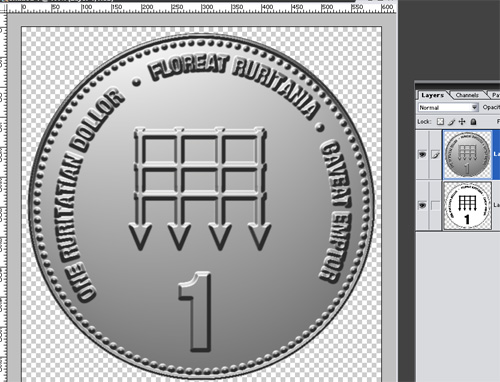
Now use the curves |
Posted on 17/04/10 9:09:07 PM |
|
Emil
KAFKAsFRIEND Posts: 413 Reply |
Re: Chapter 4: The Desk Drawer
Excellent Luis. It was my fault. In step 12 is written: make sure you're viewing the layer, ......., and duplicate gray layer at the top of the stack. And that is the point that I missed. Anyway thank you very much, the coin looks now better. Emil 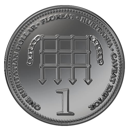 _________________ There are most happy who have no story to tell. - Anthony Trollope. |
Posted on 17/04/10 9:23:07 PM |
|
Luis
Six-String Synthesist Posts: 236 Reply  |
Re: Chapter 4: The Desk Drawer
I'm glad it all worked out. Your coin looks a lot better now. Luis |