| » Forum Index » The Friday Challenge » Topic: Contest 249: Damien's iMac |
|
Posted on 21/05/09 10:52:23 AM |
|
dwindt
Realism Realiser Posts: 767 Reply |
Re: Contest 249: Damien's iMac
Wow. There are some really great images this week. I wish I had time to go through and read them all but the images just shout quality so very well done. I really think I lost the plot here but when I saw this dude's form of art....well, read the image. 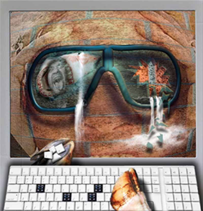 |
Posted on 21/05/09 11:56:08 AM |
|
dwindt
Realism Realiser Posts: 767 Reply |
Re: Contest 249: Damien's iMac
This looks terrible. What is the ideal size for an image? |
Posted on 21/05/09 1:15:33 PM |
|
stefan
Detail Demon Posts: 401 Reply |
Re: Contest 249: Damien's iMac
 |
Posted on 21/05/09 1:27:44 PM |
|
Jota120
Ingenious Inventor Posts: 2615 Reply |
Re: Contest 249: Damien's iMac
Using File Save - "Save for Wed and Devices...", I usually get it to a max allowed of 97k by tweaking the "Percentage" down until 97k. You can adjust the other parametes from default too of course, but this works enough for these posts I find. I start with image size around 25x17cm 240 pixels/inch. Others here also post larger image to Photobucket and add link, see examples this week. Others have I believe sent posts on this topic in the past with more details. |
Posted on 21/05/09 1:34:43 PM |
|
GKB
Magical Montagist Posts: 3733 Reply |
Re: Contest 249: Damien's iMac
dwindt, Flatten your image then go to Image>Image Size and use a value between 800 - 900 pixels for the longest side. I generally use 850 pixels. Then go to File>Save For Web. In the quality box select a value that will give you a file just below 100Kb. That should do it. Gordon _________________ If at first you don't succeed, destroy all evidence that you ever tried. |
Posted on 21/05/09 4:57:14 PM |
|
Pete
Body Booster Posts: 121 Reply |
Re: Contest 249: Damien's iMac
This was far more difficult than I first thought! 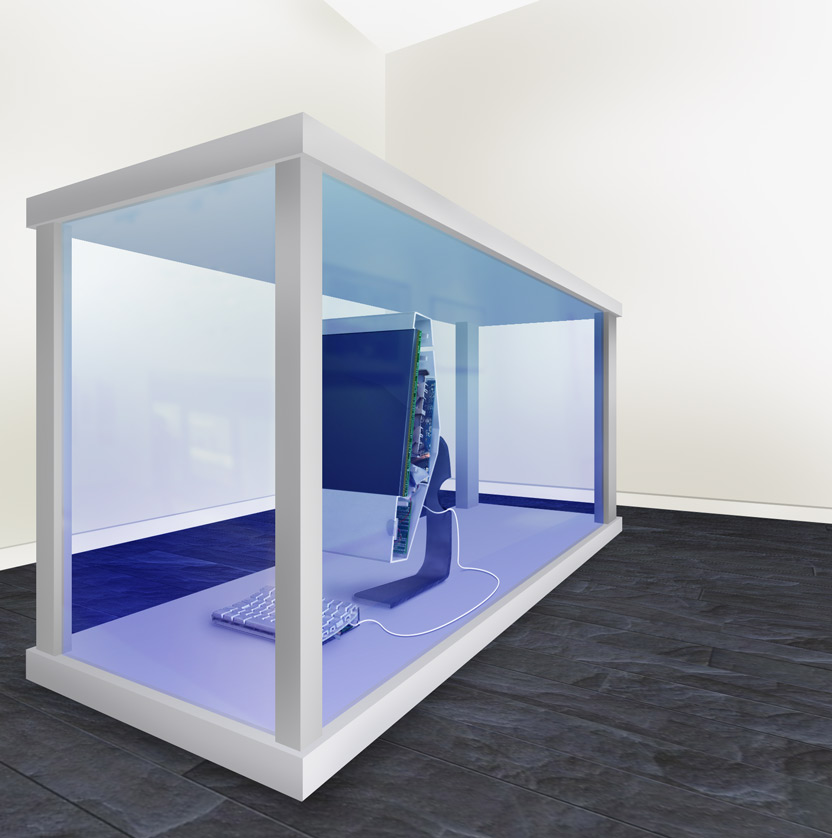 |
Posted on 21/05/09 5:07:11 PM |
|
Pete
Body Booster Posts: 121 Reply |
Re: Contest 249: Damien's iMac
larger version here: http://www.flickr.com/photos/pikuseru/3551120693/ |
Posted on 21/05/09 7:07:44 PM |
|
michael sinclair
Off-Topic Opportunist Posts: 1756 Reply |
Re: Contest 249: Damien's iMac
Very convincing Pete: it looks right. 
|
Posted on 21/05/09 9:42:16 PM |
|
Jota120
Ingenious Inventor Posts: 2615 Reply |
Re: Contest 249: Damien's iMac
Some of us found this more difficult than expected. I see a lot of hard work. |
Posted on 21/05/09 11:40:25 PM |
|
Pete
Body Booster Posts: 121 Reply |
Re: Contest 249: Damien's iMac
Thanks michael. I spent far too long trying to work out how they look on the inside. I would have liked to get the refraction right for the liquid, but in the end thought it might have made it look more fake. Some great work from everyone, I especially like the ways people have gotten around some of the difficulties with a bit of lateral thinking. |
Posted on 22/05/09 06:01:54 AM |
|
China
Surreal Sculptor Posts: 109 Reply |
Re: Contest 249: Damien's iMac
Wow I am very happy in this week.there are so many beautiful images. I really think is a hard work.but I really love it. it is very interesting. 
|
Posted on 22/05/09 08:12:22 AM |
|
Jota120
Ingenious Inventor Posts: 2615 Reply |
Re: Contest 249: Damien's iMac
Pete, Halfway through I started addressing the refraction issue too on end of tank. 1/ I could accept putting in the refracted back of the head in (difficult to see in my image), 2/ but from observation the lower rail needed to be refracted "up" too. It looked funny though i.e. counter intuative, so left it subject to further study, when I may have had more time, similar to you I think for this part  . I have studied further now, but too late for another contribution, and anyway still would look a bit strange ..."fake" ! . I have studied further now, but too late for another contribution, and anyway still would look a bit strange ..."fake" !
|
Posted on 22/05/09 08:35:49 AM |
|
Steve Caplin
Administrator Posts: 6842 Reply |
Re: Contest 249: Damien's iMac
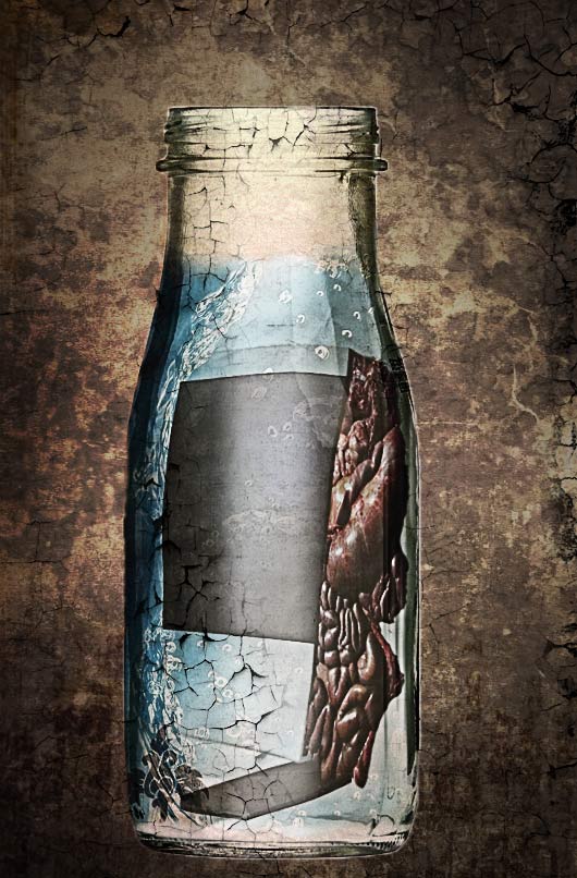
Well, this was a tricky Challenge. Building the case in perspective was hard enough - filling it with formaldehyde was even harder. The most common error was to forget to glaze the case: a reflected scene at low opacity is all that's needed to make this image work. The first entry - after Jeepy withdrew his initial attempt - was from new member China. It's an excellent piece of perspective drawing, and the iMac inside is neatly cut in half. Reflections in the sides would add to the glass effect, and some colour in the tank would make it look more full of liquid. I like the shadow, but why is there no shadow from the iMac as well? Welcome to the forum! Some ingenious internal modelling from GKB, with printed circuit boards following the shape of the objects - and a beautifully sawn leg. Are you sure the computer itself should be hollow, though? I like the extra touch of the bisected mouse! Once again, reflections would make that case look like glass. Love the pun in the second entry - a fantastic glass tank! All I'd change here would be to add a lot of refraction inside the gun barrel. Very striking work from maiden: there's a tremendous sense of liquid in that tank, brought about by the variable lighting and, especially, the few stray bubbles. Best of all is the way the internal views of the keyboard, speaker, mouse and iMac have been built: these really look true to life, and have obviously taken a lot of research. I think the perspective may be a little extreme on the case, and reflections would certainly help - but overall this is a stunning, detailed entry. A nice surreal touch from Emma, with a welder reaching out of a painting to saw the iMac in half. In fact, he's sawing the whole tank in half - in which case, shouldn't the liquid be pouring out and onto the floor? An interesting twist on the problem! A funny approach from Ben Mills - of course there's a maggot inside, that's what makes them crash occasionally. A beautiful case, which looks to me like a 3D model: the green fill works well (although perhaps it should colour the computer as well), and there's a hint of reflection. My only problem here is with the angle of the extruded side of the iMac, which seems at odds with the perspective of the case. Otherwise, this works really well. Vibeke has clearly spent hours toiling over the case - and it's a well constructed, solid piece of furniture. The angle of view, though, doesn't match that of the iMac, as you can see from the angle of the top of the monitor - but it works as an object in its own right. Adding some colour to fill the tank with liquid, and adding a reflection, would make a big difference here. I like the multicoloured diamond, but not quite sure of its relevance! A gag-filled entry from tooquilos, full of extra details - the live mouse, the fishtank screen saver, the Damien Hirst spot painting on the wall behind - and, of course, the subtle creation of the inside of the speakers and keyboard. The case itself is a little ragged: you'd have been better off using this as a perspective template, and drawing your own case over the top. Of course, the animated version showing how it was made is real genius - what an added bonus! Fantastic reflections from Nick Curtain - look how this really creates the sense of glass. A terrific setting, too, and I like the hand reaching out of the screen (anyone remember Videodrome?). A very evocative, moody and consistent image. A minimalist case from Jeepy, now with added Damien Hirst on both sides of the split. To me this looks more like a solid lump of plastic than a glass case - and I can't quite work out why. But it's a neat cutting job, and a good approach to a difficult problem. A very neatly sawn iMac from michael sinclair, with a well created leg: the keyboard has a convincing interior, too. The reflection of the keyboard in the floor is a great idea, except that the keys should of course appear on the bottom rather than on the top. Slightly embarrassed to be making a guest appearance, as always: but since I'm there, I have to ask what happened to my shoulder! Surely this would have been easy to paint back in at this low opacity? The fish tank was a good idea. Detailed work from james, with the iMac splitting in half and separating while we watch. The perspective issue here is more tricky than elsewhere: if you draw perspective lines along the top and bottom of the original iMac screen, and keyboard, then the moving section should follow these lines - and the reflection in the side glass should also follow the same perspective. Extra reflections on the front of the glass would really have helped here. A great case, though - and a most interesting base. Plenty of fruit jokes from Gerard, with a neatly created Orange Macintosh logo. I like the banana mouse, and the subtle reflection of the keyboard in the saw is an excellent addition. But - Guinness-powered speakers? Are you sure??? A lot of you found this Challenge difficult, and Jota120 clearly wants to express his frustration with the task. It's a great entry, with the already-split keyboard being followed by the half-split iMac: a very neat piece of work, Trevor. Most convincing. And a lot of thought and effort has gone into the second entry - clever work, indeed! It seems the perspective was one of the trickiest issues, as Brewell points out: "The left vanishing point was easy. The right one, all there is is the bit of an edge of the keyboard." And the iMac foot, and the side of the keyboard and foot on the other side... the clues are all there, but sometimes they're harder to read. You've got the perspective fairly well, except perhaps the cases are a little too deep. Are you sure about the cloud setting? Doesn't this just detract from the realism? Les Moore continues to entertain us - this time, with a fantastic animated entry. Look at the wealth of detail here: the stretching gore inside the monitor, the finely drawn wires/veins, the pulsating heard, the flickering sparks, the illuminated heartbeat on the oscilloscope. Then, of course, there's the perfect lighting of the whole scene, including the faint glow around the screen and the subtle highlights on the sawn Mac Pro. Stunning work, a real joy to look at. A good sense of liquid fill, with a nice touch of reflection, from Josephine Harvatt. But I take it from the "Snaatchi Gallery' listing that you're not a fan of Mr Hirst and his cronies? A pity. This is a conversation we need to have at length! A fantastic choice of tank from katew, with the subtle distortions - both of the iMac and of the view behind - creating a good sense of liquid. There's a limit to how far you can distort an object to turn its angle of view, though, and you may have just exceeded it! But it's a very consistent, appealing scene that works very well. Difficult, perhaps, but the work has paid off! Tremendous perspective drawing from Deborah Morley - both cases match the two halves of the iMac perfectly, and the altered viewpoint of the front half is very finely judged. A great sense of liquid in the cases, and the suggestion of reflections makes this a wholly consistent, accurate entry. Great work! An interesting homage to Damien Hirst from dwindt - there's loads of detail here, in a scene that really does cram everything in. Actually, Hirst's work really isn't macabre or horrifying at all, and that's where the real genius comes in. But this is a discussion for elsewhere... I like stefan's positioning of the iMac in a glass bottle, with the guts spilling out of the side, as if it were an exhibit in a medical museum. I'm not sure about the peeling paint texture over the top, though: doesn't this detract from the glassiness of the bottle? And the liquid top needs to be crisp, rather than feathered. This one is a great idea, and it nearly works. A beautifully drawn case from Pete, with a terrific iMac interior - I particularly like the way the keys have been sawn in half on the keyboard. Subtle glass reflections and colouring make this a really effective, impressive piece of work. The added touch of the snaking wire from the keyboard links the two elements together perfectly. Excellent. +++ I'm glad so many of you had a go at this one, even though it was clearly a struggle. I couldn't decide whether to post my version or not - I don't want to give the impression that there's a "right" and "wrong" way to do this. In the end I decided to include it, because there are one or two point of interest. The key to this one lies largely in creating a sense of glass on the tank. I've done this with reflections in the front, as well as internal reflections in the side. In addition, the view through the right side is refracted by the liquid in the tank, to produce an oversized view of the iMac: this helps us to see the tank as being filled with a dense liquid, rather than just air. And as for the perspective of the tank... well, I drew this with the Pen tool, starting with the front face and then adding the sides and back. No real trick to it, just continued adjustment until it looked right!  |
Posted on 22/05/09 09:11:13 AM |
|
vibeke
Kreative Kiwi Posts: 2152 Reply |
Re: Contest 249: Damien's iMac
Thanks Steve, Good to see that at least I was looking up, my 'multi coloured diamond' is actually a piece of Damien Hirst's art work. The thought being, Get the art out of the computer and home. I can see I better not get into advertising. Have a good weekend. _________________ Perfect confidence is granted to the less talented as a consolation prize. |
Posted on 22/05/09 09:29:49 AM |
|
Nick Curtain
Model Master Posts: 1768 Reply |
Re: Contest 249: Damien's iMac
Thanks Steve I wanted to add a different perspective with the hand holding the credit card, i.e. paying for the art online. Trouble was that my first post included the card number, hence the repost! Nick |
Posted on 22/05/09 09:52:02 AM |
|
josephine harvatt
Gag Gadgeteer Posts: 2596 Reply |
Re: Contest 249: Damien's iMac
Very elegant Steve. As for Britart - "cronies" is the right word. A modicum of talent spread a long way by virtue of a lot of showmanship IMHO - but I am not entirely anti  _________________ I'm not really bad - I just draw that way |
Posted on 22/05/09 11:02:21 AM |
|
stefan
Detail Demon Posts: 401 Reply |
Re: Contest 249: Damien's iMac
thanks Steve...... I know what you mean and I guess I shouldn't have posted it. Just came out of the hospital after an operation on my elbow when I did this ( but that's no excuse for bad photoshop work...I know  , so I was just playing around a bit. , so I was just playing around a bit. |
Posted on 22/05/09 11:06:10 AM |
|
katew
Virtual Virtuoso Posts: 676 Reply |
Re: Contest 249: Damien's iMac
Thanks Steve. This truly was a nightmare - I'm not very good at distortion at the best of times! I hope you've set us an easy one for this week! |
Posted on 22/05/09 12:48:18 PM |
|
Jeepy
Modeleur Mystique Posts: 174 Reply |
Re: Contest 249: Damien's iMac
[quoted] Steve Caplin wrote: A minimalist case from Jeepy, now with added Damien Hirst on both sides of the split. To me this looks more like a solid lump of plastic than a glass case - and I can't quite work out why. But it's a neat cutting job, and a good approach to a difficult problem. You still have reason, Steve. I used plastic for my image. Thank you. |
Posted on 22/05/09 1:06:46 PM |
|
Gerard
Digital Dutchman Posts: 145 Reply |
Re: Contest 249: Damien's iMac
Thanks Steve, I was really struggling with this one. Actually, my G5 crashed last week and I thought it was a curse of Damien Hirst!! |
| page: 1 2 3 4 5 last |