
| » Forum Index » The Friday Challenge » Topic: Challenge 845: Historic Le Mans |
|
Posted on 25/02/21 3:39:10 PM |
|
DavidMac
Director of Photoshop Posts: 5776 Reply  |
Re: Challenge 845: Historic Le Mans
Another Mariner extension. You seem to be going cinemascope now you have found Flickr. 
I love the little touch of her having to stand on a stool. And the bizarre mix of period costume with aluminium ladders! Very cute. _________________ The subtlety and conviction of any Photoshop effect is invariably inversely proportional to the number of knobs on it ....... |
Posted on 25/02/21 6:04:14 PM |
|
DavidMac
Director of Photoshop Posts: 5776 Reply |
Re: Challenge 845: Historic Le Mans
Oh right! Don't want much do you? That sounds nice and easy! 
I'll do my best. It's not entirely easy to demonstrate or explain. Partly because I don't think a perfect match is possible. Let's start with your existing image and why it troubles me. I'll start right off by saying that this is my own personal assessment of the problem and there is no reason to suppose that my analysis is necessarily correct - although I think and hope it is. 
I mentioned in my previous remarks that the problem is severest at ground floor level. If we look at your Rouen image it appears to have been taken from normal eye level by someone standing in the street. That being so then it is reasonable to place the horizon line, upon which the vanishing points will lie, around the height indicated by the red line. Horizontals below that line should rise to meet it and horizontals above it should slope down towards it. As I have indicated with the blue chain line this is not case in your composite. 
There are two main problems causing the difficulty. The first is that you have taken a building from the background of Steve's photo and brought it right up into the foreground of your composite. This inevitably runs a risk of producing perspective anomalies - which, I think, in this case, it has. The second problem is that, if you look at the Rouen street, the houses are four to five floors in height. The house you have borrowed from Steve is between two and three floors. Admittedly you wouldn't see all of them because the house is in the foreground and they will be cropped out of frame, but in 'stretching' the height of the foreground house to the full height of the image I think you have created a false vertical scaling which has inadvertently made a rod for your own back. Here is my best shot at trying to get a match between the two. It still leaves much to be desired. 
The parallels in the house now seem consistent with the overall perspective. The lamp on the wall is now at a similar height to its neighbour opposite but, because of the perspective of the source image, it is badly distorted. The only solution I can see to this would be to either remove it entirely or replace it with a clone from the lamp opposite. Obviously I will also need to create an extra floor for the foreground house so it reaches the top of the image. Even to get where I have has hidden problems. It proved impossible to correct the left hand house to match. To get the result I have I had to cut it in half and correct the top and bottom halves separately each with their own distortion. The blue line in the image below shows where I put the split. 
In the end we are trying to composite two images which look similar on the face of it but which contain sufficient furtive differences to trip us up. Despite their 'wonkiness' they are full of clearly defined parallels that are going show up any anomalies. Two of my images this week play on perspective. The scaffold was a deliberate exercise in perspective matching. Because it is 'married' to the wall and windows behind any mismatch would stick out like a sore thumb. This meant I really had to try and get it absolutely consistent - which I hope, and think, I did. The roller coaster is also a very strong play on perspective but, in this case for dramatic effect. No one looking at this has cried out in shock and horror which is perhaps surprising as it is, by any critical standards, a quite appalling cheat. The distance from the back of the foreground 'racer' to the church wall is probably no more than fifteen feet - if even that much. The extreme change of size and the curve I have squeezed into it is completely impossible but because I have given it a wide angle look the viewer (well maybe not Steve) accepts it. The dramatic effect helps sneak this past the viewer's more critical faculties ....... ....... or at least I hope it does. 
So there we are Michael. My best effort. Please don't expect this level of service every week.  _________________ The subtlety and conviction of any Photoshop effect is invariably inversely proportional to the number of knobs on it ....... |
Posted on 25/02/21 7:43:16 PM |
|
michael sinclair
Off-Topic Opportunist Posts: 1871 Reply |
Re: Challenge 845: Historic Le Mans
Exemplary David!  Thank you very much! Yes, I understand. This for me has been a steep learning curve. Of course, it's not really my fault you know: It's Caplin's fault had he included the roof of the building a correction would have been possible. Thank you very much! Yes, I understand. This for me has been a steep learning curve. Of course, it's not really my fault you know: It's Caplin's fault had he included the roof of the building a correction would have been possible.
PS I'm going to upload a little present for you entitled Something for David in the Reader's Gallery.  |
Posted on 25/02/21 9:11:04 PM |
|
DavidMac
Director of Photoshop Posts: 5776 Reply |
Re: Challenge 845: Historic Le Mans
Got it thanks. Love it. _________________ The subtlety and conviction of any Photoshop effect is invariably inversely proportional to the number of knobs on it ....... |
Posted on 25/02/21 9:15:52 PM |
|
Mariner
Renaissance Mariner Posts: 3124 Reply |
Re: Challenge 845: Historic Le Mans
No, David, I was already going cinemascope before I found Flickr. With this one I had fun tracking down the exact location, and then couldn't resist showing off by extending the image.
Ah, David, you have found my little moment of imperfection. I knew the aluminium ladder was not right, but I was on day seven and was getting a little tired of this very complicated image so I decided to let it go. Well spotted. |
Posted on 25/02/21 9:19:44 PM |
|
michael sinclair
Off-Topic Opportunist Posts: 1871 Reply |
Re: Challenge 845: Historic Le Mans
Okay, in view of the time, I have had to rush this a bit, but I now hope I have the perspective right or almost right. I had to substitute the original building for another to achieve this.

|
Posted on 26/02/21 04:12:58 AM |
|
dwindt
Realism Realiser Posts: 948 Reply |
Re: Challenge 845: Historic Le Mans
Had time for one. Didn't have time for the crowd though...and never dirtied the lamp up because it is new. It was installed for night executions. 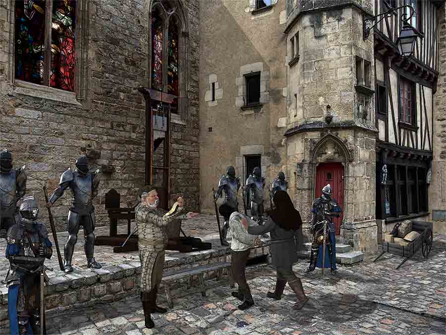 _________________ The grass is greener on the other side of the fence because there is more $hit there. |
Posted on 26/02/21 08:37:13 AM |
|
Steve Caplin
Administrator Posts: 7047 Reply |
Re: Challenge 845: Historic Le Mans
First to visit Le Mans this week was lwc, with a quick sporting reference. I like the slight translucence of the posters, but Id prefer them a little wrinkled and torn. Not sure the photographer adds much to the scene. Still waiting for her to move! And a distinct absence of moose. A splendid medieval scene from DavidMac, with tremendous detail: the dog, the reflection of the window on the neighbouring wall, the woman in the stocks, the reflection in the puddle. I really like how youve done the light from the lamp. I think the problem with the puddle is that its curvy edges would make sense on a perfectly flat ground, but not on those cobbles. The second entry makes more use of the shape, although it is a shame to lose the stream from the drain. An ingeniously modelled third entry - I like how we can just see the track going into the window on the right. Im amazed at how well the scaffolding fits in the fourth entry - outstanding! A real sense of atmosphere in tooquilos's entry. I really like the rusty, plant-covered car, and the glowing lamp. The reflection the puddle doesnt seem to line up with the window, though. I like the mix of live action and animation in the animated version, and the flickering lamp adds a lot of interest. One of the things that marks out Frank's entries is their ability to tell a story in a single scene. Here, its the tale of the church closing due to the brothel next door. But theres so much terrific detail: the slightly faded painting over the door, the lettering, the girls drumming up trade, the lascivious man in the bottom left. My only issue: since hes so much bigger, shouldnt the woman on the right be a lot bigger too? A new member this week, and DougD clearly has a macabre side. But with some serious Photoshop skills too: theres a really glow to those windows, and a good haze around the lamp. I recognise your backlit technique! Very fine work, Doug. Welcome to the Forum! A fine collection of revellers from Vibeke, neatly assembled in front of the church.I like the boy in the window, the cyclist, and the new window texture. And thanks for providing the provenance of all the elements. A theatrical extravaganza from Josephine Harvatt with great lighting; shame their audience is ignoring them. A slightly awkward perspective - it looks as if theyre sloping away - but thats a minor point. I like michael sinclairs rainy day - now thats really a serious amount of water. But do watch your perspective: the buildings on the right show a low horizon, but the building on the left is sloping up towards a different one. Interestingly, fixing this also sorts out the problem with the lamp top left: 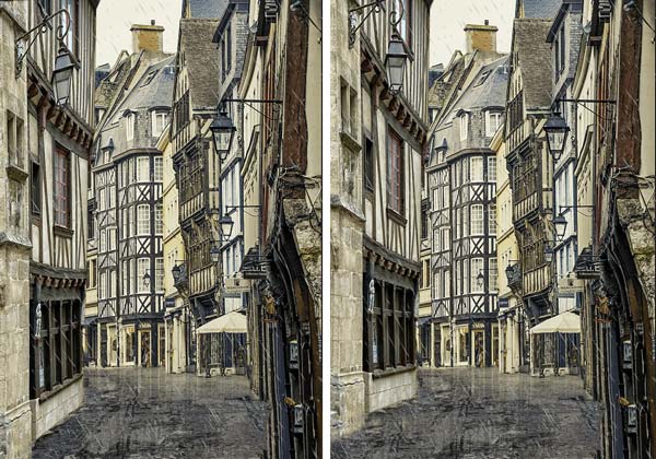
Oh - just seen David has already done it. Never mind, cant hurt to have two examples. I like the second entry, Michael, but your building on the left is still at the wrong perspective. Look at the vanishing lines and draw your horizons! A glorious balcony scene from Mariner, beautifully integrated into the extended background thats becoming something of a Mariner trademark. I like how the two angles of view are different for the two sets of stonework - seeing from above in one, and from below in the other. The reflections in the windows are ingenious, and neatly varied across the panes. Id have preferred a wooden ladder, though. And is Juliet standing on a stool? An extraordinary execution scene from dwindt, perfectly fitting the perspective. Very evocative. My only issue us that your knights are a couple of hundred years before the invention of the guillotine |
Posted on 26/02/21 08:53:40 AM |
|
DavidMac
Director of Photoshop Posts: 5776 Reply |
Re: Challenge 845: Historic Le Mans
Funny I found this one a bit dull to start and then it all became fun. Thanks Steve. Glad you approved. _________________ The subtlety and conviction of any Photoshop effect is invariably inversely proportional to the number of knobs on it ....... |
Posted on 26/02/21 08:55:32 AM |
|
vibeke
Kreative Kiwi Posts: 2166 Reply |
Re: Challenge 845: Historic Le Mans
Thank you Steve, I enjoyed this one, brought back a lot of fun memories. _________________ Perfect confidence is granted to the less talented as a consolation prize. |
Posted on 26/02/21 09:29:41 AM |
|
Mariner
Renaissance Mariner Posts: 3124 Reply |
Re: Challenge 845: Historic Le Mans
Thanks, Steve. This one was more difficult than it looked.
Sorry about the ladder. And, yes, Juliet is too small to see over the balcony without a stool. |
Posted on 26/02/21 09:34:14 AM |
|
tooquilos
Wizard of Oz Posts: 2904 Reply |
Re: Challenge 845: Historic Le Mans
Thank you Steve _________________ Wicked Witch of the West:I'll get you, my pretty! And your little dog, too! |
Posted on 26/02/21 1:14:50 PM |
|
DougD
Detail Demon Posts: 25 Reply |
Re: Challenge 845: Historic Le Mans
Cheers Steve. And thanks for the welcome everyone. I was actually on here about 10 years ago but work got in the way of fun. Couldn't remember my old login so signed up again. |
Posted on 26/02/21 1:17:51 PM |
|
dwindt
Realism Realiser Posts: 948 Reply |
Re: Challenge 845: Historic Le Mans
Thanks Steve. I knew I wouldn't get the guillotine past you. The town crier was a bit more renaissance to but it seemed to gel into an interesting scene. I didn't use gallows because they obstructed the stain glass windows and lessened the attempt to create light coming from windows of the unseen hidden side wall...not that I was able to achieve that anyway. To match the knights with the background image, I had to enlarge them 1500 percent to achieve the right perspective when I pushed them into the correct position in the virtual world. It seems to dark as-well. That must come from doing the image on 3 computers. _________________ The grass is greener on the other side of the fence because there is more $hit there. |
Posted on 26/02/21 1:42:15 PM |
|
Steve Caplin
Administrator Posts: 7047 Reply |
Re: Challenge 845: Historic Le Mans
Ah! Youre that Doug. Welcome home! |
Posted on 26/02/21 2:54:15 PM |
|
Frank
Eager Beaver Posts: 1769 Reply |
Re: Challenge 845: Historic Le Mans
Thanks Steve, you're right, I had adjusted her quite a few times and was trying to keep a happy medium between the girl in the door, the subject girl a little further in the scene, and the man in forefront. If one was to bring the car back in it shows she is too small. |
Posted on 01/03/21 10:54:54 AM |
|
josephine harvatt
Gag Gadgeteer Posts: 2603 Reply |
Re: Challenge 845: Historic Le Mans
Cheers Steve - yes, I couldnt get rid of that lean back _________________ I'm not really bad - I just draw that way |
| page: 1 2 3 last |