
| » Forum Index » Straight photography and off-topic » Topic: Colour correction and monitor alignment. |
|
Posted on 28/05/21 2:58:53 PM |
|
DavidMac
Director of Photoshop Posts: 6253 Reply  |
Colour correction and monitor alignment.
Sorry long post but it may interest the photographers and movie makers among you. I am starting to try to fine tune and grade some of my better photographs. For years of my professional life I have sat beside professional movie colourists and watched them grading and colour correcting my work. Sometimes it's a difficult exercise to try and gently stop them imposing 'looks' which I never intended and sometimes, with the really good ones, it's truly wonderful to see a colour professional with an eye far finer than mine understand what I intended and fine tune it, occasionally to a degree that is little short of miraculous. The lion's share of the movies and commercials I shot in recent years (the last fifteen or so) were graded on a truly wonderful machine called Da Vinci Resolve. I think it is fair to say it is one of the industry standards by which most other similar machines are judged. It has a colour correction tool set that makes Photoshop and Lightroom fade into relative obscurity. Some years ago Black Magic, the creators, released the software behind it for Mac and Windows as a free app. They make their money from the hardware. It is, for people without post production experience, a very steep learning curve. But for those with some experience of photography post processing (such as Photoshop or Lightroom) it has become much more accessible as there are now excellent books and tutorials available. Over the years Black Magic have extended Da Vinci from simply an amazing colour correction tool to a full featured editor, sound mixer and effects compositor. However it is for grading and colour correction that I have always known it. More here if you are curious. The problem for me is that Da Vince is strictly for movie and I want to work on photographs. However I recently discovered that you can 'trick' it into grading still photographs. So I have started to study the manuals and tutorials and learn myself what previously I had only watched and admired in professional colourists. I'll tell you more about this amazing software and what it can do later in another post, but I thought I would share the first step. End of preamble (or should that be preramble?), now I'll get to the point of this post. The first thing that becomes clear is that for anything of this sort to be significant, especially if at some point you are going to print, you need a properly adjusted monitor. Both OS X and Windows have built in apps for adjusting and colour balancing one or more displays but they are not very effective - well worth using, indeed essential, for basic setup but they don't take into account all sorts of factors that can affect the end result. I also found working twin screen with one Apple retina display and one Samsung IPS display that getting the two different manufacturers with two different specs to match was quite literally beyond my capabilities despite an awful lot of time invested in playing with both the OS and with the Samsung's native controls. I began to doubt if it was even possible to match them - which indeed with different manufacturers can often be the case. So a couple of days ago I bit the bullet and went out and bought a colorimeter and calibrated my monitors properly. The first time round it's quite a procedure but once it's done and you have learned how to use the it, it's about ten minutes to set it up and do both monitors. In professional post houses this is done every morning but in private circumstances once a month is enough (or at most once a week if you are really fussy). The end result was truly a revelation. The colorimeter not only balances the display but also (if you want it to) measures and takes into account the ambient light where you work and adjusts the displays accordingly. I discovered that I had been using mine too bright and contrasty and with completely the wrong gamma and white point. It now looks so much 'smoother' with much subtler tones and densities. But the real revelation was that my two completely disparate displays are now an almost perfect match! In terms of the end result and the effect it will have on correcting my photographs it's about 250 well spent. It also contains tools for checking and verifying corrections. If I didn't have to set up the twin monitors I could have bought a cheaper version at around 150. I had always felt this a rather superfluous overkill for use in personal work but now I am converted. I have seen the light! 😇😇 Anyone who has tried will know photographing displays is nigh on impossible, so the pictures here give no real idea of actual picture quality but they do show clearly the difference before and after. 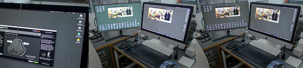 _________________ The subtlety and conviction of any Photoshop effect is invariably inversely proportional to the number of knobs on it ....... |
Posted on 29/05/21 12:46:50 PM |
|
lwc
Hole in One Posts: 3553 Reply |
Re: Colour correction and monitor alignment.
Interesting David... looking forward to your next post. |
Posted on 29/05/21 1:43:05 PM |
|
DavidMac
Director of Photoshop Posts: 6253 Reply |
Re: Colour correction and monitor alignment.
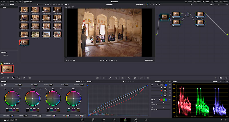
Be a while. I want to get really familiar with it 'hands on' first. Just to to tease this is the basic page with just the basic primary colour controls - just one of many different control options and modes. 
 _________________ The subtlety and conviction of any Photoshop effect is invariably inversely proportional to the number of knobs on it ....... |